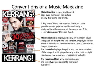
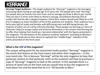
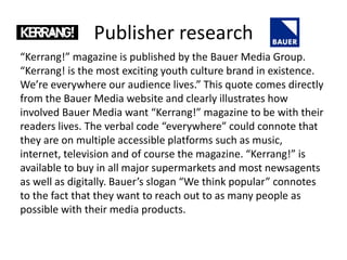
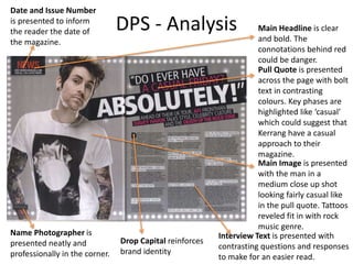
Download to read offline
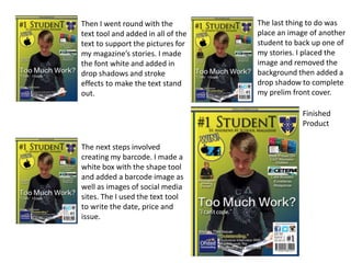
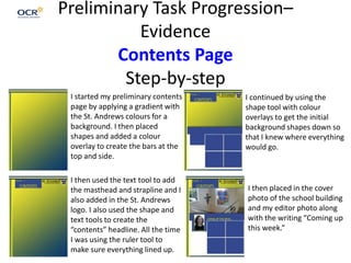
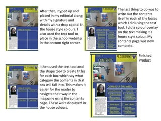

This document provides details about a student's preliminary tasks and planning for a music magazine project. It includes step-by-step descriptions of creating a front cover and contents page layout. It also includes research on the rock music genre market and target audiences for established music magazines Q and Kerrang. The unique selling points are identified as exclusive content and featuring popular artists. The publisher Bauer Media aims to connect deeply with readers through music-focused content.