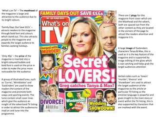
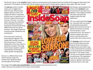
This document analyzes the front cover of a TV listings magazine focused on soap operas. It discusses various design elements used to attract readers, including bold colors, large text, prices displayed prominently, illustrations of popular TV shows, and emotive language describing dramatic storylines. Key verbal codes examined include "lovers," "murder," and "divorce" which hint at drama to draw in readers. The conclusion recommends repeating design techniques like bright colors, large text, and multiple cover stories to sensationalize content and engage the target audience.


