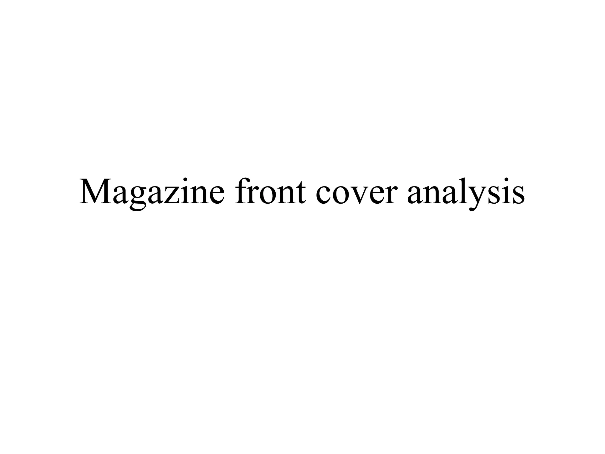
Magazine front cover analysis
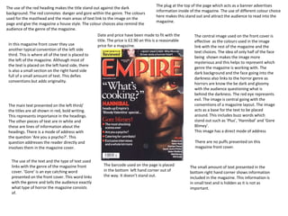
The use of the red heading makes the title stand out against the dark 
background. The red connotes danger and gore within the genre. The colours 
used for the masthead and the main areas of text link to the image on the 
page and give the magazine a house style. The colour choices also remind the 
audience of the genre of the magazine. 
The plug at the top of the page which acts as a banner advertises 
information inside of the magazine. The use of different colour choice 
here makes this stand out and attract the audience to read into the 
magazine. 
Date and price have been made to fit with the 
title. The price is £2.90 an this is a reasonable 
price for a magazine. 
The central image used on the front cover is 
effective as the colours used in the image 
link with the rest of the magazine and the 
text choices. The idea of only half of the face 
being shown makes the image more 
mysterious and this helps to represent which 
genre the magazine is working with. The 
dark background and the face going into the 
darkness also links to the horror genre as 
horrors are know the be dark and gloomy 
with the audience questioning what is 
behind the darkness. The red eye represents 
evil. The image is central going with the 
conventions of a magazine layout. The image 
acts as a base for the text to be placed 
around. This includes buzz words which 
stand out such as ‘Plus’, ‘Hannibal’ and ‘Gore 
Blimey’. 
This image has a direct mode of address 
The barcode used on the page is placed 
in the bottom left hand corner out of 
the way. It doesn’t stand out. 
In this magazine front cover they use 
another typical convention of the left side 
third. This is where all of the text is placed to 
the left of the magazine. Although most of 
the text is placed on the left hand side, there 
is also a small section on the right hand side 
full of a small amount of text. This defies 
conventions but adds originality. 
The main text presented on the left third/ 
the titles are all shown in red, bold writing. 
This represents importance in the headings. 
The other pieces of text are in white and 
these are lines of information about the 
headings. There is a mode of address with 
the question ‘Are you a psycho?’. This 
question addresses the reader directly and 
involves them in the magazine cover. 
There are no puffs presented on this 
magazine front cover. 
The use of the text and the type of text used 
links with the genre of the magazine front 
cover. ‘Gore’ is an eye catching word 
presented on the front cover. This word links 
with the genre and tells the audience exactly 
what type of horror the magazine consists 
of. 
The small amount of text presented in the 
bottom right hand corner shows information 
included in the magazine. This information is 
in small text and is hidden as it is not as 
important.
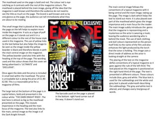
The masthead used on the page is bold and red. The colour red is eye 
catching as it contrasts with the rest of the magazine colours. The 
masthead is placed behind the main image, giving off the idea that the 
magazine is well known and therefore the audience do not need to 
see the title as much on the page. The brand is well known and so by 
one glance as the page, the audience can tell immediately what they 
are about to be reading. 
Once again the date and the price is included 
in small text within the masthead. The price 
is unreadable but is along the price of £1.90- 
£2.90. This is a reasonable price for a 
magazine of films. 
The large text at the bottom of the page is in 
capital letters, bold and presented in the 
colour white: ‘THE DARK KNIGHT RISES’. The 
text here is almost as big as the masthead 
presented on the page. This reveals 
importance in the heading and the main 
focus of the magazine. The text also links to 
the main, central image as the image is of 
the Dark Knight himself. 
The main central image follows the 
conventions of a typical magazine with it 
being central and the main image, taking up 
the page. The image is dark which helps the 
text to stand out more. It is also placed over 
part of the masthead which gives the image 
importance and a main focus for the reader. 
The main image subtly introduces the genre 
that the magazine is representing and is 
mysterious as the actor is wearing a mask; 
leaving the audience wondering who is 
behind the mask. The use of dark clothing 
and dull colours represented on the person 
itself links to the name of the film and also 
enhances the light produced by the torch 
that the actor is holding. This image uses a 
direct mode of address as the actor is 
looking straight at the camera 
The barcode used on the page is placed 
in the bottom right hand corner out of 
the way. It doesn’t stand out. 
The placing of the text on the magazine 
defies conventions of a typical magazine as it 
goes against the rule of the left third. The 
text placed on this magazine is positioned on 
the right hand third of the page. The text is 
presented in different colours. These colours 
include blue, grey and white. The blue text is 
used for the subheadings and the white and 
grey text is placed underneath describing 
the subheadings. The grey and white text is 
altered, and changes every line/group of 
words. 
The small image that is placed at the top of 
the page on the left helps to explain more 
inside the magazine. It acts as a type of puff 
on the page as it stands out and it in a 
different colour to the rest of the house style 
used in the magazine. The use of yellow links 
to the text below but also helps the image to 
be seen as the image inside the yellow 
boarder is black and therefore blends in with 
the main central image on the magazine. 
The yellow boarder used also links with the 
heading at the top of the page. The wording 
used and the colour shows that the cover set 
being advertised is ‘ULTIMATE’ and 
‘EXCLUSIVE’.
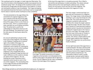
The masthead used on the page is in bold, large text filled white. The 
top of the first letter of the heading has another word placed into the 
masthead saying ‘Total’. The design of the masthead creates a brand 
that becomes recognisable and well known to the audience. It stands 
out catching the audience's eye immediately . The image overlapping 
the masthead shows that the brand is well known and so recognisable 
that he doesn’t need the whole masthead to show completely. 
At the top of the page there is a strapline presented. This is filled in 
red and the red overlaying is in white and yellow. The colours red and 
yellow stand out the most catching the audiences eye, as these 
colours are not sued as much over the rest of the magazine. The 
strapline usually includes news within the magazine or a fact. 
The main image is central and large as it 
goes with the conventions of a magazine 
layout. The image shows a male posing and 
standing in such a way that shows he is the 
alpha male. This could represent that the 
magazine is aimed at males and this 
therefore this reveals the target audience 
through the image. The film name shown 
also is aimed at a male dominant audience. 
However women may also be interested in 
reading the magazine due to the male on 
the front cover page. The image used on 
the front cover can be seen as ‘Hunky’ or 
‘attractive’ and pleasing to the eye of 
women. This shows a mixed audience and 
a wider target audience than originally 
though. This image does not use the direct 
mode of address. 
On this magazine they do not have a barcode on the 
front page. This defies conventions of a typical 
magazine as the barcode is normally placed at the 
bottom of the page in the bottom left of right hand 
corner. On this magazine the bar code is probably p-laced 
on the back page of the magazine. 
The text presented on the page follows the 
conventions of a typical magazine as the 
text is placed on the left third of the page. 
There is also text placed on the right hand 
third of the page as there is a lot of text on 
the front cover. There is a common house 
style used with the use of yellow and white 
text. The white text is used for the 
subheadings to make them stand out and 
the main headings. The yellow text is used 
for other pieces of information about the 
headings. 
On the right hand side of the page there is 
a puff presented. The text is placed inside 
a red circle. The colour of the text follows 
the house theme of the magazine keeping 
with the yellow and white text. The 
information inside of a puff is usually 
include words or phrases which help to 
boost a status of a piece of information. 
An unusual subheading is placed on the 
front cover of the magazine. This heading 
is the ‘Gladiator’ heading and it is placed 
right in the middle of the page. It is 
unusual as it is almost as large as the 
masthead is and it stands out, catching the 
readers eye, just as much as the masthead 
does. This gives the image that the 
magazine is very recognisable and so 
having the masthead in large text does not 
make a difference as the audience already 
are aware of the magazine. The sub 
heading also shows importance and it 
represents what may be to come in the 
rest of the magazine. The sub heading links 
to the image and they are both presented 
largely for the audience to see. 
http://blogs.warwick.ac.uk/michaelwalford/entry/glossary_of_magazine/

Magazine front cover analysis

  • 1.
  • 2.
    The use ofthe red heading makes the title stand out against the dark background. The red connotes danger and gore within the genre. The colours used for the masthead and the main areas of text link to the image on the page and give the magazine a house style. The colour choices also remind the audience of the genre of the magazine. The plug at the top of the page which acts as a banner advertises information inside of the magazine. The use of different colour choice here makes this stand out and attract the audience to read into the magazine. Date and price have been made to fit with the title. The price is £2.90 an this is a reasonable price for a magazine. The central image used on the front cover is effective as the colours used in the image link with the rest of the magazine and the text choices. The idea of only half of the face being shown makes the image more mysterious and this helps to represent which genre the magazine is working with. The dark background and the face going into the darkness also links to the horror genre as horrors are know the be dark and gloomy with the audience questioning what is behind the darkness. The red eye represents evil. The image is central going with the conventions of a magazine layout. The image acts as a base for the text to be placed around. This includes buzz words which stand out such as ‘Plus’, ‘Hannibal’ and ‘Gore Blimey’. This image has a direct mode of address The barcode used on the page is placed in the bottom left hand corner out of the way. It doesn’t stand out. In this magazine front cover they use another typical convention of the left side third. This is where all of the text is placed to the left of the magazine. Although most of the text is placed on the left hand side, there is also a small section on the right hand side full of a small amount of text. This defies conventions but adds originality. The main text presented on the left third/ the titles are all shown in red, bold writing. This represents importance in the headings. The other pieces of text are in white and these are lines of information about the headings. There is a mode of address with the question ‘Are you a psycho?’. This question addresses the reader directly and involves them in the magazine cover. There are no puffs presented on this magazine front cover. The use of the text and the type of text used links with the genre of the magazine front cover. ‘Gore’ is an eye catching word presented on the front cover. This word links with the genre and tells the audience exactly what type of horror the magazine consists of. The small amount of text presented in the bottom right hand corner shows information included in the magazine. This information is in small text and is hidden as it is not as important.
  • 3.
    The masthead usedon the page is bold and red. The colour red is eye catching as it contrasts with the rest of the magazine colours. The masthead is placed behind the main image, giving off the idea that the magazine is well known and therefore the audience do not need to see the title as much on the page. The brand is well known and so by one glance as the page, the audience can tell immediately what they are about to be reading. Once again the date and the price is included in small text within the masthead. The price is unreadable but is along the price of £1.90- £2.90. This is a reasonable price for a magazine of films. The large text at the bottom of the page is in capital letters, bold and presented in the colour white: ‘THE DARK KNIGHT RISES’. The text here is almost as big as the masthead presented on the page. This reveals importance in the heading and the main focus of the magazine. The text also links to the main, central image as the image is of the Dark Knight himself. The main central image follows the conventions of a typical magazine with it being central and the main image, taking up the page. The image is dark which helps the text to stand out more. It is also placed over part of the masthead which gives the image importance and a main focus for the reader. The main image subtly introduces the genre that the magazine is representing and is mysterious as the actor is wearing a mask; leaving the audience wondering who is behind the mask. The use of dark clothing and dull colours represented on the person itself links to the name of the film and also enhances the light produced by the torch that the actor is holding. This image uses a direct mode of address as the actor is looking straight at the camera The barcode used on the page is placed in the bottom right hand corner out of the way. It doesn’t stand out. The placing of the text on the magazine defies conventions of a typical magazine as it goes against the rule of the left third. The text placed on this magazine is positioned on the right hand third of the page. The text is presented in different colours. These colours include blue, grey and white. The blue text is used for the subheadings and the white and grey text is placed underneath describing the subheadings. The grey and white text is altered, and changes every line/group of words. The small image that is placed at the top of the page on the left helps to explain more inside the magazine. It acts as a type of puff on the page as it stands out and it in a different colour to the rest of the house style used in the magazine. The use of yellow links to the text below but also helps the image to be seen as the image inside the yellow boarder is black and therefore blends in with the main central image on the magazine. The yellow boarder used also links with the heading at the top of the page. The wording used and the colour shows that the cover set being advertised is ‘ULTIMATE’ and ‘EXCLUSIVE’.
  • 4.
    The masthead usedon the page is in bold, large text filled white. The top of the first letter of the heading has another word placed into the masthead saying ‘Total’. The design of the masthead creates a brand that becomes recognisable and well known to the audience. It stands out catching the audience's eye immediately . The image overlapping the masthead shows that the brand is well known and so recognisable that he doesn’t need the whole masthead to show completely. At the top of the page there is a strapline presented. This is filled in red and the red overlaying is in white and yellow. The colours red and yellow stand out the most catching the audiences eye, as these colours are not sued as much over the rest of the magazine. The strapline usually includes news within the magazine or a fact. The main image is central and large as it goes with the conventions of a magazine layout. The image shows a male posing and standing in such a way that shows he is the alpha male. This could represent that the magazine is aimed at males and this therefore this reveals the target audience through the image. The film name shown also is aimed at a male dominant audience. However women may also be interested in reading the magazine due to the male on the front cover page. The image used on the front cover can be seen as ‘Hunky’ or ‘attractive’ and pleasing to the eye of women. This shows a mixed audience and a wider target audience than originally though. This image does not use the direct mode of address. On this magazine they do not have a barcode on the front page. This defies conventions of a typical magazine as the barcode is normally placed at the bottom of the page in the bottom left of right hand corner. On this magazine the bar code is probably p-laced on the back page of the magazine. The text presented on the page follows the conventions of a typical magazine as the text is placed on the left third of the page. There is also text placed on the right hand third of the page as there is a lot of text on the front cover. There is a common house style used with the use of yellow and white text. The white text is used for the subheadings to make them stand out and the main headings. The yellow text is used for other pieces of information about the headings. On the right hand side of the page there is a puff presented. The text is placed inside a red circle. The colour of the text follows the house theme of the magazine keeping with the yellow and white text. The information inside of a puff is usually include words or phrases which help to boost a status of a piece of information. An unusual subheading is placed on the front cover of the magazine. This heading is the ‘Gladiator’ heading and it is placed right in the middle of the page. It is unusual as it is almost as large as the masthead is and it stands out, catching the readers eye, just as much as the masthead does. This gives the image that the magazine is very recognisable and so having the masthead in large text does not make a difference as the audience already are aware of the magazine. The sub heading also shows importance and it represents what may be to come in the rest of the magazine. The sub heading links to the image and they are both presented largely for the audience to see. http://blogs.warwick.ac.uk/michaelwalford/entry/glossary_of_magazine/