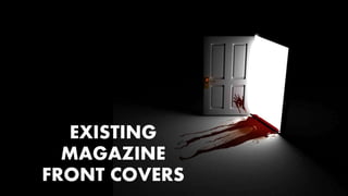
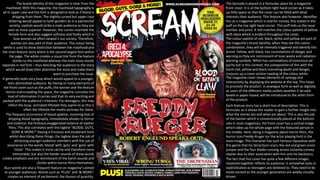
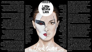
EXISTING
MAGAZINE
FRONT COVERS
The brand identity of this magazine is clear from the
masthead. With this magazine, the masthead typography is
all in upper case and the font is designed to look as if blood is
dripping from them. The slightly curved but upper case
lettering would appeal to both genders as in a patriarchal
society, capitals would strike a male audience as they are
seen as more superior. However, the curves resemble the
female form and also suggest softness and frailty which is
how women ae often viewed n our society. Therefore,
woman are also part of their audience. The colour being
white is used to show distinction between the masthead and
the main feature story which is the second largest font within
the page. The white creates a visual link from the feature
stories to the masthead whereas the main story stands
separate in red font – thus directing the audience to the story
which would draw their attention the most and make them
want to purchase the issue.
It generally looks very busy which would appeal to a younger,
teen-dominated audience. By having so many elements of
the front cover such as the puffs, the banner and the feature
stories overcrowding the space, the magazine connotes the
load of information it carries and that its very exciting and
packed with the audience’s interests. For teenagers, this may
reflect the busy, animated lifestyle they aspire to as this is
often the lifestyle the media portrays for teens.
The frequent occurrence of blood splatter, involving that of
dripping blood typography, immediately alludes to horror
and violence; the fictitious exaggerated violence of slasher
films. This also correlates with the tagline “BLOOD, GUTS,
GORE & MORE!” Having a frivolous and exuberant tone
whilst describing these things, the tagline does the job of
attracting younger audience members with the use of
assonance on the words ‘blood’ with ‘guts’ and ‘gore’ with
’more’. This makes it more catchy and therefore more
memorable, but also the harder sounds of these words
create emphasis and are reminiscent of the harsh sounds and
clichés within horror films themselves.
The barcode is placed in a formulaic place for a magazine
front cover. It is at the bottom right hand corner as it takes
up little space so that the cover can be filled with what
interests their audience. This feature also however, identifies
this as a magazine which is sold for money, this stated in the
puff on the top right hand corner. This puff tells us the issue
number and price. It still matches the colour palette of yellow
with black which is evident throughout the cover.
The colour palette of red, black, white and yellow are part of
the magazine’s brand identity; when they see this colour
combination, they will be mentally triggered and identify this
brand. Yellow, with black, has connotations of danger and
warning as they are reminiscent of toxic waste and radiation
warning symbols. White has connotations of innocence ad
purity but in this context, the juxtaposition of this with the
harsh red, yellow and black connoting death and danger,
conjures up a more sinister reading of the colour white.
The magazine cover shows elements of synergy and
interactivity by displaying the website at the top. This helps
to promote the product in analogue form as well as digitally
as users of the different media outlets weather it be web-
based or paper-based, will be introduced to the other form
of the product.
Buzz words are also a frequent feature on magazine’s aimed
at younger audiences. Words such as ‘PLUS!’ and ‘& MORE!’
creates an element of excitement; the illusion of quantity.
Each feature story has a short line of description. This is
formulaic as it allows the reader to gain a further insight into
what the stories are and what are about. This is also the job
of the banner which is conventionally placed at the bottom.
Like in most magazines, the front cover has a central image
which takes up the whole page with the featured person in
the middle. Here, being a magazine about horror films, the
horror icon Freddy Kruger (or the actor playing him) is the
main image. This character has such famous reputation with
this genre that his facial burn scars, the red and green iconic
jumper and the four blades running across instantly convey
slasher due to their association with him and his backstory.
The fact that this cover has quite a few different images
clustered together reflects its audience; it somewhat lacks in
sophistication as teenagers are believed to. They need to be
easily excited as the younger generation are widely visually
driven.
Being made to attract a niche audience, Little White
Lies has taken the approach of breaking the form and
conventions of magazine covers.
Instead of the barcode being at the bottom right hand
corner as it usually is, it is placed at the top-centre
above the masthead. In fact, it’s presence in this
particular position, in a way, is part of the masthead
design of Little White Lies which is a factor of their
brand identity.
The atypical masthead breaks conventions in being in
a white circle and not stretching across the magazine
cover at the top. It still, however, draws immediate
attention and the identity of the magazine is instantly
recognisable from first glance.
This magazine cover features a painted image rather
than a photograph. This alludes to the fact that the
boutique audience in which this is aimed at are
hipsters; creative, older, cinematically literate people
who would appreciate the unique and more
sophisticated approach to how this magazine
represents itself, and them. Additionally, by having a
horror film poster presented as a painting, it nods to
cinema’s history as painted images were previously
used as film front covers.
Little White Lies has a loyal fan base who continues to
buy their magazine as it contains information which
specifically pull their interests as film fanatics, and
which they feel they cannot get anywhere else. This is
how, in an internet-consumed society where
information can be accessed for free and quickly, this
magazine still continues to publish issues and sell
copies without falling at a financial loss. They are
catering to their boutique audience, not the
mainstream who can find most of what they want
online now.
‘The Black Swan’ was a psychological thriller-horror
which was a successful film. and earned critical praise
as well as 5 Academy Awards. The film gaining
recognition for direction and style as well as acting,
will make it appealing to a cinematically literate
audience of specific film interests. This makes sense
for the magazine producers to feature it in the front
cover.
There is a tagline which is present on each of the
‘Little White Lies’ issues. It reads ‘Truth & Movies’.
This in itself, connotes maturity and distance fro the
mainstream. It suggests an honest analysis and in-
depth look into intelligent or thought-provoking films.
However, in this unconventional cover format, the
tagline positioning remains conventionally below the
masthead and is part of the brand identity.
There is a clear juxtaposition of good and evil in the
light and dark contrasts within this cover to portray
the conventions of horror. The black background
correlates with her right eye in dark make-up
representing the sinister side of her. This evil creeps
up on her throughout the film and is thus shown here
as there is a crack of the black corrupted swan’s mask
on her left (pure) side. It is highlighted that the focus of this issue is ‘The Black
Swan’ film as stated at the bottom of the cover. The
typography of this is all in lower case and the words
‘black swan’ are bigger in size than the words ‘the’ and
‘issue’. This again draws the audience to this particular
issue, suggesting that this film was highly anticipated
amongst the ‘Little White Lies’ audience. The soft
typography matches the theme of dance and ballet in
the film, but is also a juxtaposition with the horror that
will ensue.
The form is
simplistic. This
layout for a
magazine cover
contrasts from
mainstream
magazines
catered for
younger
audiences which
are so busy and
look so full.
They connote
the excitement
and information
overload for the
audience.
However, being
so minimalistic,
Little White Lies
emphasise their
quality in
information
rather than
quantity; it is
more of an
intellectual
read.
The typography of the masthead is black and
mostly in lower case apart from the first letters of
each word. It also uses quite a squared hard edged
font style. This connotes power and knowledge as
in a male dominated society, squarer shapes
convey masculinity which in turn conveys strength.
Therefore, readers would feel that this magazine
carries superiority and importance.
In terms of the
male gaze, it can
be argued that
the red
lips(outlining
this as a
separate shape
which alludes
male attraction),
and her
seemingly
flawless
complexion
show her being
in the male gaze.
However, The
camera angle,
though slightly
high angled, still
depict her in a
powerful
position.
Additionally, the
cracks can be
used in a
different context
to say that her
flawless
compaction is
nothing but a
façade.
The Fangoria masthead in this issue is not the exact same
original masthead design that this magazine has. Depending
on the main feature story of the issue, Fangoria changes its
masthead design in colour and slightly sometimes in
typography. This is so that it is more visually appeasing for
the audience and the colour palette compliments the main
image. Its original colour palette is black, red and white. The
masthead would be in red text with a white outline with a
black background. Fangoria, being such a well-known brand
means that it can break conventions with its masthead as
their audience will still recognise and actively search for
their magazine.
The colours of masthead depict horror as the red has
connotations of blood and violence. Additionally, black
connotes death and evil. This combination is also very
arresting and grisly in it’s association with horror and
therefore appeals to its audience of horror film fanatics.
The banner at the top of the cover is quite a conventional
feature of mainstream magazines today. It is used to
advertise an additional story which the audience would take
particular interest in; thus why the buzz word ‘exclusive’ is
used to educe excitement and eagerness to read. Buzz
words are another formulaic feature. The make the
audience feel special and excited as phases such as
‘exclusive’ and ‘Nancy speaks!’ suggests information which
is quite secretive; information that only readers of this
magazine will know and thus spark human curiosity as well a
feeling collectiveness and importance.
The more organised, structured form of this magazine cover
would appeal to the slightly older more sophisticated
audience. As from a cinematically literate and more
reformer perspective, this less chaotic, more categorical
template is more visually pleasing as well as more seemingly
informative.
It is formulaic to have a predominant image on the front
cover. The main feature story is about the film ‘Evil Dead 2’
which is titled above the main image. Displaying a rotten
zombie’s face with a missing eyeball and bloody ghastly
teeth conveys the violence and artificial gore much desired
by the audience. Additionally, this, literally distorted image
of humanity, connoted what slasher horror initially sought
to educate its audience about; how people who are
‘corrupted’ will be punished; they are the ones represented
as distorted humans.
Fangoria’s audience being slightly older and therefore
having a heightened level of sophistication, means that this
intentional view of society and humanity that the cover
alone conveys, would appeal to them as politically aware
readers. Also, because of this, fewer secondary images are
displayed. As this more mature audience, they value quality
over quantity and the over-crowded, chaos of magazine
covers such as ‘SREAM’ would not appeal to them as much.
The tagline is quite a mature and more fatter-of-fact tagline
rather than conventional puns or wordplay which are often
use. Once again this reflects Fangoria’s audience. They take
cinematic arts and films seriously and search for mature
responses to horror films.
The issue’s release date is at top right corner. This is
formulaic of magazine covers. The price is conventionally
also located around this area but it is under the masthead.
The phrase ‘Here’s mud in your eye’ is a frivolous term used
between friends drinking. The wordplay in using ‘blood’
instead of ‘mud’ introduces violence and vengeance to the
once light-heated saying. Additionally, there is an element
of comedy as the image this is attached to is missing an eye.
Being published since 1979, this magazine has quite a loyal
fan base who would most predominantly be older males
who were teenagers when it first became popular amongst
the cinematically literate. Though in contemporary
magazine publication, it is quite unconventional to have a
strip acting like banner on side of the cover rather than
across the bottom, for the time period, this would have
been quite formulaic. The strip designed like a film roll tape
is a clever stylistic choice as it highlights the purpose of this
magazine within its design; discussion of horror cinema..
There is relatively conventional placement of the barcode at
the bottom left . Being placed on the film tape which acts as
a banner, adds to the appearance of a more structured
magazine which would appeal to a slightly older audience.

A2 horror existing magazine front covers

  • 1.
  • 2.
    The brand identityof this magazine is clear from the masthead. With this magazine, the masthead typography is all in upper case and the font is designed to look as if blood is dripping from them. The slightly curved but upper case lettering would appeal to both genders as in a patriarchal society, capitals would strike a male audience as they are seen as more superior. However, the curves resemble the female form and also suggest softness and frailty which is how women ae often viewed n our society. Therefore, woman are also part of their audience. The colour being white is used to show distinction between the masthead and the main feature story which is the second largest font within the page. The white creates a visual link from the feature stories to the masthead whereas the main story stands separate in red font – thus directing the audience to the story which would draw their attention the most and make them want to purchase the issue. It generally looks very busy which would appeal to a younger, teen-dominated audience. By having so many elements of the front cover such as the puffs, the banner and the feature stories overcrowding the space, the magazine connotes the load of information it carries and that its very exciting and packed with the audience’s interests. For teenagers, this may reflect the busy, animated lifestyle they aspire to as this is often the lifestyle the media portrays for teens. The frequent occurrence of blood splatter, involving that of dripping blood typography, immediately alludes to horror and violence; the fictitious exaggerated violence of slasher films. This also correlates with the tagline “BLOOD, GUTS, GORE & MORE!” Having a frivolous and exuberant tone whilst describing these things, the tagline does the job of attracting younger audience members with the use of assonance on the words ‘blood’ with ‘guts’ and ‘gore’ with ’more’. This makes it more catchy and therefore more memorable, but also the harder sounds of these words create emphasis and are reminiscent of the harsh sounds and clichés within horror films themselves. The barcode is placed in a formulaic place for a magazine front cover. It is at the bottom right hand corner as it takes up little space so that the cover can be filled with what interests their audience. This feature also however, identifies this as a magazine which is sold for money, this stated in the puff on the top right hand corner. This puff tells us the issue number and price. It still matches the colour palette of yellow with black which is evident throughout the cover. The colour palette of red, black, white and yellow are part of the magazine’s brand identity; when they see this colour combination, they will be mentally triggered and identify this brand. Yellow, with black, has connotations of danger and warning as they are reminiscent of toxic waste and radiation warning symbols. White has connotations of innocence ad purity but in this context, the juxtaposition of this with the harsh red, yellow and black connoting death and danger, conjures up a more sinister reading of the colour white. The magazine cover shows elements of synergy and interactivity by displaying the website at the top. This helps to promote the product in analogue form as well as digitally as users of the different media outlets weather it be web- based or paper-based, will be introduced to the other form of the product. Buzz words are also a frequent feature on magazine’s aimed at younger audiences. Words such as ‘PLUS!’ and ‘& MORE!’ creates an element of excitement; the illusion of quantity. Each feature story has a short line of description. This is formulaic as it allows the reader to gain a further insight into what the stories are and what are about. This is also the job of the banner which is conventionally placed at the bottom. Like in most magazines, the front cover has a central image which takes up the whole page with the featured person in the middle. Here, being a magazine about horror films, the horror icon Freddy Kruger (or the actor playing him) is the main image. This character has such famous reputation with this genre that his facial burn scars, the red and green iconic jumper and the four blades running across instantly convey slasher due to their association with him and his backstory. The fact that this cover has quite a few different images clustered together reflects its audience; it somewhat lacks in sophistication as teenagers are believed to. They need to be easily excited as the younger generation are widely visually driven.
  • 3.
    Being made toattract a niche audience, Little White Lies has taken the approach of breaking the form and conventions of magazine covers. Instead of the barcode being at the bottom right hand corner as it usually is, it is placed at the top-centre above the masthead. In fact, it’s presence in this particular position, in a way, is part of the masthead design of Little White Lies which is a factor of their brand identity. The atypical masthead breaks conventions in being in a white circle and not stretching across the magazine cover at the top. It still, however, draws immediate attention and the identity of the magazine is instantly recognisable from first glance. This magazine cover features a painted image rather than a photograph. This alludes to the fact that the boutique audience in which this is aimed at are hipsters; creative, older, cinematically literate people who would appreciate the unique and more sophisticated approach to how this magazine represents itself, and them. Additionally, by having a horror film poster presented as a painting, it nods to cinema’s history as painted images were previously used as film front covers. Little White Lies has a loyal fan base who continues to buy their magazine as it contains information which specifically pull their interests as film fanatics, and which they feel they cannot get anywhere else. This is how, in an internet-consumed society where information can be accessed for free and quickly, this magazine still continues to publish issues and sell copies without falling at a financial loss. They are catering to their boutique audience, not the mainstream who can find most of what they want online now. ‘The Black Swan’ was a psychological thriller-horror which was a successful film. and earned critical praise as well as 5 Academy Awards. The film gaining recognition for direction and style as well as acting, will make it appealing to a cinematically literate audience of specific film interests. This makes sense for the magazine producers to feature it in the front cover. There is a tagline which is present on each of the ‘Little White Lies’ issues. It reads ‘Truth & Movies’. This in itself, connotes maturity and distance fro the mainstream. It suggests an honest analysis and in- depth look into intelligent or thought-provoking films. However, in this unconventional cover format, the tagline positioning remains conventionally below the masthead and is part of the brand identity. There is a clear juxtaposition of good and evil in the light and dark contrasts within this cover to portray the conventions of horror. The black background correlates with her right eye in dark make-up representing the sinister side of her. This evil creeps up on her throughout the film and is thus shown here as there is a crack of the black corrupted swan’s mask on her left (pure) side. It is highlighted that the focus of this issue is ‘The Black Swan’ film as stated at the bottom of the cover. The typography of this is all in lower case and the words ‘black swan’ are bigger in size than the words ‘the’ and ‘issue’. This again draws the audience to this particular issue, suggesting that this film was highly anticipated amongst the ‘Little White Lies’ audience. The soft typography matches the theme of dance and ballet in the film, but is also a juxtaposition with the horror that will ensue. The form is simplistic. This layout for a magazine cover contrasts from mainstream magazines catered for younger audiences which are so busy and look so full. They connote the excitement and information overload for the audience. However, being so minimalistic, Little White Lies emphasise their quality in information rather than quantity; it is more of an intellectual read. The typography of the masthead is black and mostly in lower case apart from the first letters of each word. It also uses quite a squared hard edged font style. This connotes power and knowledge as in a male dominated society, squarer shapes convey masculinity which in turn conveys strength. Therefore, readers would feel that this magazine carries superiority and importance. In terms of the male gaze, it can be argued that the red lips(outlining this as a separate shape which alludes male attraction), and her seemingly flawless complexion show her being in the male gaze. However, The camera angle, though slightly high angled, still depict her in a powerful position. Additionally, the cracks can be used in a different context to say that her flawless compaction is nothing but a façade.
  • 4.
    The Fangoria mastheadin this issue is not the exact same original masthead design that this magazine has. Depending on the main feature story of the issue, Fangoria changes its masthead design in colour and slightly sometimes in typography. This is so that it is more visually appeasing for the audience and the colour palette compliments the main image. Its original colour palette is black, red and white. The masthead would be in red text with a white outline with a black background. Fangoria, being such a well-known brand means that it can break conventions with its masthead as their audience will still recognise and actively search for their magazine. The colours of masthead depict horror as the red has connotations of blood and violence. Additionally, black connotes death and evil. This combination is also very arresting and grisly in it’s association with horror and therefore appeals to its audience of horror film fanatics. The banner at the top of the cover is quite a conventional feature of mainstream magazines today. It is used to advertise an additional story which the audience would take particular interest in; thus why the buzz word ‘exclusive’ is used to educe excitement and eagerness to read. Buzz words are another formulaic feature. The make the audience feel special and excited as phases such as ‘exclusive’ and ‘Nancy speaks!’ suggests information which is quite secretive; information that only readers of this magazine will know and thus spark human curiosity as well a feeling collectiveness and importance. The more organised, structured form of this magazine cover would appeal to the slightly older more sophisticated audience. As from a cinematically literate and more reformer perspective, this less chaotic, more categorical template is more visually pleasing as well as more seemingly informative. It is formulaic to have a predominant image on the front cover. The main feature story is about the film ‘Evil Dead 2’ which is titled above the main image. Displaying a rotten zombie’s face with a missing eyeball and bloody ghastly teeth conveys the violence and artificial gore much desired by the audience. Additionally, this, literally distorted image of humanity, connoted what slasher horror initially sought to educate its audience about; how people who are ‘corrupted’ will be punished; they are the ones represented as distorted humans. Fangoria’s audience being slightly older and therefore having a heightened level of sophistication, means that this intentional view of society and humanity that the cover alone conveys, would appeal to them as politically aware readers. Also, because of this, fewer secondary images are displayed. As this more mature audience, they value quality over quantity and the over-crowded, chaos of magazine covers such as ‘SREAM’ would not appeal to them as much. The tagline is quite a mature and more fatter-of-fact tagline rather than conventional puns or wordplay which are often use. Once again this reflects Fangoria’s audience. They take cinematic arts and films seriously and search for mature responses to horror films. The issue’s release date is at top right corner. This is formulaic of magazine covers. The price is conventionally also located around this area but it is under the masthead. The phrase ‘Here’s mud in your eye’ is a frivolous term used between friends drinking. The wordplay in using ‘blood’ instead of ‘mud’ introduces violence and vengeance to the once light-heated saying. Additionally, there is an element of comedy as the image this is attached to is missing an eye. Being published since 1979, this magazine has quite a loyal fan base who would most predominantly be older males who were teenagers when it first became popular amongst the cinematically literate. Though in contemporary magazine publication, it is quite unconventional to have a strip acting like banner on side of the cover rather than across the bottom, for the time period, this would have been quite formulaic. The strip designed like a film roll tape is a clever stylistic choice as it highlights the purpose of this magazine within its design; discussion of horror cinema.. There is relatively conventional placement of the barcode at the bottom left . Being placed on the film tape which acts as a banner, adds to the appearance of a more structured magazine which would appeal to a slightly older audience.