Download to read offline


![Bibliography
1. Daniel Thompson. (2018) Target Audience Research Survey (conducted
on 11th April)
2. Will Stewart, Kieran Beal. (2018) Target Audience Interviews (conducted
on 10th April)
3. Spyro – Skylanders on Game-Collection – Deviantart
4. pcgamer. 2018. PC Gamer. [ONLINE] Available
at: https://www.pcgamer.com/. [Accessed 04 May 2018].
5. Wallace, Mitch (April 5, 2018). "'Spyro Reignited Trilogy' Officially Glides
Onto PS4 And Xbox One This September". Forbes. April 5, 2018
6. McWhertor, Michael. "Spyro the Dragon remastered trilogy coming to
PS4, Xbox One". Polygon. April 5, 2018
7. Dayus, Oscar (June 12, 2018). "E3 2018: Spyro Reignited Trilogy's First
Gameplay Revealed, And It Looks Gorgeous". GameSpot. June 13, 2018](https://image.slidesharecdn.com/3-180703151025/85/3-research-1-23-320.jpg)

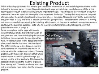
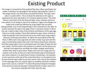
This document analyzes and summarizes several existing product designs that are relevant to the creator's magazine project. It discusses the common features found across the researched products, such as strong color schemes, layering for depth, and use of bold fonts. The creator notes they will take inspiration from the minimalist yet colorful website design and will include text wrapping in their own double page spread design. The research will help inform the creator's production work, particularly the magazine cover and website design aspects.


![Presentation1 [autosaved]](https://cdn.slidesharecdn.com/ss_thumbnails/presentation1autosaved-180329155155-thumbnail.jpg?width=640&height=640&fit=bounds)