

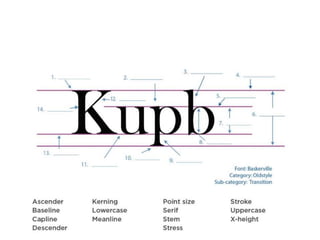
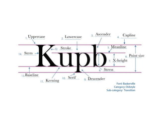
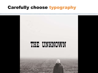
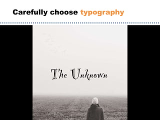
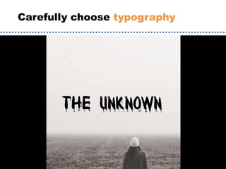
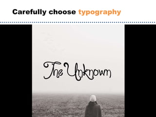
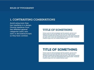
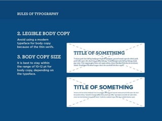
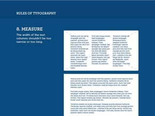
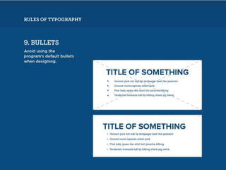
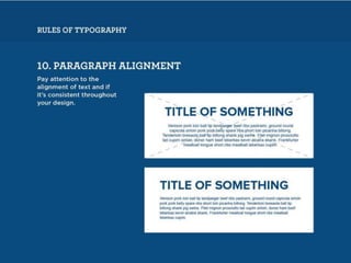
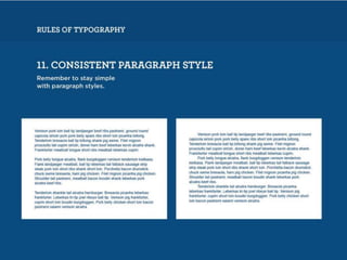


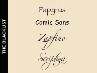
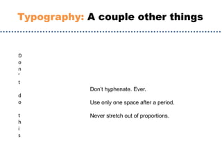
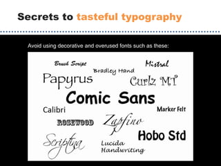
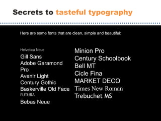
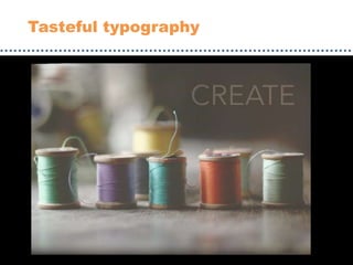
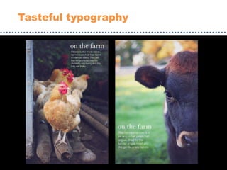
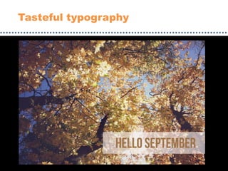
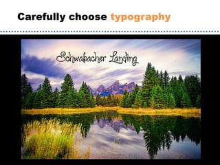
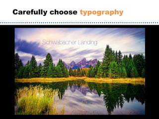
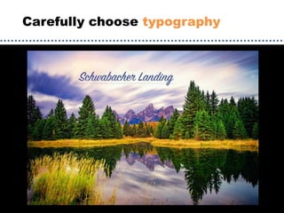
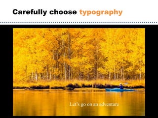
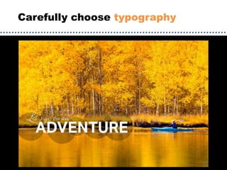


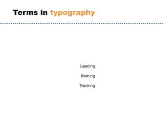
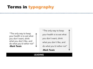
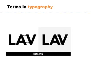
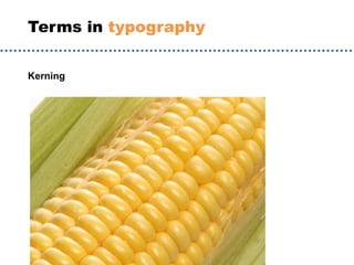
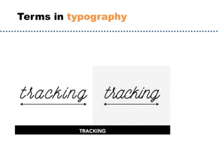
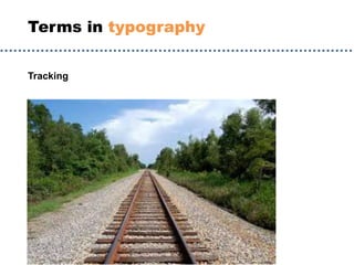

The document discusses guidelines for choosing typography. It recommends avoiding decorative or overused fonts like Helvetica Neue, Gill Sans, and Times New Roman. Instead, it suggests using clean, simple fonts. The document also advises not to hyphenate words or stretch text out of proportion, and to use only one space after periods. Finally, it mentions typography terms like leading, kerning, and tracking that are important to consider.


![Things I Know About Type [Field Guide]](https://cdn.slidesharecdn.com/ss_thumbnails/thingsiknowabouttype-fieldguide-121030022134-phpapp02-thumbnail.jpg?width=640&height=640&fit=bounds)


