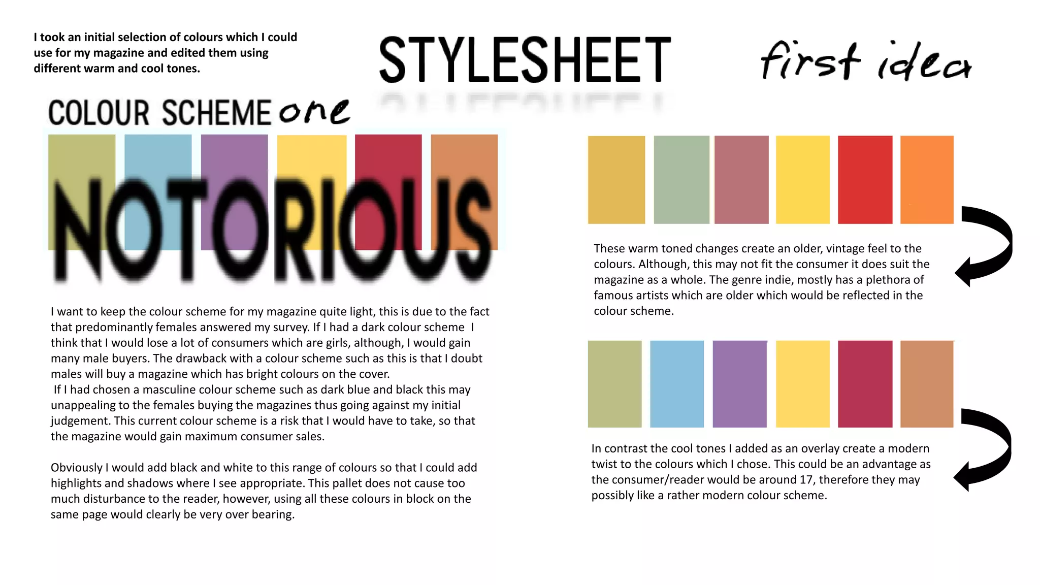
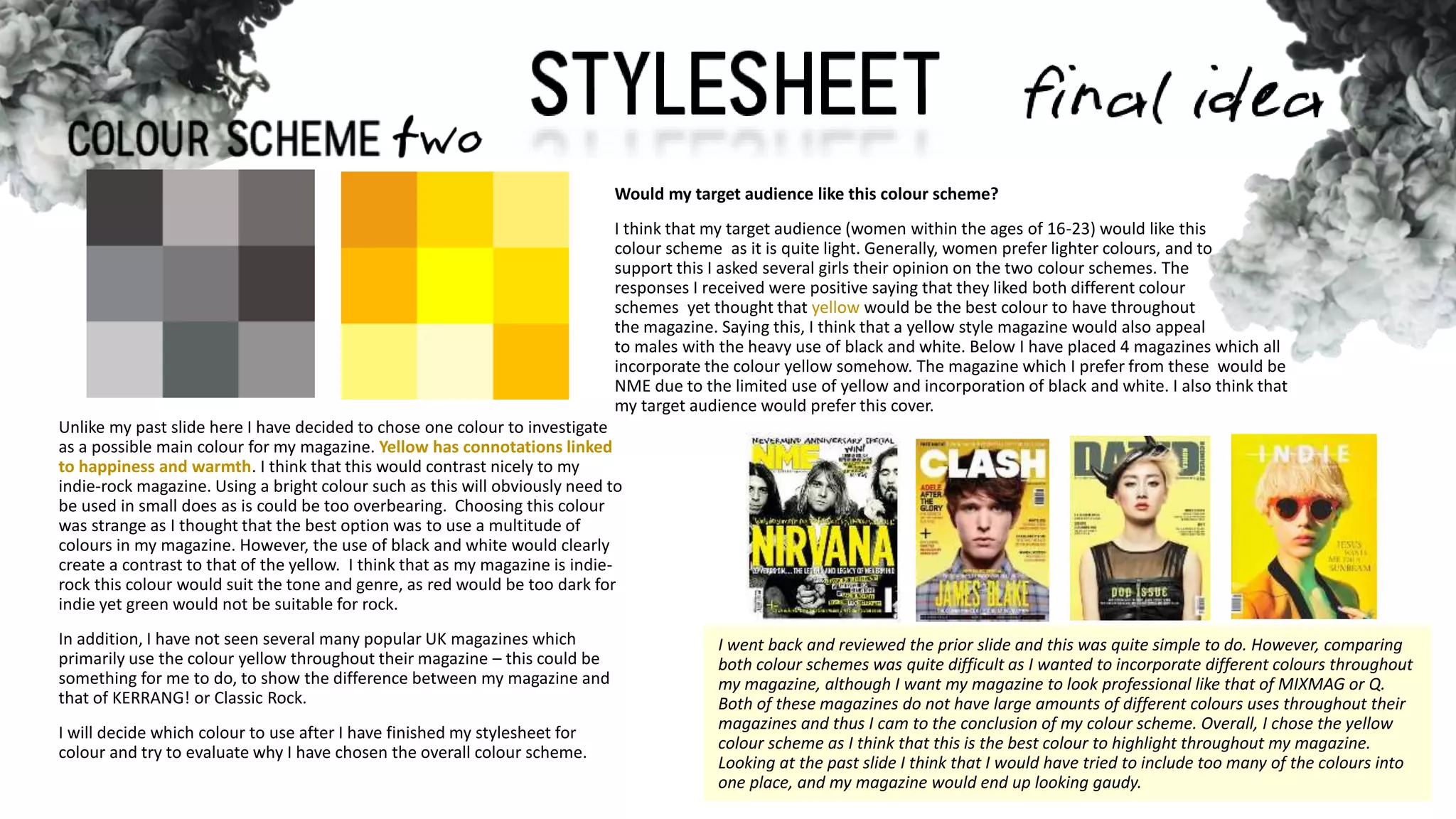
I want to keep the colour scheme for my magazine quite light, this is due to the fact
that predominantly females answered my survey. If I had a dark colour scheme I
think that I would lose a lot of consumers which are girls, although, I would gain
many male buyers. The drawback with a colour scheme such as this is that I doubt
males will buy a magazine which has bright colours on the cover.
If I had chosen a masculine colour scheme such as dark blue and black this may
unappealing to the females buying the magazines thus going against my initial
judgement. This current colour scheme is a risk that I would have to take, so that
the magazine would gain maximum consumer sales.
Obviously I would add black and white to this range of colours so that I could add
highlights and shadows where I see appropriate. This pallet does not cause too
much disturbance to the reader, however, using all these colours in block on the
same page would clearly be very over bearing.
I took an initial selection of colours which I could
use for my magazine and edited them using
different warm and cool tones.
In contrast the cool tones I added as an overlay create a modern
twist to the colours which I chose. This could be an advantage as
the consumer/reader would be around 17, therefore they may
possibly like a rather modern colour scheme.
These warm toned changes create an older, vintage feel to the
colours. Although, this may not fit the consumer it does suit the
magazine as a whole. The genre indie, mostly has a plethora of
famous artists which are older which would be reflected in the
colour scheme.
I went back and reviewed the prior slide and this was quite simple to do. However, comparing
both colour schemes was quite difficult as I wanted to incorporate different colours throughout
my magazine, although I want my magazine to look professional like that of MIXMAG or Q.
Both of these magazines do not have large amounts of different colours uses throughout their
magazines and thus I cam to the conclusion of my colour scheme. Overall, I chose the yellow
colour scheme as I think that this is the best colour to highlight throughout my magazine.
Looking at the past slide I think that I would have tried to include too many of the colours into
one place, and my magazine would end up looking gaudy.
Unlike my past slide here I have decided to chose one colour to investigate
as a possible main colour for my magazine. Yellow has connotations linked
to happiness and warmth. I think that this would contrast nicely to my
indie-rock magazine. Using a bright colour such as this will obviously need to
be used in small does as is could be too overbearing. Choosing this colour
was strange as I thought that the best option was to use a multitude of
colours in my magazine. However, the use of black and white would clearly
create a contrast to that of the yellow. I think that as my magazine is indie-
rock this colour would suit the tone and genre, as red would be too dark for
indie yet green would not be suitable for rock.
In addition, I have not seen several many popular UK magazines which
primarily use the colour yellow throughout their magazine – this could be
something for me to do, to show the difference between my magazine and
that of KERRANG! or Classic Rock.
I will decide which colour to use after I have finished my stylesheet for
colour and try to evaluate why I have chosen the overall colour scheme.
Would my target audience like this colour scheme?
I think that my target audience (women within the ages of 16-23) would like this
colour scheme as it is quite light. Generally, women prefer lighter colours, and to
support this I asked several girls their opinion on the two colour schemes. The
responses I received were positive saying that they liked both different colour
schemes yet thought that yellow would be the best colour to have throughout
the magazine. Saying this, I think that a yellow style magazine would also appeal
to males with the heavy use of black and white. Below I have placed 4 magazines which all
incorporate the colour yellow somehow. The magazine which I prefer from these would be
NME due to the limited use of yellow and incorporation of black and white. I also think that
my target audience would prefer this cover.
FFF
Lemon/Milk
Caviar Dreams
CF Old School
Caviar Dreams however, is quite thin which makes it unsuitable
as a masthead. Even though this is a problem I could use this in
the contents page and double page spread etc. A benefit of this
font is that it is quite similar to Lemon/Milk so could be used in
sync.
Font/Area Masthead Headline Cover lines Article text Pull Quotes Anchorage
FFF
Lemon/Milk
Caviar Dreams
CF Old School
Here I have included a table to indicate which fonts are suitable / not suitable for
certain tasks. This is easy to reference when I am making my magazine so that I can see
which fonts work well and which do not.
I think that I will not know which font to use for the masthead until I have completed my
dummies and possibly even moved onto the actual process of construction. I think that
this is better as I can experiment with the different fonts managing to come to a visual
understanding of what my magazine and which font best suits the image on the cover.
The font FFF has a short height to act as a mast head. In a page
full of bright, large objects I do not think that this would emit
above the other font on the page as a masthead.
Lemon/Milk I think is the most suitable font for my magazine
mast head as it is thick and bold. This would stand out against
the image which would appear behind the masthead. It is likely
that I will use this for my magazine front cover die to the
thickness and length that the font is.
CF Old School is a font which I would associate with the rock
genre. I do not think that this would be suitable within the
magazine unless I had an interview with a rock band. Even so, I
would want to keep the same fonts throughout.
The only font which would be specific for interviews
Which font would be the most suitable for the ARTICLE TEXT?FONT SAMPLE ( in size 13 )
Calibri THE QUICK BROWN DOG JUMPED OVER THE LAZY FOX
the quick brown fox jumped over the lazy dog
THE QUICK BROWN DOG JUMPED OVER THE LAZY FOX
the quick brown fox jumped over the lazy dog
Arial THE QUCIK BROWN DOG JUMPED OVER THE LAZY FOX
the quick brown fox jumped over the lazy dog
THE BROWN DOG JUMPED OVER THE LAZY FOX
the quick brown fox jumped over the lazy dog
Gadugi THE QUICK BROWN DOG JUMPED OVER THE LAZY FOX
the quick brown fox jumped over the lazy dog
THE QUICK BROWN DOG JUMPED OVER THE LAZY FOX
the quick brown fox jumped over the lazy dog
For the article text I chose three different texts which are available without download. In
addition, magazines such as KERRANG,Q and MOJO all use fonts which are plain and simple.,
Fonts do not even cross the consumers mind when reading the magazine, however, I think
that it is very important to chose a font which has not been featured in a magazine before. I
have justified my reasons for the small changed is font bellow. The texts which I chose are
very generic and popular throughout magazines, especially ARIAL, as they are simple and
easy to read. For example, on the prior slide the font CF Old School would clearly not be
suitable for article text as it would be too domineering.
Looking at the fonts closely I can see that Calibri is a very formal font which may not fit into
the tone of my magazine. The collar and loop of the g show this, here I have added an image
to show this. It seems extreme to base my whole interview font off
older age range of 29 years old.
Overall, the font which would be most suitable for my magazine NOTORIOUS would be
Gadugi as this font looks the least formal, as it can even be compared to neat handwriting.
This would be the most beneficial to my magazine as I want it to look as informal as possible
to the target audience and consumers.
the typographic variants of one ‘g’ however I though that this is
the best suitable way to convey the way which I feel the fonts
would look towards the target audience. The loop, circled in green,
seems much more sophisticated than the simplistic swoop on the
right. I would not want a font like this in magazine as I think that it
makes the magazine similar to that of Q which is aimed at and
FRONTCOVER
When creating my dummies I had a broad basis of what I could
cover. I decided to create a few simple initial hand-drawn designs
which I could recreate in a programme called MICROSOFT
PUBLISHER to develop and get a clearer vision of the dummy.
For my first design I wanted to focus around a band, as there are
many highly popular indie-rock bands. I chose this image so that I
could see where the placement would be in relation to the bands
stance and poses.
I chose the font FFF as the masthead so that it stands out as the
largest font. Looking at this font I do not this that it is bold enough to
stand out as a main masthead, to improve this I could make the font
thicker.
Underneath is a tagline which is smaller than my masthead in the
same font. To best represent the way I want my magazine to look I
chose to use silhouettes which I could manipulate instead of stock
images. This meant that I was able to clearly envision what I would
want my magazine to look like, without a popular band on the front.
The main feature image is suppose to represent a band as there are
several indie-rock bands instead of individual artists.
The headline font also matches the masthead as this makes the
magazine look more professional.
Below this I have chosen the font caviar dreams so that the headline
is more prominent than the anchorage.
The secondary lead is in the lower left hand corner, this is because
the left third will be seen on magazine stands when the magazine is
published. Also, for this reason, there are two cover lines in varying
fonts to show varying importance.
The barcode is in the right hand corner along with issue
number and date. This is one of the smallest items on the
dummy, this is due to the barcode having the least significance
or relevance to my magazine. This is reoccurring theme
throughout all of the dummies that I have made.
FRONTCOVER
The second front cover design is a medium close up of a lone
artist with surrounding cover lines and secondary leads etc. There
are many singular indie artists so I thought that including this
would be appropriate.
I chose the font LEMON/MILK as the masthead so that it stands out
as the largest font on the front cover. In addition, this font is also
very bold which would further emphasise the importance of the
word “notorious”
Underneath is a tagline which would be smaller than the masthead
and placed over the main feature photo.
Again I have used silhouettes to show the images on the front
cover. This meant that I was able to clearly envision what I would
want my magazine to look like, in this case I chose to insert a
medium close up of a male artist. This takes up a large amount of
the magazine although, there is room which is free around this. The
cover lines can be moved and manipulated into different places. So
far I do not think that I have included enough cover lines on this
dummy. As a result I would change the position of the headline so
that more cover lines could be added. The headline is in the font CF
Old School, this difference highlights the superiority of the headline
compared to the other cover lines and anchorage on the page.
The secondary lead is places in the left third of the magazine so
that it will appear when the magazines are placed in the shops.
‘secondary lead’ indicates how this is the second most important
title on the page. This would be an indie-rock band which were
featuring in the magazine.
The barcode is in the right hand corner along with issue
number and date. This is one of the smallest items on the
dummy, this is due to the barcode having the least significance
or relevance to my magazine. This is reoccurring theme
throughout all of the dummies that I have made.
This design features less than the other dummies which I created.
I wanted to do this so that I could see what the magazine would
look like if it was not as busy as the other dummies. II think that
this would be a good magazine design
I placed the masthead at the top of the magazine in the font
LEMON/MILK. Overall, looking at all of my dummies this font is
the most suitable for my magazine masthead.
Below this is the tagline which is also in the font LEMON/MILK but
is in italics. The italics are to create a difference between the
masthead and the tagline as they are both quite large. If I were to
create this dummy again I would change the tagline into the font
caviar dreams. Therefore It would be less noticeable yet still hold a
presence on the page.
The main image/feature photo is of two artists taking up the
majority of the page. I have done this so that I can see how a duo
would look taking up a large amount of the cover. I do not
understand how I would be able to integrate the floor which
would likely e dirty into my magazine.
All of the cover lines are one again in the font caviar dreams, this
thin font is good to place important information but does not
overpower the headline or secondary lead.
Similar to my other mock up the secondary lead is in a very similar
place. Although, this time it has been places slightly behind the
‘artist’ to indicate that the main image is the most important one
on the cover.
v
FRONTCOVER
ANCHORAGE
PLUG
The barcode is slightly different on this dummy, it is
still placed on the bottom right but rotated and
smaller.
v
CONTENTSPAGE
On the left is my hand drawn draft of the mock. I did not
like the way that these dummies turned out so I decided to try
and re create it on publisher so that I could understand the
layout of magazines. I left this mock up of the contents page
quite plain and did not include any images or silhouettes. This is
because I just wanted an idea of how to create the layout and
how it would look using the fonts which I had chosen.
This layout is boring but I wanted to know what it would look
like without any accents of features on. My masthead
NOTORIOUS is placed on the left hand third at the top, this is as
aspect which I would like to keep as I like how this is a running
feature on both pages. Below this is the contents which is
smaller yet still signifies what is on the page.
I placed the issue and date in the top right hand corner in the
font caviar dreams. This is small so that it would be out of sight
yet noticeable when the reader would be looking for it.
There are four images on this page in varying sizes. On this
draft I have one main image at the top next to features. This
will be related to the feature which is the most exclusive so that
the reader wants to know what the article is about.
If I were to use this draft to base my final product on I would
change the layout of the three photos as I think that I would
not have photos of that side which would fit on my magazine.
As a result, I would be able to add in whatever photos I please
at whatever size. I also prefer the masthead more when it is
placed next to the contents not above it so I would additionally
move that.
5
7
16
18
25
27
38
45
10
20
30
40
50
v
CONTENTSPAGE
10
20
30
40
50
5
7
16
18
25
27
38
45
Again, on the left is my hand drawn draft of the mock.
I did not like the way that these dummies turned out so I decided
to try and re create it on publisher so that I could understand the
layout of magazines. I left this mock up of the contents page
quite plain and did not include any images or silhouettes. This is
because I just wanted an idea of how to create the layout and
how it would look using the fonts which I had chosen.
I want to focus on including a few images on the contents as I
think that this helps a magazine look more realistic. I have
placed four on this draft contents page in varying size. Two
smaller sized images would be places around one larger image
of artists who will be in the features.
What I need to be aware of when creating my contents page
will be unused space. I feel as if there will be a lot of space
which I do not use and my magazine will reflect negatively of
this.
As a result I need to add pictures of different sizes and decide
where the space which I want to write in will be, I will make
these changes on the next slide which will show an improved
version.
v
CONTENTSPAGE
The same again, on the left is my hand drawn draft of the
mock. I did not like the way that these dummies turned out so I
decided to try and re create it on publisher so that I could
understand the layout of magazines. I left this mock up of the
contents page quite plain and did not include any images or
silhouettes. This is because I just wanted an idea of how to
create the layout and how it would look using the fonts which I
had chosen.
NOTORIOUS features at the top of the page as I want to keep
this theme on both my cover and contents. I think that this looks
professional as it is also something Q magazine and NME do. It
is in the font LEMON/MILK which is the font I have now decided
to have as my masthead. Next to this is ‘contents’ in the font
caviar dreams which is thinner than Lemon/milk so NOTORIOUS
stands out more. I made it bolder so that it is still seen as
important even though it has been on the previous page.
5 images feature on the page showing that I would have a range
of images on my front cover to fit the specifications of more
than 4 images in total.
I have included a features section, in the font caviar drams,
which is what the reader will first see. I have placed it here as
the features can be seen as ‘superior’ to the contents which gets
featured every month. Next to this are four images which will
reflect the features. The usual section means what comes up in
each months edition. Therefore it is placed below the images of
the features. It also has more content thus there are more pages
concentrated on this. Only one image is along side ‘the usual’
which enables the reader to know that the two are linked.
I think that the social media links are a good addition
here as it tells the consumer that the magazine has a
Facebook, Twitter etc. so can be followed.
Social links
10
20
30
40
50
5
7
16
18
25
27
38
45
On this magazine I have tried to
create a layout which I do not often
see in magazines. There is on large
main image on the left of the band
playing at their gig. To the reader
this could act as a poster as it takes
up half of the spread.
Placed on top of this is a pull quote
in the font FFF to indicate
something which the band has said
within the article/ interview. It is
coloured white to contrast against
the blue image background.
The columns of the interview are
placed under each member of
Radiohead, this layout makes the
magazine look neater, I think that
this would have looked better if I
had removed the second pull quote
There was some space free so I just
added in an image of a guitar to
show what the interview could be
about, in addition in the main
image on the left the member seen
in the image is playing the guitar.
I inserted some close ups of the
members of Radiohead here. The
images are placed in a row as the
images are individual. I think that
this is interesting to see in a
magazine as often bands are
photographed together.
Another pull quote In the same font
is inserted here to further peak the
interest of the consumer so that
they are interested in the articles’
contents.
Just like the other magazine, to
attract the audience I added in a
plug within the double page spread,
this will attract the audience to
enter the ‘competition’ I think that
adding this is good as it features on
a page with the artist. As it is on
the right page the audience will see
this last after reading the interview.
Thus they will think that the
magazine has deals like this in
every issue.
On the right page I have included the band name and
their logo so that the reader instantly knows who the
article is about. This is followed by images of each
member of the band.
This spread is based off this blue colour, but
if I were to make the magazine my images
could be based off my chosen colour
scheme of yellow.
In the set of dummies for my double
page spread I have added images of the
rock band RED HOT CHILI PEPPERS. BY
doing this I was able to practise layouts
and how they would look if I had one
image of a band.
To immediately grab attention I placed
an ‘exclusive’ buzz word right at the top
of the page. This stamp like
Drop cap of a large red R s here to
indicate the beginning of the paragraph.
Drop caps have been extensively used,
from the early days of printing to the
advent of web publishing
Four columns were created across each
page. Overall, this is quite a lengthy
‘interview’ as I think that this would be
too much information on a double page
spread. I will have to think about
columns more thoroughly when I create
my next DPS.
I used the burgundy colour throughout this
double page spread as this is the colour of
the bands logo and I was able to match this
with the costume.
I would have preferred if I had
figured out how to make the text
follow on instead of stopping at one
horizontal line without adding more
than one text box.
I added a pull quote across the right
hand page in large writing using the
font FFF from my stylesheet before.
The red behind this makes the black
stand out and contrast. However, the
red colour seems a little gaudy
against the stark white background.
To attract the audience I added in a
plug within the double page spread,
this will attract the audience to enter
the ‘competition’ I think that adding
this is good as it features on a page
with the artist. As it is on the right
page the audience will see this last
after reading the interview. Thus
they will think that the magazine has
deals like this in every issue.
Parallel to the image I placed the logo of the band as it fit
with the positioning of the image and the way which the
band member is leaning.
I wanted to practise with a dark
background and how I could
make the font stand out yet still
not get lost against the same
coloured image.
I inserted this blue line as an indication of what parts of
the image and writing would get lost to the SEAM. The
third member and some text here would slightly fall into
this.
The pull quote is in the font
LEMON/MILK, one of my
original chosen fonts, which is
spread across the two pages
above the feature photo.
The photo which I have chosen
to use is black and white, to
match the rest of spread.
Each member is stood carelessly
which is a good feature which I
could use within my magazine.
I think that the placement of the
logo was beneficial as it looks as
if it is creating a shadow on the
members face.
Unlike the other dummies I
made, this one has a black
background, I think that this
highlights the image placed on
the page, This is also goo if I
want to highlight certain aspects
of the page. However, I think
that this looks less professional
than that of a white
background.
This was the simplest design for a
double page spread which I created
as it only incorporates 4 elements.
First, I once again included the band
logo which acts as a headline for the
page. I think that this attracts
attention to the article, although,
overall the colour scheme looks
bland. There could be some bursts of
colour. E.g., either the logo could be
coloured to contrast the rest of the
page and be emphasised or the pull
quote could be changed to match the
magazines colour scheme.
The columns on this page differ than
the last mock-up I made, there is
significantly less text which makes
the overall layout a lot simpler. Each
column matches up with a member
of the band, the introductory
paragraph being exempt from this. I
think that this makes the magazine
spread look more sophisticated.
Elements of PHOTOGRAPHY
“Successful photos rely on order, and the main elements that bring and emphasize order in a
composition are: line, shape, form, texture, pattern, and colour. Every photograph, intentionally
or not, contains one or more of these element, which are known as the elements of design”
Reading through this helped me understand what is needed in order to take a successful
photograph. Hopefully I will apply these when taking my pictures for my magazine. I think that I will
find it difficult to initially take my images, however, I am hoping that I will be able to take an
effective batch of images.
In several indie magazines there is a high light exposure on the main artists
face although, the highlights themselves look soft. This could be achieved
using a ring light in front of the models face to accentuate their features. A
close up to shows these features could also be used to show he expression.
In these images the subjects of each magazine do not appear to be smiling.
I will try to do something similar in my magazine, as these are these are
current, successful indie magazines.
My cover page is the ultimate visual product which will entice the consumer to by the
magazine. As a result, this will have to reflect previous indie-rock magazines with a
NOTORIOUS twist. This will contain plugs, headlines, a secondary lead and a masthead
yet I think the most important thing will be the photo as it takes up the most amount
of space.
The main feature image will be a older male teen who represents the genre of indie
rock. This would be a medium close up of the ‘artist’ to show their expression and
profile. To show my chosen genre Their expression would be neutral to show their lack
of interest with the situation- this would also reflect the rock genre where the people
associated are known for not caring about rules or etc.
The mise-en scene will be important here as this image would show the genre that my
magazine reflects. The outfit that the male would be wearing many layers. These will
consist of a plain white tee, a plaid shit overlaid with an oversized denim jacket. In
many indie artists denim and plaid are widely worn, as a result I have chosen to use
this as their torso attire. Even though the full outfit will not been seen in the final image
think that it’s crucial that the model is able to wear a complete outfit to be fully
immersed into the role of being an indie-rock artist.
Along with this black, distressed ripped jeans will also be a part of this ‘costume’.
Because the jeans are ripped it shows the nonchalance of the singer and that they
don’t care to be faultless. For footwear the best option to go for would be old converse
which are in bad condition, this would emphasize the artists music genre of indie-rock.
I will hire out the studio at my college so that I can take
quality shots of my models for my music magazine front
cover.. This means that I would be working with a Canon
DSLR, using a professional grade camera such as this I would
be able to attain a better image quality, and have full control
over depth of field.
I would have any lighting required. Available lighting
includes VISIODMX DIMMER and
There is a green drop which would enable me to Photoshop
the model onto the desired coloured background however,
a plain white drop would look more professional as a
background. This would be as in PHOTOSHOP I would not
need to edit the subject onto a different background.
LOCATION + LIGHTING
COSTUME
MODEL
On the contents page there will be several different images related to different
topics which would feature in the magazine. Here I will have to include many
photos which represent the genre of indie-rock as this would directly indicate the
genre of the magazine. The main double page spread images will also be integrated
here to show the importance of the article.
To include a range of images I will take several different models to feature in my
contents. Once again I will use primarily older teen boys on my contents page to
appeal to the higher percentage of females who would read the magazine. (proven
by survey monkey results) However, the break the chain of gender bias I will
include two female models who will be slightly younger than the young adult boys
to represent the majority of people who would read the magazine.
Following with the indie theme, these artists will be wearing costumes which will
reflect the tone of the magazine. For example, the colour yellow would be
integrated here into a t-shirt or jacket as this would fit into the colour scheme of
NOTORIOUS. This would also feature on the double page spread as the same artists
will be on both. Plain colours such as white and black will also be worn throughout
all of the models. This will be don’t so that the yellow within the magazine will
stand out against these plain colours. Bright colours on any of the models would
deter the reader from the article or important aspects of the magazine, in addition,
bright colours would not suit the magazine tone.
I will be in different locations when taking my photographs
for my contents page. This will include the studio as
mentioned before, a local lake pictured above and an
industrial area. Again I will be using the Canon DSLR to
achieve high quality images.
The lighting at the lake will mostly be natural lighting for a
glow on the models’ faces, although, a PIXAPRO reflective
board will be used to emphasis this, in the industrial area
will also have the same lighting.
LOCATION + LIGHTING
COSTUMES
MODELS
On the double page spread I will be including one image of three different models
which will be a main part of my magazine NOTORIOUS. I will only include one
image so that the attention is not taken away from the models. The layout which I
want my magazine to be depends on one singular image as the main focus.
The models in this spread will be males aged at 19 and 17, this is again, to attract
the attention of my female audience who takes up the larger percentage. One will
look into the camera holding a blank expression. The other two will look at the
ground and off into the distance breaking the initial eye. They will be huddled
together which will make the audience feel sympathy for them , their bodies will
be on a slight angle so that they are making an arc.
The colour yellow would be integrated here into a t-shirt or jacket as this would fit
into the colour scheme of NOTORIOUS. Plain colours such as white and black will
also be worn throughout all of the models. The models will wear jeans and two of
the models will wear different coloured denim jackets. Denim jackets are a indie
‘staple’ with the double denim trend making a comeback I also want to integrate
this. Therefore each model placed on the end will wear a denim jacket. The middle
model will wear a black jumper so that there is some variation within the outfits.
All the model will wear plain blue jeans so that my magazine style is not
interrupted. As a result none of the models will wear brightly coloured clothing
again as this will deter the style of my magazine.
LOCATION + LIGHTING
COSTUMES
MODELS
Again I will hire out the studio at my college so that I
can take quality shots of my models for my music
magazine double page spread..Again I would be
using the same Canon DSLR camera to capture the
details of my shots.
The lighting available again is the VISIODMX
DIMMER to help create an even background.
Here I will be using the white drop background so
that my models will be on a blank canvas which I can
use as my background.
For my contact sheet I stuck with my original idea of
a single male artist. Most of the images are similar
I took my images in a studio which was available to book at my
college. This was helpful as I did not need to create my own set
and try to use a bright coloured wall in the background. A white
background was used so that the models appearance would stand
out against the colour. I used flash on the camera to create a slight
dark shadow behind the model which made him took elevated
slightly above the image. Most of the images are portrait which
would be the easiest to edit when using Photoshop as I would not
need to crop them. The eye line shot makes the consumer feel
connected to the artist. Many of the photos had a grey
background due to the flash of the Canon DSLR, which I liked as a
pure white would’ve been too bright for the cover of the
magazine. A few images were taken without flash which include a
yellowish toned background which makes the overall photograph
look less professional.
as I wanted to have a several images which were composed of
different poses and facial expressions. I varied some by taking
medium long shots. I think that I would have taken more images
with a wider selection if I didn’t have the idea already generated
as to what my feature photo would look like.
Like my photography planning I still have one male artist on
the front cover. This was also still the idea of a medium
close up. I did not want to stray too far from my initial ideas
as I believe that my magazine may have be derailed by too
many random photographs which do not match.
I chose this photograph for the cover of my magazine as the
model has a slight tilt to the head which can be seen as
suggestive- appealing to my target audience. Even though
the image is not portrait I thought that this is the best image
I took which portrays my hence and would look good as a
cover photo so I can sacrifice having a photo which can be
easily placed onto Photoshop.
I used the clone tool to take different highlights and shadows
of the models face to remove some larger blemishes which he
had. However, I did not want the models face to be
completely clear or perfect, this was because I want the
audience of my magazine to think that they are able to relate
to this character which I have created. Doing this also follows
the mission statement of the magazine teaching them they
have to be real.
During my process of using Photoshop I
learnt how to use different tools as the only
other time I had used it was preliminary
testing.
I changed the colour of the models flannel
from a dark, deep red to a subdued yellow.
Initially I thought that a red flannel would be
best to represent the genre which I was
following. Although, this red was too dark
and the cover lines were also going to be a
similar colour-using the eye dropper tool-
yet the page looked too dark. Lightening the
flannel colour and light exposure here really
helped my magazine to look 3 dimensional
instead of a flat image on the page.
The images were taken in a studio on a white drop so that I could
use this for the base of my double page spread. I took images of three
male models to be placed in different poses to feature in my magazine – the double
page spread and contents page. The images which you to the right are for my
contents page. The poses for these images were not planned out but I knew that I
wanted images of these models to be on the contents page due to their feature in
the double page spread.
However, I do wish that I took more images of the models so that I would have a
better range of images to work with. If I had a large amount of photographs clearly
the selection would've been wider and I could chose a better quality image.
The images which you see above are for the double page spread. I will choose the best
image so that I can work my article around the image. This is what I planned in the
photography planning for the poses, as I think that it does reflect what I wrote.
I have finished the planning of my magazine so
my next piece of coursework will be my
organising which will explain location scouting,
planning of models, costume, lighting and kit list.

Dummies and stylesheets

  • 2.
    I want tokeep the colour scheme for my magazine quite light, this is due to the fact that predominantly females answered my survey. If I had a dark colour scheme I think that I would lose a lot of consumers which are girls, although, I would gain many male buyers. The drawback with a colour scheme such as this is that I doubt males will buy a magazine which has bright colours on the cover. If I had chosen a masculine colour scheme such as dark blue and black this may unappealing to the females buying the magazines thus going against my initial judgement. This current colour scheme is a risk that I would have to take, so that the magazine would gain maximum consumer sales. Obviously I would add black and white to this range of colours so that I could add highlights and shadows where I see appropriate. This pallet does not cause too much disturbance to the reader, however, using all these colours in block on the same page would clearly be very over bearing. I took an initial selection of colours which I could use for my magazine and edited them using different warm and cool tones. In contrast the cool tones I added as an overlay create a modern twist to the colours which I chose. This could be an advantage as the consumer/reader would be around 17, therefore they may possibly like a rather modern colour scheme. These warm toned changes create an older, vintage feel to the colours. Although, this may not fit the consumer it does suit the magazine as a whole. The genre indie, mostly has a plethora of famous artists which are older which would be reflected in the colour scheme.
  • 3.
    I went backand reviewed the prior slide and this was quite simple to do. However, comparing both colour schemes was quite difficult as I wanted to incorporate different colours throughout my magazine, although I want my magazine to look professional like that of MIXMAG or Q. Both of these magazines do not have large amounts of different colours uses throughout their magazines and thus I cam to the conclusion of my colour scheme. Overall, I chose the yellow colour scheme as I think that this is the best colour to highlight throughout my magazine. Looking at the past slide I think that I would have tried to include too many of the colours into one place, and my magazine would end up looking gaudy. Unlike my past slide here I have decided to chose one colour to investigate as a possible main colour for my magazine. Yellow has connotations linked to happiness and warmth. I think that this would contrast nicely to my indie-rock magazine. Using a bright colour such as this will obviously need to be used in small does as is could be too overbearing. Choosing this colour was strange as I thought that the best option was to use a multitude of colours in my magazine. However, the use of black and white would clearly create a contrast to that of the yellow. I think that as my magazine is indie- rock this colour would suit the tone and genre, as red would be too dark for indie yet green would not be suitable for rock. In addition, I have not seen several many popular UK magazines which primarily use the colour yellow throughout their magazine – this could be something for me to do, to show the difference between my magazine and that of KERRANG! or Classic Rock. I will decide which colour to use after I have finished my stylesheet for colour and try to evaluate why I have chosen the overall colour scheme. Would my target audience like this colour scheme? I think that my target audience (women within the ages of 16-23) would like this colour scheme as it is quite light. Generally, women prefer lighter colours, and to support this I asked several girls their opinion on the two colour schemes. The responses I received were positive saying that they liked both different colour schemes yet thought that yellow would be the best colour to have throughout the magazine. Saying this, I think that a yellow style magazine would also appeal to males with the heavy use of black and white. Below I have placed 4 magazines which all incorporate the colour yellow somehow. The magazine which I prefer from these would be NME due to the limited use of yellow and incorporation of black and white. I also think that my target audience would prefer this cover.
  • 4.
    FFF Lemon/Milk Caviar Dreams CF OldSchool Caviar Dreams however, is quite thin which makes it unsuitable as a masthead. Even though this is a problem I could use this in the contents page and double page spread etc. A benefit of this font is that it is quite similar to Lemon/Milk so could be used in sync. Font/Area Masthead Headline Cover lines Article text Pull Quotes Anchorage FFF Lemon/Milk Caviar Dreams CF Old School Here I have included a table to indicate which fonts are suitable / not suitable for certain tasks. This is easy to reference when I am making my magazine so that I can see which fonts work well and which do not. I think that I will not know which font to use for the masthead until I have completed my dummies and possibly even moved onto the actual process of construction. I think that this is better as I can experiment with the different fonts managing to come to a visual understanding of what my magazine and which font best suits the image on the cover. The font FFF has a short height to act as a mast head. In a page full of bright, large objects I do not think that this would emit above the other font on the page as a masthead. Lemon/Milk I think is the most suitable font for my magazine mast head as it is thick and bold. This would stand out against the image which would appear behind the masthead. It is likely that I will use this for my magazine front cover die to the thickness and length that the font is. CF Old School is a font which I would associate with the rock genre. I do not think that this would be suitable within the magazine unless I had an interview with a rock band. Even so, I would want to keep the same fonts throughout. The only font which would be specific for interviews
  • 5.
    Which font wouldbe the most suitable for the ARTICLE TEXT?FONT SAMPLE ( in size 13 ) Calibri THE QUICK BROWN DOG JUMPED OVER THE LAZY FOX the quick brown fox jumped over the lazy dog THE QUICK BROWN DOG JUMPED OVER THE LAZY FOX the quick brown fox jumped over the lazy dog Arial THE QUCIK BROWN DOG JUMPED OVER THE LAZY FOX the quick brown fox jumped over the lazy dog THE BROWN DOG JUMPED OVER THE LAZY FOX the quick brown fox jumped over the lazy dog Gadugi THE QUICK BROWN DOG JUMPED OVER THE LAZY FOX the quick brown fox jumped over the lazy dog THE QUICK BROWN DOG JUMPED OVER THE LAZY FOX the quick brown fox jumped over the lazy dog For the article text I chose three different texts which are available without download. In addition, magazines such as KERRANG,Q and MOJO all use fonts which are plain and simple., Fonts do not even cross the consumers mind when reading the magazine, however, I think that it is very important to chose a font which has not been featured in a magazine before. I have justified my reasons for the small changed is font bellow. The texts which I chose are very generic and popular throughout magazines, especially ARIAL, as they are simple and easy to read. For example, on the prior slide the font CF Old School would clearly not be suitable for article text as it would be too domineering. Looking at the fonts closely I can see that Calibri is a very formal font which may not fit into the tone of my magazine. The collar and loop of the g show this, here I have added an image to show this. It seems extreme to base my whole interview font off older age range of 29 years old. Overall, the font which would be most suitable for my magazine NOTORIOUS would be Gadugi as this font looks the least formal, as it can even be compared to neat handwriting. This would be the most beneficial to my magazine as I want it to look as informal as possible to the target audience and consumers. the typographic variants of one ‘g’ however I though that this is the best suitable way to convey the way which I feel the fonts would look towards the target audience. The loop, circled in green, seems much more sophisticated than the simplistic swoop on the right. I would not want a font like this in magazine as I think that it makes the magazine similar to that of Q which is aimed at and
  • 6.
    FRONTCOVER When creating mydummies I had a broad basis of what I could cover. I decided to create a few simple initial hand-drawn designs which I could recreate in a programme called MICROSOFT PUBLISHER to develop and get a clearer vision of the dummy. For my first design I wanted to focus around a band, as there are many highly popular indie-rock bands. I chose this image so that I could see where the placement would be in relation to the bands stance and poses. I chose the font FFF as the masthead so that it stands out as the largest font. Looking at this font I do not this that it is bold enough to stand out as a main masthead, to improve this I could make the font thicker. Underneath is a tagline which is smaller than my masthead in the same font. To best represent the way I want my magazine to look I chose to use silhouettes which I could manipulate instead of stock images. This meant that I was able to clearly envision what I would want my magazine to look like, without a popular band on the front. The main feature image is suppose to represent a band as there are several indie-rock bands instead of individual artists. The headline font also matches the masthead as this makes the magazine look more professional. Below this I have chosen the font caviar dreams so that the headline is more prominent than the anchorage. The secondary lead is in the lower left hand corner, this is because the left third will be seen on magazine stands when the magazine is published. Also, for this reason, there are two cover lines in varying fonts to show varying importance. The barcode is in the right hand corner along with issue number and date. This is one of the smallest items on the dummy, this is due to the barcode having the least significance or relevance to my magazine. This is reoccurring theme throughout all of the dummies that I have made.
  • 7.
    FRONTCOVER The second frontcover design is a medium close up of a lone artist with surrounding cover lines and secondary leads etc. There are many singular indie artists so I thought that including this would be appropriate. I chose the font LEMON/MILK as the masthead so that it stands out as the largest font on the front cover. In addition, this font is also very bold which would further emphasise the importance of the word “notorious” Underneath is a tagline which would be smaller than the masthead and placed over the main feature photo. Again I have used silhouettes to show the images on the front cover. This meant that I was able to clearly envision what I would want my magazine to look like, in this case I chose to insert a medium close up of a male artist. This takes up a large amount of the magazine although, there is room which is free around this. The cover lines can be moved and manipulated into different places. So far I do not think that I have included enough cover lines on this dummy. As a result I would change the position of the headline so that more cover lines could be added. The headline is in the font CF Old School, this difference highlights the superiority of the headline compared to the other cover lines and anchorage on the page. The secondary lead is places in the left third of the magazine so that it will appear when the magazines are placed in the shops. ‘secondary lead’ indicates how this is the second most important title on the page. This would be an indie-rock band which were featuring in the magazine. The barcode is in the right hand corner along with issue number and date. This is one of the smallest items on the dummy, this is due to the barcode having the least significance or relevance to my magazine. This is reoccurring theme throughout all of the dummies that I have made.
  • 8.
    This design featuresless than the other dummies which I created. I wanted to do this so that I could see what the magazine would look like if it was not as busy as the other dummies. II think that this would be a good magazine design I placed the masthead at the top of the magazine in the font LEMON/MILK. Overall, looking at all of my dummies this font is the most suitable for my magazine masthead. Below this is the tagline which is also in the font LEMON/MILK but is in italics. The italics are to create a difference between the masthead and the tagline as they are both quite large. If I were to create this dummy again I would change the tagline into the font caviar dreams. Therefore It would be less noticeable yet still hold a presence on the page. The main image/feature photo is of two artists taking up the majority of the page. I have done this so that I can see how a duo would look taking up a large amount of the cover. I do not understand how I would be able to integrate the floor which would likely e dirty into my magazine. All of the cover lines are one again in the font caviar dreams, this thin font is good to place important information but does not overpower the headline or secondary lead. Similar to my other mock up the secondary lead is in a very similar place. Although, this time it has been places slightly behind the ‘artist’ to indicate that the main image is the most important one on the cover. v FRONTCOVER ANCHORAGE PLUG The barcode is slightly different on this dummy, it is still placed on the bottom right but rotated and smaller.
  • 9.
    v CONTENTSPAGE On the leftis my hand drawn draft of the mock. I did not like the way that these dummies turned out so I decided to try and re create it on publisher so that I could understand the layout of magazines. I left this mock up of the contents page quite plain and did not include any images or silhouettes. This is because I just wanted an idea of how to create the layout and how it would look using the fonts which I had chosen. This layout is boring but I wanted to know what it would look like without any accents of features on. My masthead NOTORIOUS is placed on the left hand third at the top, this is as aspect which I would like to keep as I like how this is a running feature on both pages. Below this is the contents which is smaller yet still signifies what is on the page. I placed the issue and date in the top right hand corner in the font caviar dreams. This is small so that it would be out of sight yet noticeable when the reader would be looking for it. There are four images on this page in varying sizes. On this draft I have one main image at the top next to features. This will be related to the feature which is the most exclusive so that the reader wants to know what the article is about. If I were to use this draft to base my final product on I would change the layout of the three photos as I think that I would not have photos of that side which would fit on my magazine. As a result, I would be able to add in whatever photos I please at whatever size. I also prefer the masthead more when it is placed next to the contents not above it so I would additionally move that. 5 7 16 18 25 27 38 45 10 20 30 40 50
  • 10.
    v CONTENTSPAGE 10 20 30 40 50 5 7 16 18 25 27 38 45 Again, on theleft is my hand drawn draft of the mock. I did not like the way that these dummies turned out so I decided to try and re create it on publisher so that I could understand the layout of magazines. I left this mock up of the contents page quite plain and did not include any images or silhouettes. This is because I just wanted an idea of how to create the layout and how it would look using the fonts which I had chosen. I want to focus on including a few images on the contents as I think that this helps a magazine look more realistic. I have placed four on this draft contents page in varying size. Two smaller sized images would be places around one larger image of artists who will be in the features. What I need to be aware of when creating my contents page will be unused space. I feel as if there will be a lot of space which I do not use and my magazine will reflect negatively of this. As a result I need to add pictures of different sizes and decide where the space which I want to write in will be, I will make these changes on the next slide which will show an improved version.
  • 11.
    v CONTENTSPAGE The same again,on the left is my hand drawn draft of the mock. I did not like the way that these dummies turned out so I decided to try and re create it on publisher so that I could understand the layout of magazines. I left this mock up of the contents page quite plain and did not include any images or silhouettes. This is because I just wanted an idea of how to create the layout and how it would look using the fonts which I had chosen. NOTORIOUS features at the top of the page as I want to keep this theme on both my cover and contents. I think that this looks professional as it is also something Q magazine and NME do. It is in the font LEMON/MILK which is the font I have now decided to have as my masthead. Next to this is ‘contents’ in the font caviar dreams which is thinner than Lemon/milk so NOTORIOUS stands out more. I made it bolder so that it is still seen as important even though it has been on the previous page. 5 images feature on the page showing that I would have a range of images on my front cover to fit the specifications of more than 4 images in total. I have included a features section, in the font caviar drams, which is what the reader will first see. I have placed it here as the features can be seen as ‘superior’ to the contents which gets featured every month. Next to this are four images which will reflect the features. The usual section means what comes up in each months edition. Therefore it is placed below the images of the features. It also has more content thus there are more pages concentrated on this. Only one image is along side ‘the usual’ which enables the reader to know that the two are linked. I think that the social media links are a good addition here as it tells the consumer that the magazine has a Facebook, Twitter etc. so can be followed. Social links 10 20 30 40 50 5 7 16 18 25 27 38 45
  • 12.
    On this magazineI have tried to create a layout which I do not often see in magazines. There is on large main image on the left of the band playing at their gig. To the reader this could act as a poster as it takes up half of the spread. Placed on top of this is a pull quote in the font FFF to indicate something which the band has said within the article/ interview. It is coloured white to contrast against the blue image background. The columns of the interview are placed under each member of Radiohead, this layout makes the magazine look neater, I think that this would have looked better if I had removed the second pull quote There was some space free so I just added in an image of a guitar to show what the interview could be about, in addition in the main image on the left the member seen in the image is playing the guitar. I inserted some close ups of the members of Radiohead here. The images are placed in a row as the images are individual. I think that this is interesting to see in a magazine as often bands are photographed together. Another pull quote In the same font is inserted here to further peak the interest of the consumer so that they are interested in the articles’ contents. Just like the other magazine, to attract the audience I added in a plug within the double page spread, this will attract the audience to enter the ‘competition’ I think that adding this is good as it features on a page with the artist. As it is on the right page the audience will see this last after reading the interview. Thus they will think that the magazine has deals like this in every issue. On the right page I have included the band name and their logo so that the reader instantly knows who the article is about. This is followed by images of each member of the band. This spread is based off this blue colour, but if I were to make the magazine my images could be based off my chosen colour scheme of yellow.
  • 13.
    In the setof dummies for my double page spread I have added images of the rock band RED HOT CHILI PEPPERS. BY doing this I was able to practise layouts and how they would look if I had one image of a band. To immediately grab attention I placed an ‘exclusive’ buzz word right at the top of the page. This stamp like Drop cap of a large red R s here to indicate the beginning of the paragraph. Drop caps have been extensively used, from the early days of printing to the advent of web publishing Four columns were created across each page. Overall, this is quite a lengthy ‘interview’ as I think that this would be too much information on a double page spread. I will have to think about columns more thoroughly when I create my next DPS. I used the burgundy colour throughout this double page spread as this is the colour of the bands logo and I was able to match this with the costume. I would have preferred if I had figured out how to make the text follow on instead of stopping at one horizontal line without adding more than one text box. I added a pull quote across the right hand page in large writing using the font FFF from my stylesheet before. The red behind this makes the black stand out and contrast. However, the red colour seems a little gaudy against the stark white background. To attract the audience I added in a plug within the double page spread, this will attract the audience to enter the ‘competition’ I think that adding this is good as it features on a page with the artist. As it is on the right page the audience will see this last after reading the interview. Thus they will think that the magazine has deals like this in every issue. Parallel to the image I placed the logo of the band as it fit with the positioning of the image and the way which the band member is leaning.
  • 14.
    I wanted topractise with a dark background and how I could make the font stand out yet still not get lost against the same coloured image. I inserted this blue line as an indication of what parts of the image and writing would get lost to the SEAM. The third member and some text here would slightly fall into this. The pull quote is in the font LEMON/MILK, one of my original chosen fonts, which is spread across the two pages above the feature photo. The photo which I have chosen to use is black and white, to match the rest of spread. Each member is stood carelessly which is a good feature which I could use within my magazine. I think that the placement of the logo was beneficial as it looks as if it is creating a shadow on the members face. Unlike the other dummies I made, this one has a black background, I think that this highlights the image placed on the page, This is also goo if I want to highlight certain aspects of the page. However, I think that this looks less professional than that of a white background. This was the simplest design for a double page spread which I created as it only incorporates 4 elements. First, I once again included the band logo which acts as a headline for the page. I think that this attracts attention to the article, although, overall the colour scheme looks bland. There could be some bursts of colour. E.g., either the logo could be coloured to contrast the rest of the page and be emphasised or the pull quote could be changed to match the magazines colour scheme. The columns on this page differ than the last mock-up I made, there is significantly less text which makes the overall layout a lot simpler. Each column matches up with a member of the band, the introductory paragraph being exempt from this. I think that this makes the magazine spread look more sophisticated.
  • 15.
    Elements of PHOTOGRAPHY “Successfulphotos rely on order, and the main elements that bring and emphasize order in a composition are: line, shape, form, texture, pattern, and colour. Every photograph, intentionally or not, contains one or more of these element, which are known as the elements of design” Reading through this helped me understand what is needed in order to take a successful photograph. Hopefully I will apply these when taking my pictures for my magazine. I think that I will find it difficult to initially take my images, however, I am hoping that I will be able to take an effective batch of images. In several indie magazines there is a high light exposure on the main artists face although, the highlights themselves look soft. This could be achieved using a ring light in front of the models face to accentuate their features. A close up to shows these features could also be used to show he expression. In these images the subjects of each magazine do not appear to be smiling. I will try to do something similar in my magazine, as these are these are current, successful indie magazines.
  • 16.
    My cover pageis the ultimate visual product which will entice the consumer to by the magazine. As a result, this will have to reflect previous indie-rock magazines with a NOTORIOUS twist. This will contain plugs, headlines, a secondary lead and a masthead yet I think the most important thing will be the photo as it takes up the most amount of space. The main feature image will be a older male teen who represents the genre of indie rock. This would be a medium close up of the ‘artist’ to show their expression and profile. To show my chosen genre Their expression would be neutral to show their lack of interest with the situation- this would also reflect the rock genre where the people associated are known for not caring about rules or etc. The mise-en scene will be important here as this image would show the genre that my magazine reflects. The outfit that the male would be wearing many layers. These will consist of a plain white tee, a plaid shit overlaid with an oversized denim jacket. In many indie artists denim and plaid are widely worn, as a result I have chosen to use this as their torso attire. Even though the full outfit will not been seen in the final image think that it’s crucial that the model is able to wear a complete outfit to be fully immersed into the role of being an indie-rock artist. Along with this black, distressed ripped jeans will also be a part of this ‘costume’. Because the jeans are ripped it shows the nonchalance of the singer and that they don’t care to be faultless. For footwear the best option to go for would be old converse which are in bad condition, this would emphasize the artists music genre of indie-rock. I will hire out the studio at my college so that I can take quality shots of my models for my music magazine front cover.. This means that I would be working with a Canon DSLR, using a professional grade camera such as this I would be able to attain a better image quality, and have full control over depth of field. I would have any lighting required. Available lighting includes VISIODMX DIMMER and There is a green drop which would enable me to Photoshop the model onto the desired coloured background however, a plain white drop would look more professional as a background. This would be as in PHOTOSHOP I would not need to edit the subject onto a different background. LOCATION + LIGHTING COSTUME MODEL
  • 17.
    On the contentspage there will be several different images related to different topics which would feature in the magazine. Here I will have to include many photos which represent the genre of indie-rock as this would directly indicate the genre of the magazine. The main double page spread images will also be integrated here to show the importance of the article. To include a range of images I will take several different models to feature in my contents. Once again I will use primarily older teen boys on my contents page to appeal to the higher percentage of females who would read the magazine. (proven by survey monkey results) However, the break the chain of gender bias I will include two female models who will be slightly younger than the young adult boys to represent the majority of people who would read the magazine. Following with the indie theme, these artists will be wearing costumes which will reflect the tone of the magazine. For example, the colour yellow would be integrated here into a t-shirt or jacket as this would fit into the colour scheme of NOTORIOUS. This would also feature on the double page spread as the same artists will be on both. Plain colours such as white and black will also be worn throughout all of the models. This will be don’t so that the yellow within the magazine will stand out against these plain colours. Bright colours on any of the models would deter the reader from the article or important aspects of the magazine, in addition, bright colours would not suit the magazine tone. I will be in different locations when taking my photographs for my contents page. This will include the studio as mentioned before, a local lake pictured above and an industrial area. Again I will be using the Canon DSLR to achieve high quality images. The lighting at the lake will mostly be natural lighting for a glow on the models’ faces, although, a PIXAPRO reflective board will be used to emphasis this, in the industrial area will also have the same lighting. LOCATION + LIGHTING COSTUMES MODELS
  • 18.
    On the doublepage spread I will be including one image of three different models which will be a main part of my magazine NOTORIOUS. I will only include one image so that the attention is not taken away from the models. The layout which I want my magazine to be depends on one singular image as the main focus. The models in this spread will be males aged at 19 and 17, this is again, to attract the attention of my female audience who takes up the larger percentage. One will look into the camera holding a blank expression. The other two will look at the ground and off into the distance breaking the initial eye. They will be huddled together which will make the audience feel sympathy for them , their bodies will be on a slight angle so that they are making an arc. The colour yellow would be integrated here into a t-shirt or jacket as this would fit into the colour scheme of NOTORIOUS. Plain colours such as white and black will also be worn throughout all of the models. The models will wear jeans and two of the models will wear different coloured denim jackets. Denim jackets are a indie ‘staple’ with the double denim trend making a comeback I also want to integrate this. Therefore each model placed on the end will wear a denim jacket. The middle model will wear a black jumper so that there is some variation within the outfits. All the model will wear plain blue jeans so that my magazine style is not interrupted. As a result none of the models will wear brightly coloured clothing again as this will deter the style of my magazine. LOCATION + LIGHTING COSTUMES MODELS Again I will hire out the studio at my college so that I can take quality shots of my models for my music magazine double page spread..Again I would be using the same Canon DSLR camera to capture the details of my shots. The lighting available again is the VISIODMX DIMMER to help create an even background. Here I will be using the white drop background so that my models will be on a blank canvas which I can use as my background.
  • 19.
    For my contactsheet I stuck with my original idea of a single male artist. Most of the images are similar I took my images in a studio which was available to book at my college. This was helpful as I did not need to create my own set and try to use a bright coloured wall in the background. A white background was used so that the models appearance would stand out against the colour. I used flash on the camera to create a slight dark shadow behind the model which made him took elevated slightly above the image. Most of the images are portrait which would be the easiest to edit when using Photoshop as I would not need to crop them. The eye line shot makes the consumer feel connected to the artist. Many of the photos had a grey background due to the flash of the Canon DSLR, which I liked as a pure white would’ve been too bright for the cover of the magazine. A few images were taken without flash which include a yellowish toned background which makes the overall photograph look less professional. as I wanted to have a several images which were composed of different poses and facial expressions. I varied some by taking medium long shots. I think that I would have taken more images with a wider selection if I didn’t have the idea already generated as to what my feature photo would look like.
  • 20.
    Like my photographyplanning I still have one male artist on the front cover. This was also still the idea of a medium close up. I did not want to stray too far from my initial ideas as I believe that my magazine may have be derailed by too many random photographs which do not match. I chose this photograph for the cover of my magazine as the model has a slight tilt to the head which can be seen as suggestive- appealing to my target audience. Even though the image is not portrait I thought that this is the best image I took which portrays my hence and would look good as a cover photo so I can sacrifice having a photo which can be easily placed onto Photoshop. I used the clone tool to take different highlights and shadows of the models face to remove some larger blemishes which he had. However, I did not want the models face to be completely clear or perfect, this was because I want the audience of my magazine to think that they are able to relate to this character which I have created. Doing this also follows the mission statement of the magazine teaching them they have to be real. During my process of using Photoshop I learnt how to use different tools as the only other time I had used it was preliminary testing. I changed the colour of the models flannel from a dark, deep red to a subdued yellow. Initially I thought that a red flannel would be best to represent the genre which I was following. Although, this red was too dark and the cover lines were also going to be a similar colour-using the eye dropper tool- yet the page looked too dark. Lightening the flannel colour and light exposure here really helped my magazine to look 3 dimensional instead of a flat image on the page.
  • 23.
    The images weretaken in a studio on a white drop so that I could use this for the base of my double page spread. I took images of three male models to be placed in different poses to feature in my magazine – the double page spread and contents page. The images which you to the right are for my contents page. The poses for these images were not planned out but I knew that I wanted images of these models to be on the contents page due to their feature in the double page spread. However, I do wish that I took more images of the models so that I would have a better range of images to work with. If I had a large amount of photographs clearly the selection would've been wider and I could chose a better quality image. The images which you see above are for the double page spread. I will choose the best image so that I can work my article around the image. This is what I planned in the photography planning for the poses, as I think that it does reflect what I wrote.
  • 25.
    I have finishedthe planning of my magazine so my next piece of coursework will be my organising which will explain location scouting, planning of models, costume, lighting and kit list.