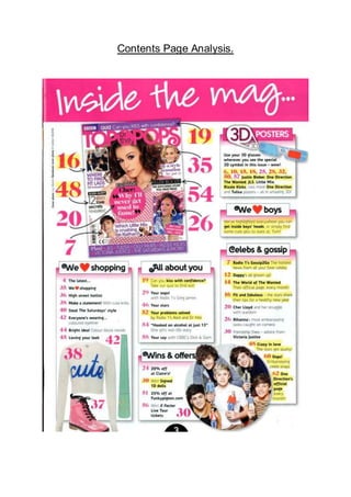
This contents page from Top of the Pops magazine effectively targets its teenage audience. Bright colors, informal language, and images of celebrities in casual clothing establish a fun, relatable tone. Short blurbs and visual elements tease various articles about music, celebrities, fashion, and advice without revealing too much. This piques readers' curiosity and encourages exploration of the full magazine.
Autofinanziamento.it - Il Social Crowdfunding ItalianoAndrea Guerriero
Un team di professionisti che da oltre 20 anni lavora nel campo dell'e-commerce e ha pensato di mettere a disposizione delle Comunità che operano in ambito sociale strumenti e servizi utili ad autofinanziare i progetti in cui credono!
Chi siamo, da dove veniamo, dove andiamo... siamo tecnici del turismo ed insieme Host entusiasti che hanno vissuto in prima persona e visto con i loro occhi perdere tutte le sfide poste al mondo del turismo da internet negli ultimi vent’anni.
Siamo noi Host a mettere in gioco la forza dei nostri numeri e la nostra esperienza, per insegnare a tutti i nostri compagni di avventura come utilizzare gli strumenti e la competenza giusta per vincere questa partita.
E non si tratta solo di normative ma di conoscere le regole del business, perché non siamo tutti il B&B sulla spiaggia di Rimini o in piazza dei Miracoli a Pisa, o l’appartamento in Montenapoleone a Milano, che si vendono da soli e devono solo avere sicurezza del proprio agire.
Sappiamo di rappresentare centomila proprietari e gestori di appartamenti che hanno bisogno che qualcuno gli spieghi con chiarezza e semplicità come e dove muoversi per avere dalla propria casa un guadagno sicuro senza patemi e senza bisogno di avvocati e commercialisti o esperti di marketing
http://www.hospres.it
https://www.facebook.com/hospres/
The Roman Empire A Historical Colossus.pdfkaushalkr1407
The Roman Empire, a vast and enduring power, stands as one of history's most remarkable civilizations, leaving an indelible imprint on the world. It emerged from the Roman Republic, transitioning into an imperial powerhouse under the leadership of Augustus Caesar in 27 BCE. This transformation marked the beginning of an era defined by unprecedented territorial expansion, architectural marvels, and profound cultural influence.
The empire's roots lie in the city of Rome, founded, according to legend, by Romulus in 753 BCE. Over centuries, Rome evolved from a small settlement to a formidable republic, characterized by a complex political system with elected officials and checks on power. However, internal strife, class conflicts, and military ambitions paved the way for the end of the Republic. Julius Caesar’s dictatorship and subsequent assassination in 44 BCE created a power vacuum, leading to a civil war. Octavian, later Augustus, emerged victorious, heralding the Roman Empire’s birth.
Under Augustus, the empire experienced the Pax Romana, a 200-year period of relative peace and stability. Augustus reformed the military, established efficient administrative systems, and initiated grand construction projects. The empire's borders expanded, encompassing territories from Britain to Egypt and from Spain to the Euphrates. Roman legions, renowned for their discipline and engineering prowess, secured and maintained these vast territories, building roads, fortifications, and cities that facilitated control and integration.
The Roman Empire’s society was hierarchical, with a rigid class system. At the top were the patricians, wealthy elites who held significant political power. Below them were the plebeians, free citizens with limited political influence, and the vast numbers of slaves who formed the backbone of the economy. The family unit was central, governed by the paterfamilias, the male head who held absolute authority.
Culturally, the Romans were eclectic, absorbing and adapting elements from the civilizations they encountered, particularly the Greeks. Roman art, literature, and philosophy reflected this synthesis, creating a rich cultural tapestry. Latin, the Roman language, became the lingua franca of the Western world, influencing numerous modern languages.
Roman architecture and engineering achievements were monumental. They perfected the arch, vault, and dome, constructing enduring structures like the Colosseum, Pantheon, and aqueducts. These engineering marvels not only showcased Roman ingenuity but also served practical purposes, from public entertainment to water supply.
2024.06.01 Introducing a competency framework for languag learning materials ...Sandy Millin
http://sandymillin.wordpress.com/iateflwebinar2024
Published classroom materials form the basis of syllabuses, drive teacher professional development, and have a potentially huge influence on learners, teachers and education systems. All teachers also create their own materials, whether a few sentences on a blackboard, a highly-structured fully-realised online course, or anything in between. Despite this, the knowledge and skills needed to create effective language learning materials are rarely part of teacher training, and are mostly learnt by trial and error.
Knowledge and skills frameworks, generally called competency frameworks, for ELT teachers, trainers and managers have existed for a few years now. However, until I created one for my MA dissertation, there wasn’t one drawing together what we need to know and do to be able to effectively produce language learning materials.
This webinar will introduce you to my framework, highlighting the key competencies I identified from my research. It will also show how anybody involved in language teaching (any language, not just English!), teacher training, managing schools or developing language learning materials can benefit from using the framework.
How to Create Map Views in the Odoo 17 ERPCeline George
The map views are useful for providing a geographical representation of data. They allow users to visualize and analyze the data in a more intuitive manner.
We all have good and bad thoughts from time to time and situation to situation. We are bombarded daily with spiraling thoughts(both negative and positive) creating all-consuming feel , making us difficult to manage with associated suffering. Good thoughts are like our Mob Signal (Positive thought) amidst noise(negative thought) in the atmosphere. Negative thoughts like noise outweigh positive thoughts. These thoughts often create unwanted confusion, trouble, stress and frustration in our mind as well as chaos in our physical world. Negative thoughts are also known as “distorted thinking”.
Ethnobotany and Ethnopharmacology:
Ethnobotany in herbal drug evaluation,
Impact of Ethnobotany in traditional medicine,
New development in herbals,
Bio-prospecting tools for drug discovery,
Role of Ethnopharmacology in drug evaluation,
Reverse Pharmacology.
Students, digital devices and success - Andreas Schleicher - 27 May 2024..pptxEduSkills OECD
Andreas Schleicher presents at the OECD webinar ‘Digital devices in schools: detrimental distraction or secret to success?’ on 27 May 2024. The presentation was based on findings from PISA 2022 results and the webinar helped launch the PISA in Focus ‘Managing screen time: How to protect and equip students against distraction’ https://www.oecd-ilibrary.org/education/managing-screen-time_7c225af4-en and the OECD Education Policy Perspective ‘Students, digital devices and success’ can be found here - https://oe.cd/il/5yV
Read| The latest issue of The Challenger is here! We are thrilled to announce that our school paper has qualified for the NATIONAL SCHOOLS PRESS CONFERENCE (NSPC) 2024. Thank you for your unwavering support and trust. Dive into the stories that made us stand out!
Unit 8 - Information and Communication Technology (Paper I).pdfThiyagu K
This slides describes the basic concepts of ICT, basics of Email, Emerging Technology and Digital Initiatives in Education. This presentations aligns with the UGC Paper I syllabus.
2. This contents page is from an issue of Top of the Pops. Even from a glance, it is
clear to see that this contents page is perfect for the target audience of the
magazine. This is because of the colours used, the mode of address and the general
feel of the contents page is geared towards a teenage audience.
The title of the contents page is “Inside the mag…” The word mag creates a laid
back feel, as it is a slang word. The slang makes the contents page more informal,
and allows the audience to relate more. The use of ellipses creates a sense of
mystery and suspense because it leaves the audience wondering what they will see
inside the mag, and this makes the audience want to read on.
Underneath the title, there is a smaller version of the front cover of the issue. There
are arrows coming away from the page numbers and pointing to different parts of the
front cover. This is a fun way to tell the audience the page numbers, without having
too much text to bore the audience. The advantage of this is that the audience will be
looking at the front cover again, so they can easily pick out what articles they wanted
to read, and find the page number straight away.
To the right, there is a small box that has a title of “3D Posters”. This would excite
the audience as 3D posters are not something that you see every day. There is also
a small image of the glasses. There is a brief explanation of what the glasses are for.
At the end, it says “wow!” This is effective because the buzz word will interest the
audience. Moreover, through using the word ‘wow’, the mag is encouraging the
audience to see the idea in a similar way and think it is ‘wow’ too. There is a list of all
the page numbers the glasses can be used on, along with the celebrity posters that
are in 3D. This would interest the audience because they will want to see their
favourite celebrity in 3D. The 3D glasses were probably cover mount, and so the
audience would have been happy to get a freebie. There is then a small box
underneath that says “We Love Boys”. This box says that the highlighted areas are
where you can “get inside boys’ heads”. This would interest the audience as teenage
girls are interested in dating, and would want to know more about boys and
understand them more in the hope that they may get a boyfriend.
The box underneath is titled “Celebs and gossip”. This shows that the magazine is
following conventions of pop music magazines by containing gossip on celebrities.
This box contains all the articles about celebrities and gossip, and their page
numbers. The page numbers are in pink and this matches the colour scheme of the
article. The celebrities, or main topic featured in each article are in bold, and this
makes them stand out. There is also a short sentence on what each article is about.
This allows the audience to know enough to get excited by it, but not too much, so
they still need to read the article. Then we see a circle shaped medium shot of One
Direction holding dolls of themselves at the bottom of the page. This provides a
break from the text, so stops the audience getting bored. Harry is wearing a grey
hoodie, Niall is wearing a white shirt, Louis is wearing a stripy shirt and Zayn is
wearing a black and orange jumper. Their costumes reflect their typical style and star
image, which makes it easier for the audience to recognise them. They are all
looking directly at the camera, giving the audience direct address, and making it
more personal for them. They are also smiling, and this will make the audience
3. happy, while reinforcing the happy and fun brand identity of the magazine. The
audience may also think that if they win the dolls, they will be happy and smiling too.
The leftmost box is titled “We Love Shopping”. The word love is replaced by a heart,
making it more interesting and fun. At the bottom of the box, there are three images.
One is of a white jumper that has the word “cute” written across it. This would appeal
to the audience as they would want to find out where to get all the latest fashions.
Also, many young girls wear clothes like this. The next image is of a bright pink boot.
This would also appeal to the female target audience as their favourite colour is likely
to be pink, so they would want to buy these boots. An image of eyeliner is also in this
box, and this relates to the article on page 42 that says “Everyone’s wearing…
coloured eyeliner”. The audience would see the eyeliner and want read the article to
find out more about it.
The main colours used are pink and yellow. These are bright and fun colours, which
links to the audience’s personality. It also links to the brand identity of the magazine.
The font used in the title of the contents page is a script font, making it look
handwritten and more causal. The most important parts of the articles are in bold, so
they stand out. The first letter of each of the sub-headings has a swirl effect, which
links to the style of the magazine’s masthead. They are also in a bigger and bolder
font to the rest of the text, making them stand out. The boxes have a 3D effect to
them, caused by the shadows behind them. This makes it look like the articles are
jumping out to the audience and catching their attention.