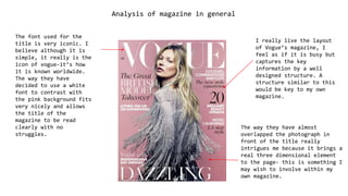
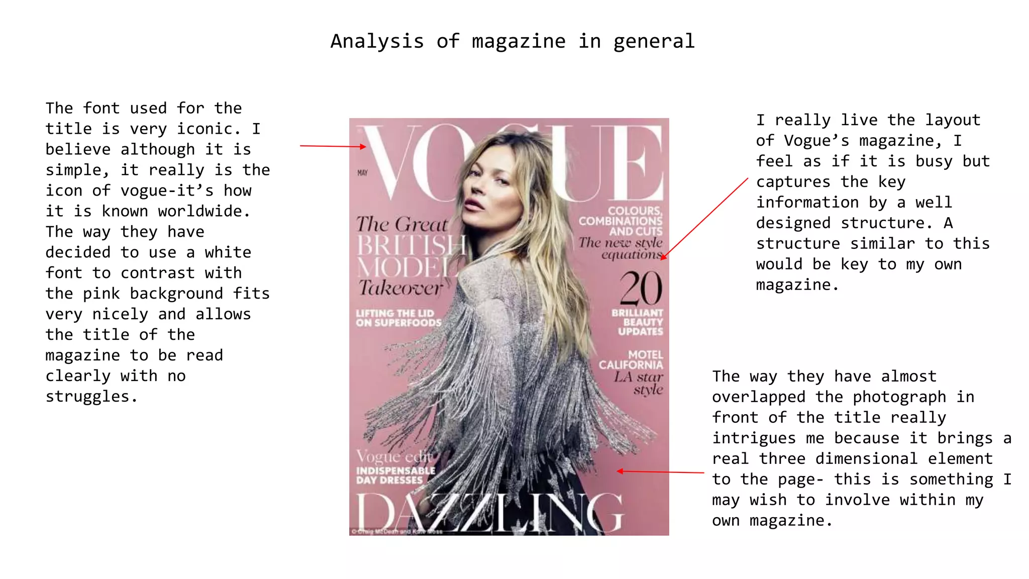
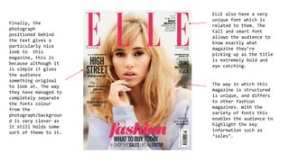
The document analyzes magazine layout and design. It discusses liking the busy but well-structured layout of Vogue magazine. It also notes the iconic pink font used for the title and how the overlapped photograph brings a three-dimensional element. Finally, it comments on how ELLE magazine has a unique tall and eye-catching font, and how positioning photographs behind text gives magazines a nice, original look.