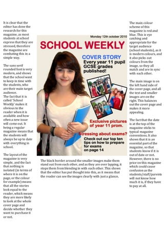
The document provides an analysis of the design elements of a school magazine cover. It discusses the magazine's color scheme, layout, font choices, main image placement, and how well various elements appeal to and engage the target audience of school students. Overall, the analysis finds that most design decisions are appropriate for the genre and audience, with a few minor issues around readability and balance that could be improved.


