Download to read offline
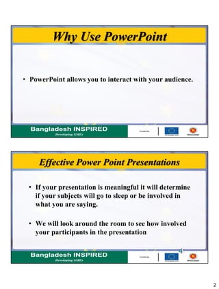
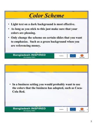


The document provides tips for creating effective PowerPoint presentations. Some key points include: - Use PowerPoint to interact with your audience and keep them engaged rather than just presenting slides of information. - Choose a light text on dark background color scheme and only change colors on certain emphasis slides. Limit colors to those associated with your business. - Include no more than 5 bullet points per slide and never read directly from slides. Use clip art sparingly to enhance points without needing explanation. - Customize backgrounds and use animation, sounds, and transitions sparingly. Ensure readability of text on slides with font size, style and sufficient contrast with backgrounds.


![Creating a powerful_presentation[1]](https://cdn.slidesharecdn.com/ss_thumbnails/creatingapowerfulpresentation1-100604185446-phpapp01-thumbnail.jpg?width=640&height=640&fit=bounds)


