J. Burgess
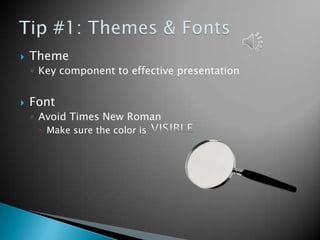
   Theme
    ◦ Key component to effective presentation


   Font
    ◦ Avoid Times New Roman
      Make sure the color is
   Keep background
    consistent and subtle
    ◦ Keep design clear and
      uncluttered
      Limit number of graphics


Avoid Internet pictures           For copyright reasons
✔
Credibility will be lost if you misspell a word.
   Don’t Confuse the
    Audience with a slide
    like this.
?!?
   Always face the audience
   Make sure the presentation flows nicely
   If sound effects are present, wait till they are
    finished than speak


   Most of all, GOOD LUCK
Animations should be subtle


Like this one…


Music shouldn’t be obnoxious and overpowering


Should be basic, like this…


Timings should make sense


Like this presentation…
   Greathouse, J. (2012, September 24). 9 Easy Ways To Create PowerPoint Slides That Suck
          Less - Forbes. Information for the World's Business Leaders - Forbes.com.
          Retrieved February 12, 2013, from
          http://www.forbes.com/sites/johngreathouse/2012/09/24/9-easy-ways-to-
          create-powerpoint-slides-that-suck-less/
   Prost, J. (2013). 12 Mistakes Made when Creating PowerPoint® Slides and How to
          Correct Them | The Executive Speech Coach Blog. Patricia Fripp, Professional
          Speaker, Speech Coach | Fripp & Associates. Retrieved February 12, 2013,
          from http://www.fripp.com/blog/12-mistakes-made-when-creating-
          powerpoint-slides-and-how-to-correct-them/
   Reynolds, G. (2005). Garr Reynolds/Design Basics. Retrieved February 12, 2013, from
          http://www.garrreynolds.com/Design/basics.html
   Rrichar2 (2011, August 31). Powerpoint: Presentation Tips | Information & Library
          Services | Bates College. Bates College. Retrieved February 12, 2013, from
          http://www.bates.edu/ils/2011/how-do-i/software/powerpoint-presentation-
    tips/

Effective PowerPoint Presentation

  • 1.
  • 2.
    Theme ◦ Key component to effective presentation  Font ◦ Avoid Times New Roman  Make sure the color is
  • 3.
    Keep background consistent and subtle ◦ Keep design clear and uncluttered  Limit number of graphics Avoid Internet pictures For copyright reasons
  • 4.
    ✔ Credibility will belost if you misspell a word.
  • 5.
    Don’t Confuse the Audience with a slide like this. ?!?
  • 6.
    Always face the audience  Make sure the presentation flows nicely  If sound effects are present, wait till they are finished than speak  Most of all, GOOD LUCK
  • 7.
    Animations should besubtle Like this one… Music shouldn’t be obnoxious and overpowering Should be basic, like this… Timings should make sense Like this presentation…
  • 8.
    Greathouse, J. (2012, September 24). 9 Easy Ways To Create PowerPoint Slides That Suck Less - Forbes. Information for the World's Business Leaders - Forbes.com. Retrieved February 12, 2013, from http://www.forbes.com/sites/johngreathouse/2012/09/24/9-easy-ways-to- create-powerpoint-slides-that-suck-less/  Prost, J. (2013). 12 Mistakes Made when Creating PowerPoint® Slides and How to Correct Them | The Executive Speech Coach Blog. Patricia Fripp, Professional Speaker, Speech Coach | Fripp & Associates. Retrieved February 12, 2013, from http://www.fripp.com/blog/12-mistakes-made-when-creating- powerpoint-slides-and-how-to-correct-them/  Reynolds, G. (2005). Garr Reynolds/Design Basics. Retrieved February 12, 2013, from http://www.garrreynolds.com/Design/basics.html  Rrichar2 (2011, August 31). Powerpoint: Presentation Tips | Information & Library Services | Bates College. Bates College. Retrieved February 12, 2013, from http://www.bates.edu/ils/2011/how-do-i/software/powerpoint-presentation- tips/