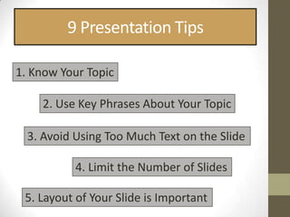
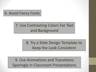
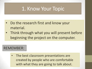
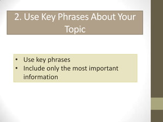
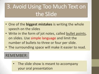
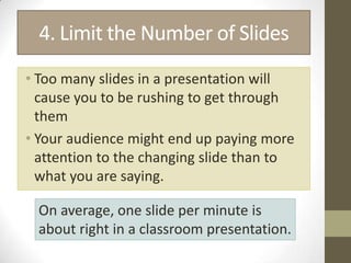
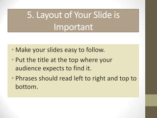
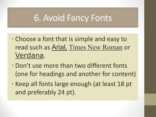
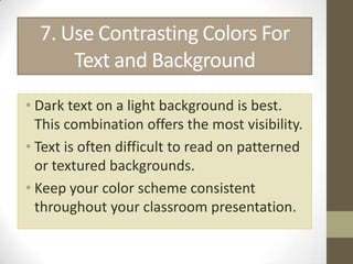
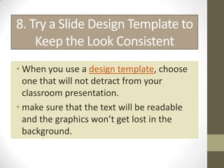
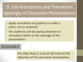
9 Power Point
Presentation Tips
9 Presentation Tips

1. Know Your Topic

    2. Use Key Phrases About Your Topic

  3. Avoid Using Too Much Text on the Slide

           4. Limit the Number of Slides

 5. Layout of Your Slide is Important
6. Avoid Fancy Fonts

      7. Use Contrasting Colors For Text
              and Background

            8. Try a Slide Design Template to
                Keep the Look Consistent

     9. Use Animations and Transitions
    Sparingly in Classroom Presentations
1. Know Your Topic

• Do the research first and know your
  material.
• Think through what you will present before
  beginning the project on the computer.

REMEMBER:
   • The best classroom presentations are
     created by people who are comfortable
     with what they are going to talk about.
2. Use Key Phrases About Your
            Topic

• Use key phrases
• Include only the most important
  information
3. Avoid Using Too Much Text on
            the Slide
• One of the biggest mistakes is writing the whole
  speech on the slides
• Write in the form of jot notes, called bullet points,
  on slides. Use simple language and limit the
  number of bullets to three or four per slide.
• The surrounding space will make it easier to read.

REMEMBER:
     • The slide show is meant to accompany
       your oral presentation
4. Limit the Number of Slides
• Too many slides in a presentation will
  cause you to be rushing to get through
  them
• Your audience might end up paying more
  attention to the changing slide than to
  what you are saying.

  On average, one slide per minute is
  about right in a classroom presentation.
5. Layout of Your Slide is
            Important

• Make your slides easy to follow.
• Put the title at the top where your
  audience expects to find it.
• Phrases should read left to right and top to
  bottom.
6. Avoid Fancy Fonts

• Choose a font that is simple and easy to
  read such as Arial, Times New Roman or
  Verdana.
• Don't use more than two different fonts
  (one for headings and another for content)
• Keep all fonts large enough (at least 18 pt
  and preferably 24 pt).
7. Use Contrasting Colors For
      Text and Background
• Dark text on a light background is best.
  This combination offers the most visibility.
• Text is often difficult to read on patterned
  or textured backgrounds.
• Keep your color scheme consistent
  throughout your classroom presentation.
8. Try a Slide Design Template to
    Keep the Look Consistent
• When you use a design template, choose
  one that will not detract from your
  classroom presentation.
• make sure that the text will be readable
  and the graphics won’t get lost in the
  background.
9. Use Animations and Transitions
 Sparingly in Classroom Presentations
  • Apply animations to graphics to make a
    point, not to entertain
  • the audience will be paying attention to
    animation rather to the message of the
    presentation.

REMEMBER:
          the slide show is a visual aid and not the
          objective of the classroom presentation.
_END_

9 power point presentation tips

  • 1.
  • 2.
    9 Presentation Tips 1.Know Your Topic 2. Use Key Phrases About Your Topic 3. Avoid Using Too Much Text on the Slide 4. Limit the Number of Slides 5. Layout of Your Slide is Important
  • 3.
    6. Avoid FancyFonts 7. Use Contrasting Colors For Text and Background 8. Try a Slide Design Template to Keep the Look Consistent 9. Use Animations and Transitions Sparingly in Classroom Presentations
  • 4.
    1. Know YourTopic • Do the research first and know your material. • Think through what you will present before beginning the project on the computer. REMEMBER: • The best classroom presentations are created by people who are comfortable with what they are going to talk about.
  • 5.
    2. Use KeyPhrases About Your Topic • Use key phrases • Include only the most important information
  • 6.
    3. Avoid UsingToo Much Text on the Slide • One of the biggest mistakes is writing the whole speech on the slides • Write in the form of jot notes, called bullet points, on slides. Use simple language and limit the number of bullets to three or four per slide. • The surrounding space will make it easier to read. REMEMBER: • The slide show is meant to accompany your oral presentation
  • 7.
    4. Limit theNumber of Slides • Too many slides in a presentation will cause you to be rushing to get through them • Your audience might end up paying more attention to the changing slide than to what you are saying. On average, one slide per minute is about right in a classroom presentation.
  • 8.
    5. Layout ofYour Slide is Important • Make your slides easy to follow. • Put the title at the top where your audience expects to find it. • Phrases should read left to right and top to bottom.
  • 9.
    6. Avoid FancyFonts • Choose a font that is simple and easy to read such as Arial, Times New Roman or Verdana. • Don't use more than two different fonts (one for headings and another for content) • Keep all fonts large enough (at least 18 pt and preferably 24 pt).
  • 10.
    7. Use ContrastingColors For Text and Background • Dark text on a light background is best. This combination offers the most visibility. • Text is often difficult to read on patterned or textured backgrounds. • Keep your color scheme consistent throughout your classroom presentation.
  • 11.
    8. Try aSlide Design Template to Keep the Look Consistent • When you use a design template, choose one that will not detract from your classroom presentation. • make sure that the text will be readable and the graphics won’t get lost in the background.
  • 12.
    9. Use Animationsand Transitions Sparingly in Classroom Presentations • Apply animations to graphics to make a point, not to entertain • the audience will be paying attention to animation rather to the message of the presentation. REMEMBER: the slide show is a visual aid and not the objective of the classroom presentation.
  • 13.