The document provides tips for creating effective PowerPoint presentations with key points including:
- Use fewer slides by including only main ideas and supporting details on each slide. Choose dark, high-contrast colors and large fonts for readability.
- Organize slides in a logical order from most to least important or vice versa, keeping related details together.
- Insert relevant pictures, ensuring they are enlarged properly without distortion, and download video clips rather than linking to avoid internet issues. Limit additional movement and sounds to avoid distraction.
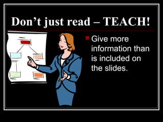
- Cite sources as needed and speak loudly with eye contact when presenting, teaching the audience rather than just reading slides, having practiced and researched the content thoroughly.


![Creating a powerful_presentation[1]](https://cdn.slidesharecdn.com/ss_thumbnails/creatingapowerfulpresentation1-100604185446-phpapp01-thumbnail.jpg?width=640&height=640&fit=bounds)


