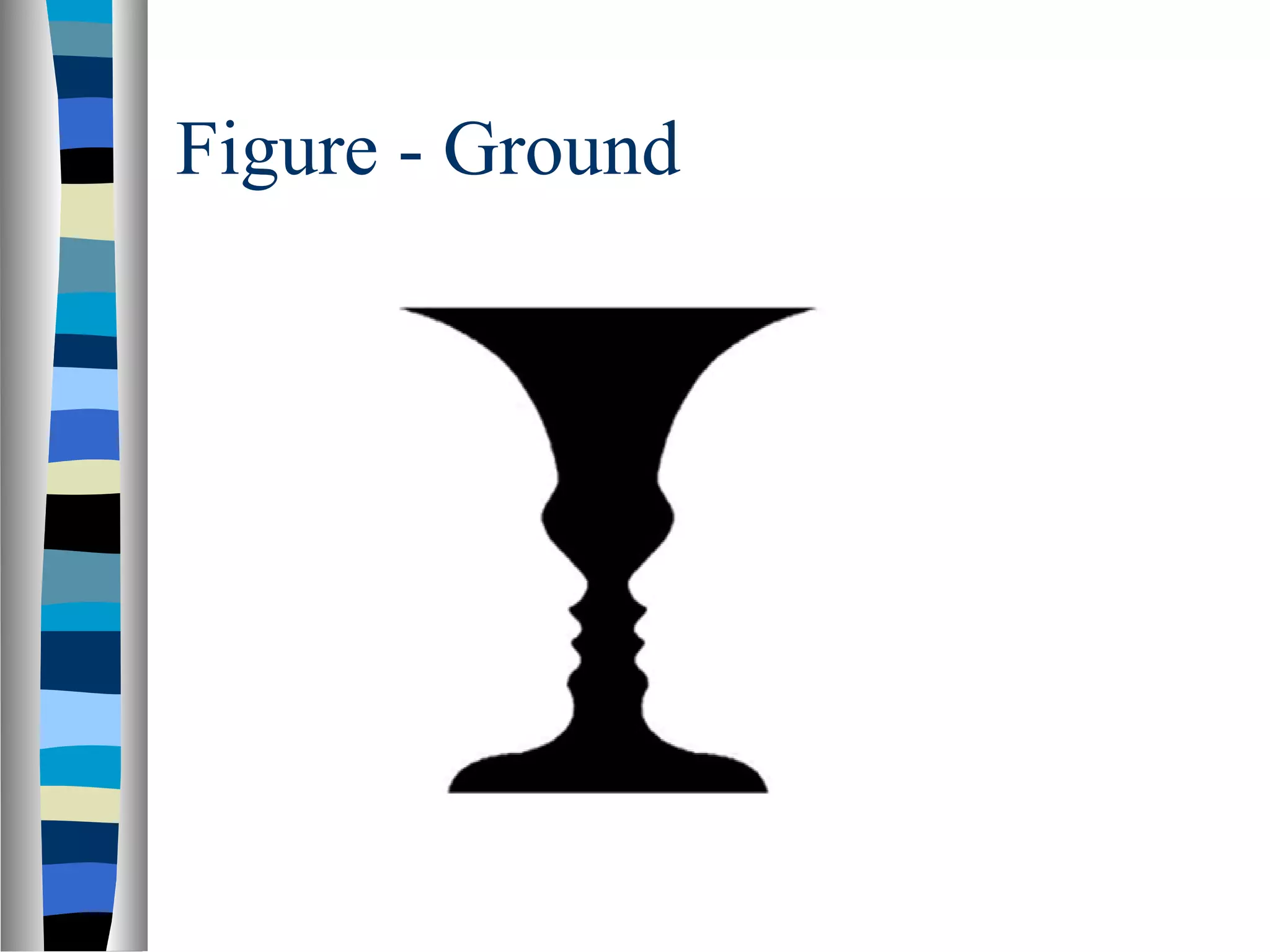
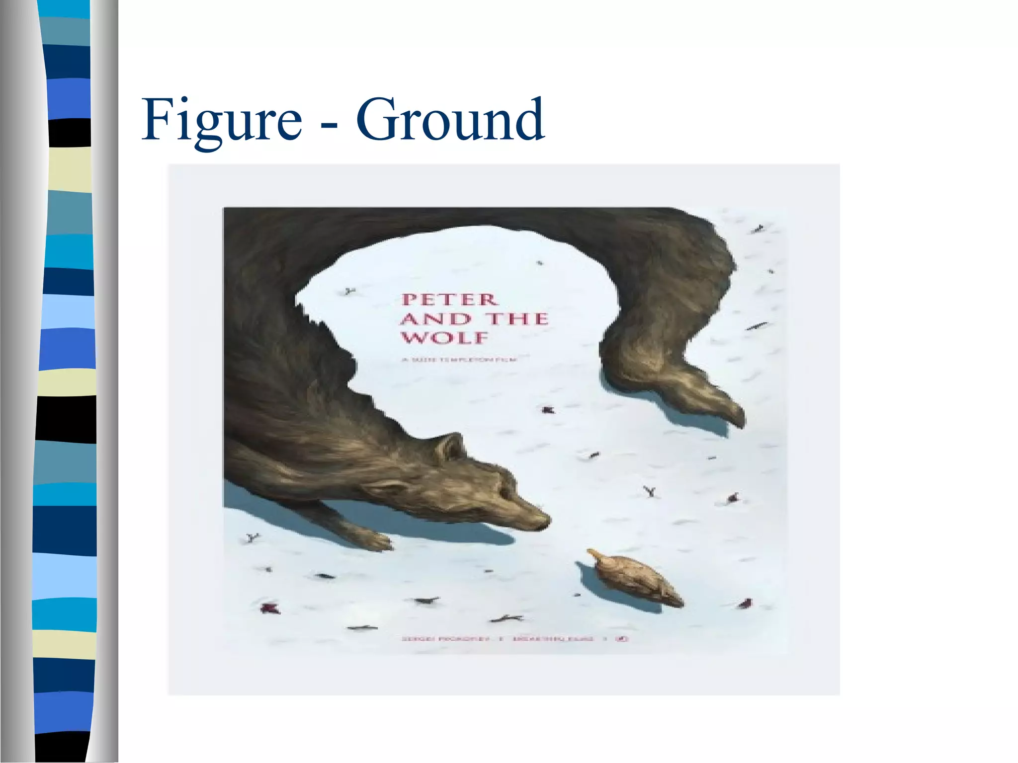
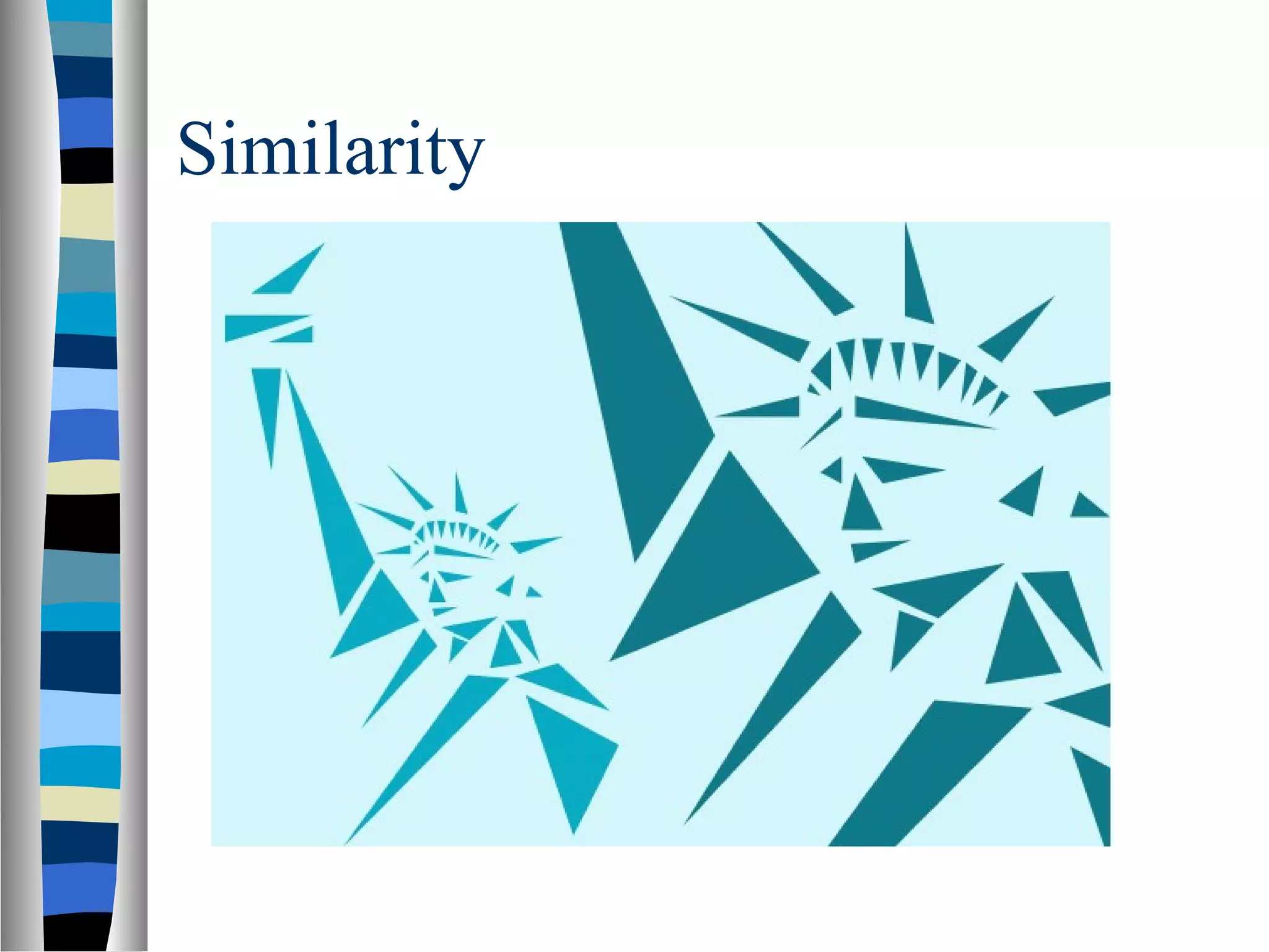
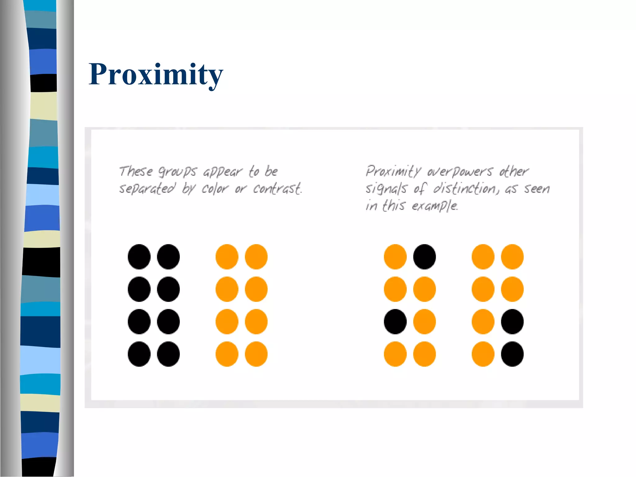
Visual perception refers to how the brain makes sense of what the eyes see. Gestalt laws of perception help explain how the human eye perceives objects or visual elements as coherent wholes rather than individual parts. Some key Gestalt principles include figure-ground, which determines what is the focus versus the background; similarity, which groups like elements; proximity, which groups close elements; and closure, where the eye sees completed shapes and patterns. These principles are useful for interface design to help users quickly understand relationships and organization.
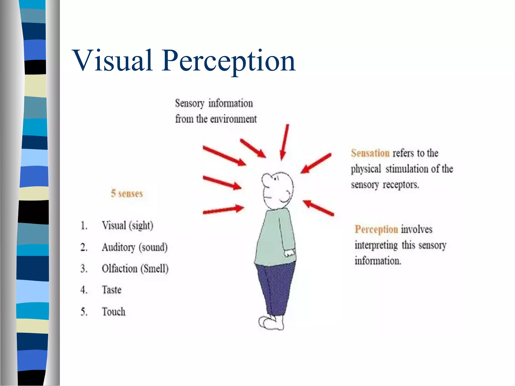
An overview of visual perception, emphasizing the eye's role as the main information input and the brain's function in interpreting visual data.
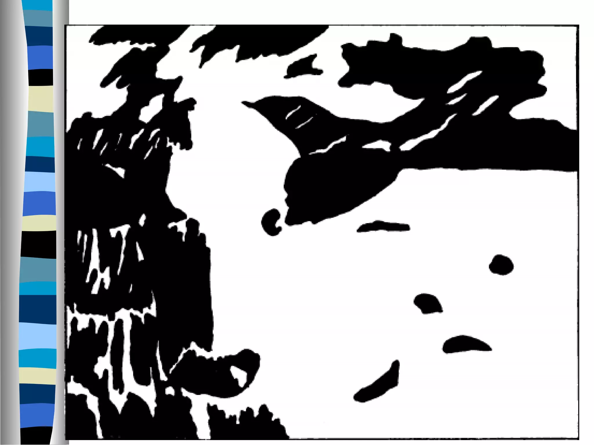
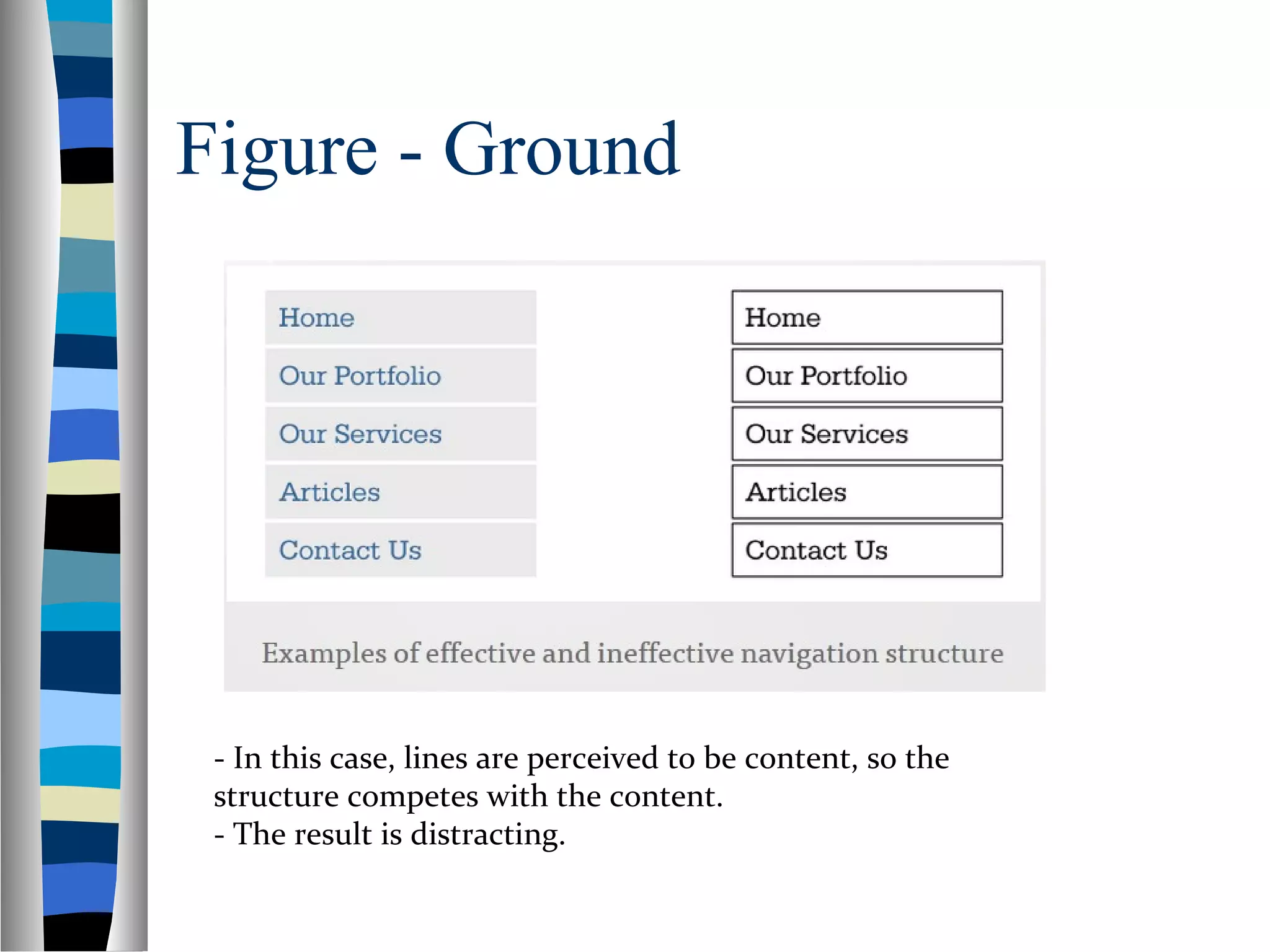
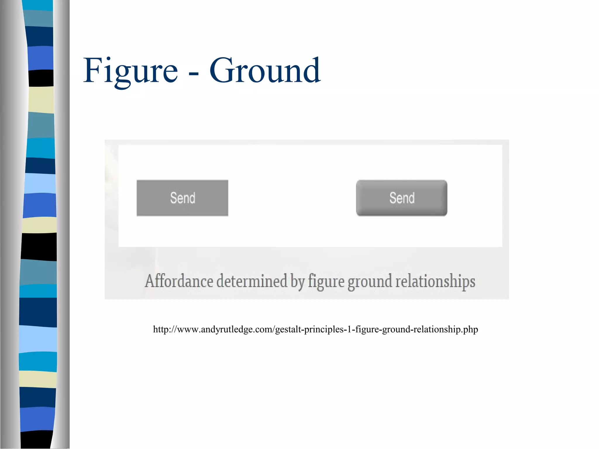
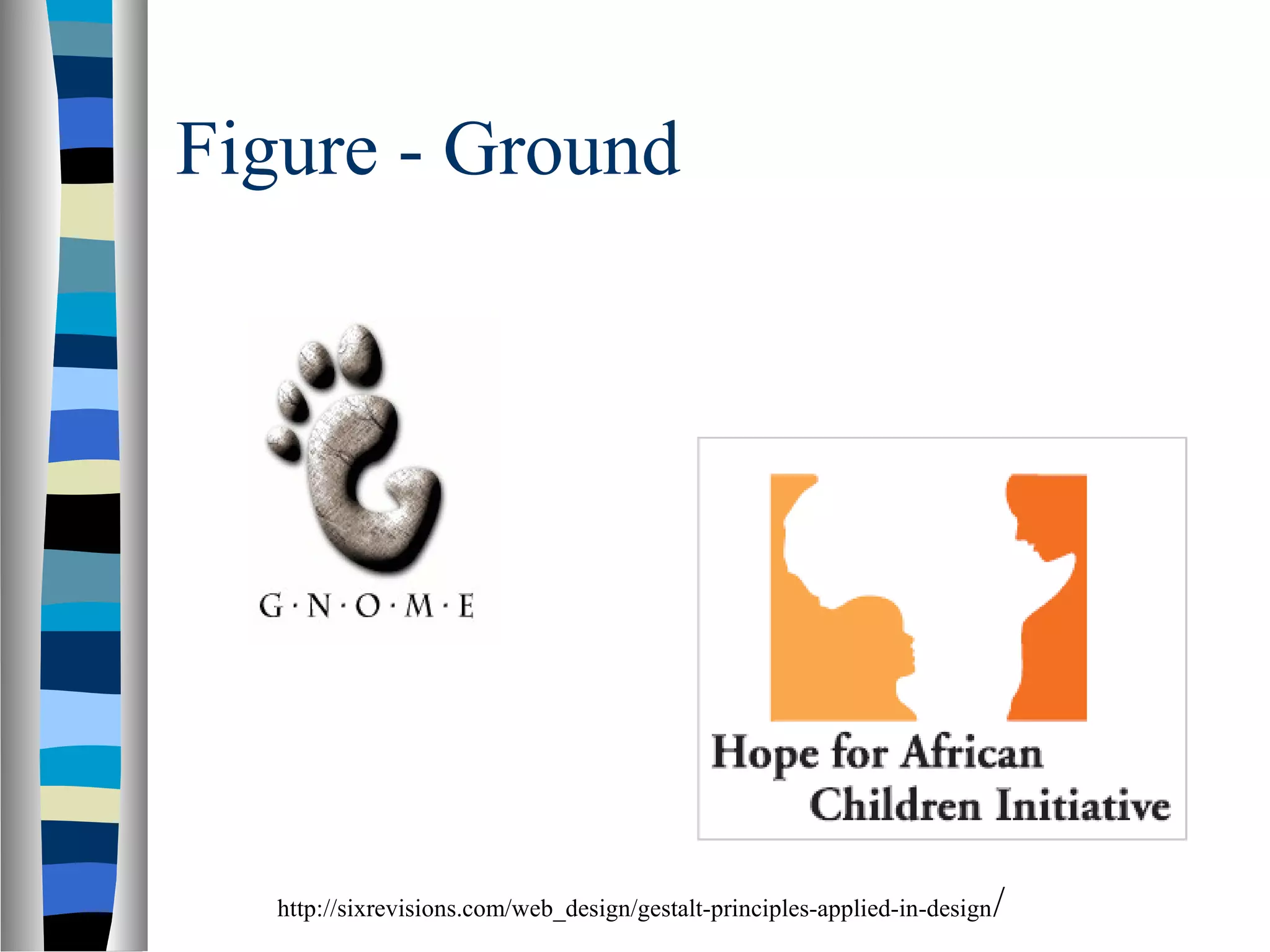
Introduction to Gestalt principles that explain visual perception and coherence of visual elements important for UI design. Key Gestalt principles: Figure-Ground, Similarity, Proximity, etc., that enhance user interface usability. Focuses on the Figure-Ground principle, explaining how elements are perceived as figures or background, impacting attention.
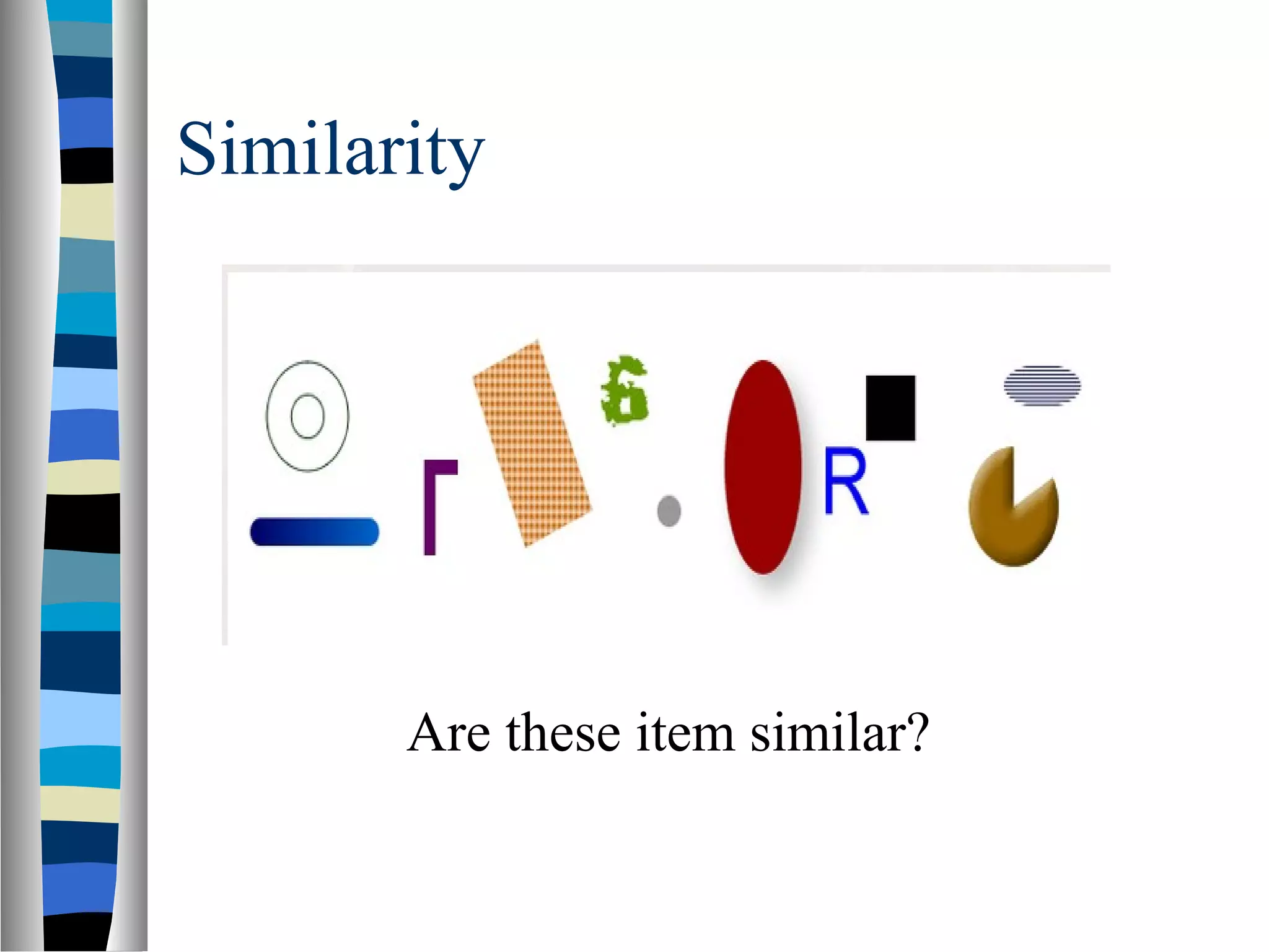
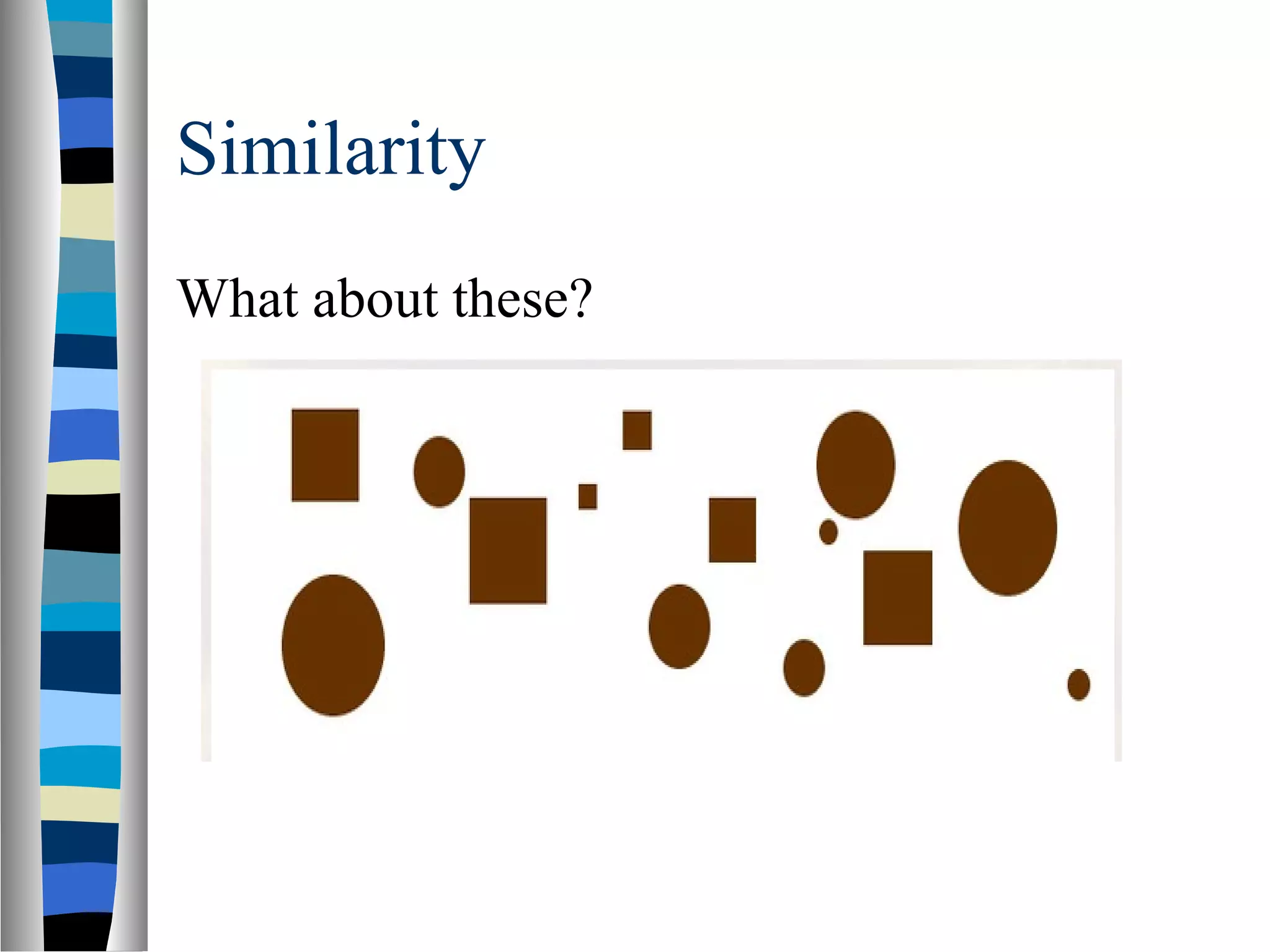
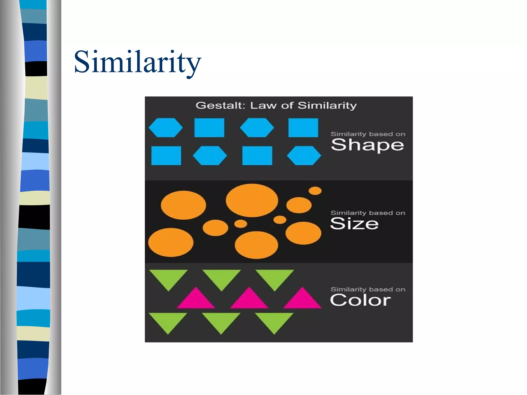
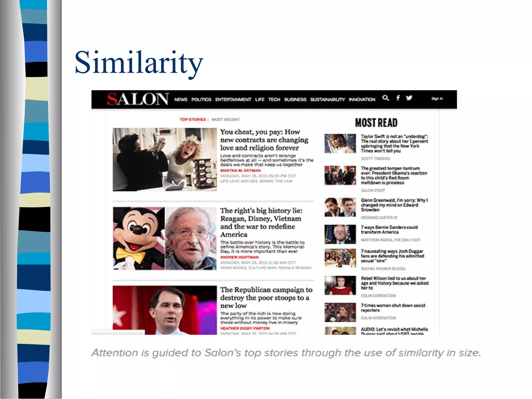
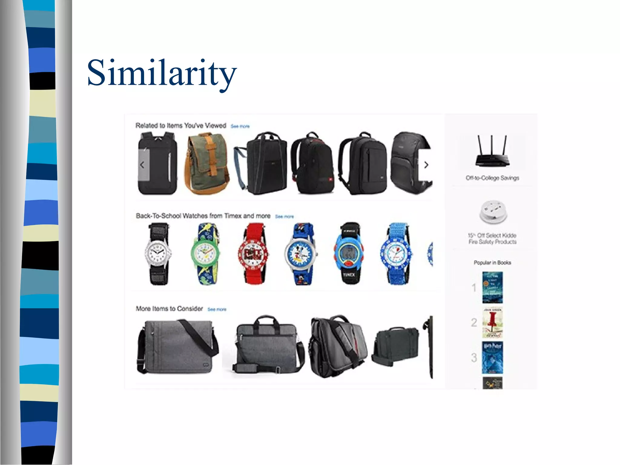
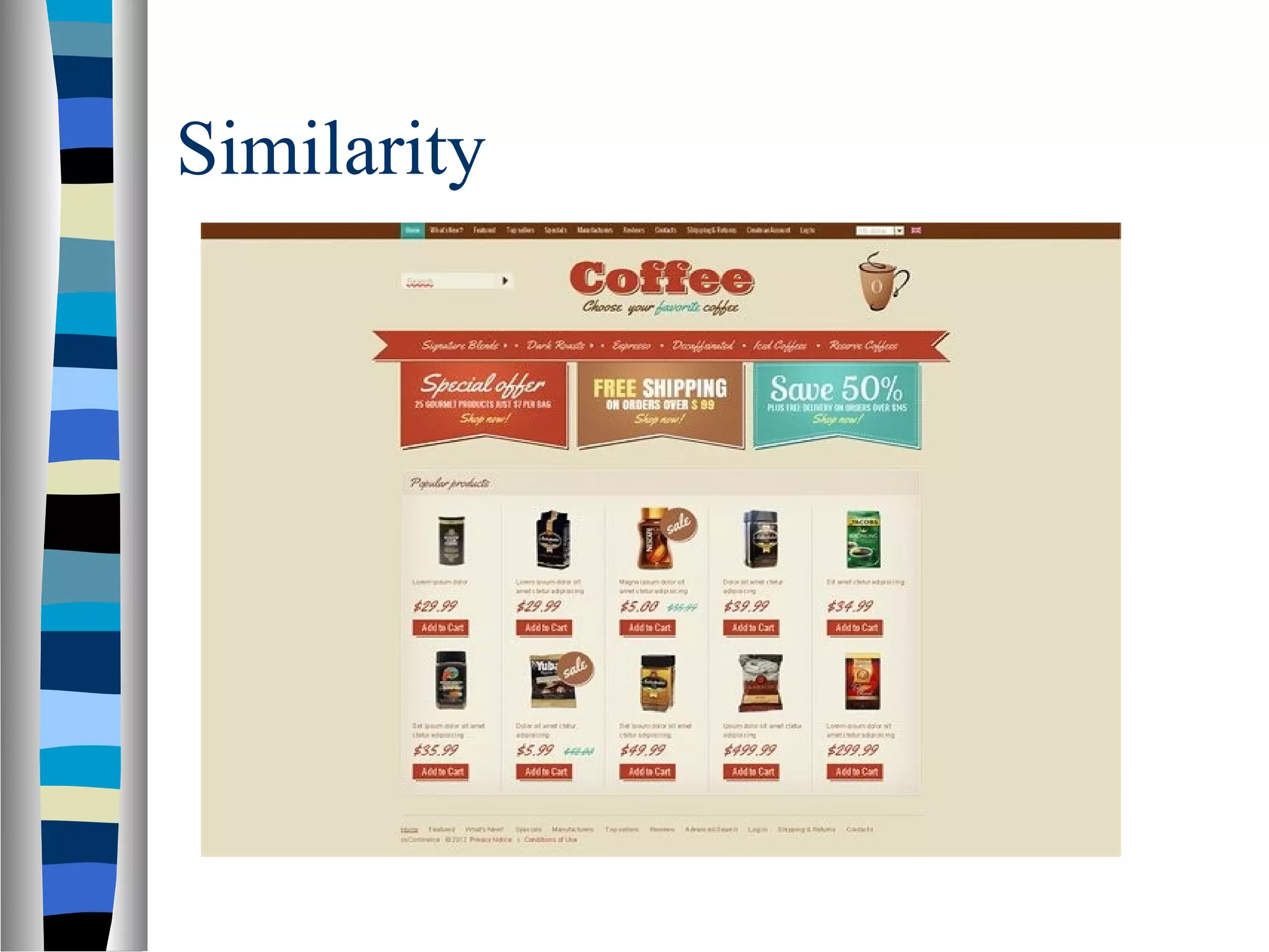
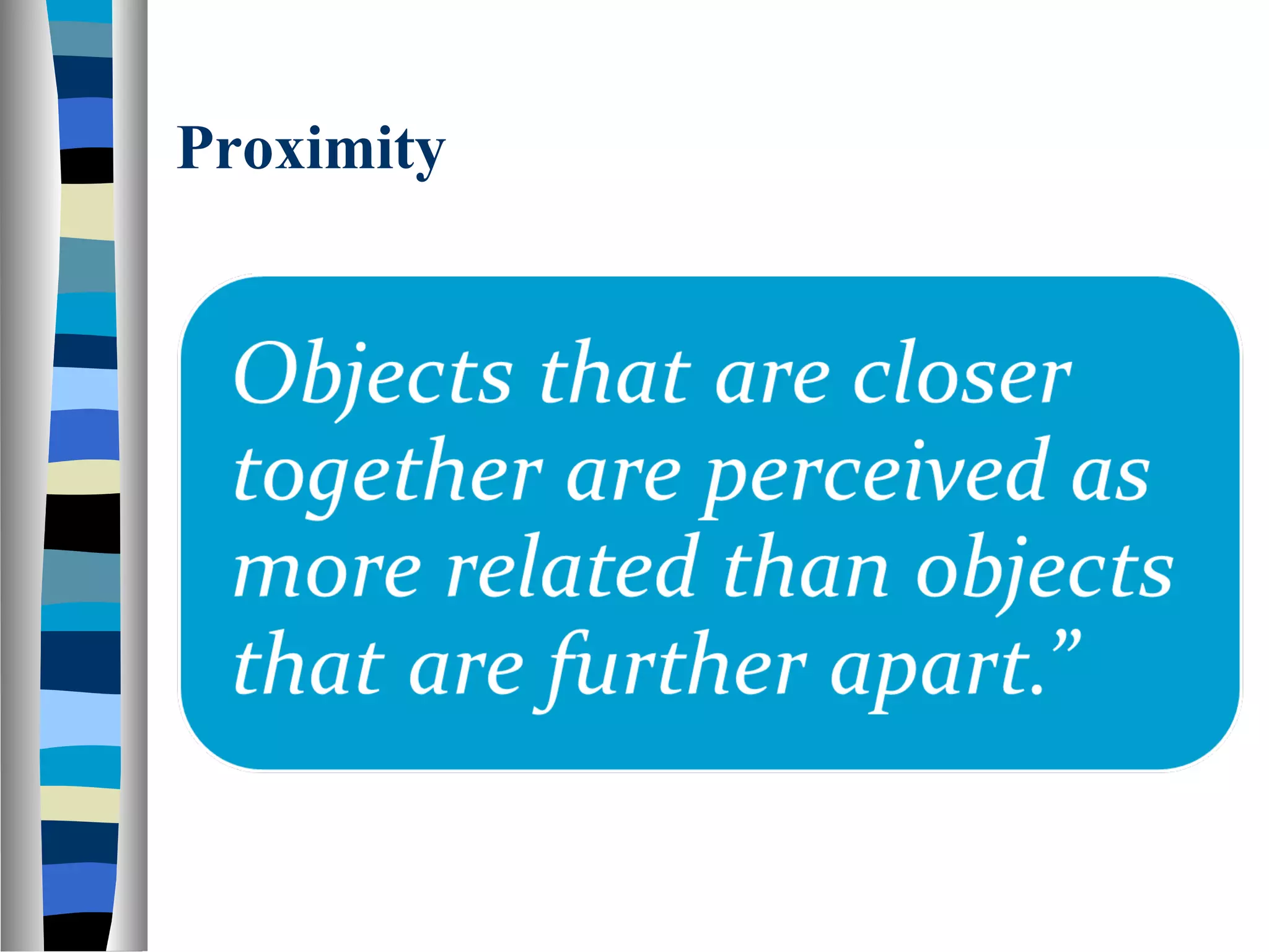
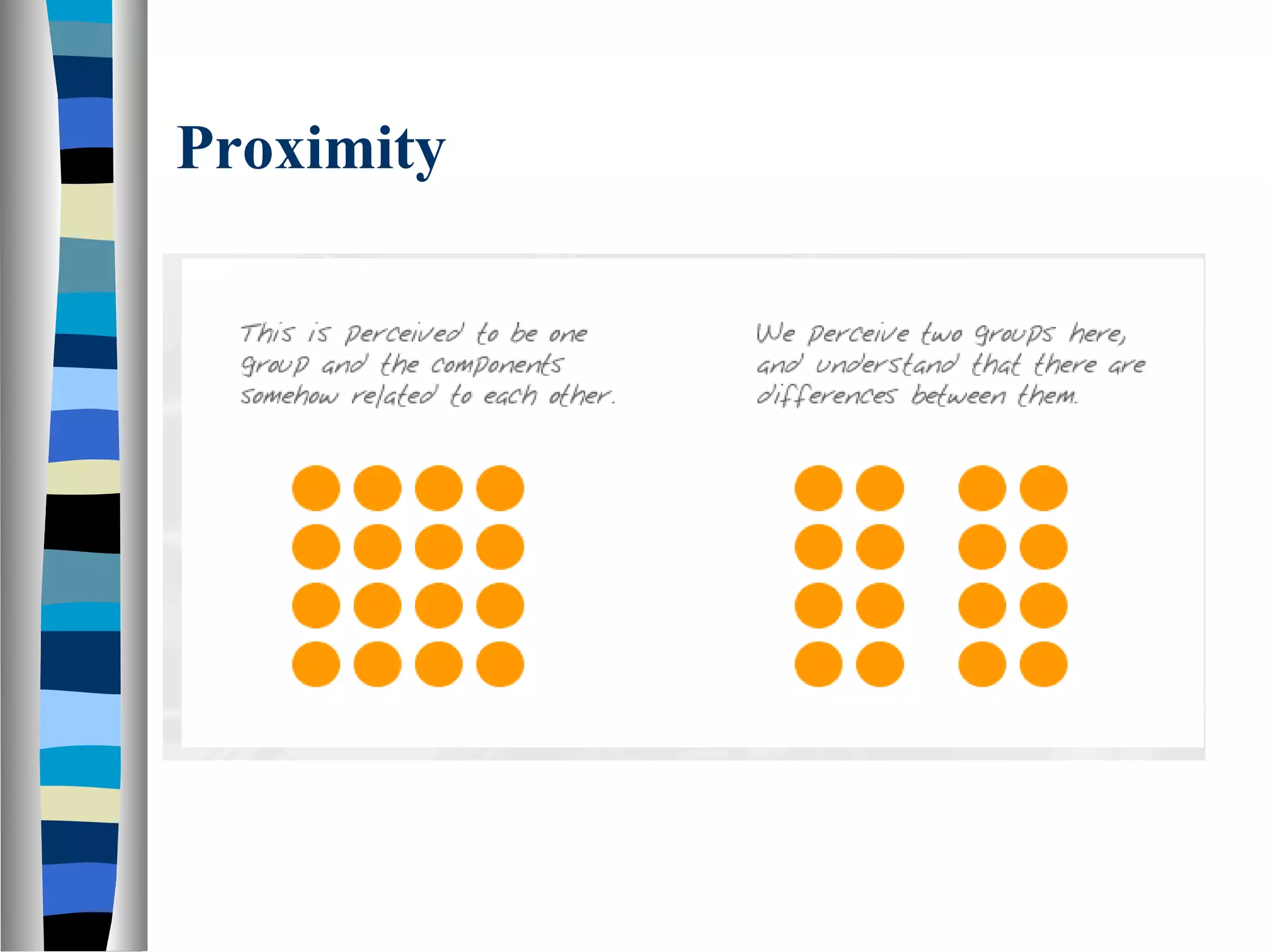
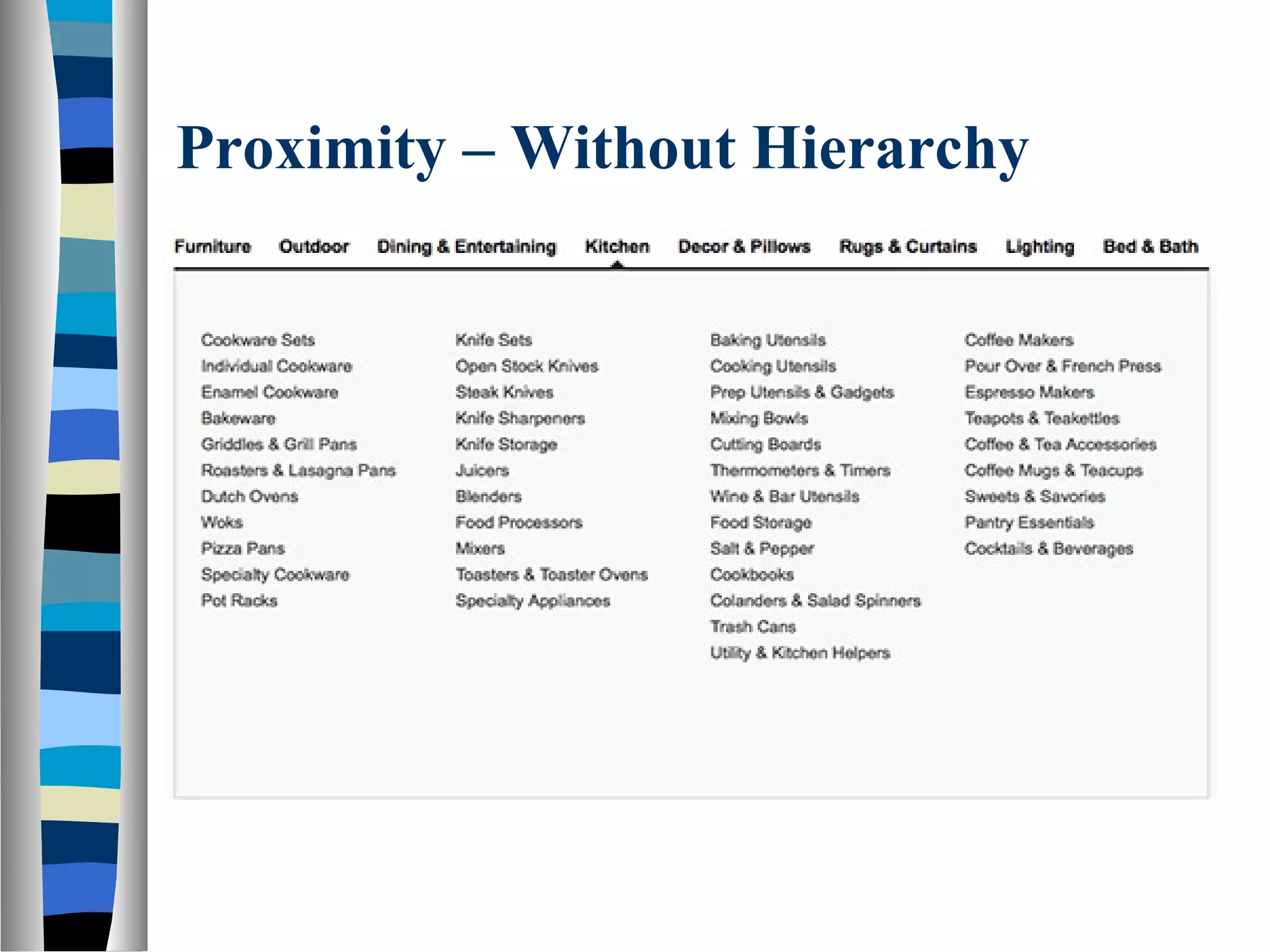
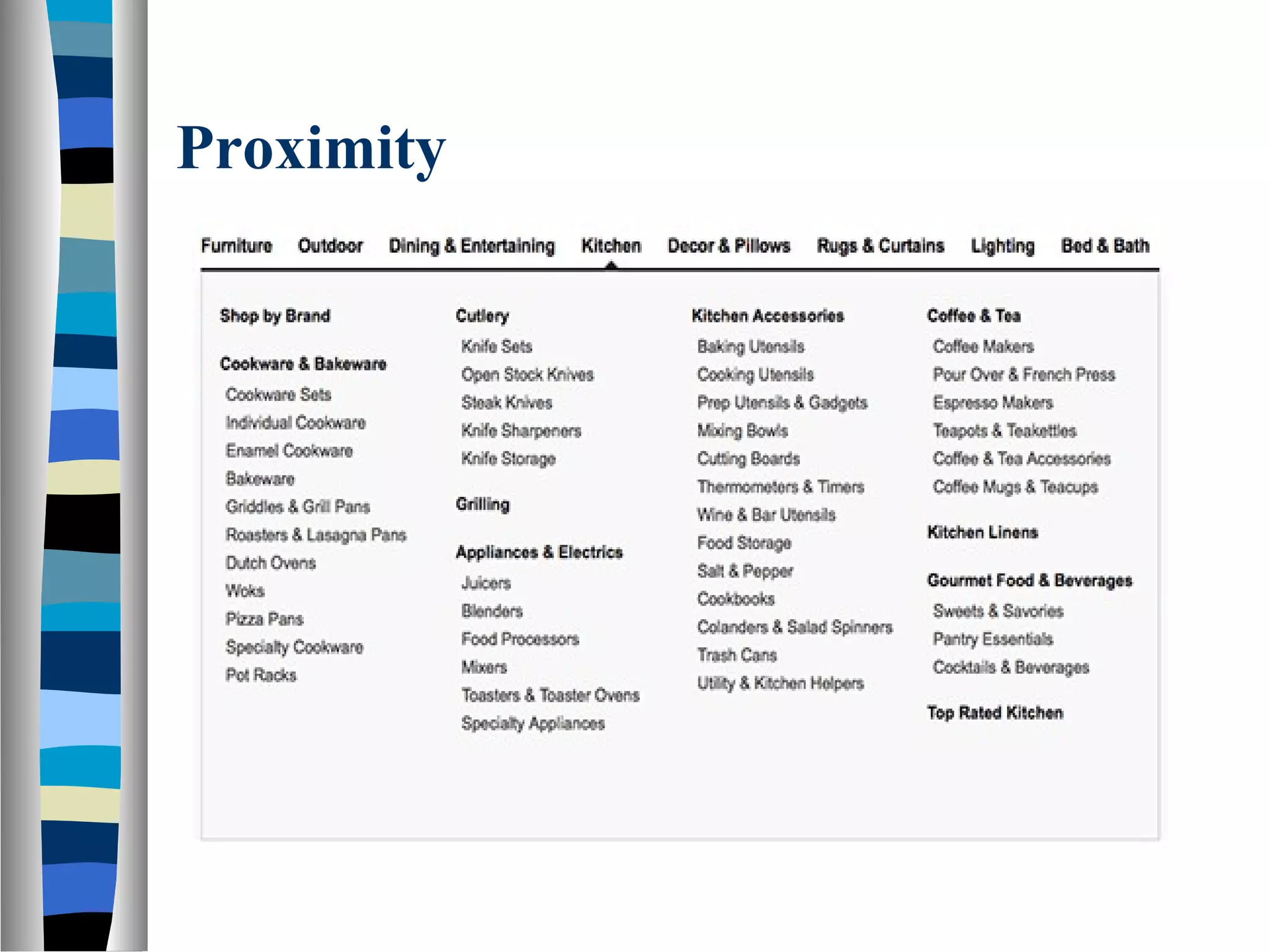
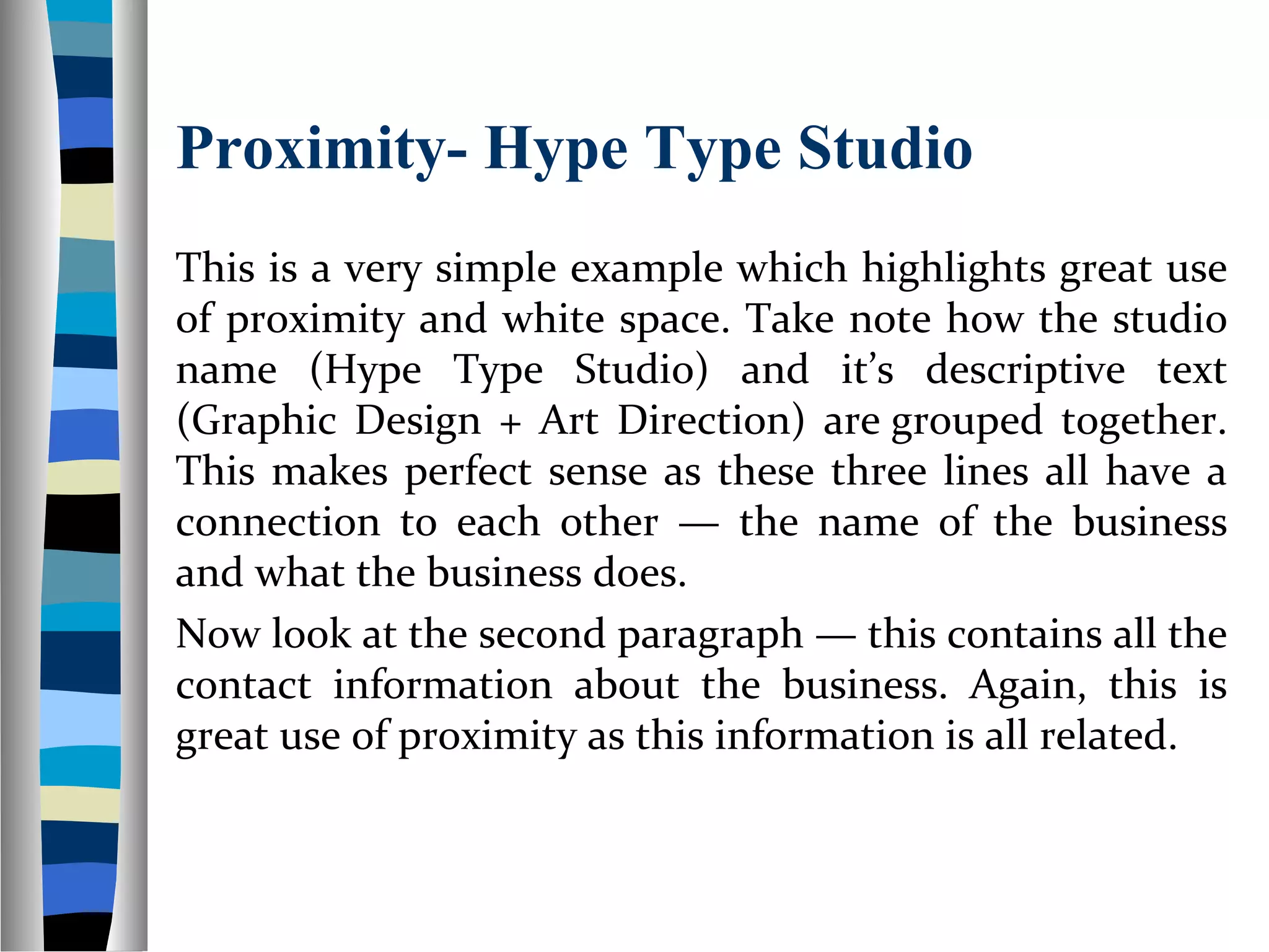
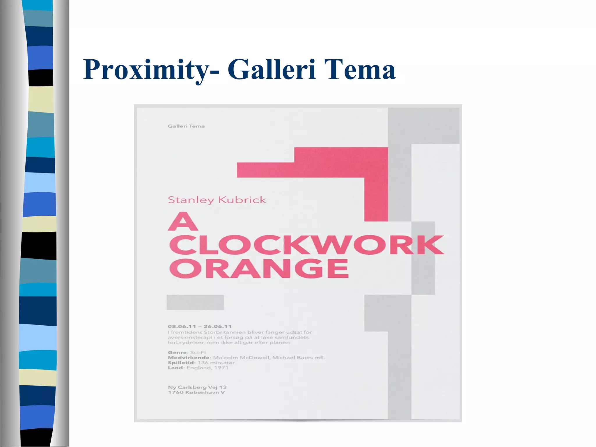
The principle of similarity that dictates elements with shared characteristics are perceived as related, impacting design coherence.The principle of proximity which states that elements close to each other are seen as related, aiding in clear communication.
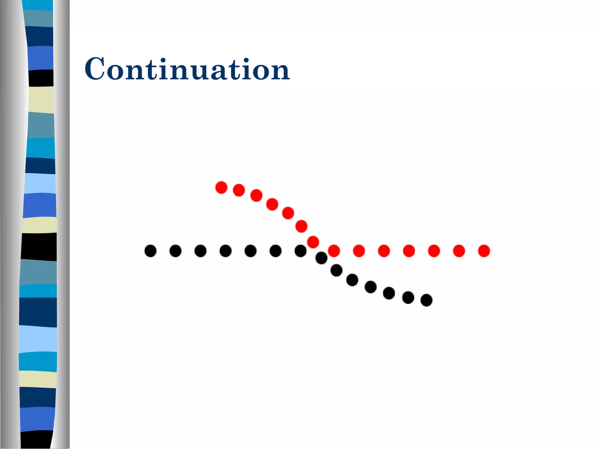
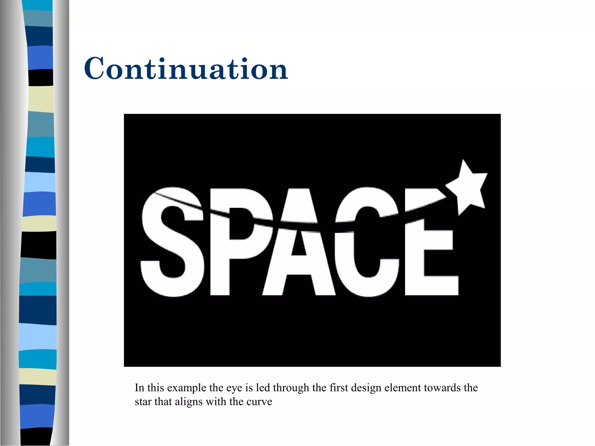
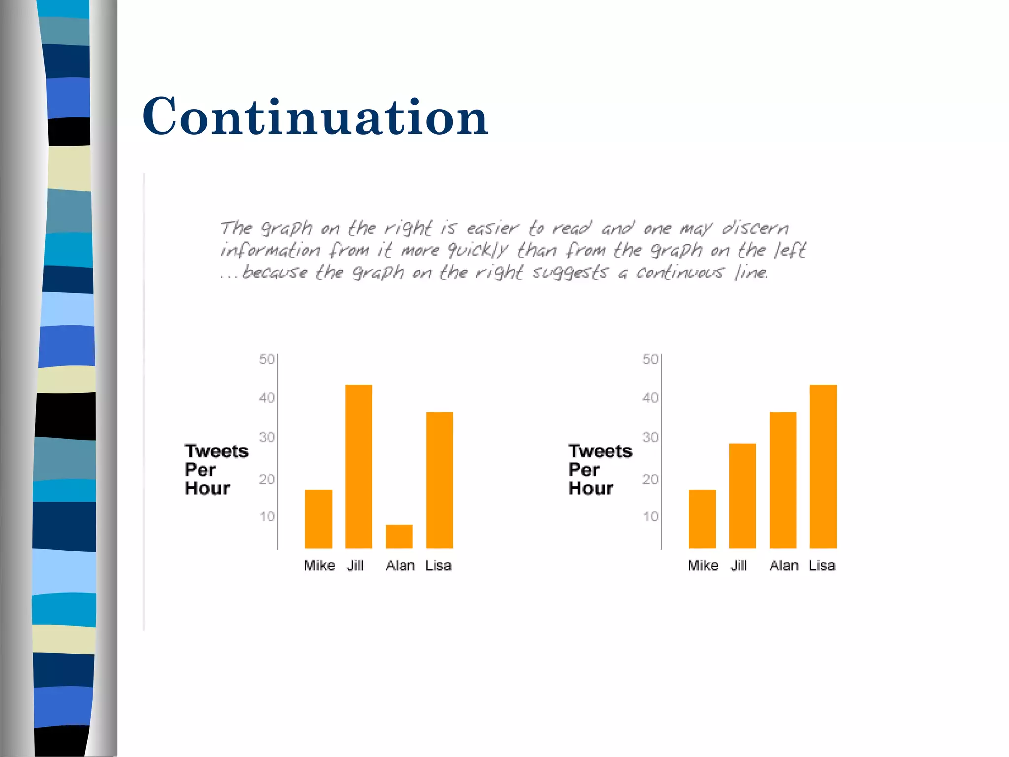
Explains the continuation principle where elements aligned on lines or curves are seen as connected, guiding viewer's attention.
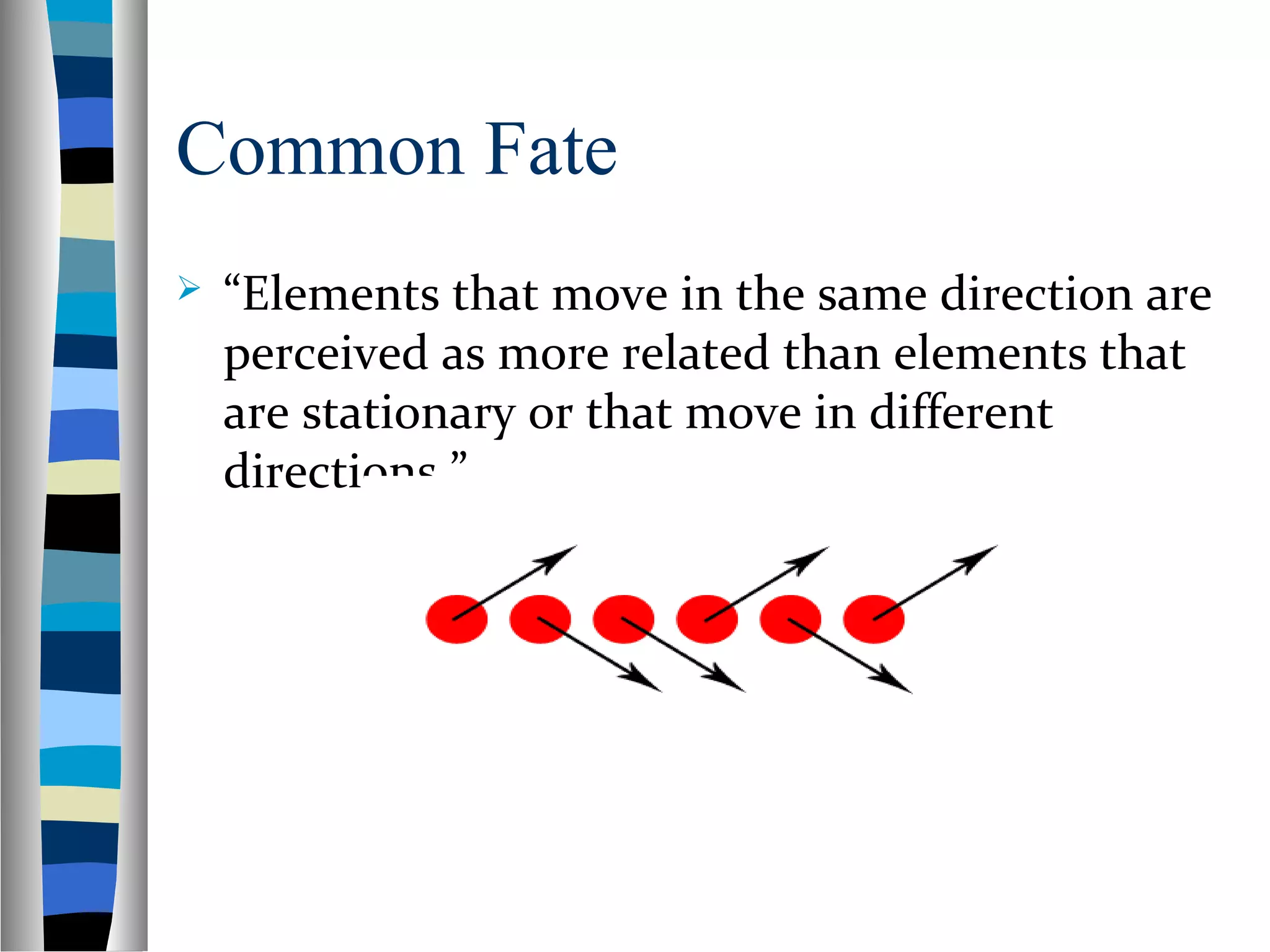
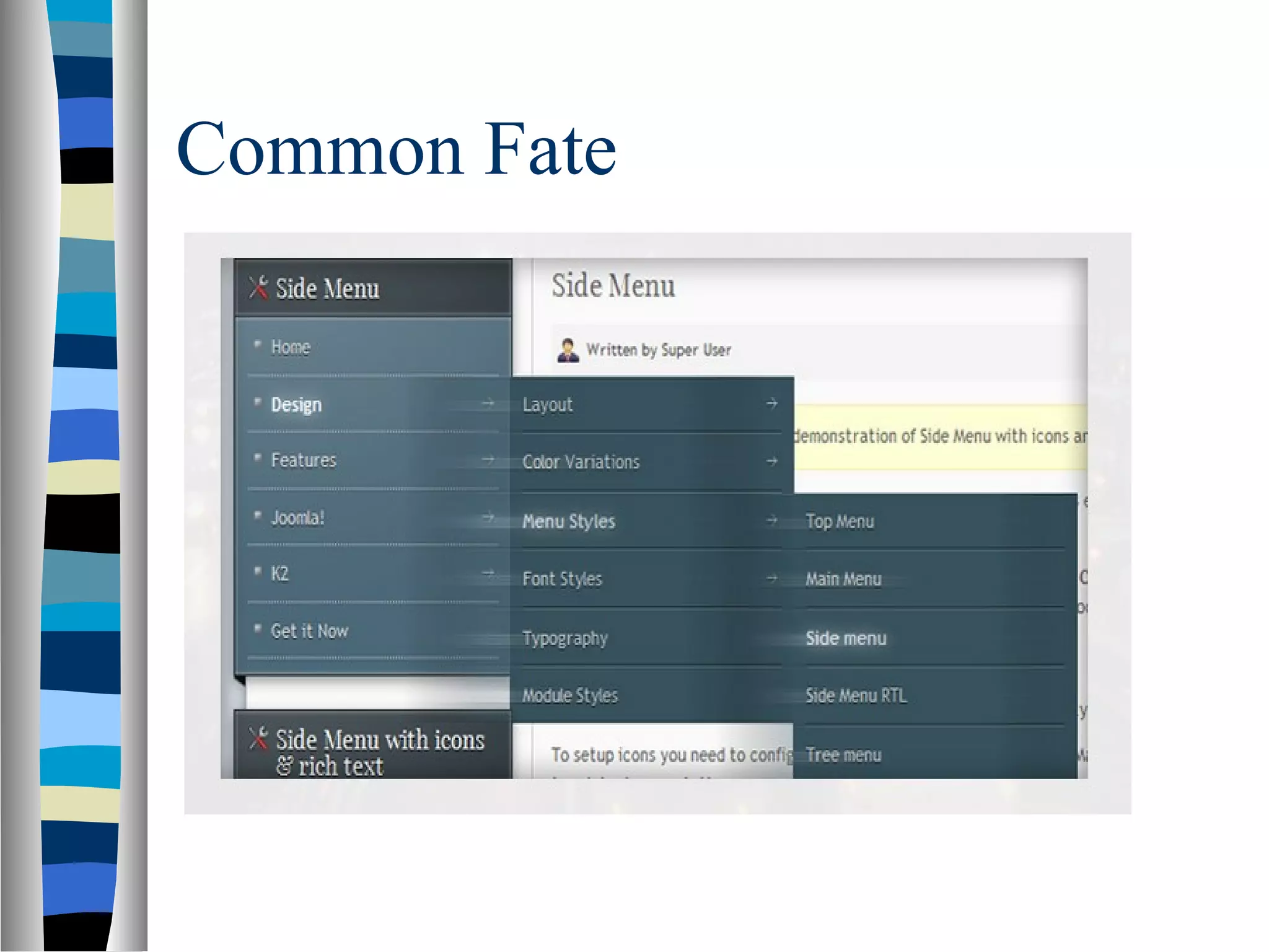
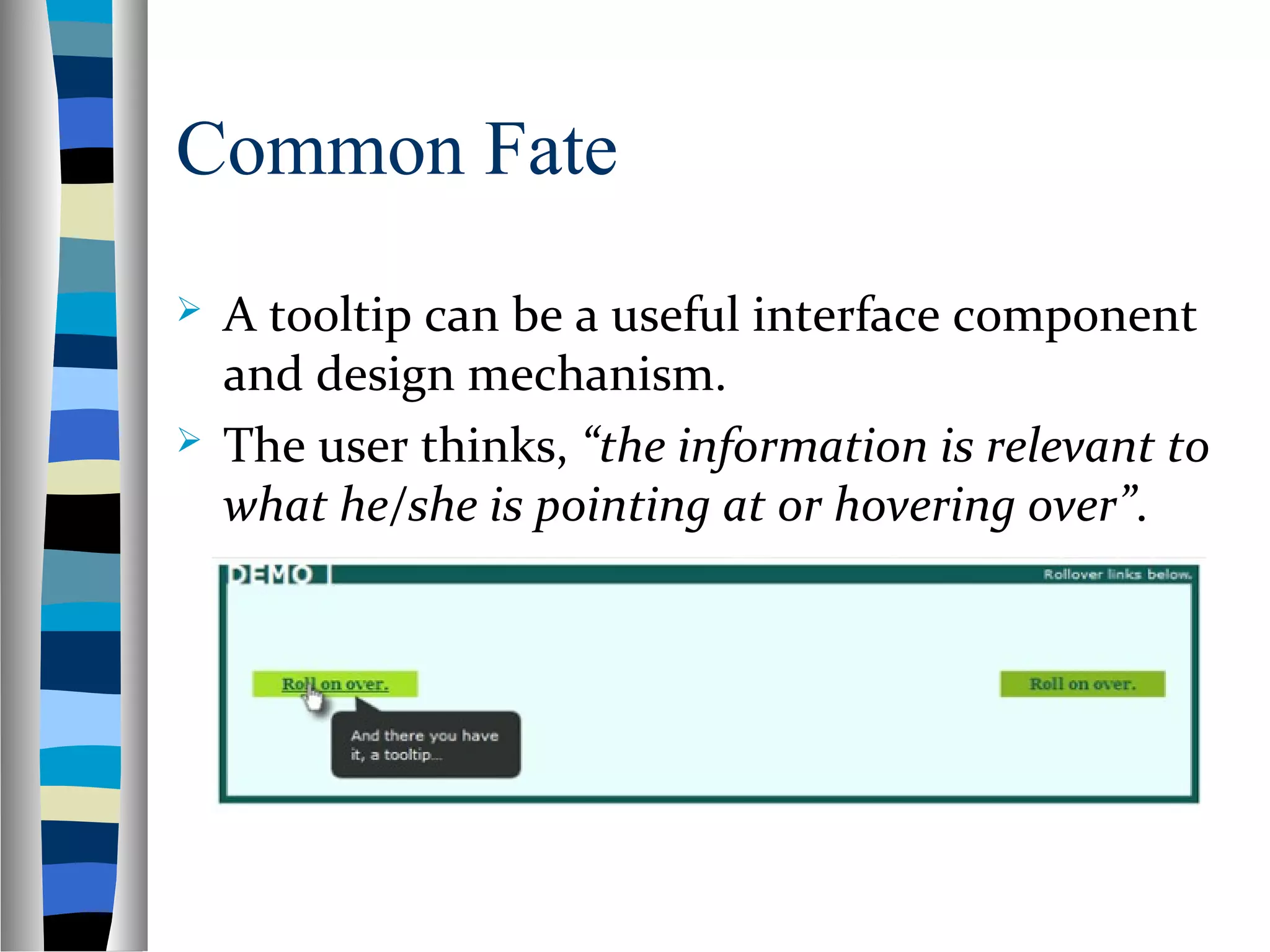
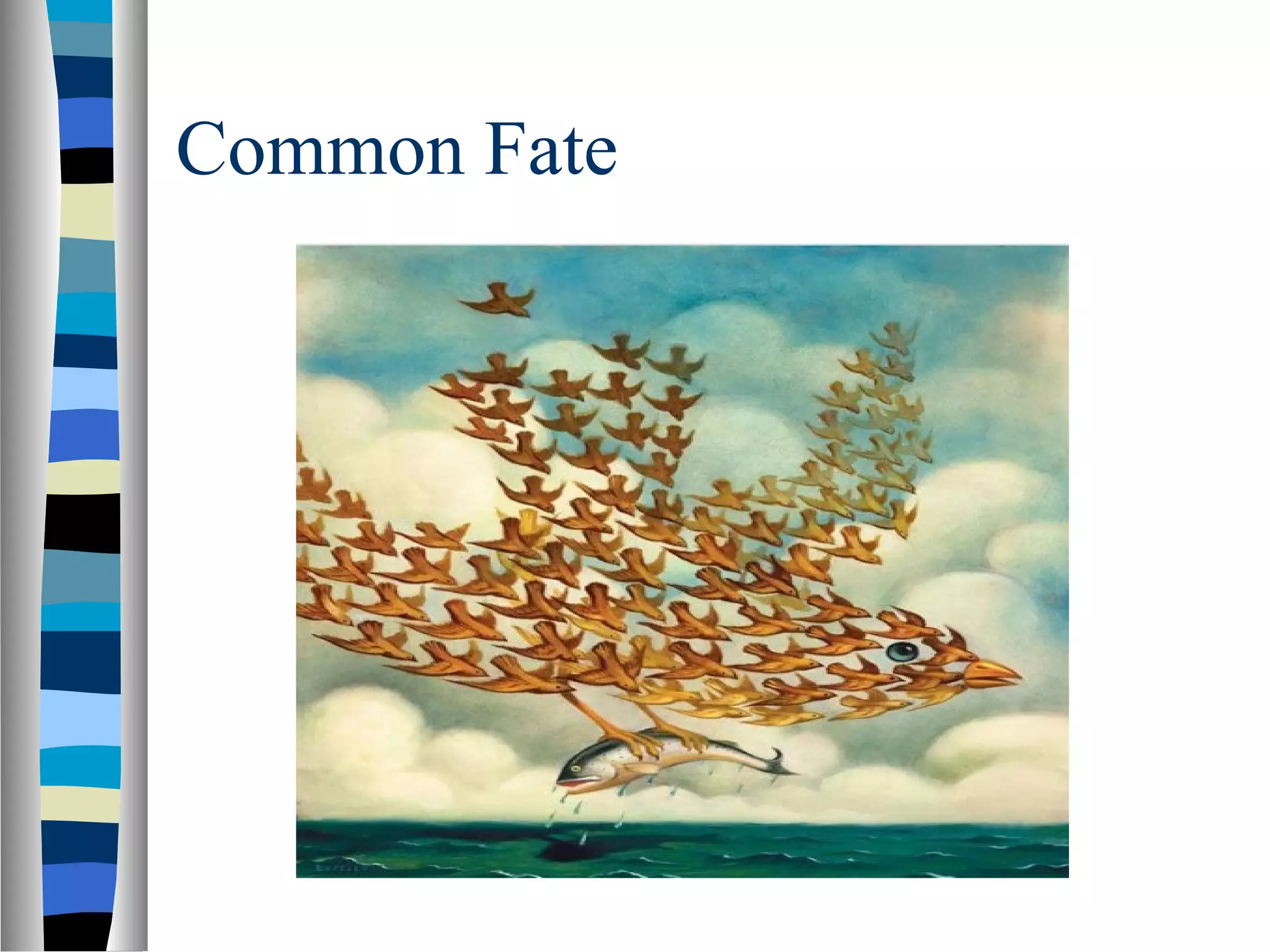
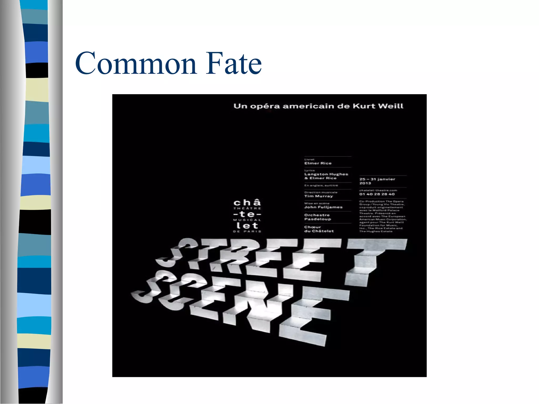
Discusses the common fate principle that relates moving elements, enhancing user interaction through perceived relevance.
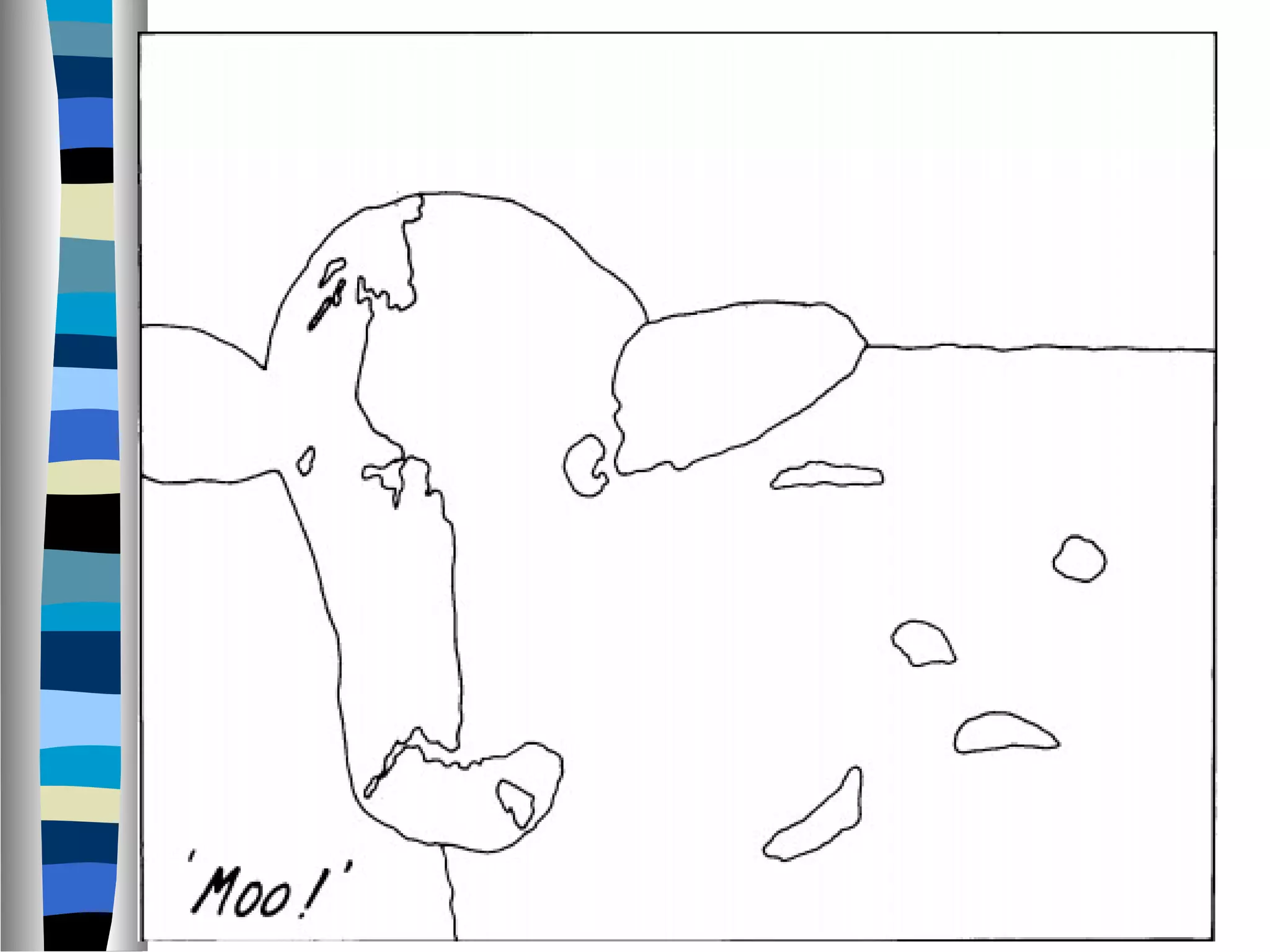
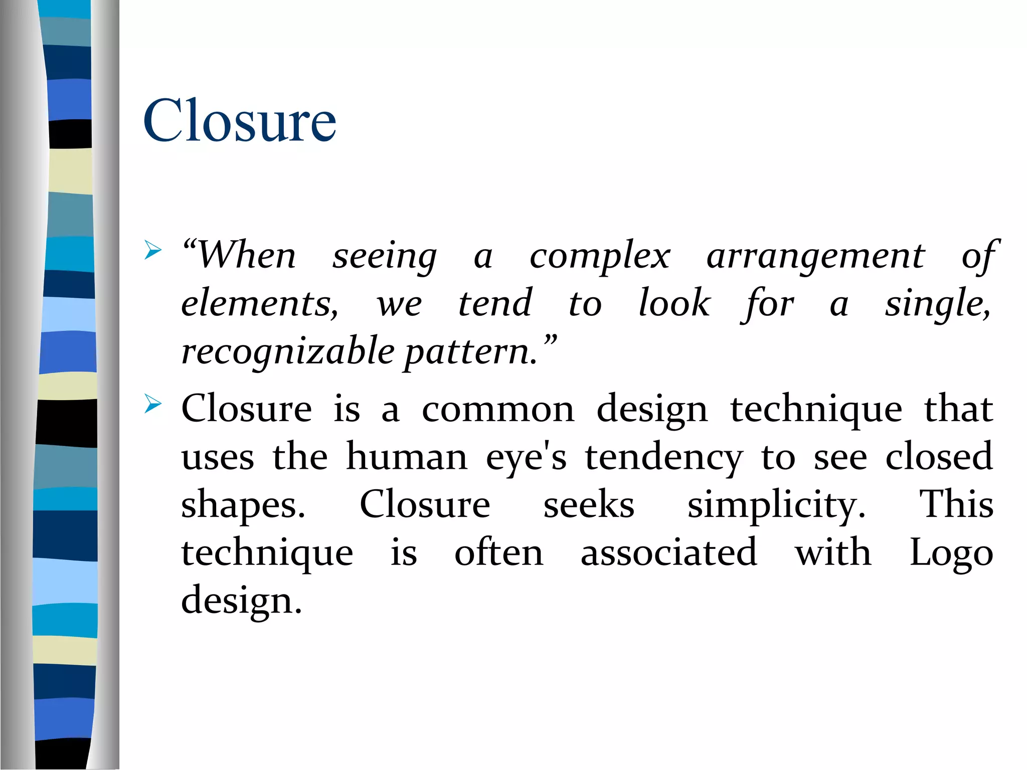
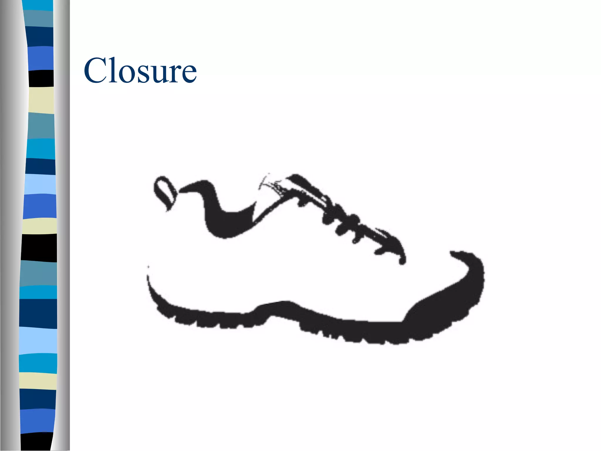
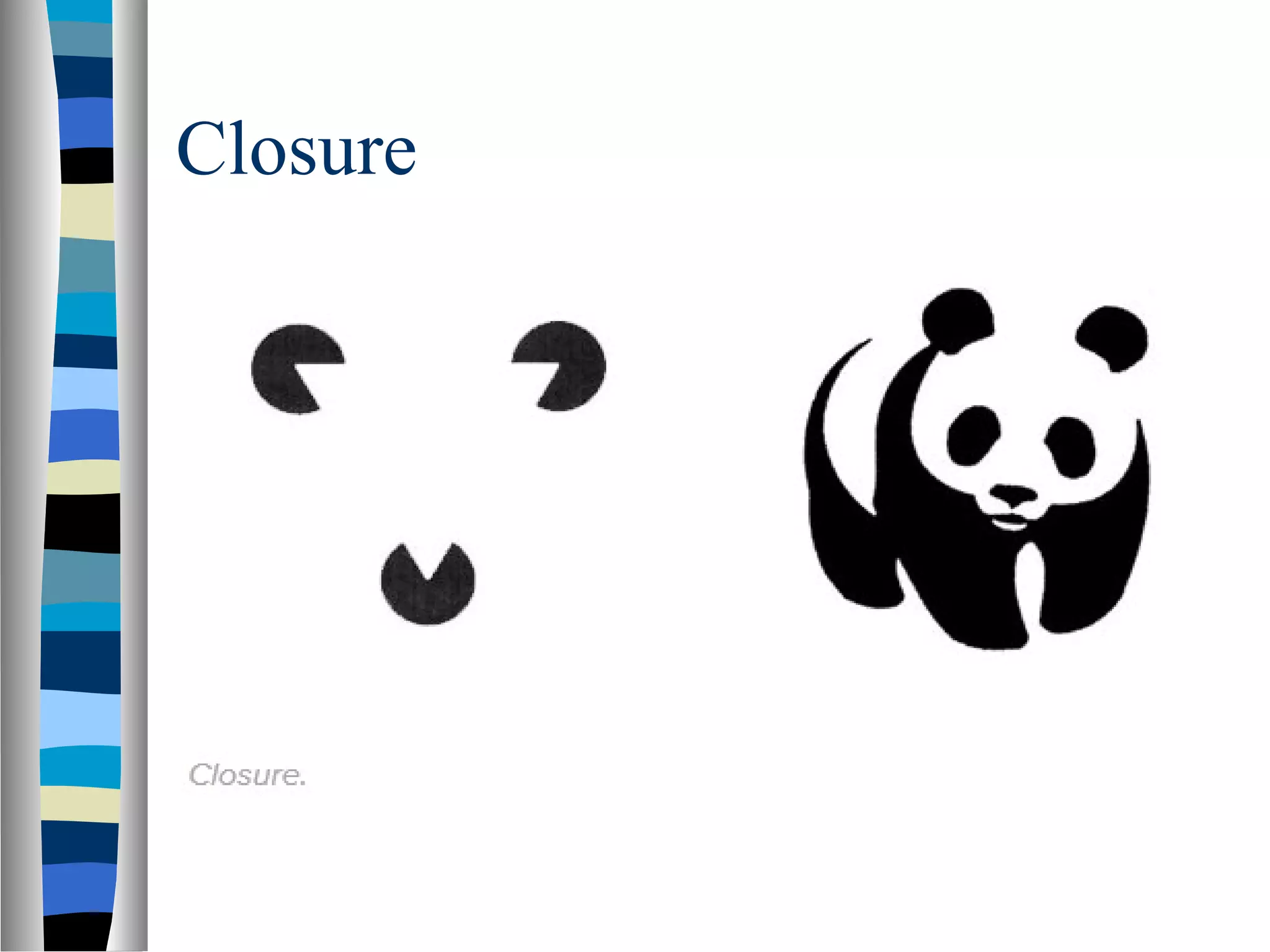
The closure principle focuses on the tendency to perceive incomplete shapes as whole, often used in logo designs.
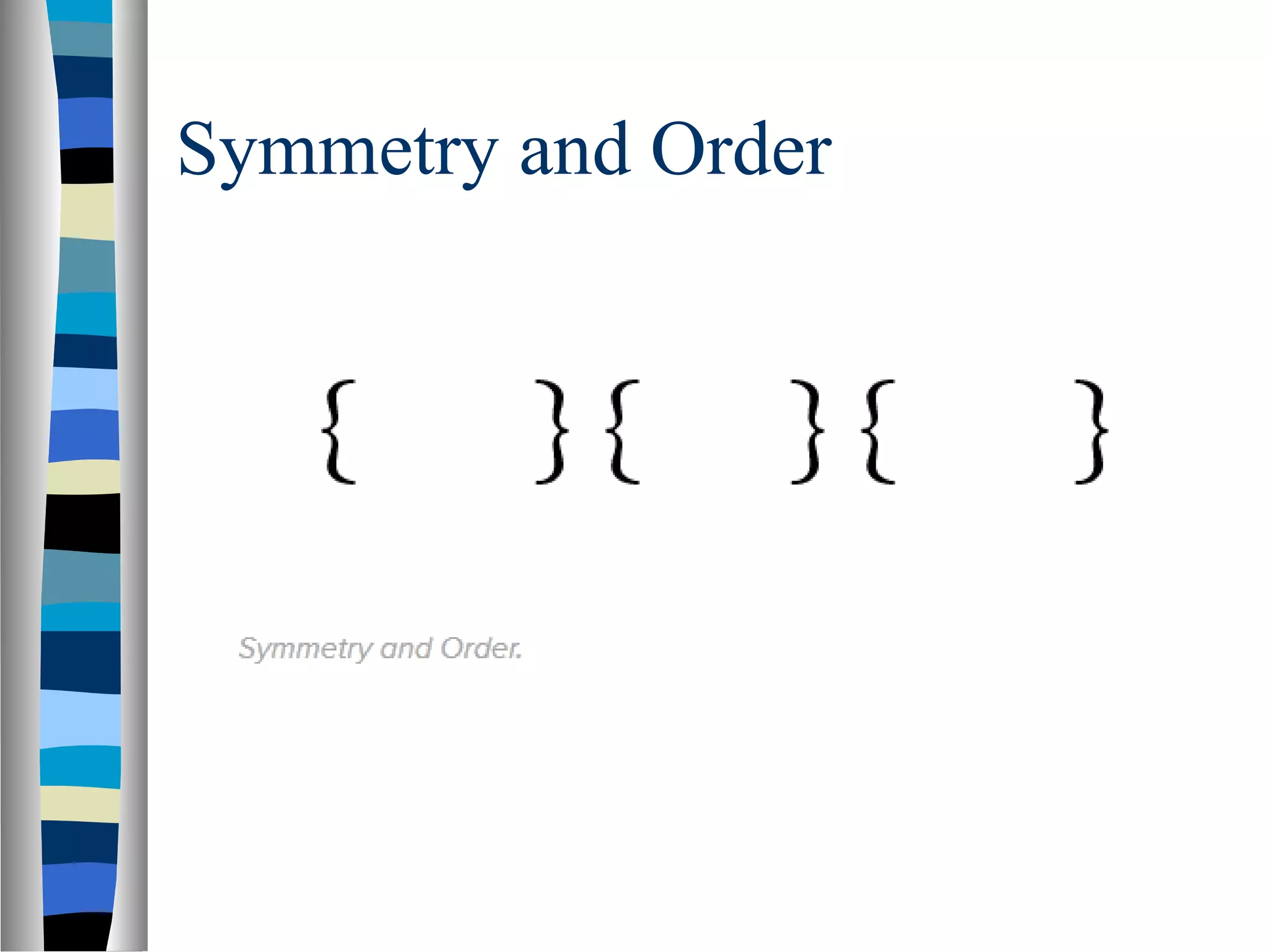
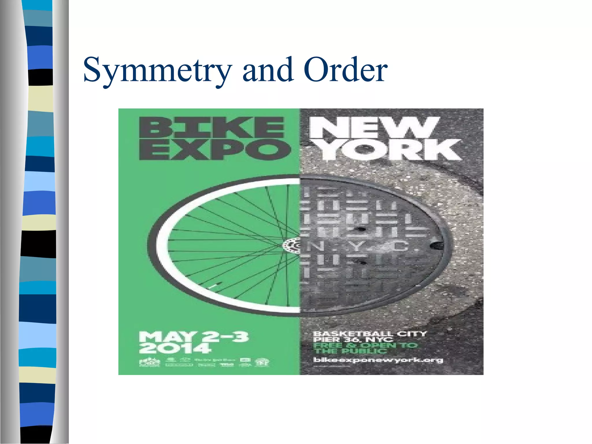
Describes how symmetry offers solidity and order, influencing visual layout perception to convey information efficiently.
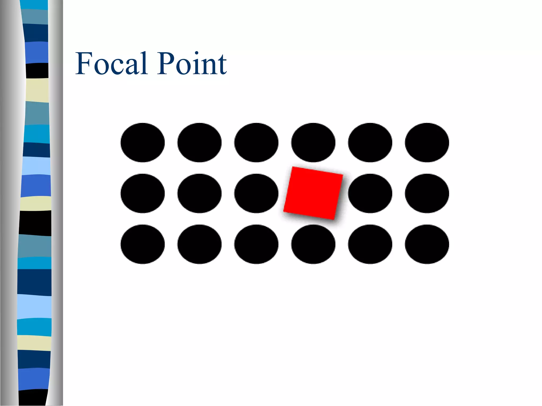
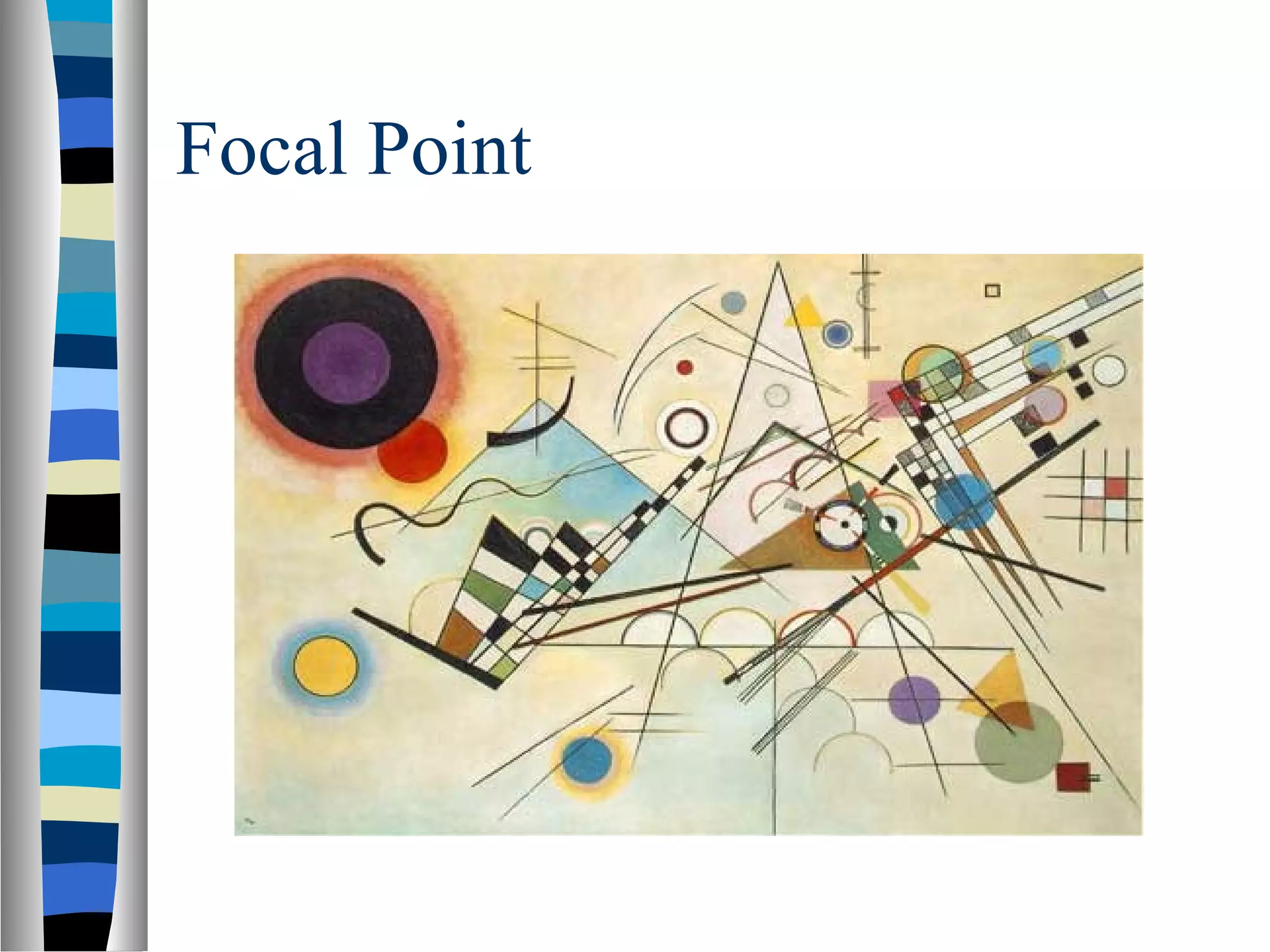
Focuses on the focal point principle, indicating that elements with contrast capture attention effectively.
Provides a link for further reading on Gestalt principles consolidated from various sources.
Visual Perception
Perceptionrefers to how information is acquired
from the environment via the different sense
organs – eyes, ears, fingers.
Eye is the main input channel for a person with
normal eye sight.
The eyes (often) show where the attention is.
Visual perception refers to the brain’s ability to
make sense of what the eyes sees.
Gestalt Laws
Gestalis a German word that roughly means
“shape”, “form”, or “whole”
The Gestalt Laws of Perception helps us to
explain how the human eye perceives objects
or visual elements.
As user interface designers, the laws are
interesting to us because they can help us
better communicate concepts and
relationships that exist in our underlying
conceptual model for the application.
7.
Gestalt Principle
Accordingto Gestalt principle when we are
presented with a complex visual image, our
brain recognize coherent, whole forms,
rather than individually perceiving all of the
smaller constituent parts that make up the
image.
The whole is other than the sum of parts.
Gestalt principles play an important role in
making interfaces usable and easy to
understand.
Figure - Ground
“Elements are perceived as either figure (the
element in focus) or ground (the background
on which the figure rests).”
We have to determine which elements are
figures (requiring immediate concern and
attention) and which are ground (not so
important right now, but do provide
context)
10.
Figure - Ground
In short it allows us to determine what we’re
supposed to look at and what we might safely
ignore.
Foreground objects should be more prominent
than their backgrounds.
Similarity
“Elements thatshare similar
characteristics are perceived as more
related than elements that don’t share
those characteristics.”
Similarity is a powerful mechanism for
communication.
There are many ways in which objects
can be considered to be similar.
We will look at different examples
Similarity
In designingweb pages and applications, its is
important to provide visual clues as to which
interface elements are related to one another.
So users can quickly perceive organization and
make sense of what the designer has created
so that they know how to use or interact with
it.
Similarity
As agraphic designer make use of the law
of similarity, you help viewers scan data
quickly and effortlessly. You can
manipulate their eyes and minds, focus
their attention on small things you want
them to consider important. For example, if
it's a web store design, you group items
together or emphasize the style of how they
appear on a page like in the following
examples:
Proximity- Hype TypeStudio
This is a very simple example which highlights great use
of proximity and white space. Take note how the studio
name (Hype Type Studio) and it’s descriptive text
(Graphic Design + Art Direction) are grouped together.
This makes perfect sense as these three lines all have a
connection to each other — the name of the business
and what the business does.
Now look at the second paragraph — this contains all the
contact information about the business. Again, this is
great use of proximity as this information is all related.
Proximity- Galleri Tema
Thisis a great example of using the principle of
proximity with both type and graphics. The type
is well organised using relationships such as
the name of the movie (A Clockwork Orange)
and the director (Stanley Kubrick). In addition to
this, take note how most of the graphical
elements are grouped together and positioned
on the same side of the layout.
38.
Continuation
“Elements arrangedon a line or curve are
perceived as more related than elements not on
the line or curve.”
Once you look or move in a particular
direction, you continue to look or move in that
direction until you see something significant
or you determine there’s nothing significant to
see.
Common Fate
“Elementsthat move in the same direction are
perceived as more related than elements that
are stationary or that move in different
directions.”
Common Fate
Atooltip can be a useful interface component
and design mechanism.
The user thinks, “the information is relevant to
what he/she is pointing at or hovering over”.
Closure
“When seeinga complex arrangement of
elements, we tend to look for a single,
recognizable pattern.”
Closure is a common design technique that
uses the human eye's tendency to see closed
shapes. Closure seeks simplicity. This
technique is often associated with Logo
design.
Symmetry & Order
“People tend to perceive objects as
symmetrical shapes that form around their
center.”
Symmetry gives us a feeling of solidity and
order, which we tend to seek.
Since our eyes will quickly find symmetry
and order, these principles can be used to
effectively communicate information
quickly.
Symmetry and Order
Inthe following poster for the Bike Expo
in New York, the design concept aimed
for a unified circle as the main focal
point. To create the circle, the designer
portrayed one half as a bike wheel and
one half as a manhole cover. While
different in texture and color, the fact
that they resembled a symmetrical figure
unified them in the eyes of this poster’s
audience.
Focal Point
“Elementswith a point of interest, emphasis or
difference will capture and hold the viewer’s
attention.”
This principle suggests that our attention will
be drawn toward contrast, toward the element
that is unlike the others in some way. In the
image below, your eye should be drawn to the
square. It’s a different shape and colour from
the other elements.
References / Readinglist
http://www.andyrutledge.com/gestalt-princip
(Most from this link)
Editor's Notes
#24 In the example above, the web applications that 37signals offers are shown here using a consistent visual motif. Most conspicuous is the distinct shape and color palette used for the icons, so we immediately perceive that the four bits of information about their web apps are related in some way. If we then read one of the examples, say the top one for Basecamp, we can then immediately assume (correctly) that all of the other entries that are styled and configured in this manner are also web apps offered by 37signals. Here, consistency of styling and presentation indicates consistency of category or context.
Note that this similarity is reinforced by how the apps’ information contrasts strongly with the surrounding content. Because of this contrast and similarity there is no need to structurally “wall-off” these four elements from the surrounding content in order to show their relatedness.
#52 On the right image, you see a panda even though the figure is several random shapes. Seeing the triangle and panda is simpler than trying to make sense of the individual parts.