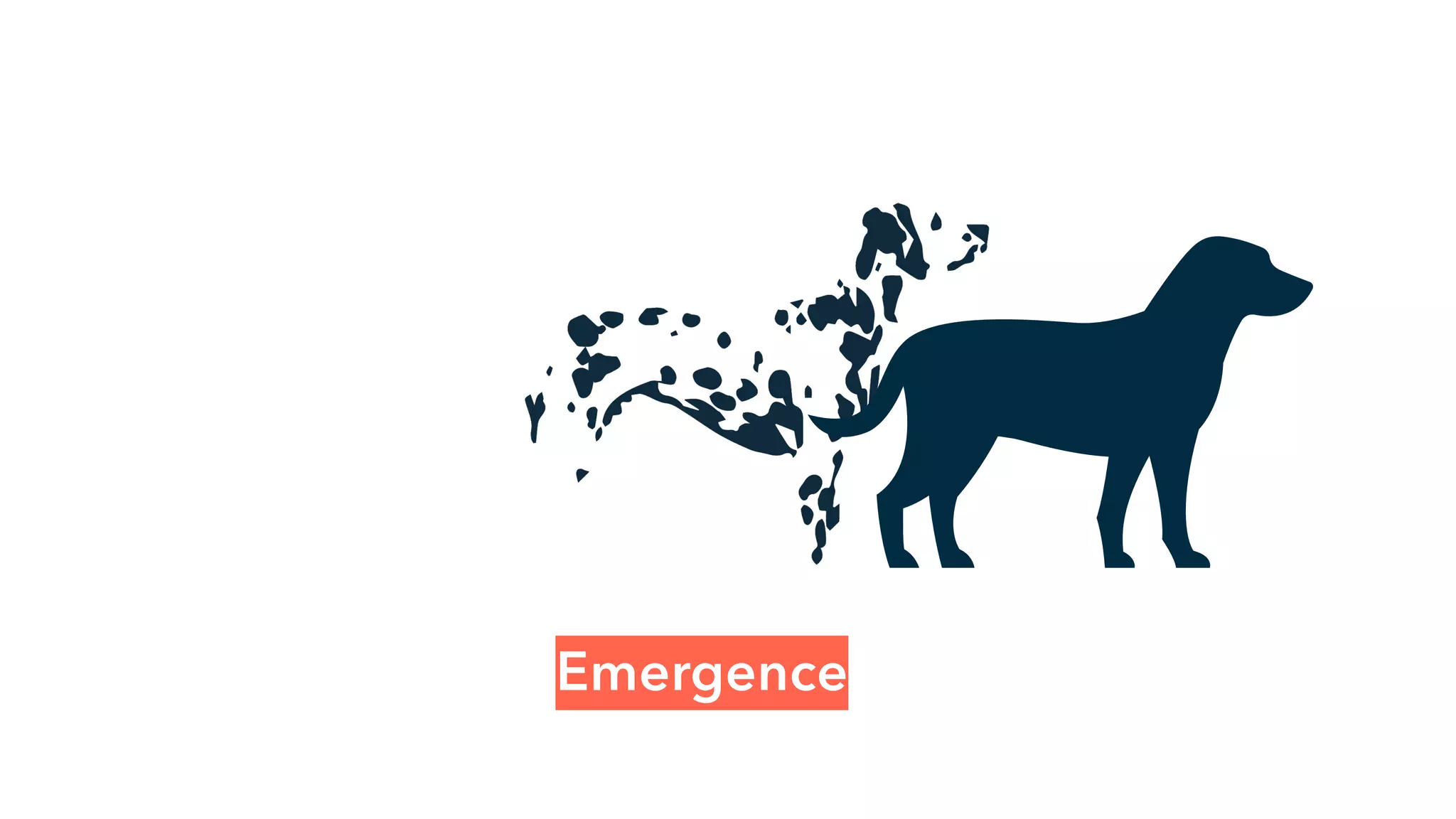
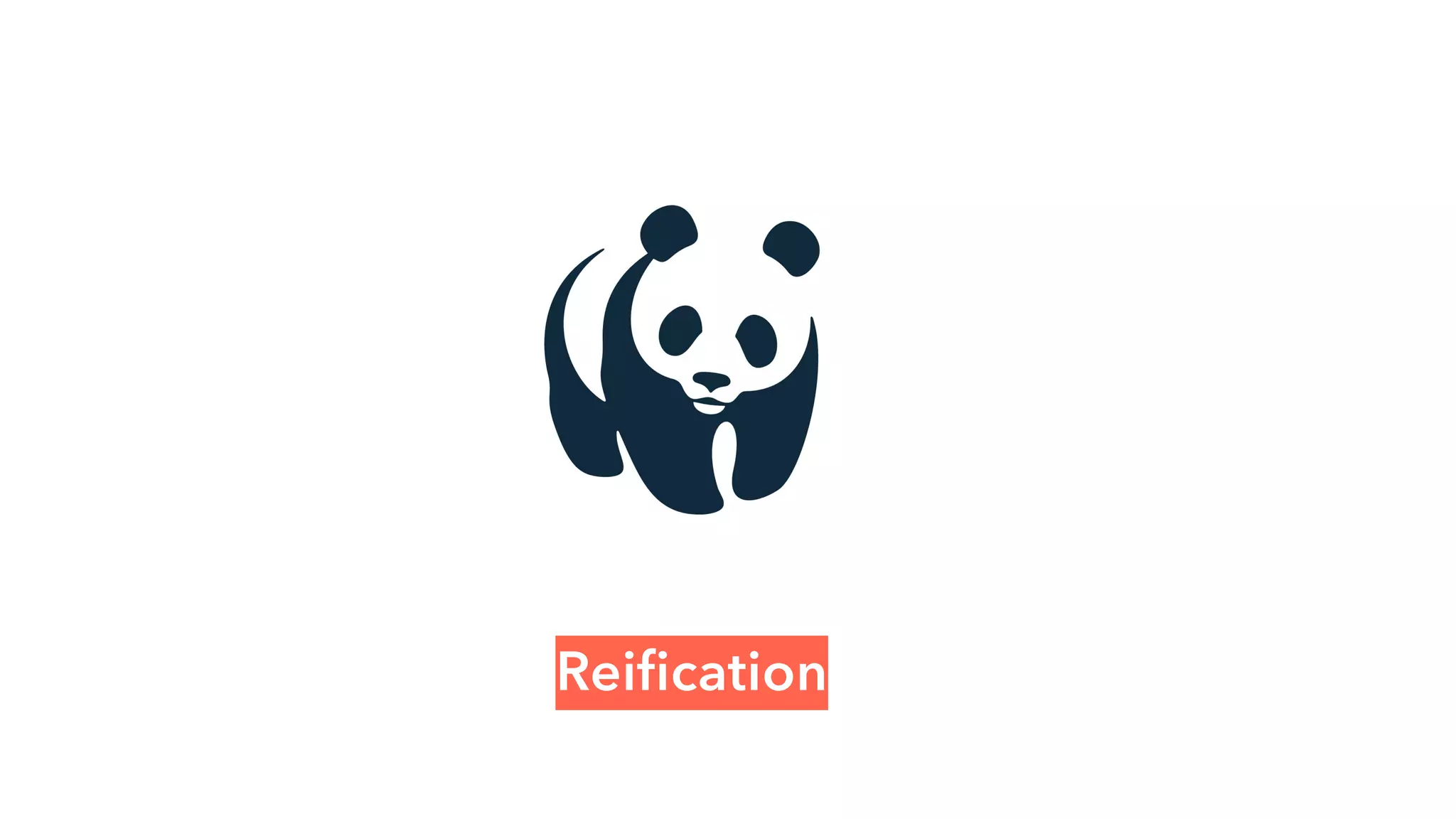
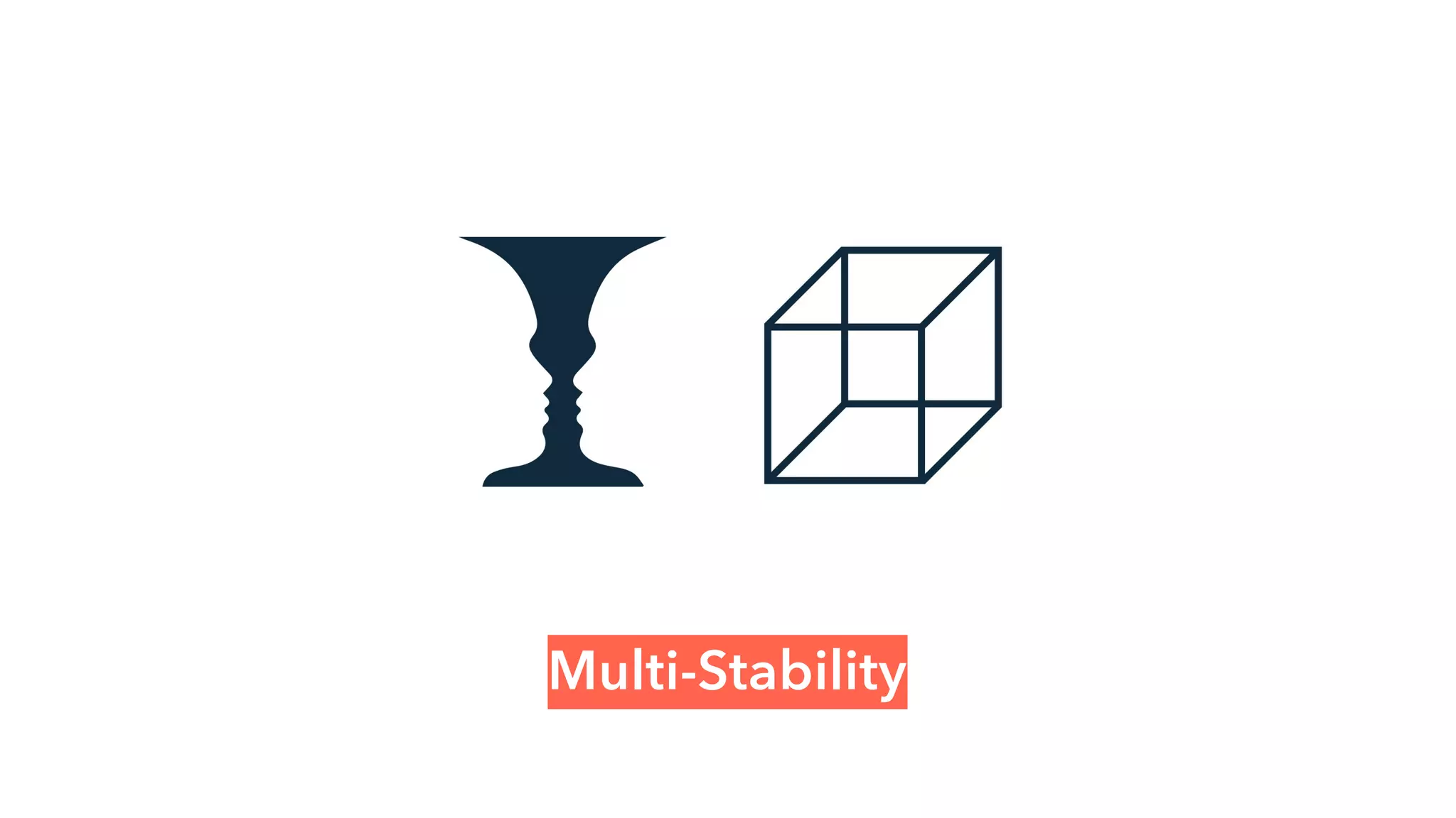
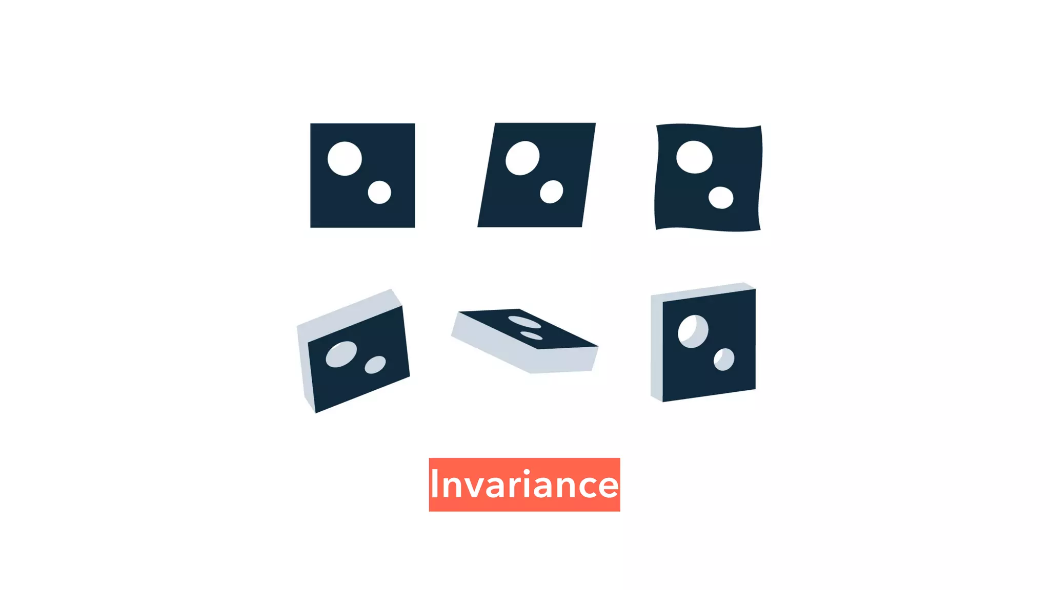
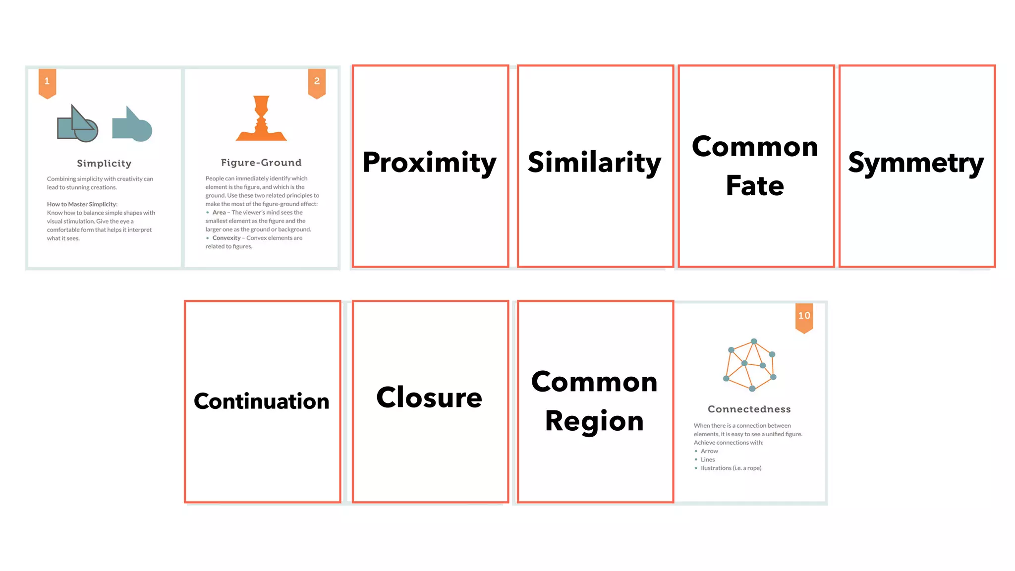
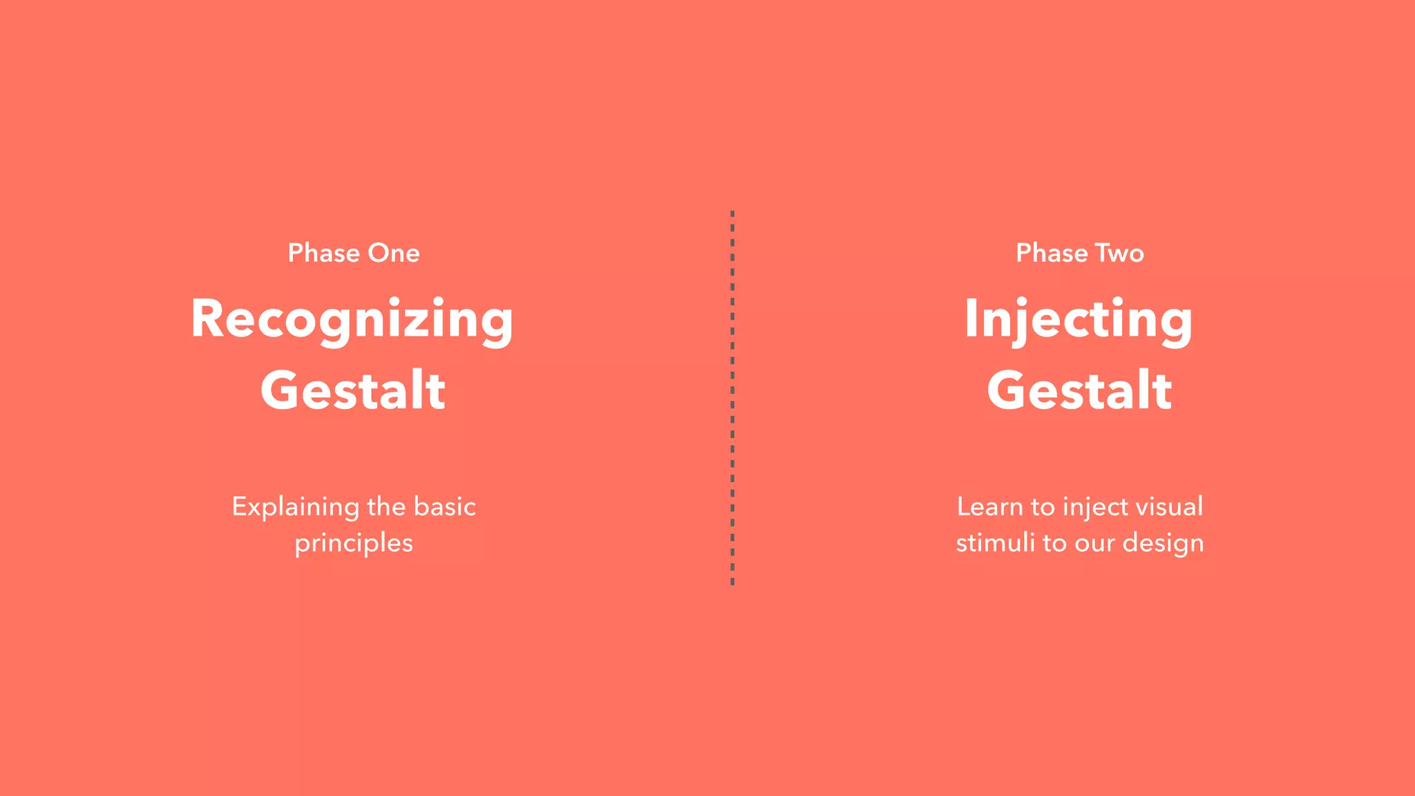
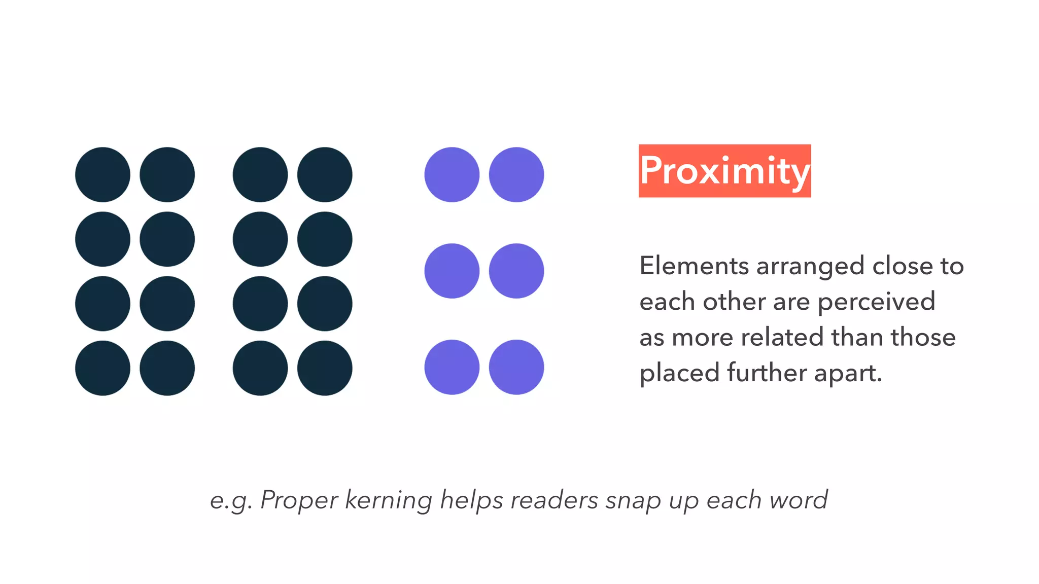
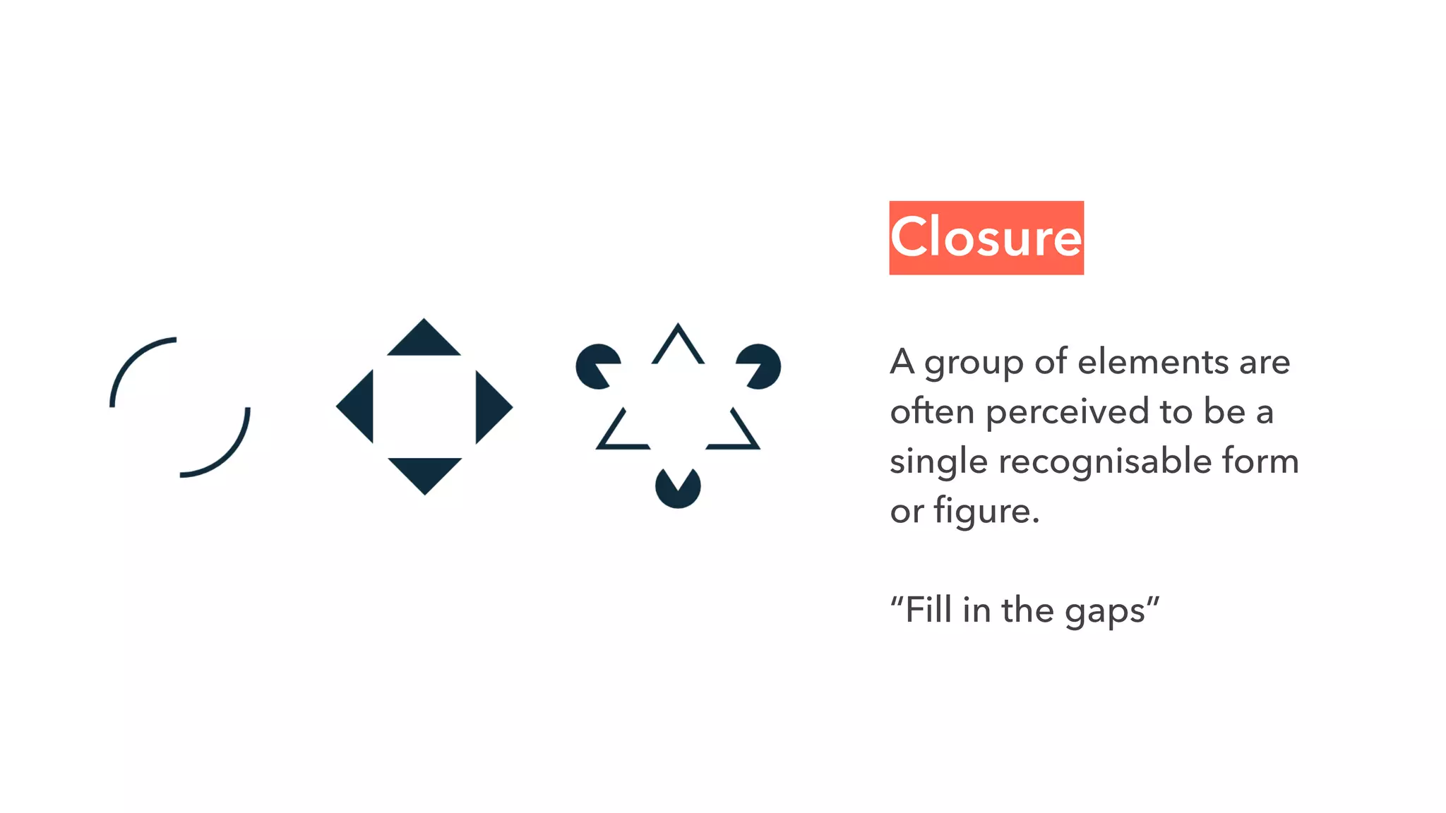
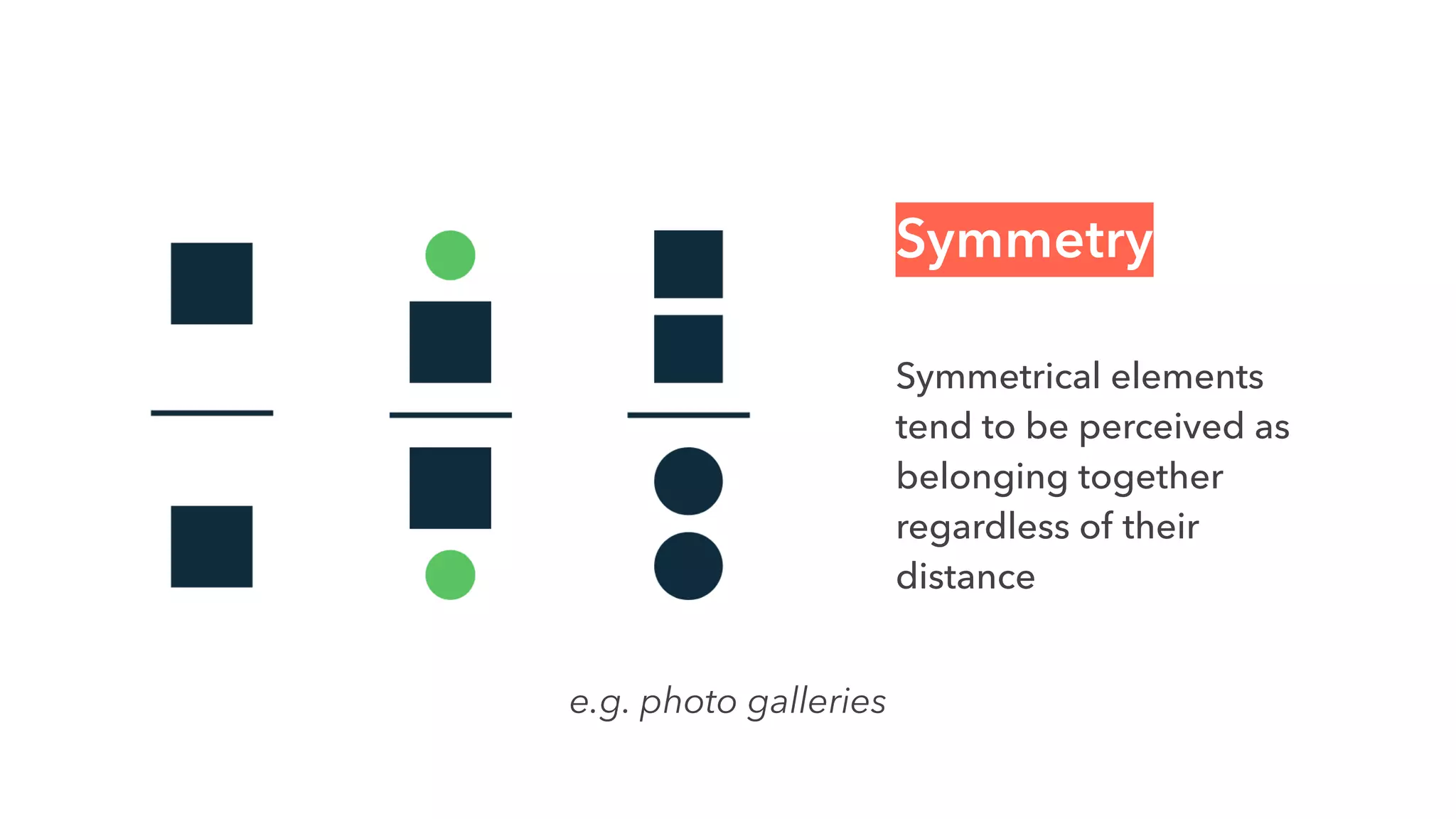
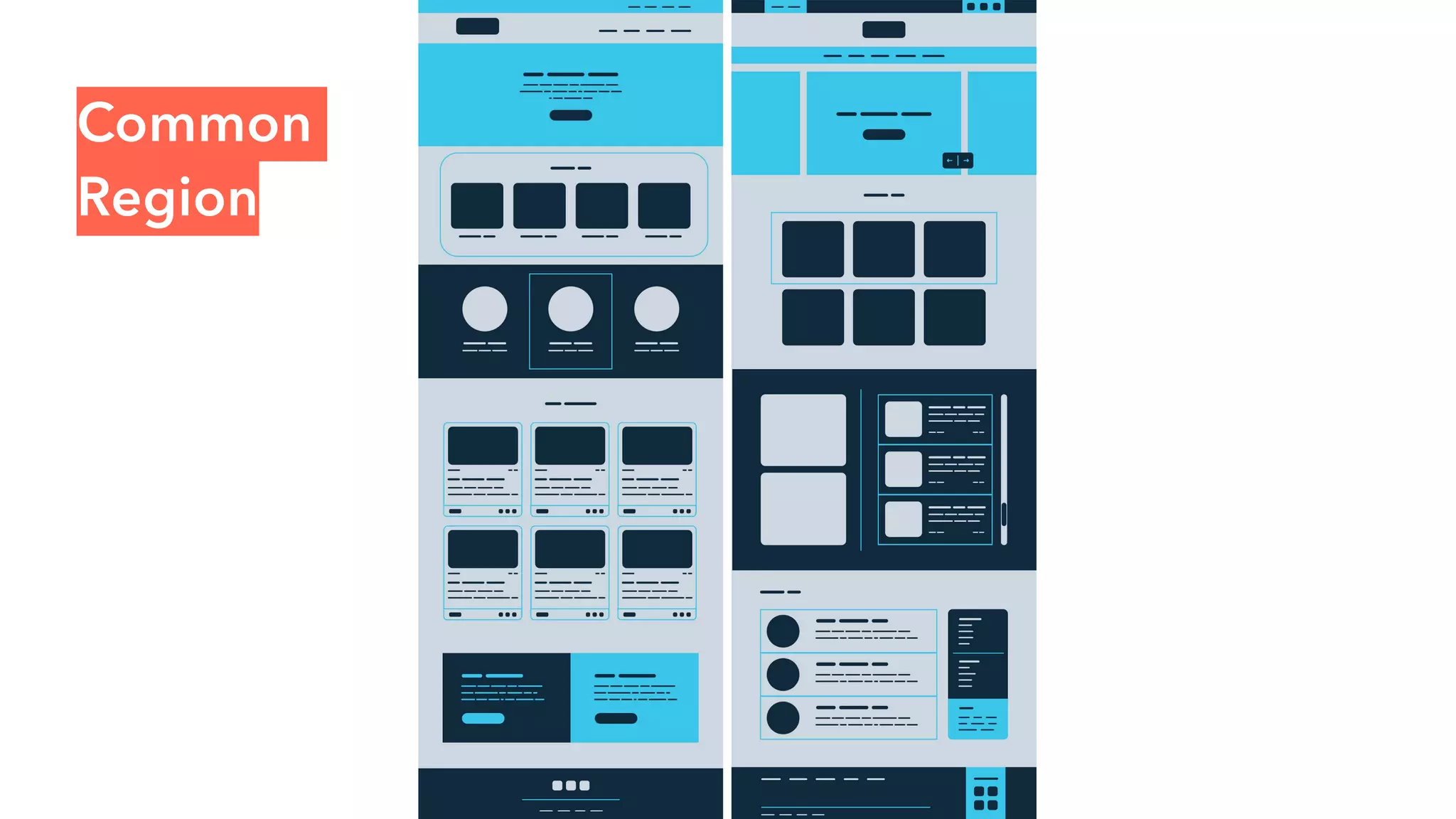
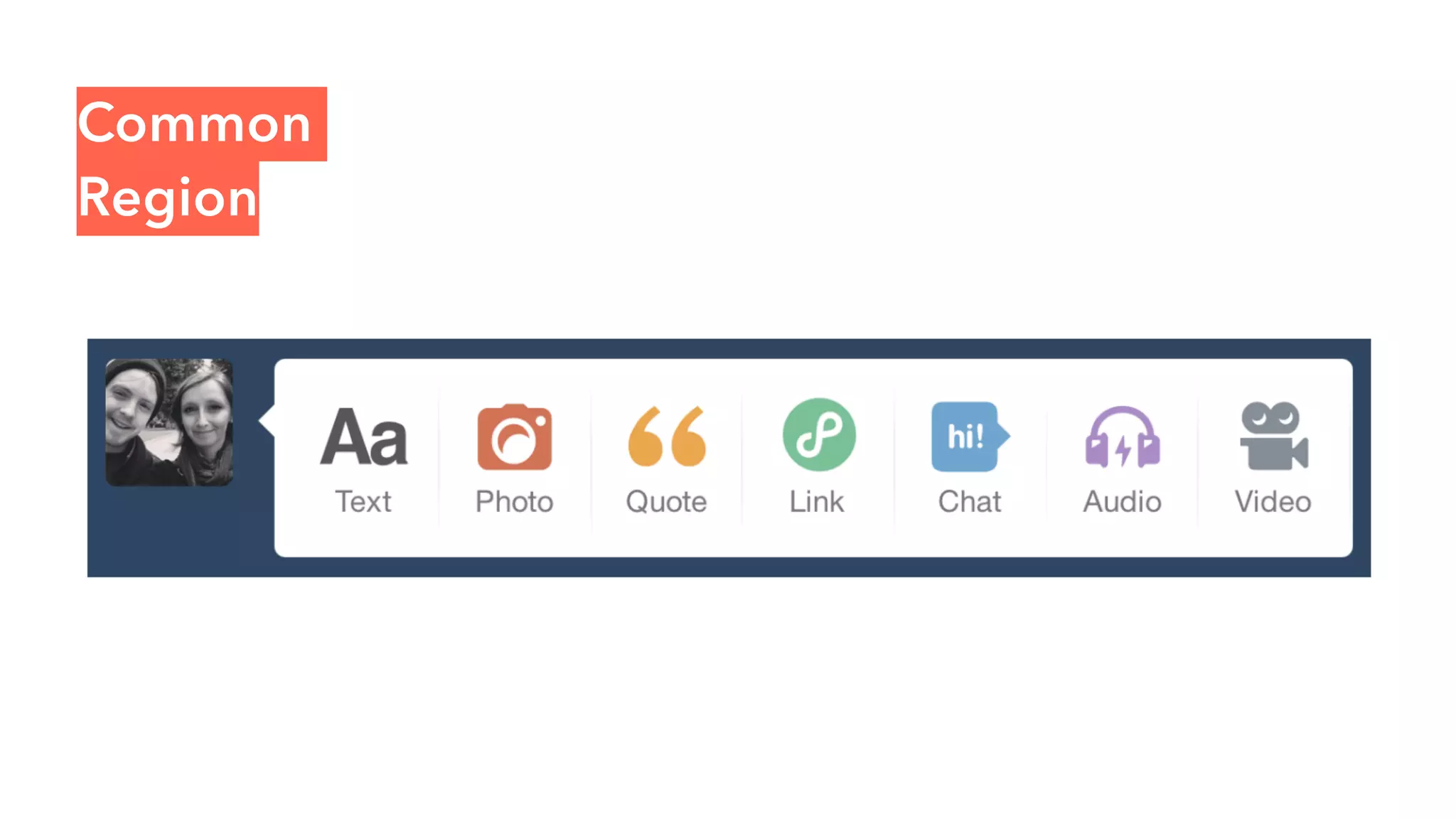
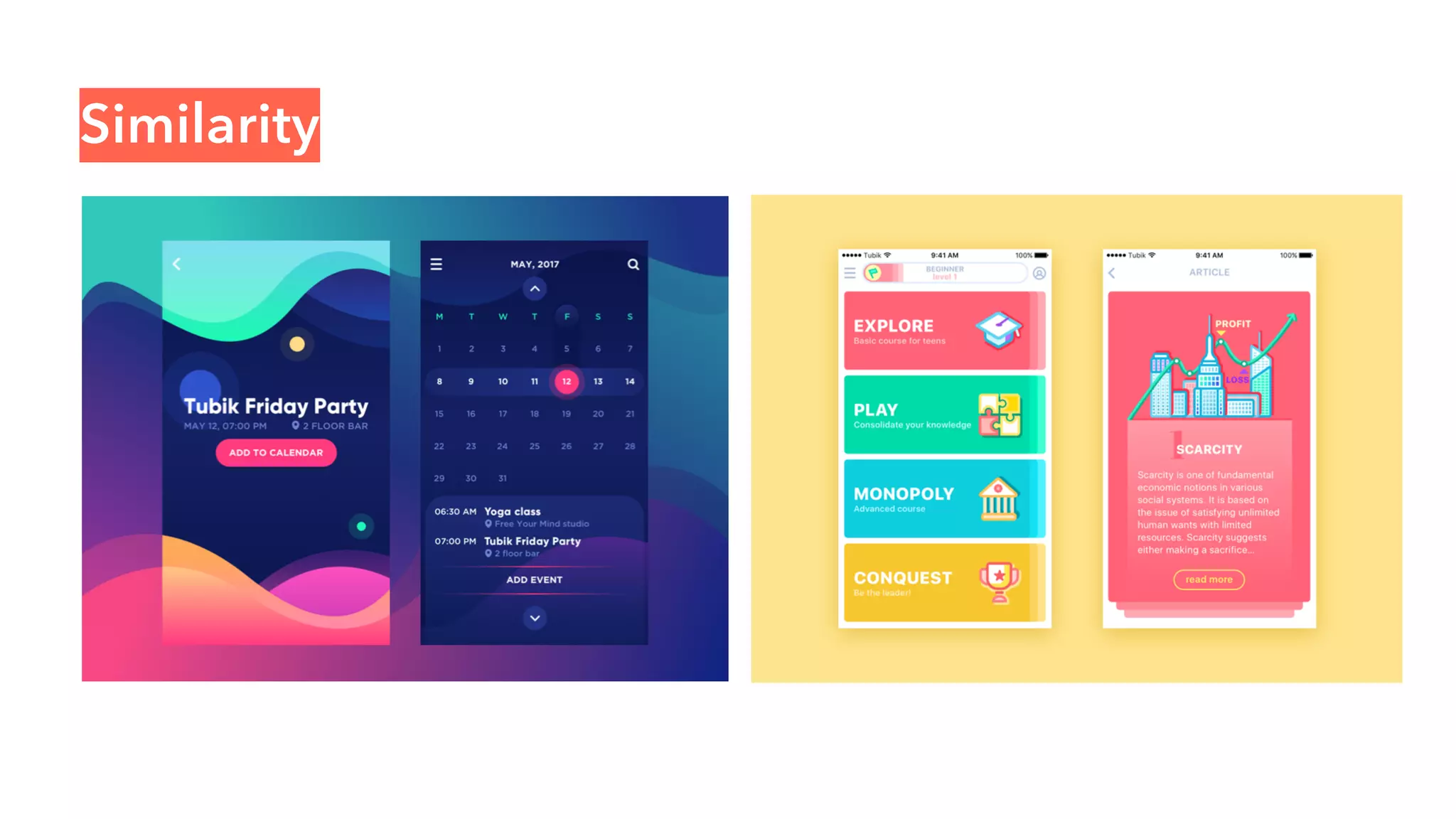
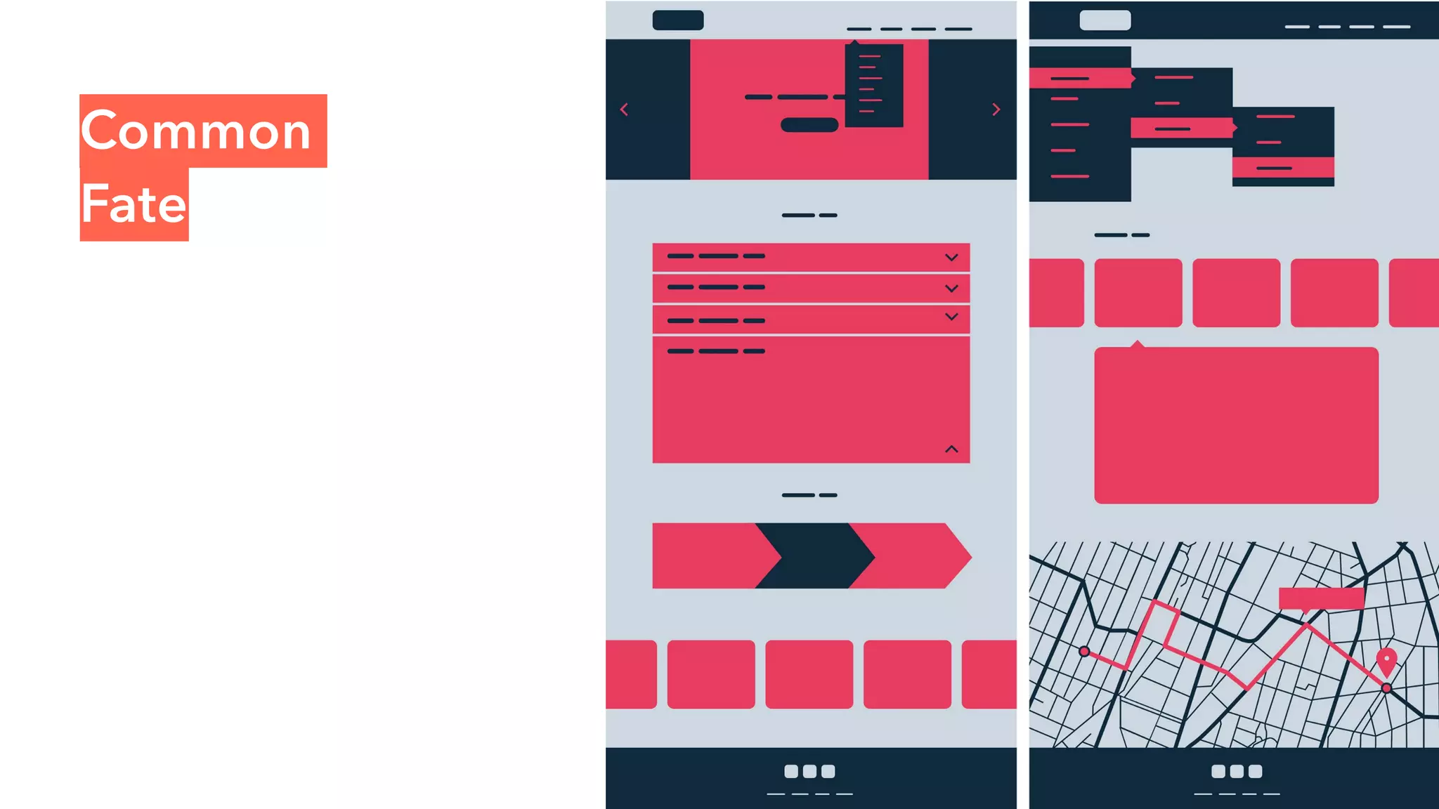
This week Yang Qian and Teesta Das took a brief session on 'Gestalt Theory' during the studio time at the Mdes Graduate Interaction Design class, CCA. We had to also base the teaching time on the studio principle of 'Push Yourself!'
This presentation has all the essential points on “Design Principles for All the
Designers” whether they are web, graphic, video editor, animation, visual effects artist, motion graphic artist, multimedia
designer or from any other design industry e.g. fashion, interior, architectural designing.
This presentation has all the essential points on “Design Principles for All the
Designers” whether they are web, graphic, video editor, animation, visual effects artist, motion graphic artist, multimedia
designer or from any other design industry e.g. fashion, interior, architectural designing.
The way people see a web page or digital design strongly affects its utility and the meaning that they take away. Gestalt principles tell people how to perceive visual objects, what they mean, and how they relate to one another within the user's experience. Design with these principles in mind to meet users' needs and leave a positive impression.
Making Better Designs with Gestalt PrinciplesLucas Glenn
Gestalt Theory is a key ingredient to designing successful products and creating effective, visually pleasing designs. NotProf. Lucas William Glenn BFA/MIB walks you through laws of human perception common to us all, and how to design for those laws.
Designed originally as a Lunch & Learn for his coworkers at FreshGrade.
During the Define stage, you put together the information you have created and gathered during the Empathise stage. This is where you will analyse your observations and synthesise them in order to define the core problems that you and your team have identified up to this point. You should seek to define the problem as a problem statement in a human-centred manner.
This slideshow provides an introduction to graphic design. It illustrates the growth of it, especially during the Web 2.0 age. This was presented by Viraj and Veena, our designers at MindTree Limited.
The slideshow uses images and examples from external sources. The respective owners hold the copyright.
Designing visualisations and dashboards can be a difficult task. It involves working out how to condense large amounts of data into easy to understand visualisations, understanding how the information presented will be used, and even choosing the right kinds of charts.
This presentation covers elements of design thinking, usability, and an understanding of human perception. The goal end goal is to try and enhance the user experience of visualisations and dashboards.
The Elements and Principles of Design A Guide to Design Term.docxtodd701
The Elements and Principles of Design
A Guide to Design Terminology
The elements of design are some of the basic building blocks that make up the design or artwork.
Understanding and using this terminology can help the designer articulate what works and what doesn’t
work in a design, and to think critically about a design on a more conscious level. Combined, the elements
and principles of design can make for a strong, complete and well-established composition. The principles
of Gestalt, which arise from the elements of design, are included at the end of this document. Learning to
use these elements and principles will be the focus of Beginning Design.
The elements of design are: Point, Line, Form, Value, Texture, Shape, Space, Color
(Color is covered in Art 110; we will be focusing on black, white, and gray scale values.)
DEFINITIONS:
A Point is a position in space.
A Line is the path of a moving point. Two points connected make a line. Lines often imply motion, and can
be rendered in a variety of ways. Contour lines or outlines, define the boundary between shapes. Lines can
create texture or value when used in crosshatching. In addition to these types of actual lines, our eyes can
invent implied lines, such as in dotted lines, or where area boundaries describe lines that may not be there.
Shape is a two dimensional form. The variety of possible shapes is endless. Several common ones are as
follows:
• Simple Geometric: circles, squares, triangles are some of the examples.
• Complex Geometric: straight and curved shapes that have more sides and angles.
• Curvilinear: French curves, ellipses, circles and ovals used in combination.
• Accidental: an example of this might be a coffee ring or paint splatters.
Form is a shape with dimension, an object existing in three dimensional space physically or implied.
Value is the tone created by black, white and shades of gray. The value or tone of an element can create
mass, dimension, emphasis or volume.
Texture can be actual or visual.
• Actual texture is tactile: you can feel it by touching it.
• Visual texture are the markings of a two dimensional artwork that imply actual texture.
Space is an illusion or feeling of 3-dimensionality, which can be created in a two-dimensional design in
several ways, for example:
• Overlapping one object in front of another;
• Using differences in value, amount of detail, etc. between elements;
• Using techniques related to linear perspective, such as differences in size or height on page between
elements
The principles of design are: Unity, Variety, Movement, Balance, Emphasis, Contrast, Proportion,
and Pattern.
DEFINITIONS:
Unity or harmony is the quality of wholeness or oneness that is achieved through the effective use of the
elements and principles of design. The most basic quality of a design or artwork, unity gives a piece the
feeling of being an integrated human expression. The princi.
Can AI do good? at 'offtheCanvas' India HCI preludeAlan Dix
Invited talk at 'offtheCanvas' IndiaHCI prelude, 29th June 2024.
https://www.alandix.com/academic/talks/offtheCanvas-IndiaHCI2024/
The world is being changed fundamentally by AI and we are constantly faced with newspaper headlines about its harmful effects. However, there is also the potential to both ameliorate theses harms and use the new abilities of AI to transform society for the good. Can you make the difference?
Book Formatting: Quality Control Checks for DesignersConfidence Ago
This presentation was made to help designers who work in publishing houses or format books for printing ensure quality.
Quality control is vital to every industry. This is why every department in a company need create a method they use in ensuring quality. This, perhaps, will not only improve the quality of products and bring errors to the barest minimum, but take it to a near perfect finish.
It is beyond a moot point that a good book will somewhat be judged by its cover, but the content of the book remains king. No matter how beautiful the cover, if the quality of writing or presentation is off, that will be a reason for readers not to come back to the book or recommend it.
So, this presentation points designers to some important things that may be missed by an editor that they could eventually discover and call the attention of the editor.
Transforming Brand Perception and Boosting Profitabilityaaryangarg12
In today's digital era, the dynamics of brand perception, consumer behavior, and profitability have been profoundly reshaped by the synergy of branding, social media, and website design. This research paper investigates the transformative power of these elements in influencing how individuals perceive brands and products and how this transformation can be harnessed to drive sales and profitability for businesses.
Through an exploration of brand psychology and consumer behavior, this study sheds light on the intricate ways in which effective branding strategies, strategic social media engagement, and user-centric website design contribute to altering consumers' perceptions. We delve into the principles that underlie successful brand transformations, examining how visual identity, messaging, and storytelling can captivate and resonate with target audiences.
Methodologically, this research employs a comprehensive approach, combining qualitative and quantitative analyses. Real-world case studies illustrate the impact of branding, social media campaigns, and website redesigns on consumer perception, sales figures, and profitability. We assess the various metrics, including brand awareness, customer engagement, conversion rates, and revenue growth, to measure the effectiveness of these strategies.
The results underscore the pivotal role of cohesive branding, social media influence, and website usability in shaping positive brand perceptions, influencing consumer decisions, and ultimately bolstering sales and profitability. This paper provides actionable insights and strategic recommendations for businesses seeking to leverage branding, social media, and website design as potent tools to enhance their market position and financial success.
You could be a professional graphic designer and still make mistakes. There is always the possibility of human error. On the other hand if you’re not a designer, the chances of making some common graphic design mistakes are even higher. Because you don’t know what you don’t know. That’s where this blog comes in. To make your job easier and help you create better designs, we have put together a list of common graphic design mistakes that you need to avoid.
13. What happens when someone’s eye
meets your design creations?
How does their mind react to the
message your piece is sharing?
Laura Busche, Brand Content Strategist at Autodesk
23. Proximity
Elements arranged close to
each other are perceived
as more related than those
placed further apart.
e.g. Proper kerning helps readers snap up each word
30. Common Fate
Elements moving towards
the same direction are
perceived as more related
than those moving in
different directions, or not
moving at all.
e.g. vertical scrolling + horizontal scrolling
59. The form of an object is not more
important than the form of the space
surrounding it. All things exist in
interaction with other things.
In music, are the separations
between notes less important than
the notes themselves?
“
”
Malcolm Grear