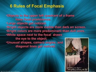
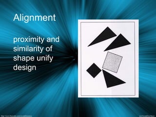
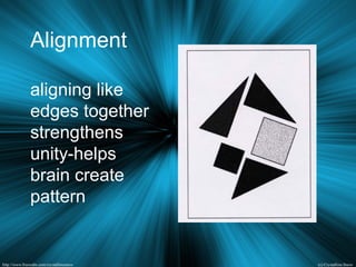
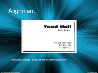
Downloaded 17 times


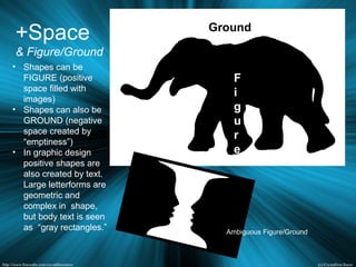
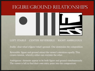


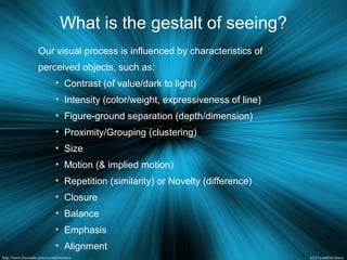


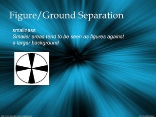
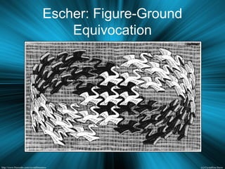
![Figure/Ground Separation
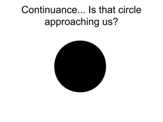
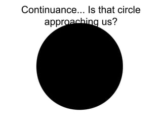
the simplest and most stable interpretations are favored.
an object [form] is differentiated from its
surroundings [context, background] by
positive/negative space juxtaposition
the object must peel of its context to see
it as a separate form
if object can not be seen as an organized
structure, it can not be separated from its
context](https://image.slidesharecdn.com/gestaltsingleimagecomposition-151016161905-lva1-app6891/85/Gestalt-amp-single-image-composition-for-designers-42-320.jpg)


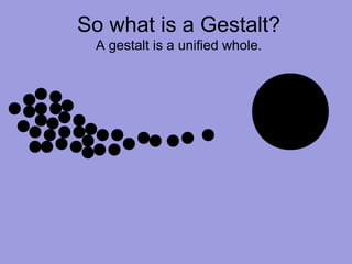
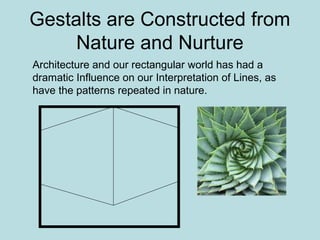
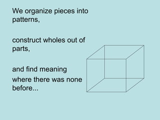
This document discusses the key principles and elements of design, including how design purposefully manipulates viewers through visual cues and psychology. It outlines various gestalt principles like proximity, similarity, closure and continuity that influence how we perceive designs. The basic design elements of line, shape, color, texture and other elements are also examined. Overall, the document provides an in-depth overview of design fundamentals and how visual communication works on a psychological level.