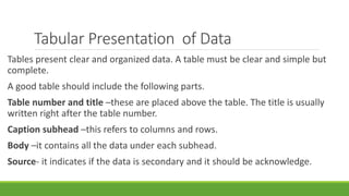
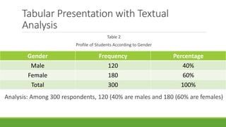
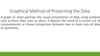
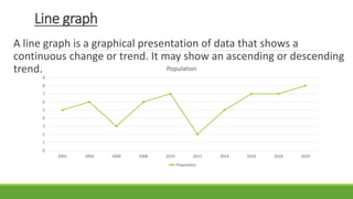
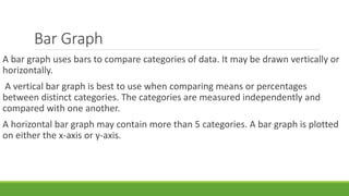
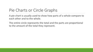
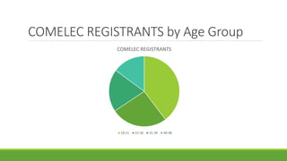
2. INTRODUCTION
To be able to create and present an organized picture
of information from a research report, it is important
to use certain techniques to communicate findings
and interpretations of research studies into visual
form. The common techniques being used to display
results are tabular, textual and graphical methods.
3. TEXTUAL PRESENTATION OF DATA
Textual presentation use words, statements or paragraphs with
numerals, numbers to describe data.
Example:
◦ There are 42, 036 barangays in the Philippines. The largest barangay in
terms of population size in Barangay 176 in Caloocan City with 247
thousand persons. It is followed by Commonwealth in Quezon City (198,
295) and Batasan Hills in Quezon City (161, 409). Twelve other
barangays posted a population size of more than a hundred thousand
persons.
4. Tabular Presentation of Data
Tables present clear and organized data. A table must be clear and simple but
complete.
A good table should include the following parts.
Table number and title –these are placed above the table. The title is usually
written right after the table number.
Caption subhead –this refers to columns and rows.
Body –it contains all the data under each subhead.
Source- it indicates if the data is secondary and it should be acknowledge.
5. Example of a good table
Table 1
Ages of individuals in Various Employment Sectors
Employment Sector 18-25 Age
Group
26-35 Age Group 36-45 Age Group
Agriculture 3 8 12
Education 10 15 15
Health 15 28 35
Law 3 5 6
Manufacturing 15 23 32
Retail 30 12 8
Others 25 16 10
6. Tabular Presentation with Textual
Analysis
Table 2
Profile of Students According to Gender
Gender Frequency Percentage
Male 120 40%
Female 180 60%
Total 300 100%
Analysis: Among 300 respondents, 120 (40% are males and 180 (60% are females)
7. Graphical Method of Presenting the Data
A graph or chart portrays the visual presentation of data using symbols
such as lines, dots, bars or slices. It depicts the trend of a certain set of
measurements or shows comparison between two or more sets of data
or quantities.
8. Line graph
A line graph is a graphical presentation of data that shows a
continuous change or trend. It may show an ascending or descending
trend.
0
1
2
3
4
5
6
7
8
9
2002 2004 2006 2008 2010 2012 2014 2016 2018 2020
Population
Population
9. Bar Graph
A bar graph uses bars to compare categories of data. It may be drawn vertically or
horizontally.
A vertical bar graph is best to use when comparing means or percentages
between distinct categories. The categories are measured independently and
compared with one another.
A horizontal bar graph may contain more than 5 categories. A bar graph is plotted
on either the x-axis or y-axis.
11. Pie Charts or Circle Graphs
A pie chart is usually used to show how parts of a whole compare to
each other and to the whole.
The entire circle represents the total and the parts are proportional
to the amount of the total they represent.