
Recommended
More Related Content
What's hot
What's hot (20)
Similar to Typography, Design & Genre Theory Analysis of Rapper Tee Grizzley's Website
Similar to Typography, Design & Genre Theory Analysis of Rapper Tee Grizzley's Website (20)
More from maria_angelova2808
More from maria_angelova2808 (20)
Recently uploaded
Recently uploaded (20)
Typography, Design & Genre Theory Analysis of Rapper Tee Grizzley's Website
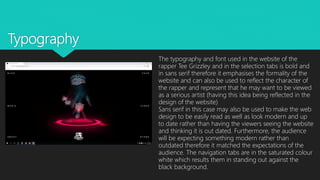
- 1. Typography The typography and font used in the website of the rapper Tee Grizzley and in the selection tabs is bold and in sans serif therefore it emphasises the formality of the website and can also be used to reflect the character of the rapper and represent that he may want to be viewed as a serious artist (having this idea being reflected in the design of the website) Sans serif in this case may also be used to make the web design to be easily read as well as look modern and up to date rather than having the viewers seeing the website and thinking it is out dated. Furthermore, the audience will be expecting something modern rather than outdated therefore it matched the expectations of the audience. The navigation tabs are in the saturated colour white which results them in standing out against the black background.
- 2. Having this style of design and location of the selection tabs makes the website go against the usual genre conventions however it makes it look more effective. This related to the genre conventions theory of Steve Neale which recognises the repetition and difference of genre conventions used. His theory explains how there is a specific pattern of genre conventions established for example in this case the usual design however he recognises how these already established genre conventions do not neccessarily have to be conformed but some people can go against them and the difference is essential to the economy of genre. Therefore having Tee Grizzley`s website not conforming to these usual genre conventions makes the website appeal to the audience as it is different than the usual and makes it look more interesting. The design consist the selection tabs being directed and located on the left and right hand side of the website page rather than than having them located in the usual way which is at the top of the page. Theory related & design
- 3. In the image, the artist is establishing a direct mode of address which forms a relationship between the artist and the viewer of the website. Furthermore, the direct mode of address makes the artist look quit hard and dangerous in the sense of portraying him to the viewers as a serious and a successfull rapper. On the left hand side of his head there are flames used which furthermore emphasises the idea of him being dangerous which could encourage the viewers of the website to listen to his music. Image
- 4. The image used in the 1st page of the website stands out as a result of the saturated colours used on it such as the silver jewellery and the watch on the rapper`s hand. In the image we can see that the rapper has his hand pressing down a button that is flashing in bright red saying ``activated``. The fact that his hand is pressing down the button can be used in order to represent his influence upon the music industry and his dominance. Furthermore, the jewellery and the watch are quit big and therefore are used in order to portray and emphasise the wealth of the rapper and therefore link to the success in his career in the music industry. The bright red flashing button can be demonstrating that he has released a new song and therefore the audience should press on it to listen to it. The image is also located in the centre of the website which can therefore suggest the importance of the rapper. Image
- 5. As the rapper is a male and comes from a black ethnic background from America from the website we may recognise that his music may mainly be targetted at black males. This can also be a result of the way he is portrayed which is in a very strong, serious and masculine rather than in a soft way which relates more to the male demographic rather than female. Furthermore, it will appeal mostly to the black demographic as black males are usually stereotyped to be into and listening to this kind of rap music and style. Most black males come from a working class background therefore the website may appeal and be targetting the working class demographic furthermore because of the type of music which is advertised in the website which is rap. Context
- 6. The colours used are very contrasting to each other therefore they make each aspect of the page stand out and be clearly seen or read. For example the main colours used in the page are black, white, silver and bit red in the image. Each colour has an attached meaning and a symbolism to it. The silver symbolises the wealth and richness of the rapper, the red implies that he is a powerful person as well as implies the danger he creates and the black is associated with the formality and the seriousness of the artist. The white can however he used to symbolise purity and therefore the positive and bright side of the rapper rather than having the viewers of the website only assuming that the rapper is tough. Colours
- 7. The logo of the rapper is a grizzley bear and it is situated at the bottom of the website`s first page. Once again the logo is in white and is clearly visible against a black background. The bear in the logo can be used in order to compare the rapper to a powerful warrior and therefore suggests that he is striving in his career as he is working and looking for personal success. Bears are mostly associated with a warrior spirit and prosperity which is what the rapper consists of as a character. This connotations associated with bears furthermore shows how the website can be targetting a male demographic as the bear is a powerful animal and the animal is also linked to physical strength related to the male gender. Logo