dusjagr & nano talk on open tools for agriculture research and learning
Analysis of digipack a2 media
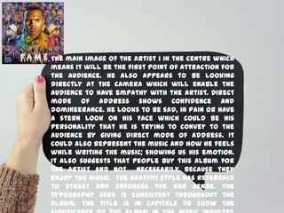
1. The main image of the artist i in the centre which
means it will be the first point of attraction for
the audience. He also appears to be looking
directly at the camera which will enable the
audience to have empathy with the artist. Direct
mode of address shows confidence and
domineerance. He looks to be sad, in pain or have
a stern look on his face which could be his
personality that he is trying to convey to the
audience by giving direct mode of address. It
could also represent the music and how he feels
while writing the music; showing us his emotion.
It also suggests that people buy this album for
the artist and not necessarily because they
enjoy the music. The graffiti style has reference
to street and enforces the RnB genre. The
typography used is consistent throughout the
album. The title is in capitals to show the
2. The background image is very focused on
the artist, the collage of images used are
very colourful which will attract the
audience to look at the cover and will
attract a younger audience demographic . It
could also be him trying to get across to
the audience that there are many different
people within him, for example, the dancer
or the actor which widens the demographic
to RnB fans too. The graffiti style continues
through to the artists name in the right
third in the bottom corner; being in the
right third would mean that it is one of the
first things that you would expect to see
however it is disguised because of the size
and position meaning that he doesnt need his
name there big and bold for people to
3. Yet another picture of the artist, although
this time a wide shot of him indicates that he
wants to be marketed and known for his
iconography. The metal mask could suggest
that he has to put a brave face on or that he
is too exposed and wants to hide his emotion
which contradicts the front cover directly.
This could be linked to his history about
becoming famous such as the trouble he had
with his girlfriend Rihanna ; the mask could
therefore symbolise the shame and the fact
that he wants to his from his past or maybe
just that he wants to hide his past from the
public. The wide shot shows all of his body
which is more formal compared to the
4. The back cover contrasts completely
to the front cover in terms of
costume, which is casual on the front
cover and colourful compared with
black and formal on the back; and
mode of address which on the front is
direct and on the back we cannot see
his face. The black font on the back
isn’t in the graffiti style which
enforces the point of view that this
album is showing all different aspects
of Chris Brown’s personality. It is
black to contrast with the pink so
5. The black on the white creates a very strong
contrast meaning that it stands out to the
audience grabbing their attention just by the
colour. It could also be another personality
of the artist through colour, for example,
back and white usually have connotations
with a suit or a formal dinner and being
smartly dressed. It could also show that
there is a battle between the personalities
due to black and white usually representing
evil and good. His stance also shows that
there could be some kind of struggle going on
inside himself. The long shot allows us as the
audience to see his body language which
could remind the viewer of Michael Jackson
especially because of the costume and stance
but also relating back to the colour and idea
6. The main image is quite obscure because of
the camera angle, pose of the artist and
the prop used. We can only see his nose
and lips which could imply he has a secrets
that his eyes would reveal if we saw them.
This is reinforced by the colour scheme;
greys and blacks have connotations with
mystery and hidden secrets which could
symbolise the artists songs on this album.
Going against the conventions of RnB music
this cover doesn’t consist of ‘bling’ or
materialistic things which could
represented his background story and
explain that he had nothing and he has
worked for what he has not but he still
7. He is portrayed as very masculine here which
will appeal to a wider audience demographic
which will then include girls because of the
sexual appeal. The background is all black so
that any lighter parts on the image stand out so
that we as an audience can see the figure. The
costume is very urban which could suggest that
this is the life style he leads and this is his
inspiration for his music. Direst mode of
address is still used even though we cannot see
his eyes and therefore empathy is created for
him as the audience sees the cover. The font
used at the top of the digipack covers all
thirds and because it is at the top it is the first
thing that the viewer will look at which will
reveal who the artist is . The artists name,
although unusually it is the same size as the
album name is it highlighted by being a crisper
8. The house style is kept throughout by using a black
background with a contrast of white writing. The
simple design could imply that he feels that he
doesn’t need to show off about his high status
within the music business for his album to sell
because of his loyal fans. It could also emphasise
that he came from nothing working his way to the
top and showing that you don’t need fancy things to
become your dream and become something amazing
like a world wide singer.
The colour scheme could also imply
sophistication because it has connotations with
black and white dinner parties and smart events.
The artist is also promoted with his record label
being shown and the website for it. Again the white
font is used, all in capitals to create consistency
and to try to get the artists personality over to
the audience demographic. Culturally the use of
capitals in text conveys importance and/or
significance.
9. The same typography is used here,
again to give the artist their own
iconography and create consistency
throughout the album. The font is
capitalised again and is aligned in the
centre third t create some symmetry
and make the reader focus their
attention to the songs to try and
influence the audience to buy the
album. It implies that the music should
be the centre of attention and not the
artist as a ‘brand’.
10. This digipack is very colourful using vibrant
colours to attract the audience’s attention.
The colours have a youthful feel to them
because of the vibrancy meaning that the
target audience demographic are more
likely to be younger. There are a range of
colours here however they are all blended
or smudged which could mean that Cheryl
Cole is moving to fast and unsure of where
she is going. This is emphasised in the album
name with the use of the word ‘messy’ which
could be describing her life and/or career,
which, metaphorically, are the raindrops.
The main image is very powerful and due to
her facial, we can see the RnB genre appear
because of the attitude, in contrast to the
11. The body language of the artist suggests that
she in thinking or sad about something and
almost that she has given up which emphasises
the point states earlier about the use of the
word ‘messy’. To further explore the RnB side
of this album cover, her costume consists of
gold and leapod print which all suggest
wealth which plays a large part in RnB music.
The image falls across two thirds of the
cover implying dominance over the cover and
over the music industry. She also has her legs
on show here which will create a sexual
appeal for men which in turn will widen the
audience demographic. The typography used
compliments the words, especially ‘messy’
because of the hand written feel. It is slanted
12. The back cover doesnt have an image of the artist
on however the colour scheme is carried on
throughout. Her name is not featured on the front
and is only seen here, in the first third of the
back cover. If looking at the back, and also
because it is the largest thing on the back, the
audience’s attention will be brought here which
will market the artist. Because it is on the back it
suggests that the artist is confident enough to be
recognised without need for a name on the front
cover showing domineerance within the music
industry. The writing is in mainly lower case
letters, again implying that this album is
targeted at a younger audience demographic. Also
featuring in the same first third on the bcak is the
track list showing that the artist believes that
the music is just as importand at the atrist name
as a brand name. The colour of the font shows
13. Rihanna’s album loud features an extreme close up
as the main image on the front cover and the back
cover which consist of the same image. The artist
has her eyes closed and her moth slightly open
which is seen as a sexual pose, this will mean the
appeal of men which in turn will widen the
audience demographic and make it more likely for
men to buy the album. This is because they will
assume that the music will all have this a sexual
feel. Her lips are red, as is her hair and there is an
all round rosé effect on the image, this all has
connotations of passion and love which will
symbolise what the artists music is like. We can
also not see any clothes in the main image here and
the audience will therefore all assume that she
isn’t wearing any. the artists name is at the top
and covers all three thirds with large gaps in
between letters, this implies that it is slow and
14. Both the artist name and album name are in
capitals however ‘Rihanna’, although at the top
and therefore is one of the first things we see
,due to the target audience on average reading
top to bottom, is smaller in comparison to the
album name which is very unusual in the
conventions of an album cover. They are also
both faint and the same font to result on the
main image of Rihanna take dominance over the
whole album, because it is such a strong image.
This album includes a booklet which is a wide
high angle shot. The artist is posing in a very
sexual way here to and the viewer is able to see
her cleavage and part of her stomach which will
also appeal to the sexual nature of men. This
image covers three different sections and the
artist covers the first and middle third. The disk
is a slightly lighter image of a rose which will
appeal to the younger target audience
15.
16. The text used here is extremely simple. the artist and
album name is located on each of the components of
the album; the CD and both covers. Beyonce's name is
positioned at the top of each of the components which
maintains the house style and it stretches over the
whole of the top of the front and back cover so that
it is not only the first thing that the audience will
see, it is also the biggest and boldest making it eye
catching for the audience which, in turn will increase
sales. Because the target audience demographic are
more likely to be attracted to the artist name
instead of the album name the album name takes
more of a background position; hens it is positioned in
the lower right hand corner. The track listing is
positioned on both the back cover and the disc which
is uncommon although effective because many people
could misplace the cover and have the CD's lying
round, this would mean that the image of Beyonce,
her name and the track list is still available to the
17. The house style is maintained throughout
because the same front is used on each of
the components: sans sarif font, also
maintaining the simplicity. The colour of
all of the font is black which contrasts
the muted which background. the track
listing on the back cover is in italics which
adds an effective contrast to the other
font used in order to not make the album
look boring. The rule of thirds has been
applied effectively to this digipack. On all
of the components Beyonce is located in
the left third which means that it will be
the first thing that the audience will look
at because we, as an audience, read left to
right. The album name is always seen
located in the right third. The artist name
is located either in the middle third or
18. Imagery used on all components of this digipack are a very
similar style therefore creating a constant house style,
like many other digipack, the imagery consists of one single
image of the artist on each of the components, his is so that
the audience will recognise that these images are linked
with this album. the main image on the front cover is a low
angle shot of Beyonce which ultimately gives her power
and makes her seem superior to the audience; emphasised
by the back cover where she is photographed looking out
onto a city. This has direct mode of address and high key
lighting to attract the audiences attention. The lighting
creates an inspirational feel as the audience wants to be
her and a happy feel resulting in people thinking that they
will feel this way when they listen to the music on this disc
meaning that they are more likely to buy the video,
although it is still clear that the image has attitude. the
front image over laps the artist name which suggests that
she is such an established artist that she is recognised by
just her appearance. An unconventional aspect of this
digipack is that she has an image on the disc which stands
out as a unique selling point. The imagery used is quite
provocative due to the lack of clothes she is wearing which
19. Breaking down the front cover it shows a
typical RnB picture implying wealth because he
has the ‘world in his hands’ represented by
buildings within his arms. This mid shot shows
him wearing sun glasses which complies to the
RnB conventions. The cover also includes the
logo of his stage name for which he will be
always recognised which is also marketing the
artist. His brand identity has been established
because the typography used here has been
consistent throughout the majority of his
albums. His costume shows he is suited to the
genre of music he represents, for example, his
‘bling’(watch and chain) is stereotypical of RnB
as they are portrayed as being wealthy and
able to buy what they want, including their
women. The use of colour could be to get the
20. However the dark colours mixed with the
pinky purple bring back the attitude and
darkness of the RnB genre. The lighter
parts on his arms could represent that he
is bringing something new and his music is
‘fresh’. The title could imply that these are,
however, starts and we are making new
‘Desc-Overy’s about the universe all the
time. I think that the title could also
represent that new music had been born
because the ‘ovary's are where potential
life is held in a woman. The whole design is
based on triangles which could appeal to
the indie market because of their obsession
with the iluminarty triangle; this could
also be a marketing strategy. It could also
be showing the progression that the artist
has made, like in Maslow's hierarchy
triangle the bottom are basic needs like
21. Inside the album there is a continued theme of
purple and therefore the pop genre. The
typography is also kept consistent and simple.
This could be not to overwhelm the viewer
because the outer covers are so busy and in
your face that the cd shows a more mellowed
feel. The colour shows attitude which
complies with the RnB genre’s stereotype.
Overall the whole digipak complies to the
codes and conventions of an RnB typical
album. The parts that lean towards a more
pop genre are shown as a marketing strategy
to grab the attention of the mainstream
music listener. This shows that he has not only
grown as an artist but become more
successful in the process because he has