
Recommended
More Related Content
What's hot
What's hot (20)
Viewers also liked
Viewers also liked (19)
Similar to Poster Analysis Rihanna
Similar to Poster Analysis Rihanna (20)
More from sophiejvbell
More from sophiejvbell (12)
Recently uploaded
Recently uploaded (20)
Poster Analysis Rihanna
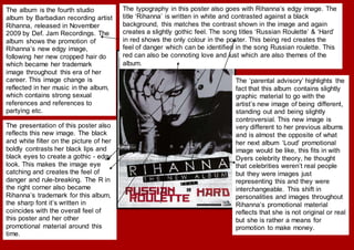
- 1. The album is the fourth studio album by Barbadian recording artist Rihanna, released in November 2009 by Def. Jam Recordings. The album shows the promotion of Rihanna’s new edgy image, following her new cropped hair do which became her trademark image throughout this era of her career. This image change is reflected in her music in the album, which contains strong sexual references and references to partying etc. The presentation of this poster also reflects this new image. The black and white filter on the picture of her boldly contrasts her black lips and black eyes to create a gothic - edgy look. This makes the image eye catching and creates the feel of danger and rule-breaking. The R in the right corner also became Rihanna’s trademark for this album, the sharp font it’s written in coincides with the overall feel of this poster and her other promotional material around this time. The typography in this poster also goes with Rihanna’s edgy image. The title ‘Rihanna’ is written in white and contrasted against a black background, this matches the contrast shown in the image and again creates a slightly gothic feel. The song titles ‘Russian Roulette’ & ‘Hard’ in red shows the only colour in the poster. This being red creates the feel of danger which can be identified in the song Russian roulette. This red can also be connoting love and lust which are also themes of the album. The ‘parental advisory’ highlights the fact that this album contains slightly graphic material to go with the artist’s new image of being different, standing out and being slightly controversial. This new image is very different to her previous albums and is almost the opposite of what her next album ‘Loud’ promotional image would be like, this fits in with Dyers celebrity theory, he thought that celebrities weren’t real people but they were images just representing this and they were interchangeable. This shift in personalities and images throughout Rihanna’s promotional material reflects that she is not original or real but she is rather a means for promotion to make money.
- 2. Goodwin’s idea about the demands of the record label is also shown here. It is obvious that this image produced motifs by which people could identify the star with, for example the ‘R’ which fans drew on their faces for concerts and even got tattoos of. Another trademark is the covering one eye. This is a theme that can be recognised in other artists from the label such as Lady Gaga, Kanye West and Jay Z. This action makes the star seem mysterious and creates the feel that maybe there is a side to them that the media does not see. It could also create the idea of alter-egos, showing one ‘good’ side which is the exposed side, and one bad side which is the covered one. This idea of alter egos has been used by other stars such as Beyoncé in ‘I am…Sasha Fierce’. It could be said that the artist is defying stereotypes of women in this promotional poster. Her shaven haircut is rather masculine as promotes the idea of her being a strong female character and not a weak, innocent feminine girl like how females are usually portrayed in the media. However this poster in general is quite conventional as it includes an image of the artist, the name and a parental advisory sticker as well as a barcode at the bottom. However this helps the poster to look professional, so I think use of conventions when creating my own poster will be useful. This strong and edgy woman look that Rihanna is displaying can also be seen in her makeup and clothes. She is wearing a rigid looking black leather jacket which is usually associated with bikers, and this contributes to her edgy look. Her black lipstick and eyes contrast against her skin which looks particularly light in this photo, and creates a punky look. She is wearing many rings and jewellery on her arm which also associates with the edgy look. This look runs throughout all of her promotional material at his time and creates a completely new dangerous, controversial and sexy image. The technique of displaying two of the main songs on the album is used to help the fans recognise the two hits, as they may have heard them on the radio but not yet associated them with the album. This may tempt the viewers into buying the album if it includes two popular songs, and they may also be interested as to what other songs are included.
- 3. Reception – The preferred audience will immediately recognise Rihanna and will appreciate her new image. The negotiated audience will be unsure as to what genre her music is and will perhaps be interested and want to find out more. Oppositional audience may not like Rihanna’s new image and may say it contradicts her original ‘wholesome’ Barbadian island girl roots. They may also say that is conflicts with the pop genre and does not fit in with the artist herself, thus creating confusion and controversy. If they are not familiar already with Rihanna, then people may not be able to immediately identify what genre of music this poster is presenting. Some may say it looks like a rock poster, which is one of the themes of the album and Rihanna’s new image. This creates ambiguity and makes the album more interesting and not just your conventional pop album. The use of Rihanna as the key signifier in the poster amplifies the idea her being a massive and influential figure in the music industry. She is often portrayed as, and refers to herself as the ‘Queen’ of pop. This can be seen in her sales within the industry and her promotional material all portrays her as being this massive figure. A huge part of Rihanna’s success is mainly down to the selling of her image, perhaps even more so than her actual music. She is hugely popular among her male audience for being sexual provocative, and this can be seen in her makeup and sultry pose in this photo. Her female audience may be threatened by her highly sexual and dangerous new image. This conflicts with her previous promotional material where she is portrayed as innocent and wholesome. Below are some examples of contrasting materials from her previous/ following work that may illustrate this point of stars being interchangeable and fake. As you can see the two images display a more natural wholesome image and the other two display a highly feminine image. Whereas rated R contrasts with both of these to create a masculine and strong woman image.