
Recommended
More Related Content
What's hot
What's hot (20)
Viewers also liked
Viewers also liked (20)
Similar to CD Cover Analysis
Similar to CD Cover Analysis (20)
More from sophiejvbell
More from sophiejvbell (12)
Recently uploaded
Recently uploaded (20)
CD Cover Analysis
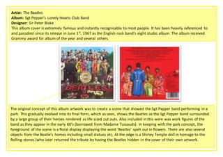
- 1. Artist: The Beatles Album: Sgt Pepper’s Lonely Hearts Club Band Designer: Sir Peter Blake This album cover is extremely famous and instantly recognisable to most people. It has been heavily referenced to and parodied since its release in June 1st, 1967 as the English rock band’s eight studio album. The album received Grammy award for album of the year and several others. The original concept of this album artwork was to create a scene that showed the Sgt Pepper band performing in a park. This gradually evolved into its final form, which as seen, shows the Beatles as the Sgt Pepper band surrounded by a large group of their heroes rendered as life sized cut outs. Also included in this were wax work figures of the band as they appear in the early 60’s (borrowed from Madame Tussauds). In keeping with the park concept, the foreground of the scene is a floral display displaying the word ‘Beatles’ spelt out in flowers. There are also several objects from the Beatle’s homes including small statues etc. At the edge is a Shirley Temple doll in homage to the Rolling stones (who later returned the tribute by having the Beatles hidden in the cover of their own artwork. ffffffgf
- 2. Typography: The name of the band is displayed in a huge, over-the-top flower display. This coincides with the fact that the band itself was huge, completely dominating the music industry throughout the 60’s. This use of titling denotes how the artist (band) is the most important aspect of the album (people will buy the album just because of the band). The use of the flower display together with other bright colours may also connote the band’s extravagance, colourfulness and perhaps relation to the emergence of psychedelic rock culture and the use of psychedelic drugs. It could be said that this album cover is stereotypical of a rock band, due to the inclusion of visuals of instruments (the drum) and the band members appearing looking rather solemn and serious. The posture that the band members have on the back cover demonstrates this. The lettering on the back is plain and simple, which contrasts with the flamboyance of the lettering on the front cover. This could be indicating that the contents of the album is of equal importance and should be taken with the same seriousness as the fun front cover. Genre conventions of the rock genre can be identified in this artwork. For example, the entire band appear together on the front cover. This convention can be seen in some of Queens and The Rolling Stones artwork. Another convention of the rock genre could be said to be the slight mockery/tribute paying of prominent figures. These figures include people such as Karl Marx, Marilyn Monroe, Carl Jung, and Bob Dylan. This can be likened to the ‘God Save The Queen’ campaign from the Sex Pistols. This leaves the band open to controversy and public backlash, which again is all part of the Rock music culture. The key signifier(s) in this image is the band. They appear not only larger but more bold, colourful and prominent than the other figures. This creates the idea that they are, perhaps, the most important and powerful.
- 3. By placing the band in the foreground in front of all these hugely influential and prominent historical figures including authors, poets, actresses, political figures etc. the designer is suggesting that the Beatles are not only among and of equal importance and popularity to these figures, but that they are bigger than them. This is a big statement that coincides with the huge fame the Beatles had. Goodwin’s idea of the ‘demands of the record label’ can be identified here, as the record label would require the whole band to be included in the cover, due to the fact that fans loved them together as a band and that was their selling point. Roland Barthes’ enigma code can be identified within this album cover. What exactly the album cover means is not explained, it is more an abstract piece of art which is open to ambiguity. For example, a possible interpretation of this could be that the Lonely Hearts club consists of all these prominent figures, who one way or another have something in common. However as I have previously mentioned another interpretation of this is that the Beatles are making a statement that all of these prominent figures have been and gone, and they are now just cardboard cut-outs and the Beatles are bigger and better than them. This would coincide with Lennon’s claim that the band was ‘bigger than the son of God’ which caused public backlash due to Christians taking offence. Symbolic code – as I have previously mentioned the bright bold colours and random objects etc. seen in this cover could be symbolic of the ‘hippie’ psychedelic rock culture of the 60’s. There have been claims that the foliage depicted in the image could be a marijuana plant. The bright blue sky could be symbolic of the laid back sex, drugs, leisurely life style that the band had, it indicates being carefree and happy which was a part of the bands image. The cultural code can be identified in this artwork as a part of the Beatles image was all about controversy and teenage/young adult rebellion as well as being quirky and alternative. All of these things can be identified within the visuals of this cover, which all link back to going against society and conservatism. Reception Theory -Preferred Reading: People who listen to rock music and the Beatles will enjoy and appreciate this quirky, vibrant and iconic album artwork. Negotiated Reading: Some people May be unsure as to what this means Oppositional Reading: religious, more conservative people may be offended by this cover
- 4. Dyer on Celebrity – The Theorist Richard Dyer’s ‘Star Theory’ could be applied here. His theory states that celebrity figures are not real and promote themselves to be a certain image which may not reflect their true personality or style. The Beatles’ image was constructed in a certain way as their music, campaigns, album covers etc. portrayed them to be carefree, peaceful ‘Hippie’ characters who were the prominent figures of the 60s rock culture. (Which can all be seen in this cd cover) However it’s possible that they are not truly those people but are being represented in that way in order to allow the audience to identify with them therefore increasing sales etc. We cannot know whether the artists images are true their personalities behind the scenes. It’s possible to argue that this Cd cover is not stereotypical in comparison with others of those in the rock Genre. This could be argued on the grounds that conventionally, rock bands have more of a dark, mysterious ‘sexy’ image which is portrayed throughout all of their campaigns and album covers. This one in particular however contradicts this convention as it is garish, bright and ‘happy’ looking, which blends in with the Beatles image of being more ‘Hippies’ than rock stars. Therefore they are defying conventions to express their individuality and personality. Here are some of examples of other massive Rock bands album covers, so a comparison between the two can be drawn: