
Recommended
More Related Content
What's hot
What's hot (20)
Similar to How Rihanna's Album Advert Uses Design Elements to Engage Audiences
Similar to How Rihanna's Album Advert Uses Design Elements to Engage Audiences (20)
Recently uploaded
Recently uploaded (20)
How Rihanna's Album Advert Uses Design Elements to Engage Audiences
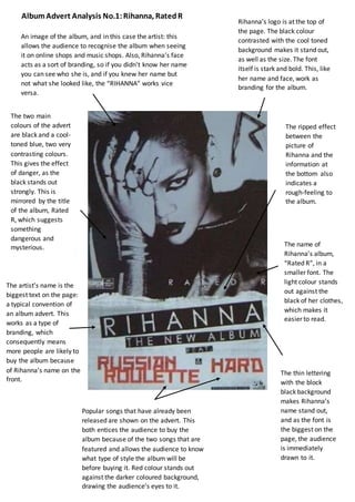
- 1. The artist’s name is the biggest text on the page: a typical convention of an album advert. This works as a type of branding, which consequently means more people are likely to buy the album because of Rihanna’s name on the front. Popular songs that have already been released are shown on the advert. This both entices the audience to buy the album because of the two songs that are featured and allows the audience to know what type of style the album will be before buying it. Red colour stands out against the darker coloured background, drawing the audience’s eyes to it. An image of the album, and in this case the artist: this allows the audience to recognise the album when seeing it on online shops and music shops. Also, Rihanna’s face acts as a sort of branding, so if you didn’t know her name you can see who she is, and if you knew her name but not what she looked like, the “RIHANNA” works vice versa. The name of Rihanna’s album, “Rated R”, in a smaller font. The light colour stands out against the black of her clothes, which makes it easier to read. The thin lettering with the block black background makes Rihanna’s name stand out, and as the font is the biggest on the page, the audience is immediately drawn to it. Rihanna’s logo is at the top of the page. The black colour contrasted with the cool toned background makes it stand out, as well as the size. The font itself is stark and bold. This, like her name and face, work as branding for the album. The two main colours of the advert are black and a cool- toned blue, two very contrasting colours. This gives the effect of danger, as the black stands out strongly. This is mirrored by the title of the album, Rated R, which suggests something dangerous and mysterious. The ripped effect between the picture of Rihanna and the information at the bottom also indicates a rough-feeling to the album. AlbumAdvert Analysis No.1:Rihanna, RatedR