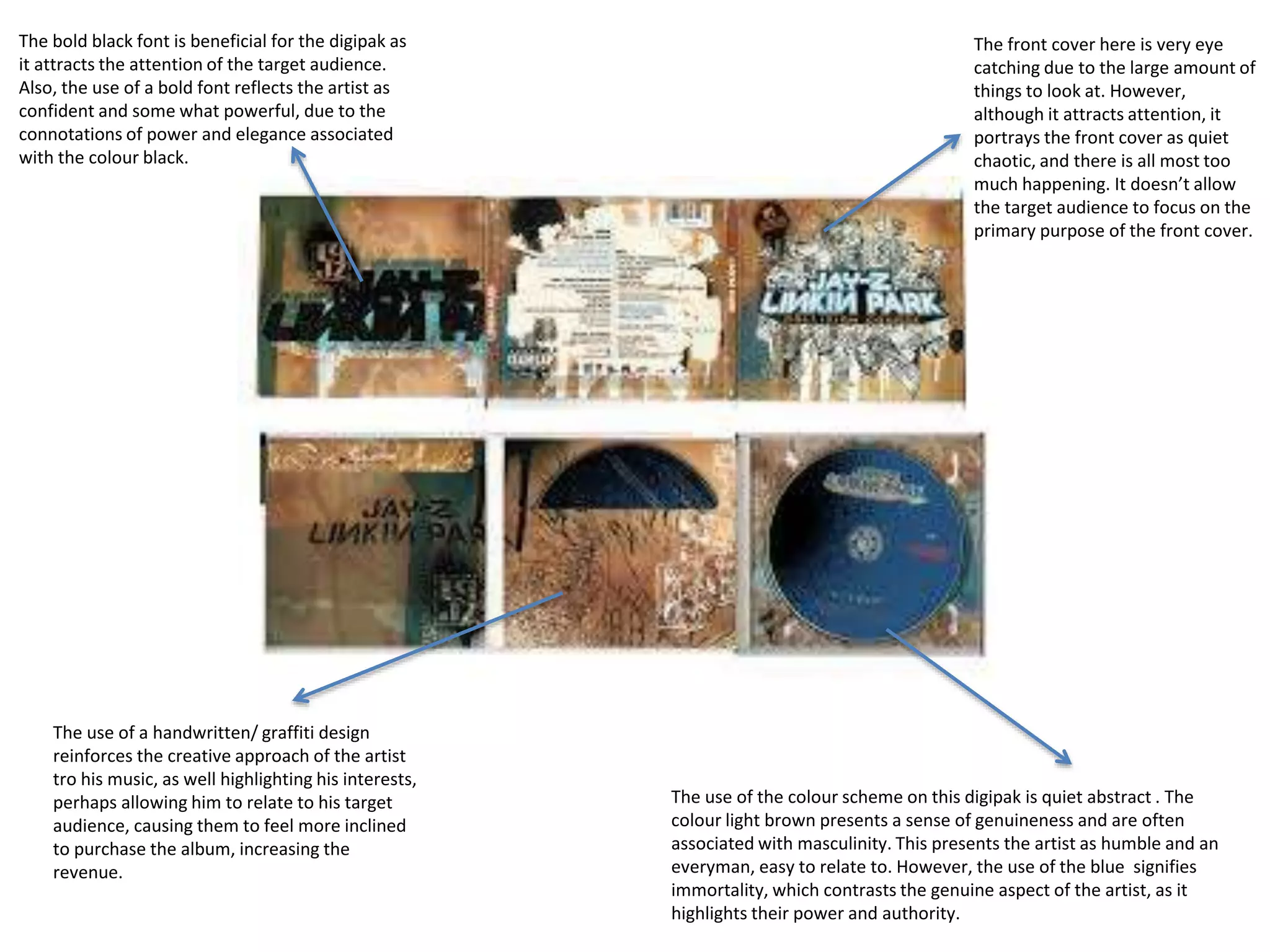
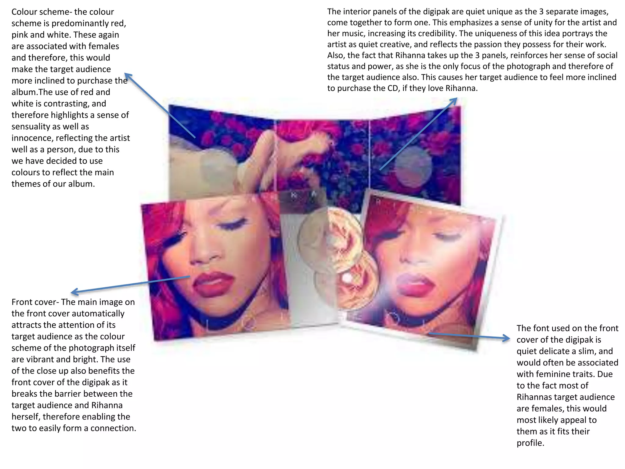
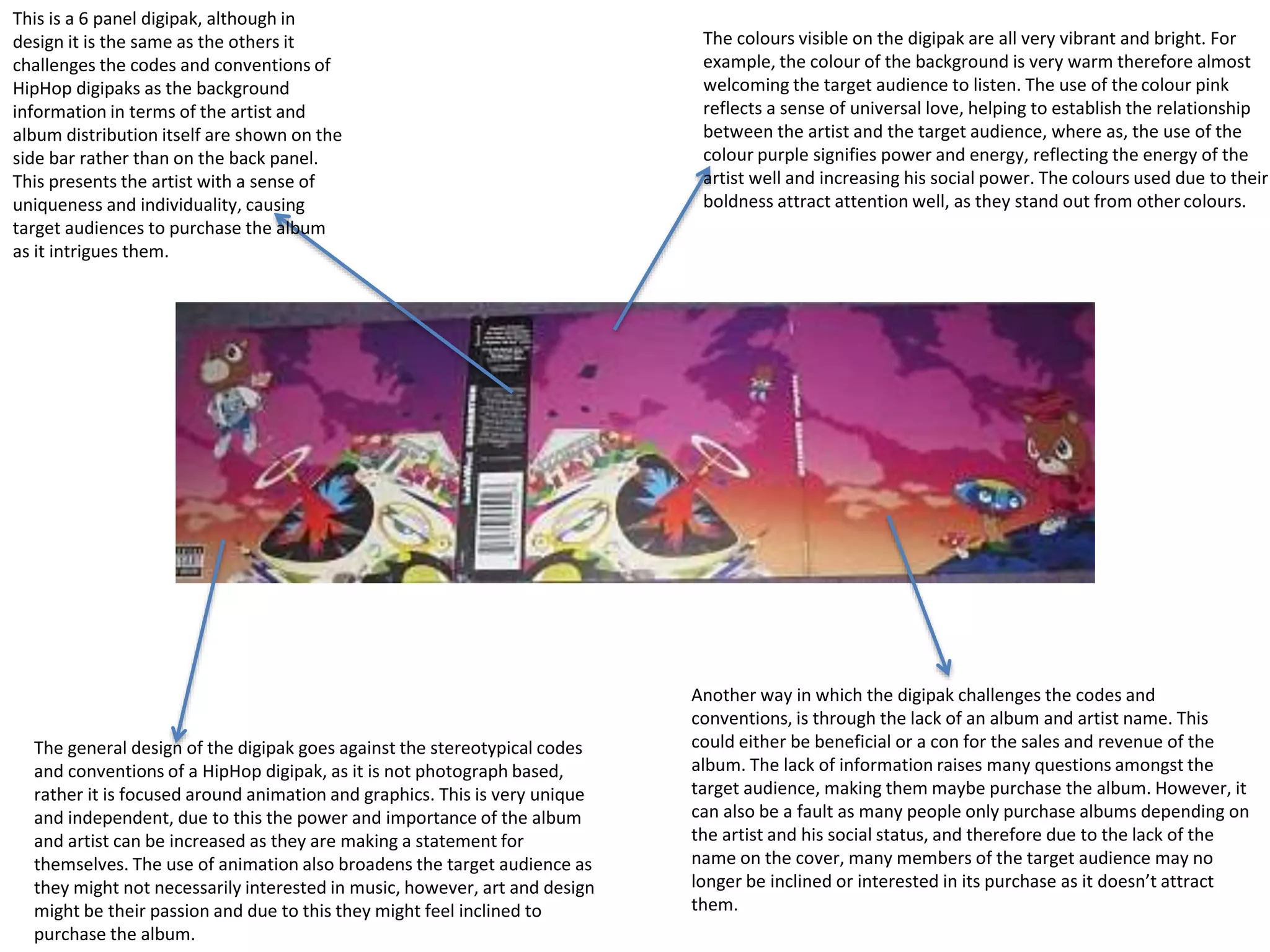
The front cover here is very eye
catching due to the large amount of
things to look at. However,
although it attracts attention, it
portrays the front cover as quiet
chaotic, and there is all most too
much happening. It doesn’t allow
the target audience to focus on the
primary purpose of the front cover.
The use of the colour scheme on this digipak is quiet abstract . The
colour light brown presents a sense of genuineness and are often
associated with masculinity. This presents the artist as humble and an
everyman, easy to relate to. However, the use of the blue signifies
immortality, which contrasts the genuine aspect of the artist, as it
highlights their power and authority.
The bold black font is beneficial for the digipak as
it attracts the attention of the target audience.
Also, the use of a bold font reflects the artist as
confident and some what powerful, due to the
connotations of power and elegance associated
with the colour black.
The use of a handwritten/ graffiti design
reinforces the creative approach of the artist
tro his music, as well highlighting his interests,
perhaps allowing him to relate to his target
audience, causing them to feel more inclined
to purchase the album, increasing the
revenue.
Front cover- The main image on
the front cover automatically
attracts the attention of its
target audience as the colour
scheme of the photograph itself
are vibrant and bright. The use
of the close up also benefits the
front cover of the digipak as it
breaks the barrier between the
target audience and Rihanna
herself, therefore enabling the
two to easily form a connection.
The interior panels of the digipak are quiet unique as the 3 separate images,
come together to form one. This emphasizes a sense of unity for the artist and
her music, increasing its credibility. The uniqueness of this idea portrays the
artist as quiet creative, and reflects the passion they possess for their work.
Also, the fact that Rihanna takes up the 3 panels, reinforces her sense of social
status and power, as she is the only focus of the photograph and therefore of
the target audience also. This causes her target audience to feel more inclined
to purchase the CD, if they love Rihanna.
The font used on the front
cover of the digipak is
quiet delicate a slim, and
would often be associated
with feminine traits. Due
to the fact most of
Rihannas target audience
are females, this would
most likely appeal to
them as it fits their
profile.
Colour scheme- the colour
scheme is predominantly red,
pink and white. These again
are associated with females
and therefore, this would
make the target audience
more inclined to purchase the
album.The use of red and
white is contrasting, and
therefore highlights a sense of
sensuality as well as
innocence, reflecting the artist
well as a person, due to this
we have decided to use
colours to reflect the main
themes of our album.
This is a 6 panel digipak, although in
design it is the same as the others it
challenges the codes and conventions of
HipHop digipaks as the background
information in terms of the artist and
album distribution itself are shown on the
side bar rather than on the back panel.
This presents the artist with a sense of
uniqueness and individuality, causing
target audiences to purchase the album
as it intrigues them.
The colours visible on the digipak are all very vibrant and bright. For
example, the colour of the background is very warm therefore almost
welcoming the target audience to listen. The use of the colour pink
reflects a sense of universal love, helping to establish the relationship
between the artist and the target audience, where as, the use of the
colour purple signifies power and energy, reflecting the energy of the
artist well and increasing his social power. The colours used due to their
boldness attract attention well, as they stand out from other colours.
The general design of the digipak goes against the stereotypical codes
and conventions of a HipHop digipak, as it is not photograph based,
rather it is focused around animation and graphics. This is very unique
and independent, due to this the power and importance of the album
and artist can be increased as they are making a statement for
themselves. The use of animation also broadens the target audience as
they might not necessarily interested in music, however, art and design
might be their passion and due to this they might feel inclined to
purchase the album.
Another way in which the digipak challenges the codes and
conventions, is through the lack of an album and artist name. This
could either be beneficial or a con for the sales and revenue of the
album. The lack of information raises many questions amongst the
target audience, making them maybe purchase the album. However, it
can also be a fault as many people only purchase albums depending on
the artist and his social status, and therefore due to the lack of the
name on the cover, many members of the target audience may no
longer be inclined or interested in its purchase as it doesn’t attract
them.

Digipak analysis

  • 1.
    The front coverhere is very eye catching due to the large amount of things to look at. However, although it attracts attention, it portrays the front cover as quiet chaotic, and there is all most too much happening. It doesn’t allow the target audience to focus on the primary purpose of the front cover. The use of the colour scheme on this digipak is quiet abstract . The colour light brown presents a sense of genuineness and are often associated with masculinity. This presents the artist as humble and an everyman, easy to relate to. However, the use of the blue signifies immortality, which contrasts the genuine aspect of the artist, as it highlights their power and authority. The bold black font is beneficial for the digipak as it attracts the attention of the target audience. Also, the use of a bold font reflects the artist as confident and some what powerful, due to the connotations of power and elegance associated with the colour black. The use of a handwritten/ graffiti design reinforces the creative approach of the artist tro his music, as well highlighting his interests, perhaps allowing him to relate to his target audience, causing them to feel more inclined to purchase the album, increasing the revenue.
  • 2.
    Front cover- Themain image on the front cover automatically attracts the attention of its target audience as the colour scheme of the photograph itself are vibrant and bright. The use of the close up also benefits the front cover of the digipak as it breaks the barrier between the target audience and Rihanna herself, therefore enabling the two to easily form a connection. The interior panels of the digipak are quiet unique as the 3 separate images, come together to form one. This emphasizes a sense of unity for the artist and her music, increasing its credibility. The uniqueness of this idea portrays the artist as quiet creative, and reflects the passion they possess for their work. Also, the fact that Rihanna takes up the 3 panels, reinforces her sense of social status and power, as she is the only focus of the photograph and therefore of the target audience also. This causes her target audience to feel more inclined to purchase the CD, if they love Rihanna. The font used on the front cover of the digipak is quiet delicate a slim, and would often be associated with feminine traits. Due to the fact most of Rihannas target audience are females, this would most likely appeal to them as it fits their profile. Colour scheme- the colour scheme is predominantly red, pink and white. These again are associated with females and therefore, this would make the target audience more inclined to purchase the album.The use of red and white is contrasting, and therefore highlights a sense of sensuality as well as innocence, reflecting the artist well as a person, due to this we have decided to use colours to reflect the main themes of our album.
  • 3.
    This is a6 panel digipak, although in design it is the same as the others it challenges the codes and conventions of HipHop digipaks as the background information in terms of the artist and album distribution itself are shown on the side bar rather than on the back panel. This presents the artist with a sense of uniqueness and individuality, causing target audiences to purchase the album as it intrigues them. The colours visible on the digipak are all very vibrant and bright. For example, the colour of the background is very warm therefore almost welcoming the target audience to listen. The use of the colour pink reflects a sense of universal love, helping to establish the relationship between the artist and the target audience, where as, the use of the colour purple signifies power and energy, reflecting the energy of the artist well and increasing his social power. The colours used due to their boldness attract attention well, as they stand out from other colours. The general design of the digipak goes against the stereotypical codes and conventions of a HipHop digipak, as it is not photograph based, rather it is focused around animation and graphics. This is very unique and independent, due to this the power and importance of the album and artist can be increased as they are making a statement for themselves. The use of animation also broadens the target audience as they might not necessarily interested in music, however, art and design might be their passion and due to this they might feel inclined to purchase the album. Another way in which the digipak challenges the codes and conventions, is through the lack of an album and artist name. This could either be beneficial or a con for the sales and revenue of the album. The lack of information raises many questions amongst the target audience, making them maybe purchase the album. However, it can also be a fault as many people only purchase albums depending on the artist and his social status, and therefore due to the lack of the name on the cover, many members of the target audience may no longer be inclined or interested in its purchase as it doesn’t attract them.