👉 Tirunelveli Call Girls Service Just Call 🍑👄6378878445 🍑👄 Top Class Call Gir...
Analysis of advert 5
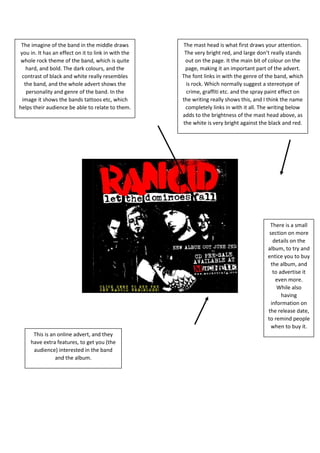
1. The imagine of the band in the middle draws
you in. It has an effect on it to link in with the
whole rock theme of the band, which is quite
hard, and bold. The dark colours, and the
contrast of black and white really resembles
the band, and the whole advert shows the
personality and genre of the band. In the
image it shows the bands tattoos etc, which
helps their audience be able to relate to them.
The mast head is what first draws your attention.
The very bright red, and large don’t really stands
out on the page. It the main bit of colour on the
page, making it an important part of the advert.
The font links in with the genre of the band, which
is rock. Which normally suggest a stereotype of
crime, graffiti etc. and the spray paint effect on
the writing really shows this, and I think the name
completely links in with it all. The writing below
adds to the brightness of the mast head above, as
the white is very bright against the black and red.
There is a small
section on more
details on the
album, to try and
entice you to buy
the album, and
to advertise it
even more.
While also
having
information on
the release date,
to remind people
when to buy it.
This is an online advert, and they
have extra features, to get you (the
audience) interested in the band
and the album.