SlideShare a Scribd company logo
1 of 3
The use of the images in this advert is good, you can see lots
of effort has been taken in the editing, however it is the same
image that is in the album cover, even his name is written the
same. This is something I can’t do in my advert as it will look
rushed with a lack of effort.

The lighting is high key which I think connotes that Wretch is
in a good place and that its a happy album unlike the album
covers that I analysed. I think it challenges the conventions of
the genre as I would expect to see the paint drips and vector
style editing in an electronic album advert. I think it presents
Wretch’s image as a real life happy guy who doesn’t brag on
about his hard life and social disadvantage. However I think it
goes along with hip hop conventions because the text is shiny,
almost like bling.
The layout is simple and typical, and there are only two
typefaces used throughout the advert, this is good because it
means things aren’t overloaded and too fussy, this could
contribute to his star image as a serious music maker.

The details are small and conspicuous and almost contribute
to the design themselves. I must remember to put some
‘Available from’ on my advert.
The size of the advert is a full page, Wretch 32 is a mainstream
artist who appeals to the masses so his record label can afford
this type of exposure.
I think the advert is quite entropic but also very redundant as
there are parts of it that I feel are quite unexpected like the
paint dripping, the blacked out arms of wretch and the
beautiful day, but parts of it I feel are quite redundant, the
photograph of him and the shiny type.

Its important to have appealing and appropriate print work
even if people do download, because if there are no adverts
or exposure of the album people won’t know its coming out to
go download it.
It also contributes towards the star image, so every piece of
print work is important.
This album advert is an illustration, the type face is quite a generic old skool hip hop style and is quite redundant as it has been used so much.
There are no photographs on the digipak advert which I think its quite entropic because normally there is a photograph of the digipak cover or some
 kind of photograph of the band. The mise en scene of the advert is quite rough and metallic, what with the rivet holes in the background, it gives it
                                                                    more of a street edge.
                          I think it reinforces the star image as its blatantly hip hop is quite simple and not overly developed.
      This advert was from before iTunes so that isn’t included there isn’t allot of detail at all in this advert, not much detail was really needed!
   This advert is around half a page, Beastie Boys were more alternative, yet were still very popular for there time so this surprises me, however it
                                     could be from when they were just starting out so there could be an explanation.
    Although we can download Beastie Boys songs on the internet there music came out in a time where there was no internet so print work was
                                       extremely important in attracting sales and getting the bands name out there.
The use of images in this advert is interesting, and as we can see although the
 style is the same as on the album cover, it is not a copy, this is definitely a good
  thing. The pose that NAS is in indicates that he is thinking, and the poster style
   reminds me of a propaganda poster, with the colour scheme and washed out
           look so I think this is something that could influence my design.
His pose helps contribute to the title of the album, which is a rhetorical question,
                            it represents him as thoughtful.
I think it challenges the conventions of the genre because its not blingy, its quite
   mellow, almost dark and scary which is a contrast to wretch 32’s advert in my
                                        first analysis.
NAS, as in his album work has been successful in presenting himself as a real life
      rap artist who originates from the streets and has lots of life experience.
what is connoted by the angle, shot type, mise en scene, lighting etc.? How does
   this use or challenge the conventions of the genre? How does it contribute to
                    the creation or reinforcement of a star image?
       The layout is simple, and the font he uses are gritty, but simple and not
     overbearing, it challenges the conventions of the genre, and I believe the
        conventions of the genre are what we saw in the beastie boys advert.
The use of detail is nicely positioned at the bottom in a black banned, separating
                                  it from the photograph.
      The size of the advert is a full page, NAS is a mainstream artist signed to
          Columbia, so they can afford lots of exposure of him as an artist.
    I think the advert is quite entropic as I don’t think its something you would
     expect to see from a mainstream hip hop artist because its quite thought
                            provoking and in a vintage style.

More Related Content

What's hot (17)

Question 2 media evaluation
Question 2 media evaluationQuestion 2 media evaluation
Question 2 media evaluation
 
Evaluation 1
Evaluation 1Evaluation 1
Evaluation 1
 
mr probz ablum research
mr probz ablum researchmr probz ablum research
mr probz ablum research
 
Mr Probz album research
Mr Probz album researchMr Probz album research
Mr Probz album research
 
Q2
Q2Q2
Q2
 
Media image analysis 2
Media image analysis 2Media image analysis 2
Media image analysis 2
 
Formal proposal task 10
Formal proposal task 10Formal proposal task 10
Formal proposal task 10
 
Research and Planning - Task 10
Research and Planning - Task 10Research and Planning - Task 10
Research and Planning - Task 10
 
Summary
Summary Summary
Summary
 
Genre analysis
Genre analysisGenre analysis
Genre analysis
 
Photo presentation8
Photo presentation8Photo presentation8
Photo presentation8
 
Influences
InfluencesInfluences
Influences
 
Question 1
Question 1Question 1
Question 1
 
Digipak analysis
Digipak analysisDigipak analysis
Digipak analysis
 
In what ways does your media product use, develop or challenge forms and conv...
In what ways does your media product use, develop or challenge forms and conv...In what ways does your media product use, develop or challenge forms and conv...
In what ways does your media product use, develop or challenge forms and conv...
 
Media evaluation post 2
Media evaluation post 2Media evaluation post 2
Media evaluation post 2
 
Exisiting products and fonts
Exisiting products and fontsExisiting products and fonts
Exisiting products and fonts
 

Similar to Adverts

Question 1: Part 2: Digipak & Music Magazine Advertisment
Question 1: Part 2: Digipak & Music Magazine AdvertismentQuestion 1: Part 2: Digipak & Music Magazine Advertisment
Question 1: Part 2: Digipak & Music Magazine Advertisment
Alysia Hurrell
 
Digipack presentation
Digipack presentation Digipack presentation
Digipack presentation
Nikachu
 
Digipack presentation
Digipack presentationDigipack presentation
Digipack presentation
ABM06
 
Evaluation Q2
Evaluation Q2Evaluation Q2
Evaluation Q2
Laysan94
 
Student ancillary analysis
Student ancillary analysisStudent ancillary analysis
Student ancillary analysis
saraahadele
 
Appendix 9: Poster analysis (AO2)
Appendix 9: Poster analysis (AO2)Appendix 9: Poster analysis (AO2)
Appendix 9: Poster analysis (AO2)
chazzrodgers
 

Similar to Adverts (20)

Question 1: Part 2: Digipak & Music Magazine Advertisment
Question 1: Part 2: Digipak & Music Magazine AdvertismentQuestion 1: Part 2: Digipak & Music Magazine Advertisment
Question 1: Part 2: Digipak & Music Magazine Advertisment
 
Student Album cover and Magazine advert analysis
Student Album cover and Magazine advert analysisStudent Album cover and Magazine advert analysis
Student Album cover and Magazine advert analysis
 
Digipack presentation
Digipack presentation Digipack presentation
Digipack presentation
 
Magazine advets ancillary text
Magazine advets ancillary textMagazine advets ancillary text
Magazine advets ancillary text
 
Evaluation 2
Evaluation 2 Evaluation 2
Evaluation 2
 
Digipack presentation
Digipack presentationDigipack presentation
Digipack presentation
 
Digipak analysis
Digipak analysis Digipak analysis
Digipak analysis
 
Album artwork
Album artworkAlbum artwork
Album artwork
 
Evaluation 2 - How effective is the combination of your main product and anci...
Evaluation 2 - How effective is the combination of your main product and anci...Evaluation 2 - How effective is the combination of your main product and anci...
Evaluation 2 - How effective is the combination of your main product and anci...
 
Evaluation Q2
Evaluation Q2Evaluation Q2
Evaluation Q2
 
contents Page Analysis
contents Page Analysiscontents Page Analysis
contents Page Analysis
 
Student ancillary analysis
Student ancillary analysisStudent ancillary analysis
Student ancillary analysis
 
Ancillary tasks digi- packs
Ancillary tasks  digi- packsAncillary tasks  digi- packs
Ancillary tasks digi- packs
 
Appendix 9: Poster analysis (AO2)
Appendix 9: Poster analysis (AO2)Appendix 9: Poster analysis (AO2)
Appendix 9: Poster analysis (AO2)
 
Three ads
Three adsThree ads
Three ads
 
Student Digipak Analysis
Student Digipak AnalysisStudent Digipak Analysis
Student Digipak Analysis
 
Conventions of back cover.
Conventions of back cover.Conventions of back cover.
Conventions of back cover.
 
2. research 2
2. research 22. research 2
2. research 2
 
Digipack Presentation
Digipack PresentationDigipack Presentation
Digipack Presentation
 
3. research
3. research3. research
3. research
 

Recently uploaded

The basics of sentences session 3pptx.pptx
The basics of sentences session 3pptx.pptxThe basics of sentences session 3pptx.pptx
The basics of sentences session 3pptx.pptx
heathfieldcps1
 
Activity 01 - Artificial Culture (1).pdf
Activity 01 - Artificial Culture (1).pdfActivity 01 - Artificial Culture (1).pdf
Activity 01 - Artificial Culture (1).pdf
ciinovamais
 
1029 - Danh muc Sach Giao Khoa 10 . pdf
1029 -  Danh muc Sach Giao Khoa 10 . pdf1029 -  Danh muc Sach Giao Khoa 10 . pdf
1029 - Danh muc Sach Giao Khoa 10 . pdf
QucHHunhnh
 
The basics of sentences session 2pptx copy.pptx
The basics of sentences session 2pptx copy.pptxThe basics of sentences session 2pptx copy.pptx
The basics of sentences session 2pptx copy.pptx
heathfieldcps1
 
Making and Justifying Mathematical Decisions.pdf
Making and Justifying Mathematical Decisions.pdfMaking and Justifying Mathematical Decisions.pdf
Making and Justifying Mathematical Decisions.pdf
Chris Hunter
 

Recently uploaded (20)

Web & Social Media Analytics Previous Year Question Paper.pdf
Web & Social Media Analytics Previous Year Question Paper.pdfWeb & Social Media Analytics Previous Year Question Paper.pdf
Web & Social Media Analytics Previous Year Question Paper.pdf
 
Holdier Curriculum Vitae (April 2024).pdf
Holdier Curriculum Vitae (April 2024).pdfHoldier Curriculum Vitae (April 2024).pdf
Holdier Curriculum Vitae (April 2024).pdf
 
The basics of sentences session 3pptx.pptx
The basics of sentences session 3pptx.pptxThe basics of sentences session 3pptx.pptx
The basics of sentences session 3pptx.pptx
 
Activity 01 - Artificial Culture (1).pdf
Activity 01 - Artificial Culture (1).pdfActivity 01 - Artificial Culture (1).pdf
Activity 01 - Artificial Culture (1).pdf
 
Measures of Central Tendency: Mean, Median and Mode
Measures of Central Tendency: Mean, Median and ModeMeasures of Central Tendency: Mean, Median and Mode
Measures of Central Tendency: Mean, Median and Mode
 
psychiatric nursing HISTORY COLLECTION .docx
psychiatric  nursing HISTORY  COLLECTION  .docxpsychiatric  nursing HISTORY  COLLECTION  .docx
psychiatric nursing HISTORY COLLECTION .docx
 
microwave assisted reaction. General introduction
microwave assisted reaction. General introductionmicrowave assisted reaction. General introduction
microwave assisted reaction. General introduction
 
Ecological Succession. ( ECOSYSTEM, B. Pharmacy, 1st Year, Sem-II, Environmen...
Ecological Succession. ( ECOSYSTEM, B. Pharmacy, 1st Year, Sem-II, Environmen...Ecological Succession. ( ECOSYSTEM, B. Pharmacy, 1st Year, Sem-II, Environmen...
Ecological Succession. ( ECOSYSTEM, B. Pharmacy, 1st Year, Sem-II, Environmen...
 
1029 - Danh muc Sach Giao Khoa 10 . pdf
1029 -  Danh muc Sach Giao Khoa 10 . pdf1029 -  Danh muc Sach Giao Khoa 10 . pdf
1029 - Danh muc Sach Giao Khoa 10 . pdf
 
Presentation by Andreas Schleicher Tackling the School Absenteeism Crisis 30 ...
Presentation by Andreas Schleicher Tackling the School Absenteeism Crisis 30 ...Presentation by Andreas Schleicher Tackling the School Absenteeism Crisis 30 ...
Presentation by Andreas Schleicher Tackling the School Absenteeism Crisis 30 ...
 
The basics of sentences session 2pptx copy.pptx
The basics of sentences session 2pptx copy.pptxThe basics of sentences session 2pptx copy.pptx
The basics of sentences session 2pptx copy.pptx
 
Introduction to Nonprofit Accounting: The Basics
Introduction to Nonprofit Accounting: The BasicsIntroduction to Nonprofit Accounting: The Basics
Introduction to Nonprofit Accounting: The Basics
 
Nutritional Needs Presentation - HLTH 104
Nutritional Needs Presentation - HLTH 104Nutritional Needs Presentation - HLTH 104
Nutritional Needs Presentation - HLTH 104
 
Making and Justifying Mathematical Decisions.pdf
Making and Justifying Mathematical Decisions.pdfMaking and Justifying Mathematical Decisions.pdf
Making and Justifying Mathematical Decisions.pdf
 
Food Chain and Food Web (Ecosystem) EVS, B. Pharmacy 1st Year, Sem-II
Food Chain and Food Web (Ecosystem) EVS, B. Pharmacy 1st Year, Sem-IIFood Chain and Food Web (Ecosystem) EVS, B. Pharmacy 1st Year, Sem-II
Food Chain and Food Web (Ecosystem) EVS, B. Pharmacy 1st Year, Sem-II
 
Z Score,T Score, Percential Rank and Box Plot Graph
Z Score,T Score, Percential Rank and Box Plot GraphZ Score,T Score, Percential Rank and Box Plot Graph
Z Score,T Score, Percential Rank and Box Plot Graph
 
Basic Civil Engineering first year Notes- Chapter 4 Building.pptx
Basic Civil Engineering first year Notes- Chapter 4 Building.pptxBasic Civil Engineering first year Notes- Chapter 4 Building.pptx
Basic Civil Engineering first year Notes- Chapter 4 Building.pptx
 
ComPTIA Overview | Comptia Security+ Book SY0-701
ComPTIA Overview | Comptia Security+ Book SY0-701ComPTIA Overview | Comptia Security+ Book SY0-701
ComPTIA Overview | Comptia Security+ Book SY0-701
 
Sociology 101 Demonstration of Learning Exhibit
Sociology 101 Demonstration of Learning ExhibitSociology 101 Demonstration of Learning Exhibit
Sociology 101 Demonstration of Learning Exhibit
 
Key note speaker Neum_Admir Softic_ENG.pdf
Key note speaker Neum_Admir Softic_ENG.pdfKey note speaker Neum_Admir Softic_ENG.pdf
Key note speaker Neum_Admir Softic_ENG.pdf
 

Adverts

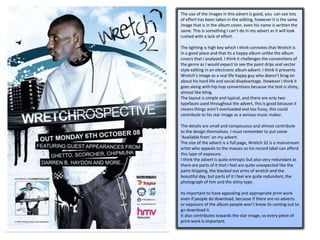
  • 1. The use of the images in this advert is good, you can see lots of effort has been taken in the editing, however it is the same image that is in the album cover, even his name is written the same. This is something I can’t do in my advert as it will look rushed with a lack of effort. The lighting is high key which I think connotes that Wretch is in a good place and that its a happy album unlike the album covers that I analysed. I think it challenges the conventions of the genre as I would expect to see the paint drips and vector style editing in an electronic album advert. I think it presents Wretch’s image as a real life happy guy who doesn’t brag on about his hard life and social disadvantage. However I think it goes along with hip hop conventions because the text is shiny, almost like bling. The layout is simple and typical, and there are only two typefaces used throughout the advert, this is good because it means things aren’t overloaded and too fussy, this could contribute to his star image as a serious music maker. The details are small and conspicuous and almost contribute to the design themselves. I must remember to put some ‘Available from’ on my advert. The size of the advert is a full page, Wretch 32 is a mainstream artist who appeals to the masses so his record label can afford this type of exposure. I think the advert is quite entropic but also very redundant as there are parts of it that I feel are quite unexpected like the paint dripping, the blacked out arms of wretch and the beautiful day, but parts of it I feel are quite redundant, the photograph of him and the shiny type. Its important to have appealing and appropriate print work even if people do download, because if there are no adverts or exposure of the album people won’t know its coming out to go download it. It also contributes towards the star image, so every piece of print work is important.
  • 2. This album advert is an illustration, the type face is quite a generic old skool hip hop style and is quite redundant as it has been used so much. There are no photographs on the digipak advert which I think its quite entropic because normally there is a photograph of the digipak cover or some kind of photograph of the band. The mise en scene of the advert is quite rough and metallic, what with the rivet holes in the background, it gives it more of a street edge. I think it reinforces the star image as its blatantly hip hop is quite simple and not overly developed. This advert was from before iTunes so that isn’t included there isn’t allot of detail at all in this advert, not much detail was really needed! This advert is around half a page, Beastie Boys were more alternative, yet were still very popular for there time so this surprises me, however it could be from when they were just starting out so there could be an explanation. Although we can download Beastie Boys songs on the internet there music came out in a time where there was no internet so print work was extremely important in attracting sales and getting the bands name out there.
  • 3. The use of images in this advert is interesting, and as we can see although the style is the same as on the album cover, it is not a copy, this is definitely a good thing. The pose that NAS is in indicates that he is thinking, and the poster style reminds me of a propaganda poster, with the colour scheme and washed out look so I think this is something that could influence my design. His pose helps contribute to the title of the album, which is a rhetorical question, it represents him as thoughtful. I think it challenges the conventions of the genre because its not blingy, its quite mellow, almost dark and scary which is a contrast to wretch 32’s advert in my first analysis. NAS, as in his album work has been successful in presenting himself as a real life rap artist who originates from the streets and has lots of life experience. what is connoted by the angle, shot type, mise en scene, lighting etc.? How does this use or challenge the conventions of the genre? How does it contribute to the creation or reinforcement of a star image? The layout is simple, and the font he uses are gritty, but simple and not overbearing, it challenges the conventions of the genre, and I believe the conventions of the genre are what we saw in the beastie boys advert. The use of detail is nicely positioned at the bottom in a black banned, separating it from the photograph. The size of the advert is a full page, NAS is a mainstream artist signed to Columbia, so they can afford lots of exposure of him as an artist. I think the advert is quite entropic as I don’t think its something you would expect to see from a mainstream hip hop artist because its quite thought provoking and in a vintage style.