
Recommended
More Related Content
What's hot
What's hot (20)
Viewers also liked
Viewers also liked (20)
Similar to Magazine cover and layout inspiration and differences
Similar to Magazine cover and layout inspiration and differences (20)
More from kaitlyn bodham
Recently uploaded
Recently uploaded (20)
Magazine cover and layout inspiration and differences
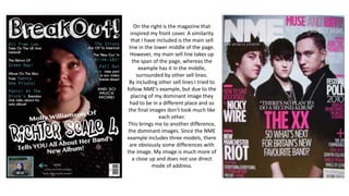
- 1. On the right is the magazine that inspired my front cover. A similarity that I have included is the main sell line in the lower middle of the page. However, my main sell line takes up the span of the page, whereas the example has it in the middle, surrounded by other sell lines. By including other sell lines I tried to follow NME’s example, but due to the placing of my dominant image they had to be in a different place and so the final images don’t look much like each other. This brings me to another difference, the dominant images. Since the NME example includes three models, there are obviously some differences with the image. My image is much more of a close up and does not use direct mode of address.
- 2. On the right is the magazine that inspired my contents page. Similarities that I included are the masthead across the top and in the middle. However, my masthead is so long that when in the middle it spans the whole page. I also tried to make the writing bend around the model, however it is less noticeable as my image s a lot more close up that the example. I also included the large band names and the age numbers being a different colour. However, I also changed the colour of the band name to make it stand out more. Another difference between my magazine and Mojo is that their contents pages are usually grey/white backgrounds, but I made mine black so as to coincide with my front cover. I also followed the trend of making the font the same colour as either the models hair or most visible item of clothing. Both my work and the example provided linked the font colour to the models hair colour.
- 3. On the right is the magazine that inspired my double page spread. Similarities that I included are the dominant image taking up the whole left page and the bright colour to make the main focus stand out. However, the example’s title is almost boxed off by the image on one side and text on the other. In my work I decided to make the title a banner across the top of the right page. I decided to continue the theme of blue for features such as the title and pull quote. However, the example also used it for their sub-head and throughout the article. Another difference is in the main body of text. The example uses a question-and-answer format, like a conversation, whereas my article is from one perspective only.