
Recommended
Recommended
More Related Content
What's hot
What's hot (20)
Viewers also liked
Viewers also liked (20)
Similar to Front cover analysis nme 1
Similar to Front cover analysis nme 1 (20)
More from shanwa-lton
Recently uploaded
Recently uploaded (20)
Front cover analysis nme 1
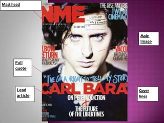
- 1. Mast head Main Image Pull quote Lead Cover article lines
- 2. Mast head – The mast head is block coloured in a bold text to hold effect and stand out to the audience itself, because of its boldness and highlights the whole theme of the magazine. NME is coloured in red to keep with the rest of the colour theme of the whole front cover therefore making it blend in but at the same time stand out. The colour red is also used in the magazine front cover to accompany the image in which anger is being implied. The mast head holds trust and reassurance upon its readers as they would follow this logo as they know what they are reading about when purchasing the magazine. Main article and Pull Quote- The main article title is written in a bold text the same as the mast head and also in the same colour accept from the quote that is attached to it. This is in a different colour to highlight its importance upon the reader, so they know what they are going to be reading about, and it will symbolise, and represent a whole story to keep in theme in which the magazine is centred around. The quote itself, is very forceful “I’ve got a right to tell my story” this could be catchy to the audience as it holds a bit or drama and they want to hear more about his story, it’s almost like they have left it on a cliff hanger, this should be good for the magazine drawing then readers in. Main image - The quote is also tied in with the main image of the man Carl Barat himself, the contrast had been raised on his face to bring emphasis to his eyes in which his expression shows seriousness and content, matching the quote to show his forcefulness in sharing his story with the public. The main image is also blended in to the rest of the magazine as it is blurred out in the background where the man’s body is, until the reach his face, where u are really drawn into his eyes, the colour of them has been over emphasized to give off more of an effect, also the match the colour theme of the magazine, which has been repeatedly used.
- 3. Cover lines- The cover lines to the left of the magazine, are more over important to the ones of the right hand side of the magazine, the colours of them are yet blending in with the same theme of red white and blue, very basic as there is no tone change. The titles of the cover lines have tried to stay quite bold as they still need some focus on them but not too much so the main title is still kept in main focus The left third – The left third is the main bit in which you will see in the shop when purchasing the magazine so this has to be catchy and have some main focus. So in this magazine it has used the same text colours but one after the other in a pattern for effect. Also it has bold catchy main cover line titles showing so people want to pull the magazine out properly and read more.