9953330565 Low Rate Call Girls In Rohini Delhi NCR
Powerpoint
1. In what ways does your media product use, develop
or challenge forms and conventions of real media
products?
I have looked at NME and vibe magazine to learn about the conventions of hip-hop and
indie music.
The layout and design of NME magazine was the most inspiring one as it shares a similar
sort of style to my own magazine.
As shown in NME and VIBE magazine the font used is very simple and bold without any
effects or drop shadows. I followed this sort of theme throughout my magazine using
simple font.
I focused on both genres for my magazine this had an influence on the sort of masthead
I had chosen and the use of font style I used, this is because there are few hip-hop artist
in NME magazine and few indie artist in Vibe.
Layout: I followed the convention of the layout of a music magazine mainly referring to
NME magazine such as the layout of the double page spread and a similar layout for the
contents page.
For example NME: The double page spread is divided into one page of writing and one
page covered with one enlarged image. This style of layout is very effective as the large
image draws attention to the reader and how there is space on top of the heading which
adds more emphases to the headline. The article includes a brief context underneath
the heading of what the article would be based on. There are 2 different colour font
used black and red this keeps the magazine simple and professional and it wouldn’t look
irritating to the audience if there are lots of different colours being used.
My magazine: I followed the magazine layout for my double page spread. This is
because I think it looks simple and would make it easier for the readers to read and
what the page is about as there is an enlarged image of the artist in a separate page.
Also I used the same colour scheme red, white and black.
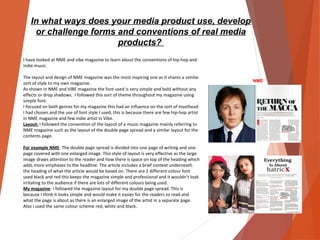
NME
2. Masthead:
Masthead needs to be unique for every magazine as it needs to
stand out from the rest of the magazine which are being stacked on
stores.
At first I wanted to keep it simple like the 2 magazine I have
researched. However I have changed the way I have designed my
masthead this is because I wanted to make it unusual and different
from other magazine. I done this by separating the letters by spacing
it out, making gaps in the letters and changing its size. This was done
in Photoshop.
Also another thing was challenged is the placement of the masthead
is that the masthead is usually on the corner or behind the artist. I
decided to have the masthead above the artist and in front this is
because there was space at the top and you can still clearly see the
main image and the masthead.
Photography:
Images of the front cover are usually medium close up or a close up I
followed this convention by using a medium close up of models to
show the readers/audience the sort of clothes that the artist are
wearing. They are looking directly at the camera, engaging with the
audience.
I decided to have the camera more focused at the middle model
since my double page spread is about her.
3. Images for the contents are usually portraits of group shot of
musicians and bands.
I only added few pictures on the contents page and shared a similar
layout to the NME contents page this is because I liked how the
pictures were numbered and with pull quotes underneath the image
and a brief info. I followed this rule by doing the same on my
contents page because it seems easier for readers to navigate
themselves and also the brief info helps the reader in understanding
what the page is going to be about
The contents page is very packed showing the readers that there is a
lot in this issue and the regulars which gives more to the audiences
as it convinces that there is good value for their money. There is also
a large section for the main cover story.
In both my case studies NME and VIBE magazine, vibe magazine
used more slang than did NME as NME used formal language.
However there are often slang words used in interviews with artist
but I decided to avoid this .Therefore I chose to use simpler writing
as my target audience is from 18-25 to keep it look professional.
Double page spread: It is common to use at least 2 double pages for
the main cover story. Where the entire first double page is a shot of
the artists/bands. I used the same style and added a short
introduction underneath the heading because I followed the same
rules as the NME double page.
For the colour scheme I have decided to follow the convention of 3
colour scheme which are red black and white. This is because more
colours make the page look messy and unprofessional.
Font : I have decided to use a simple font which looks professional
and easy to read.
4. Looking back at your preliminary task, what
do you feel you have learnt in the
progression from it to the full product?
By looking at the preliminary task you can clearly see that the
masthead is a very small font size and it won’t be able to draw
reader’s attention if it was being stacked up on stores. Also
including the colours of the font it was difficult to read what
the text as the colour blended in with the background.
However if we look at the music magazine we could see how it
has changed a lot because of the use of colours, font size and
the way I have placed it, this gives a whole different look to the
magazine compare to the first masthead as it looked dull and
simple. There has been a change from the font I first used in
the college magazine because I haven’t made the size bigger
and try playing around with the text whereas in the main task I
did and it looks more interesting and unusual and did not go
with the typical masthead font which are mostly used in some
magazine. In addition to this even though I have used capital
letter in both of the masthead I think the second one looks
more stronger and powerful because of the size and the way it
has been spaced out.
The difference between the two main cover images is quite a
contrast this mainly due to the way in which the photograph
have been taken and the place it has been taken. The main task
the colours blend it really well and the colours compliment the
image more. Whereas the college magazine
The photo is not very focused and it does not look like it has
been taken with a professional camera and it doesn’t look
bright and looks blurry. Also I decided to go for a different
facial shot this is because in the college magazine the model
was smiling whereas in the main task I decided to make the
models have a slightly serious face.
5. In terms of the layout of the contents page I think that
the college magazine does not look professional as well as
the font this is because it is not clear and it has many
colours being used which look messy. Also the
background does not compliment the text and the image.
In the music magazine there is only 3 colours being used
which makes it look neater and shows the colour scheme
is being used.
Another drastic change between the two magazine is that
in the college magazine the model who was on the front
cover was not on the contents page but in my music
magazine I made the front models re appear in the
contents page. Also I haven’t added any features or
regulars on the college magazine.
The layout of the number on the college magazine is that
the page numbers don’t look structured properly,
whereas on the music magazine all the page numbers are
the same size and have been placed on the bottom left
corner of every image to making it look well structured.
6. In terms of the layout of the contents page I think that
the college magazine does not look professional as well as
the font this is because it is not clear and it has many
colours being used which look messy. Also the
background does not compliment the text and the image.
In the music magazine there is only 3 colours being used
which makes it look neater and shows the colour scheme
is being used.
Another drastic change between the two magazine is that
in the college magazine the model who was on the front
cover was not on the contents page but in my music
magazine I made the front models re appear in the
contents page. Also I haven’t added any features or
regulars on the college magazine.
The layout of the number on the college magazine is that
the page numbers don’t look structured properly,
whereas on the music magazine all the page numbers are
the same size and have been placed on the bottom left
corner of every image to making it look well structured.