
Recommended
More Related Content
What's hot
What's hot (18)
Viewers also liked
Viewers also liked (11)
Similar to 4 DPS of my Own Choice
Similar to 4 DPS of my Own Choice (20)
More from caitlinosul
Recently uploaded
Recently uploaded (20)
4 DPS of my Own Choice
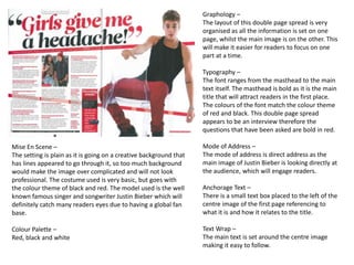
- 1. Graphology – The layout of this double page spread is very organised as all the information is set on one page, whilst the main image is on the other. This will make it easier for readers to focus on one part at a time. Typography – The font ranges from the masthead to the main text itself. The masthead is bold as it is the main title that will attract readers in the first place. The colours of the font match the colour theme of red and black. This double page spread appears to be an interview therefore the questions that have been asked are bold in red. Mode of Address – The mode of address is direct address as the main image of Justin Bieber is looking directly at the audience, which will engage readers. Anchorage Text – There is a small text box placed to the left of the centre image of the first page referencing to what it is and how it relates to the title. Text Wrap – The main text is set around the centre image making it easy to follow. Mise En Scene – The setting is plain as it is going on a creative background that has lines appeared to go through it, so too much background would make the image over complicated and will not look professional. The costume used is very basic, but goes with the colour theme of black and red. The model used is the well known famous singer and songwriter Justin Bieber which will definitely catch many readers eyes due to having a global fan base. Colour Palette – Red, black and white
- 2. Graphology – The layout of this double page spread may attract readers due to the boldness of it and how different it is. The main image is issued on the first main page, whilst all of the text is on the second page. This magazine revolves around fashion even though it may be recognised for music. Typography – The font seems to be continuous throughout this double page spread. However, there is a capital ‘L’ striking through the middle of the second page of the double page spread, to represent the main focus of the name Lady Gaga. Issued on the top right hand corner of the second page is the name of the model, with her surname in capital letters showing the importance. Mode of Address – The mode of address is direct address which will engage and intrigue readers to read on. The main image of Lady Gaga is looking directly at the audience. Mise En Scene – The setting of the main image is not very clear, but just seems to be appeared on a grey scale background. The costume used is very lack of, as there is only jewellery. This may be emphasising what the main story is about. The model used is the singer and dancer Lady Gaga. The lighting used is directed towards her face, focusing on her emotions. This is an up-close shot. Colour Palette – The monochrome theme is used on the main image as it appears black and white with a hint of greyscale. The page with the copy on has colours of black, white and red. Copy – The copy is situated on the second page of the double page spread and is all in the same font. When there is a start to a new section changing tone, there is a large black bold letter placed to show this. There is also a very oversized L in the centre highlighting in red over the copy.
- 3. Graphology – The layout of this double page spread is very different and may appeal to readers due to it being so different. However, this double page spread is very organised due to having the text and masthead on one page, and the main image on the other making it easier for readers to follow. Typography – The font ranges throughout this double page spread, which may be interesting for readers. The masthead is completely different to parts of the main copy, but then some of the main copy is different to the other part. When starting a new paragraph of a section, it is shown with a black capital letter in bold. Mode of Address – The mode of address is indirect as the model is looking away. As this is a part of a fashion magazine, direct address is not really expected when models are used as it is their initial job to pose. Anchorage Text – There is text in the top left hand corner to represent the image, showing who is in the image and what clothes are being worn. Mise En Scene – The setting used in this image is just a blank background of white, to show emphasis upon the model. The costume use appears to be a studded leather jacket, which may support the story appearing to show ‘the different sides of Rosie’. The model used is clearly model as this double page spread is in a fashion magazine. The lighting used is mainly aiming towards the face showing main features of the face such as a jaw line, cheekbones defined with contour. The shot used is a mid shot/ close up. Colour Palette – It is a monochrome theme throughout the image, whilst a hint of red has been used in the masthead.
- 4. Graphology – The layout used for this double page spread is very tidy and sectioned into 6 separate parts. This may engage readers as it is very organized and is not the usual type of layout. Typography – The main masthead is enlarged to show that it is the main title. This font seems to continue throughout the double page spread and onto the anchorage text. The text beneath that is just plain and simple. Mode of Address – Each image is directly towards the readers. Therefore, the mode of address is direct address. There are 13 images present, which all seems and appear to be direct address. Mise En Scene – Each image has a different setting and costume. However, the 6 top main images seem to all be in a street in Liverpool, showing pop in street style of girls everyday in Liverpool. The 6 bottom images are a single silhouetted image which have been edited to be a single figure without a background. These images are all long full body shots, showing the outfits off in a fashion magazine. Colour Palette – The colour palette ranges are there is a lot going on in one double page spread. There is a vary of colours due to fashion and different styles, and there are many different colours due to being in different backgrounds of Liverpool involving everyday life. Text Wrap – There is text wrap above, below and on the actual images themselves to describe what is going on and also extra additional information for readers.