
Recommended
More Related Content
What's hot
Similar to Compare and contrast
Similar to Compare and contrast (20)
More from kaitlyn bodham
More from kaitlyn bodham (20)
Recently uploaded
Recently uploaded (20)
Compare and contrast
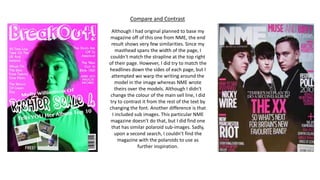
- 1. Compare and Contrast Although I had original planned to base my magazine off of this one from NME, the end result shows very few similarities. Since my masthead spans the width of the page, I couldn't match the strapline at the top right of their page. However, I did try to match the headlines down the sides of each page, but I attempted wo warp the writing around the model in the image whereas NME wrote theirs over the models. Although I didn't change the colour of the main sell line, I did try to contrast it from the rest of the text by changing the font. Another difference is that I included sub images. This particular NME magazine doesn’t do that, but I did find one that has similar polaroid sub-images. Sadly, upon a second search, I couldn’t find the magazine with the polaroids to use as further inspiration.