“Oh GOSH! Reflecting on Hackteria's Collaborative Practices in a Global Do-It...
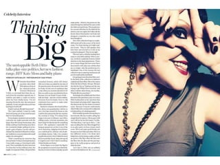
Marie claire double page spread
1.
2. Marie Claire front cover
Masthead: The masthead of this image has very imaginatively put the size of the text depending on the word used. The
words “Thinking Big” is the masthead, and compared to any other text on the page these stand out the most, but the
word “big” has been put even bigger than the word “thinking” although they are part of the same title. This goes in with
the idea of the thought being bigger than anything else, like the word big itself in this case.
Main Image: The image used is quite a close up of the model, and the image itself has been stretched out to the size of
half the double page spread (so a full page). The model is posing with her fingers in a triangle shape around her eye,
showing us the eye makeup on the model. The eyes have dark strong makeup on including eye shadow and eye liner.
This makes her eyes stand out a lot and look very black. The lips of the model are a darkish red, and that is the only
main makeup used in this case. The model is wearing a brown coloured piece of clothing with gold jewellery and black
nail varnish. These colours all go well together as there is no sudden outburst of a random bright colour.
Text: There is three different sections in which the main text is included in, with a sub-title and paragraph before these
to explain what the article is about, as well as the masthead at the top of the page. All of the text is in black, including
the mastheads which allows all of the text to stand out against the white background. Some of the texts are bolder than
the others, such as the subheading and the masthead, allowing us to notice that these are the more important parts of
the double page spread.
Colours: The colours used in this double page article have been well thought out as there is no clashing colours used
at all and every colour used goes with each other. The only colour which is slightly different to the colour scheme would
be the colour of the models lipstick, but as it is lipstick and not a main item it doesn’t matter as such, as it matches her
outfit therefore doesn’t look too bad. The colour is all about the main image as there is no colour involved in the text.
This allows the main image to stand out a lot, as there is no bright colours or anything unusual about the pose therefore
needs help standing out. Although the left page would look too boring and plain if it was presented on its own without an
image, the image to the right of it makes up for the lack of colour used so it goes well together.
Other information: The page number is located at the bottom left of the page, as expected, with the name of the
magazine and the month the magazine was released. The page number isn't located on the right page as there is an
image there and it could spoil it, so the page numbers will jump up a number in the next page. The reader will then have
to figure out for themselves what the page number is on by simple adding one to the previous number, or taking away
from the next number.