My media product compares to professional magazines in its use of codes and conventions
1.
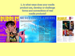
2. My media product compares with professional products as it follows the codes and conventions. By using an image with direct address it compares to other magazines as seen above each image uses direct address on the professional front covers and mine. The way the image has been cropped to be in front of the title is on professional front pages too. The cover lines of just a few words mainly the artists name are around the main image. The color scheme of a pop music magazine is bright colors usually yellows and pinks and blues which are in my own media product.