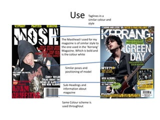
1. Use
Taglines in a
similar colour and
style
The Masthead I used for my
magazine is of similar style to
the one used in the ‘Kerrang’
Magazine. Which is bold and
is the colour white
Similar poses and
positioning of model
Sub-Headings and
information about
magazine
Same Colour scheme is
used throughout
2. Develop
More sub-headings
used on Kerrang
Images used other than
the main image
Text is clearer on Kerrang
and uses various different
fonts
6. There is the title of the
magazine on the
contents page.
Colours used for the background are
brighter and more relaxing.
Challenge
Colours are darker on my magazine
masthead such as mine being a
dark red whereas Kerrang being
white.
There is images on the
kerrang magazine
7. Use-Double page spread
The similarities between my
magazine are that the image is
on the right hand-side of the
page, due to the double page
spread being about the people
in the images. Another
similarity is that both of these
double page spreads have an
interview with the artist
shown, Also the main subheadings are questions from
the interviewer and quotes
from the band/Artist. The
background colours are light on
both double page spreads so
that the text and the images
stand out.
8. Develop
Where the magazine starts to
change is the text of the articles are
a different colour and on the
kerrang magazine the text is in a
smaller font size, the image on the
kerrang magazine is bigger and
takes up more of the space on the
page.
9. Challenge
Where the magazine starts to change
completely is the text on kerrang is to
the left and the image on the right,
Whereas on my double page spread
the text covers the whole page and the
image only covers a small portion of
the page and there is a quote on top of
the Kerrang magazine from one of the
band members whereas on my
magazine there is no quote on my
double page spread, another
difference is the text on the Kerrang
magazine is surrounded by a black
border and mine is not. Mine is also a
lot more plain.