Downloaded 804 times
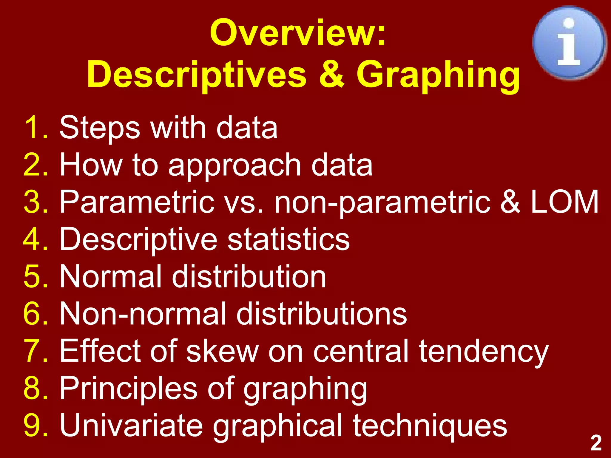

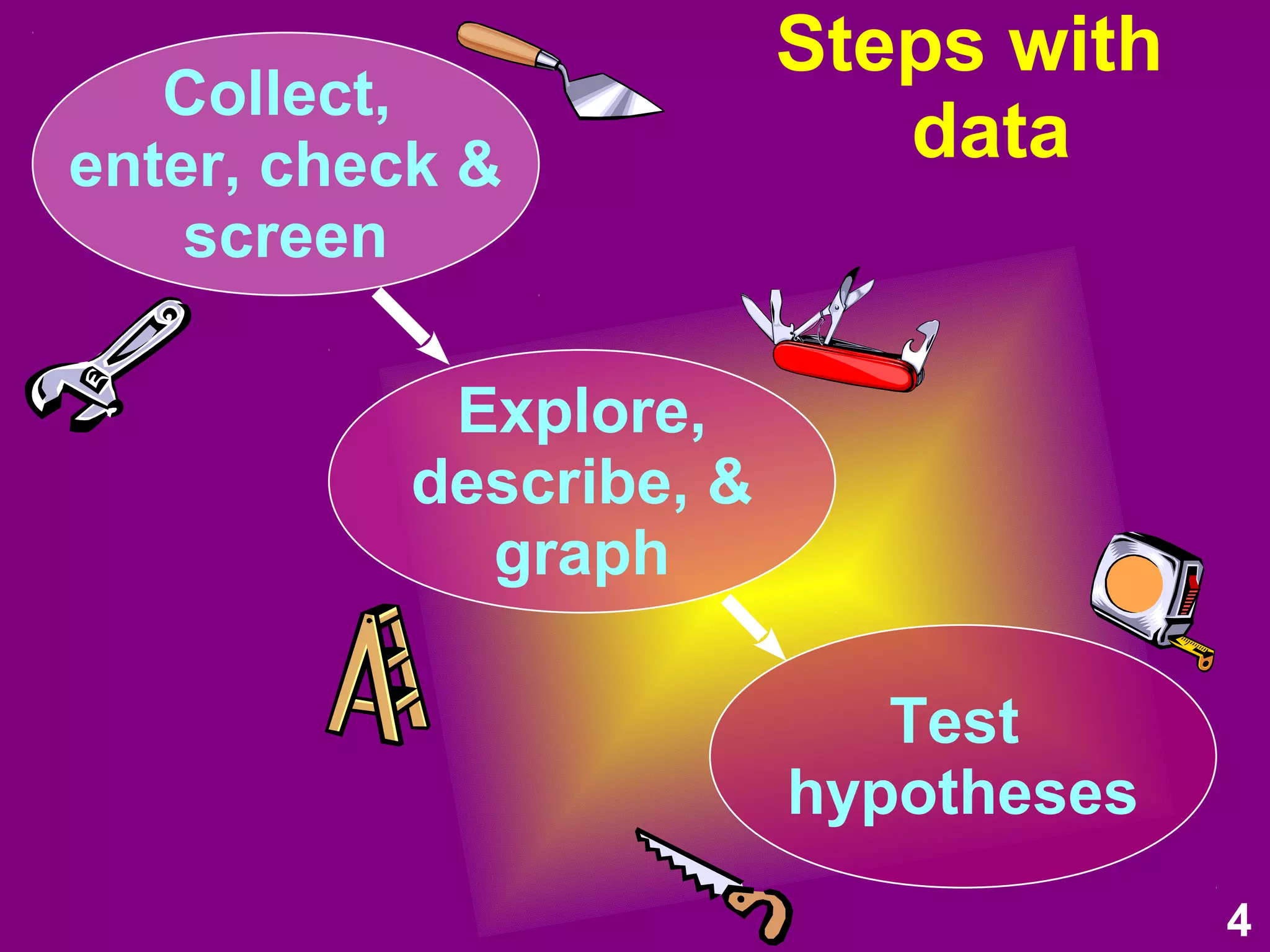


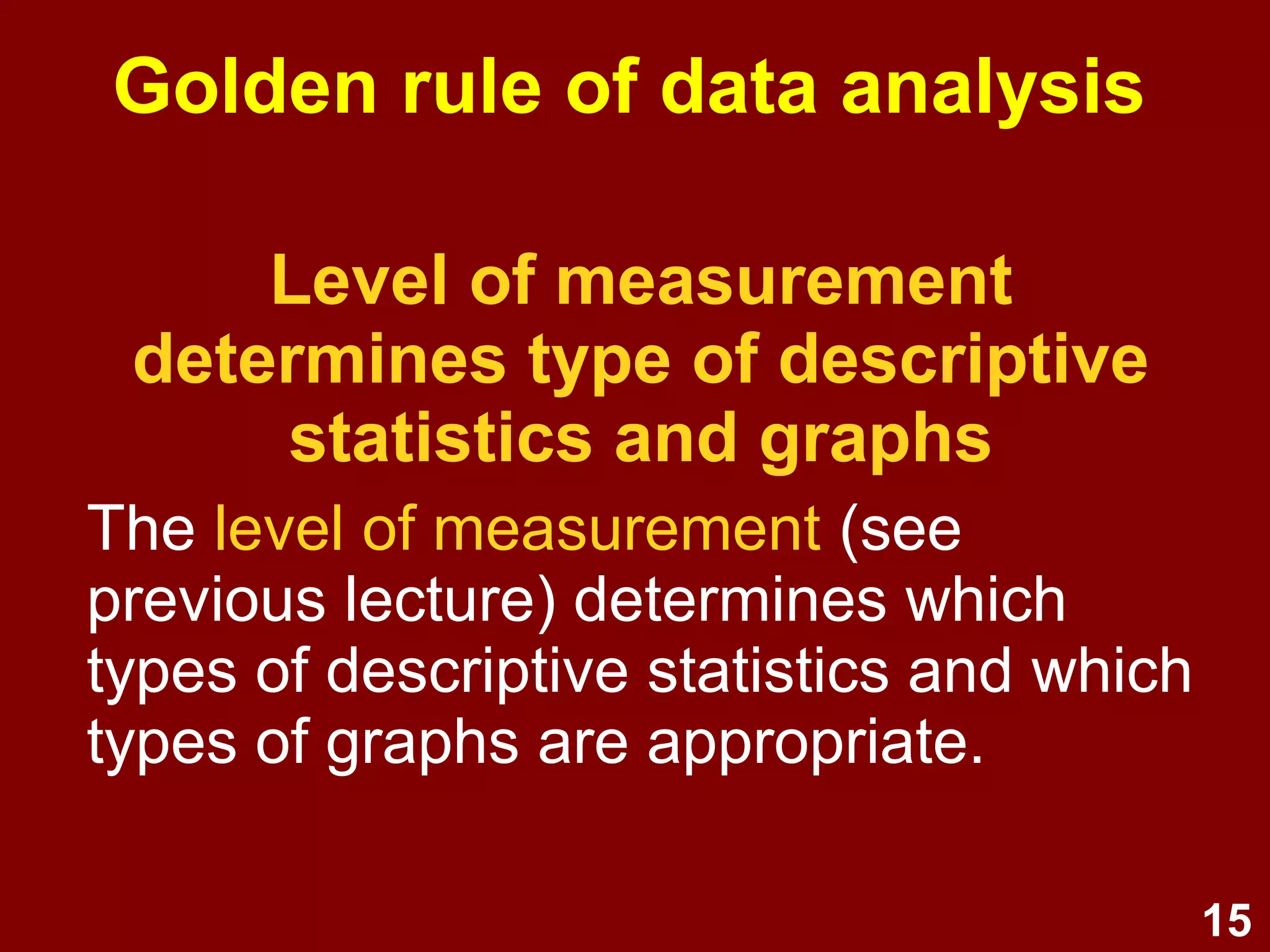
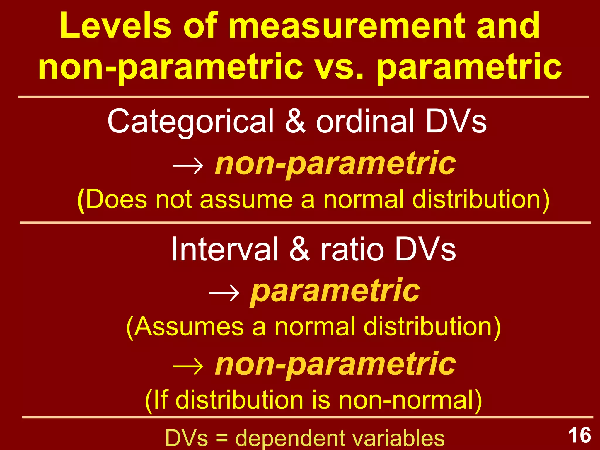
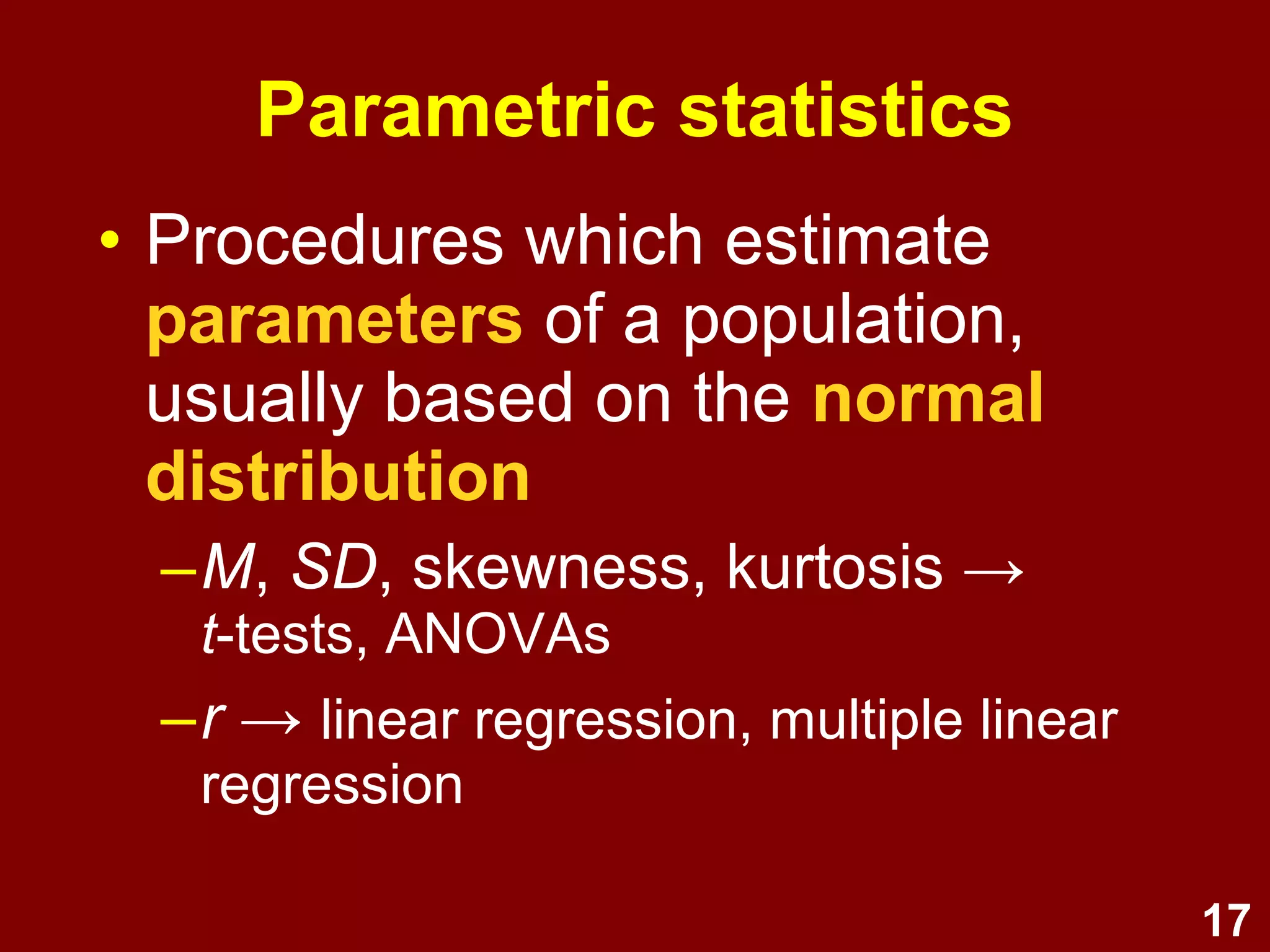
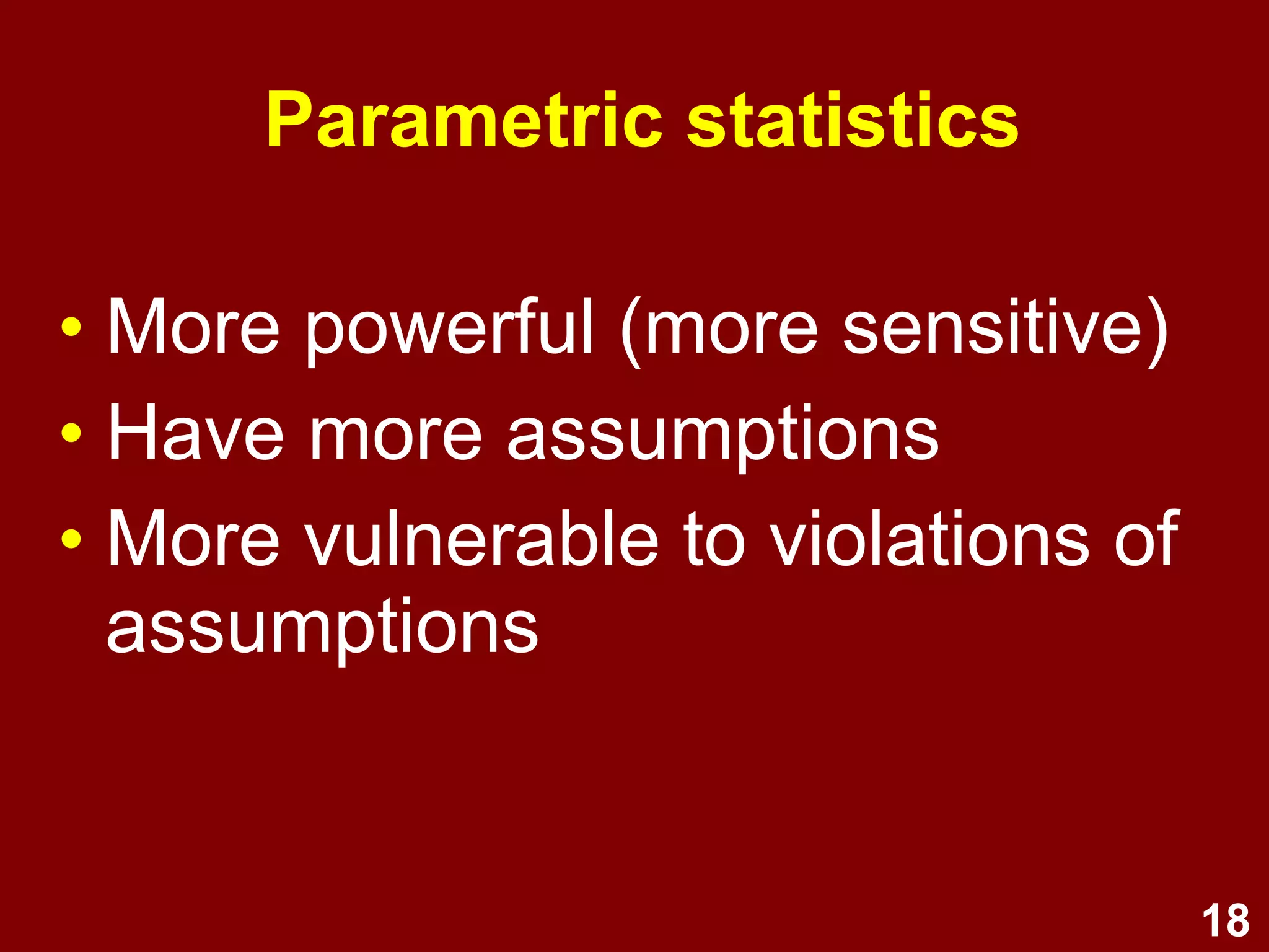
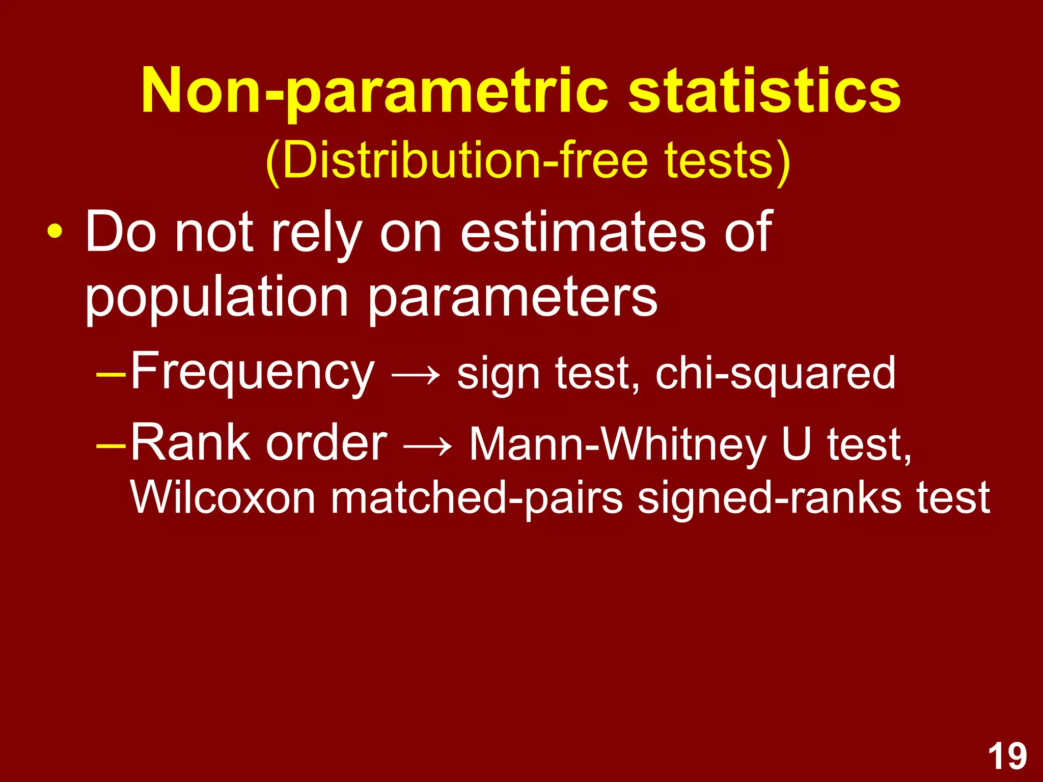
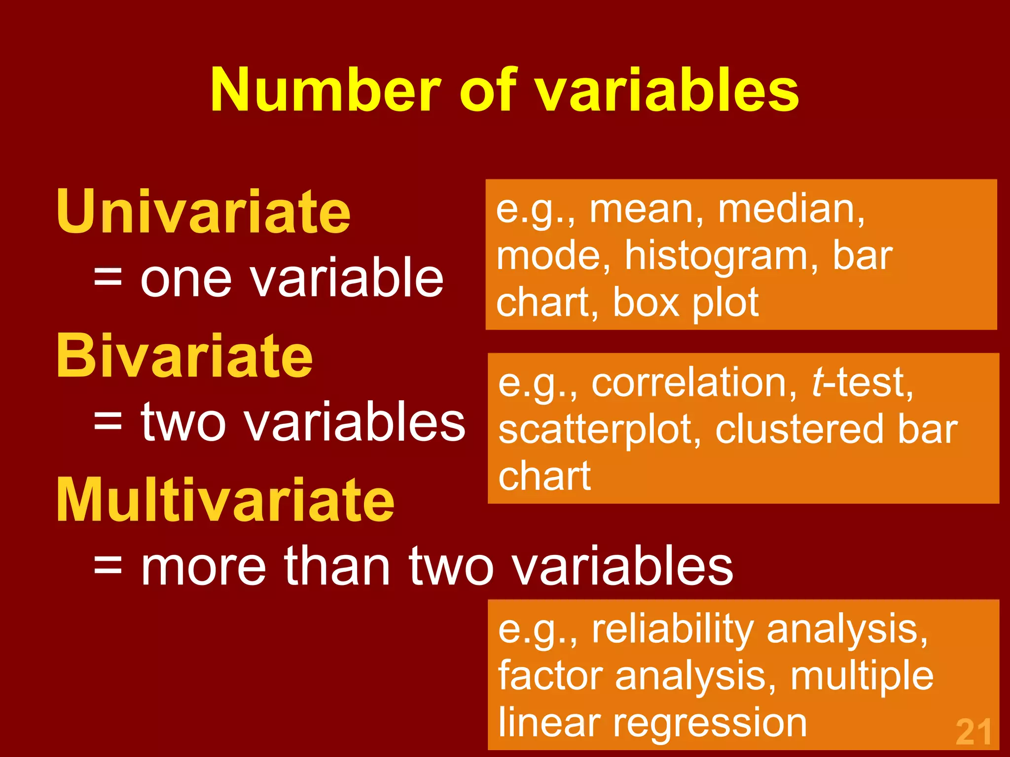
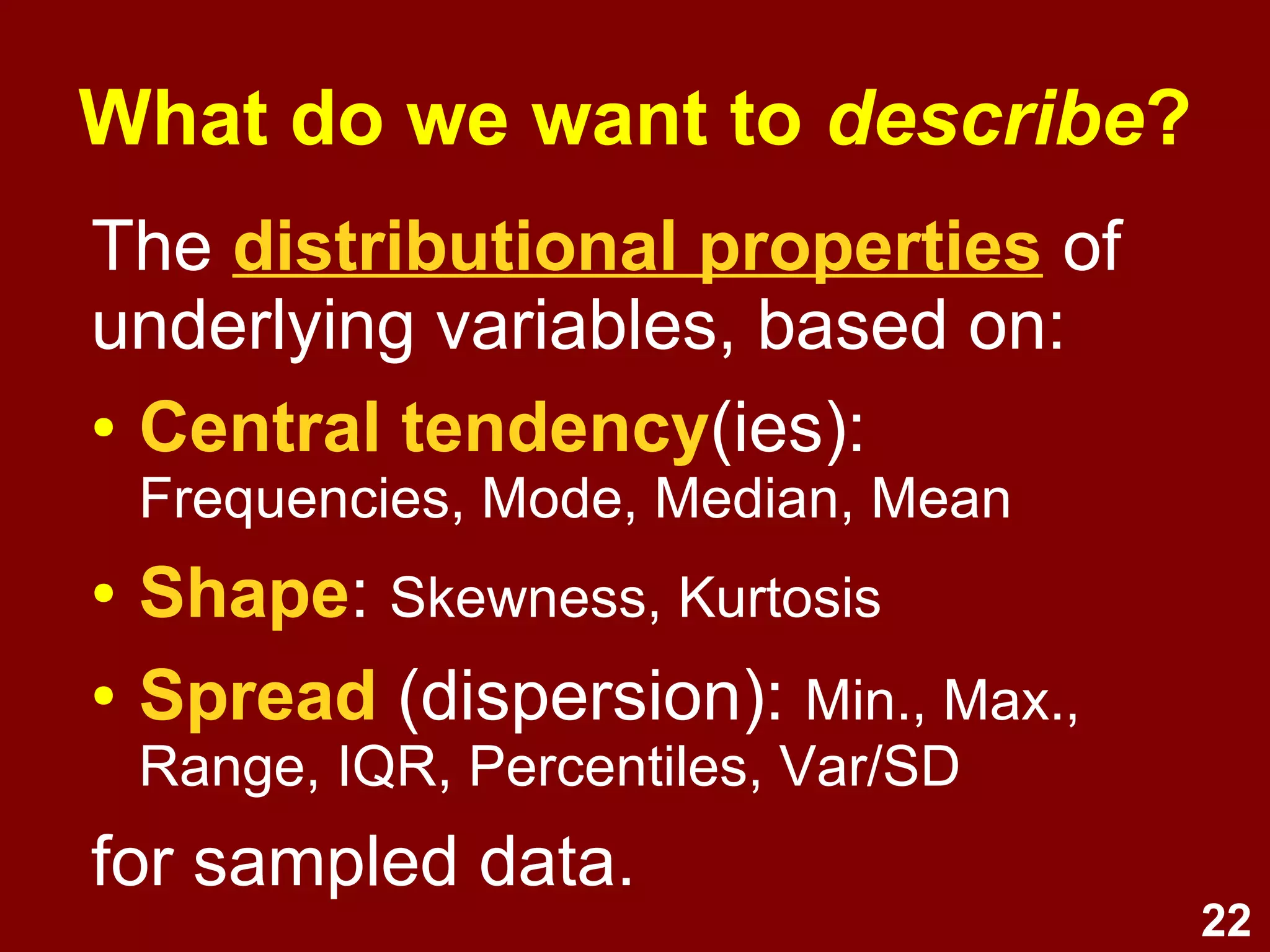
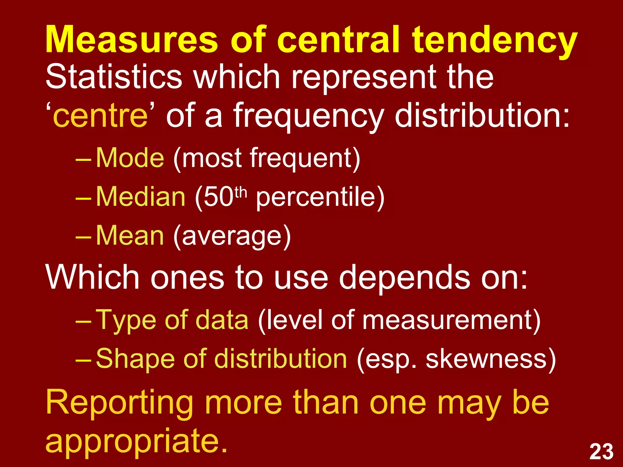
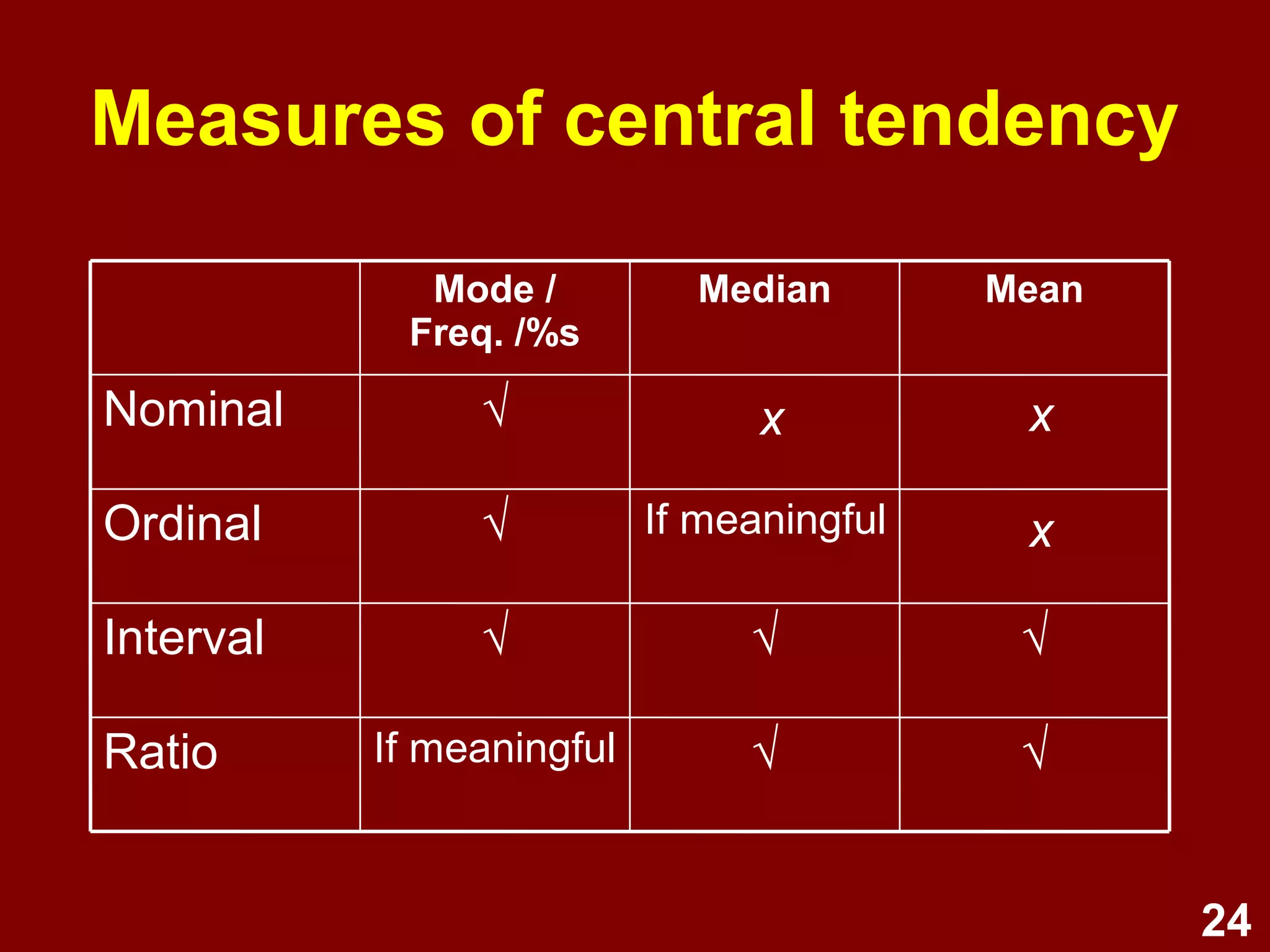
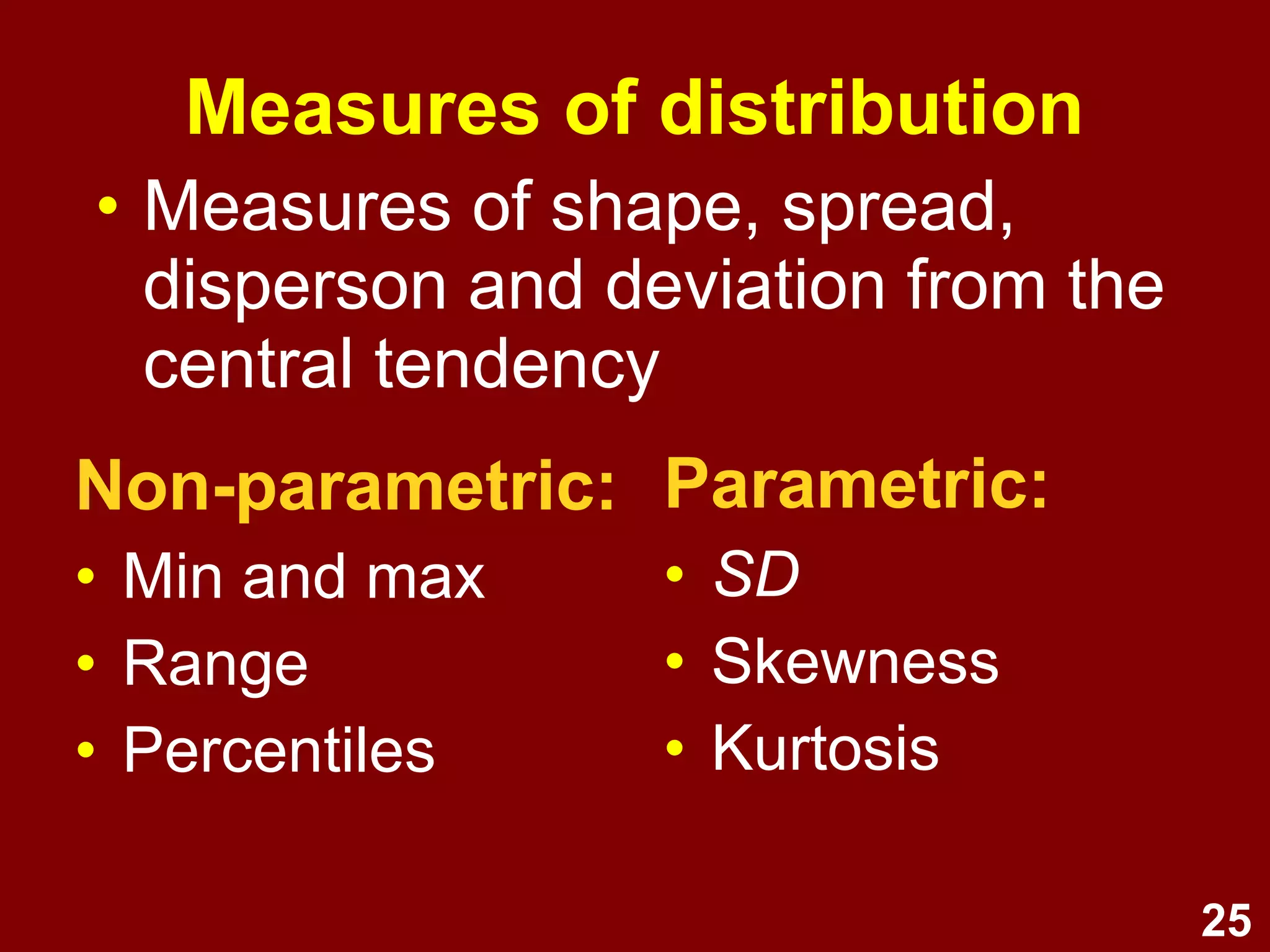
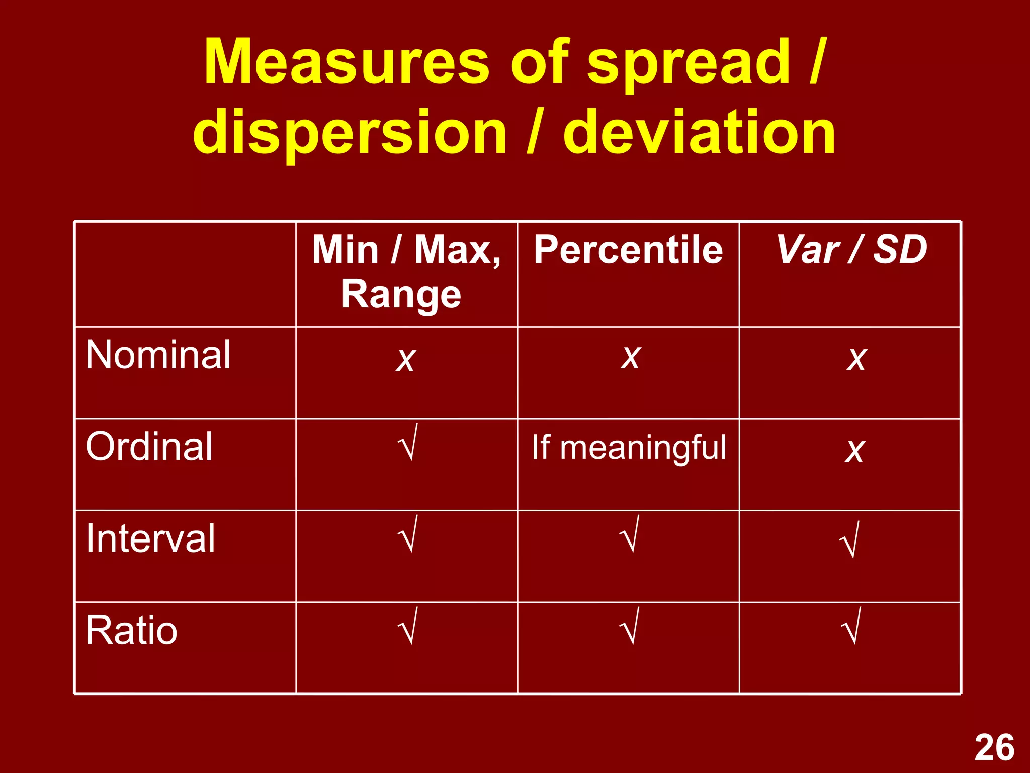
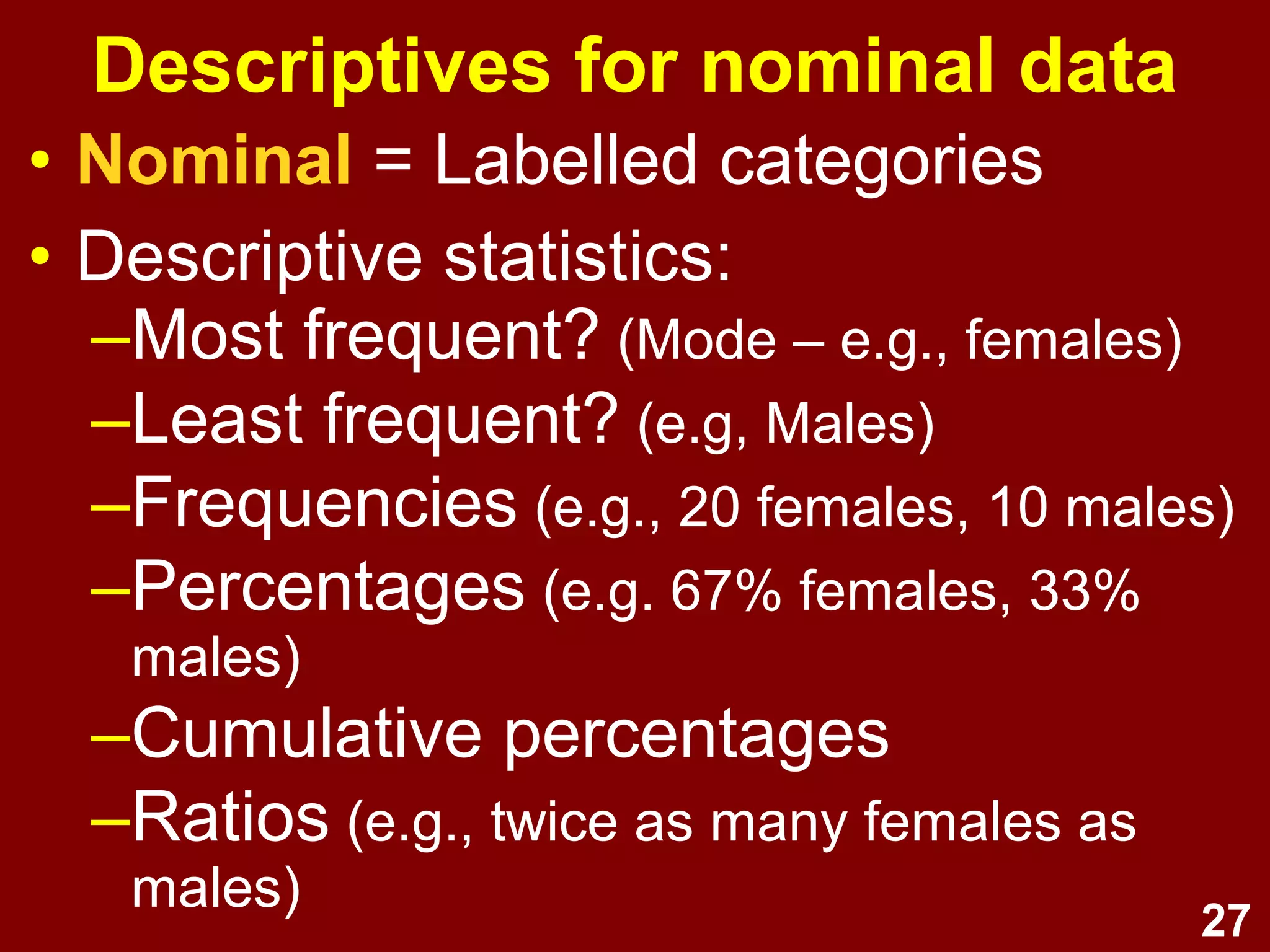
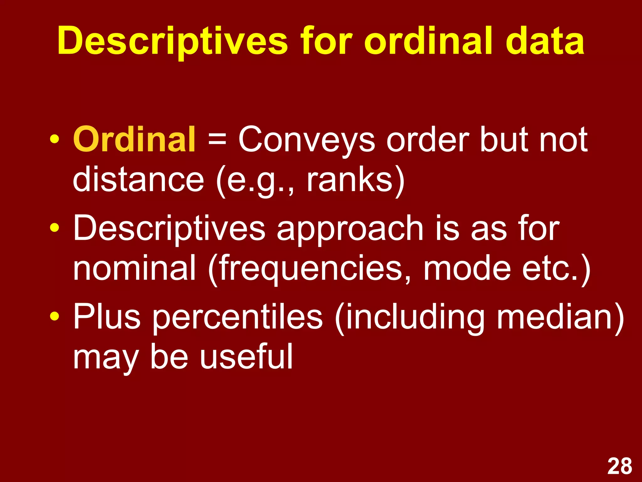
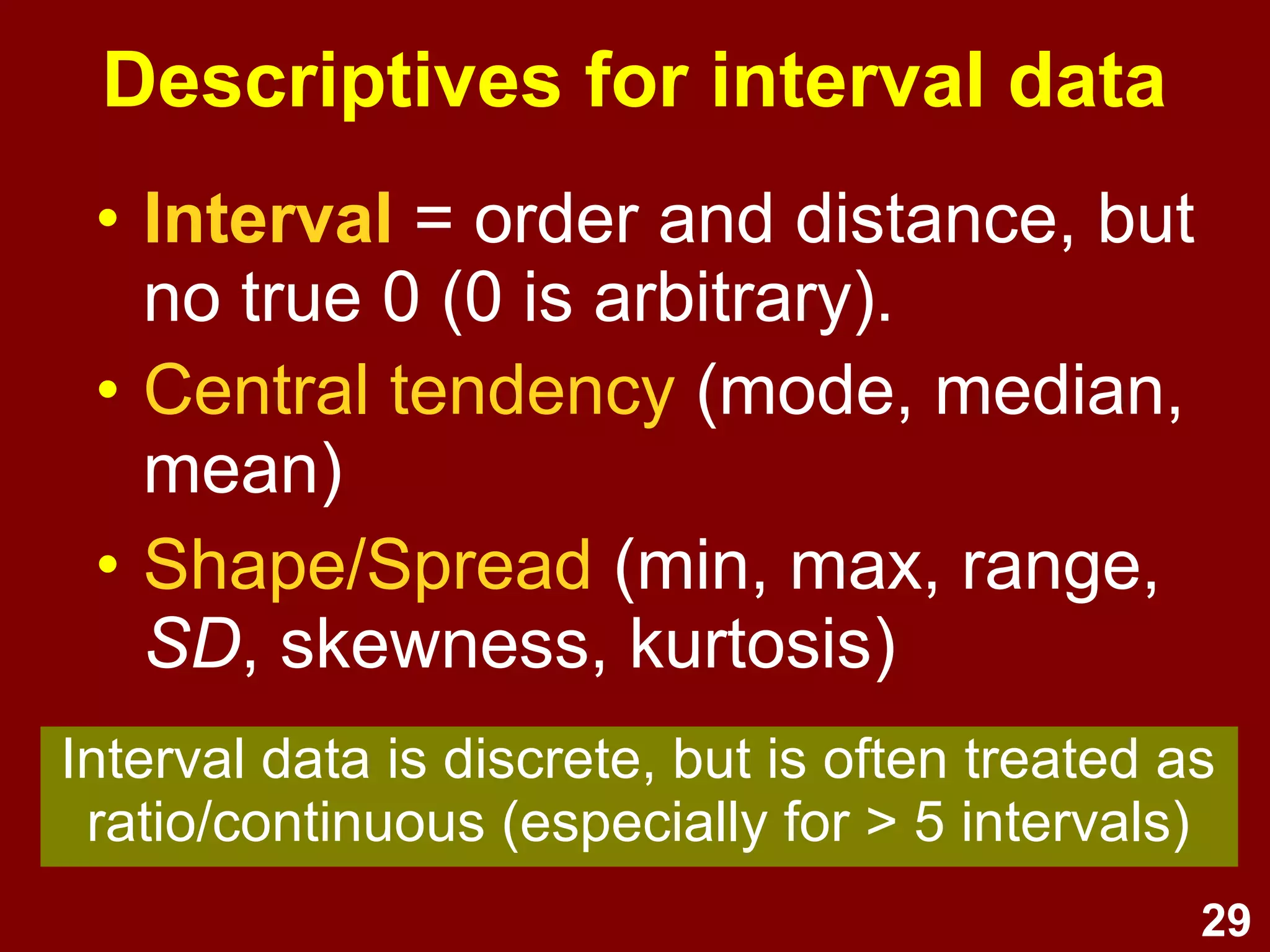
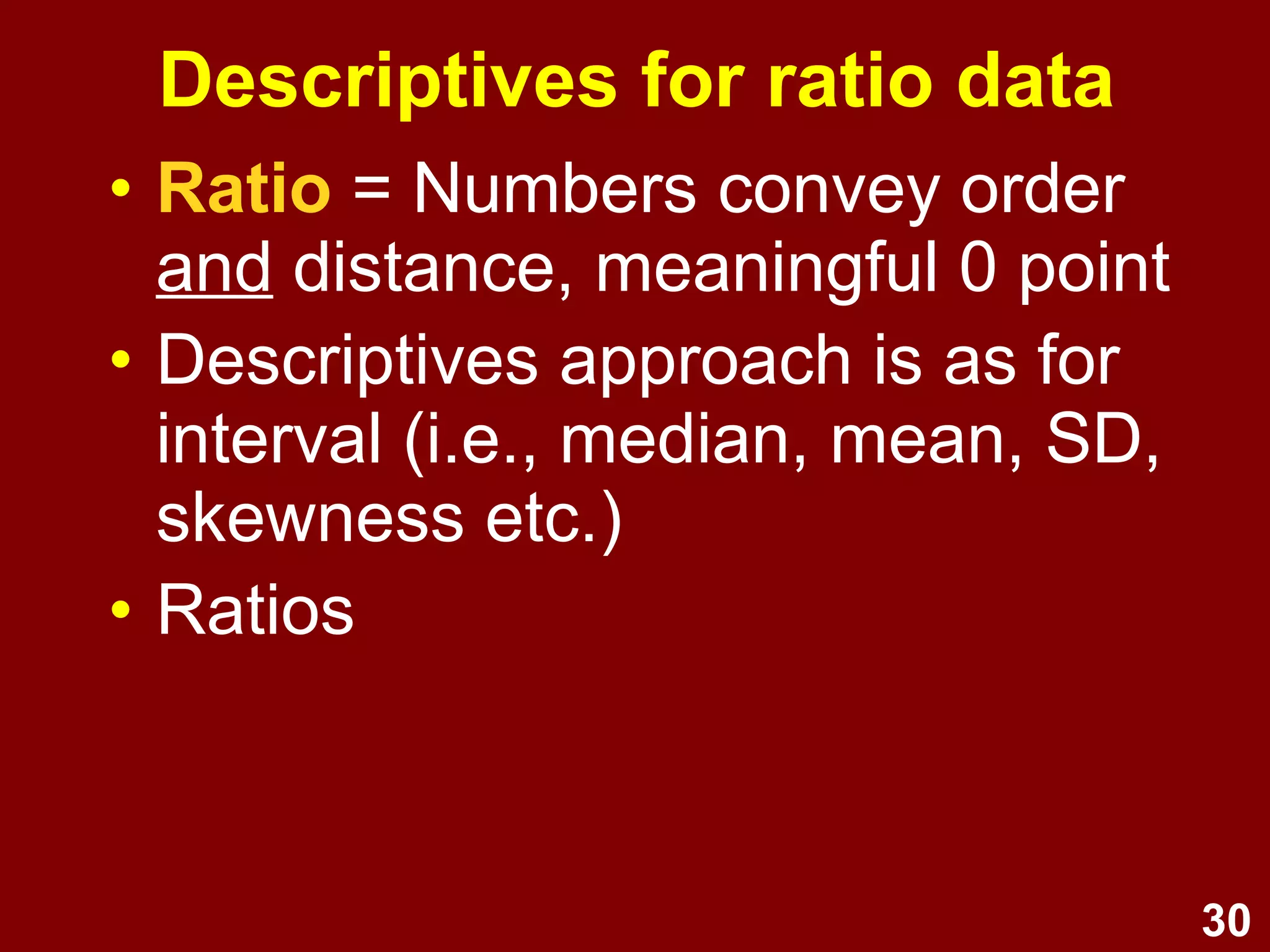


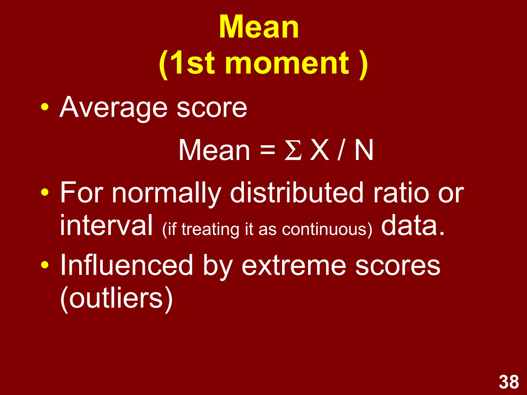
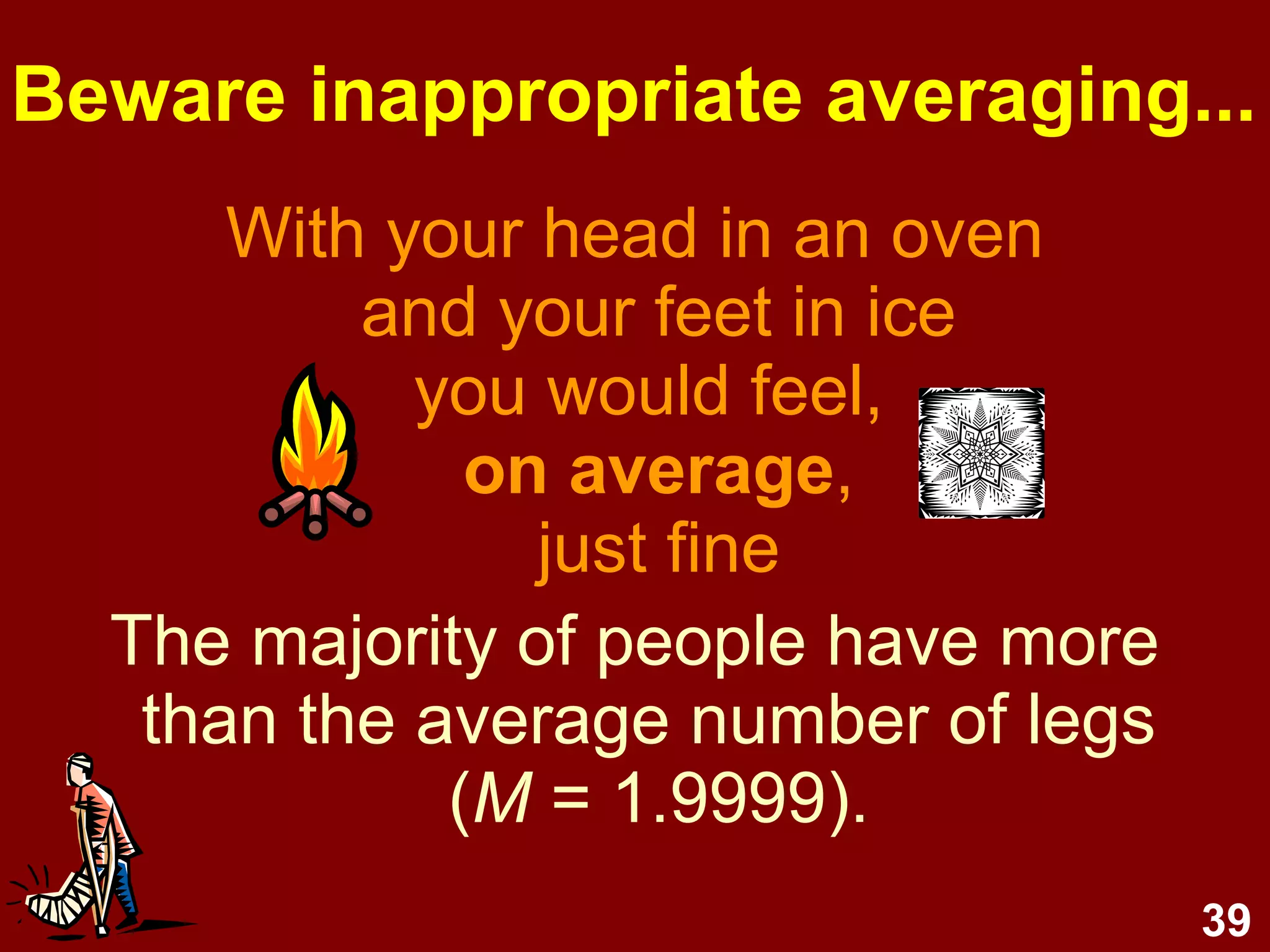
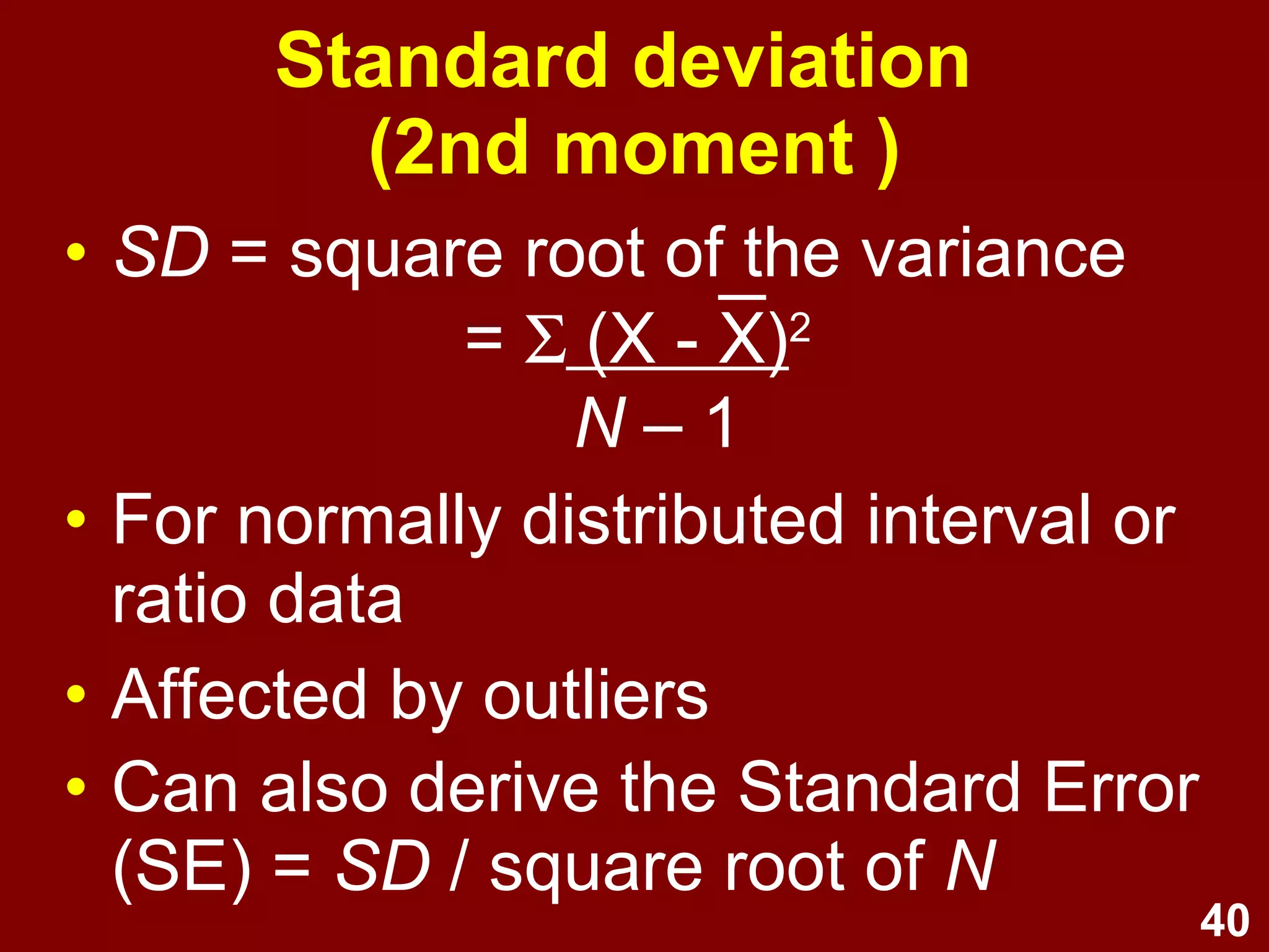
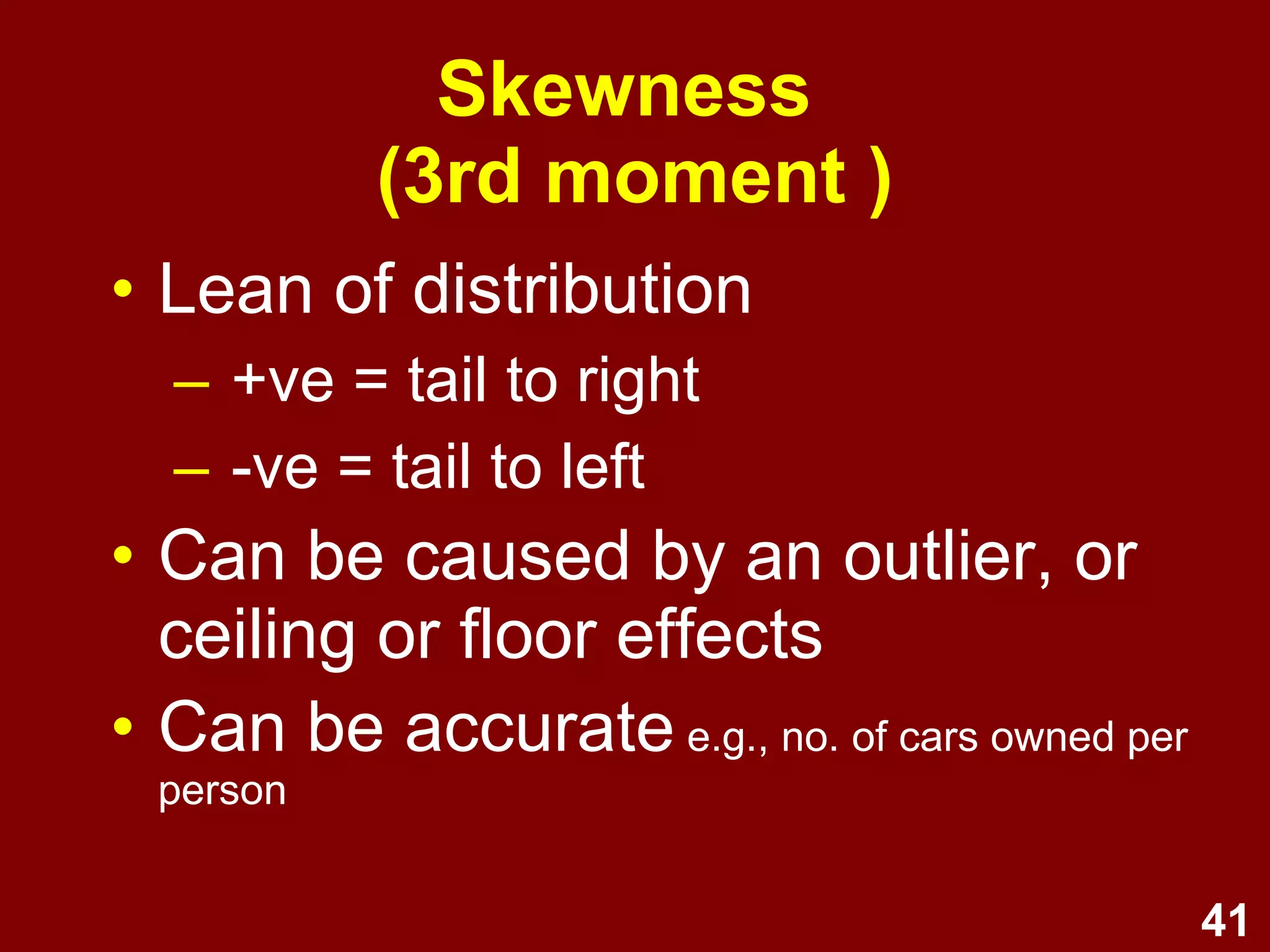
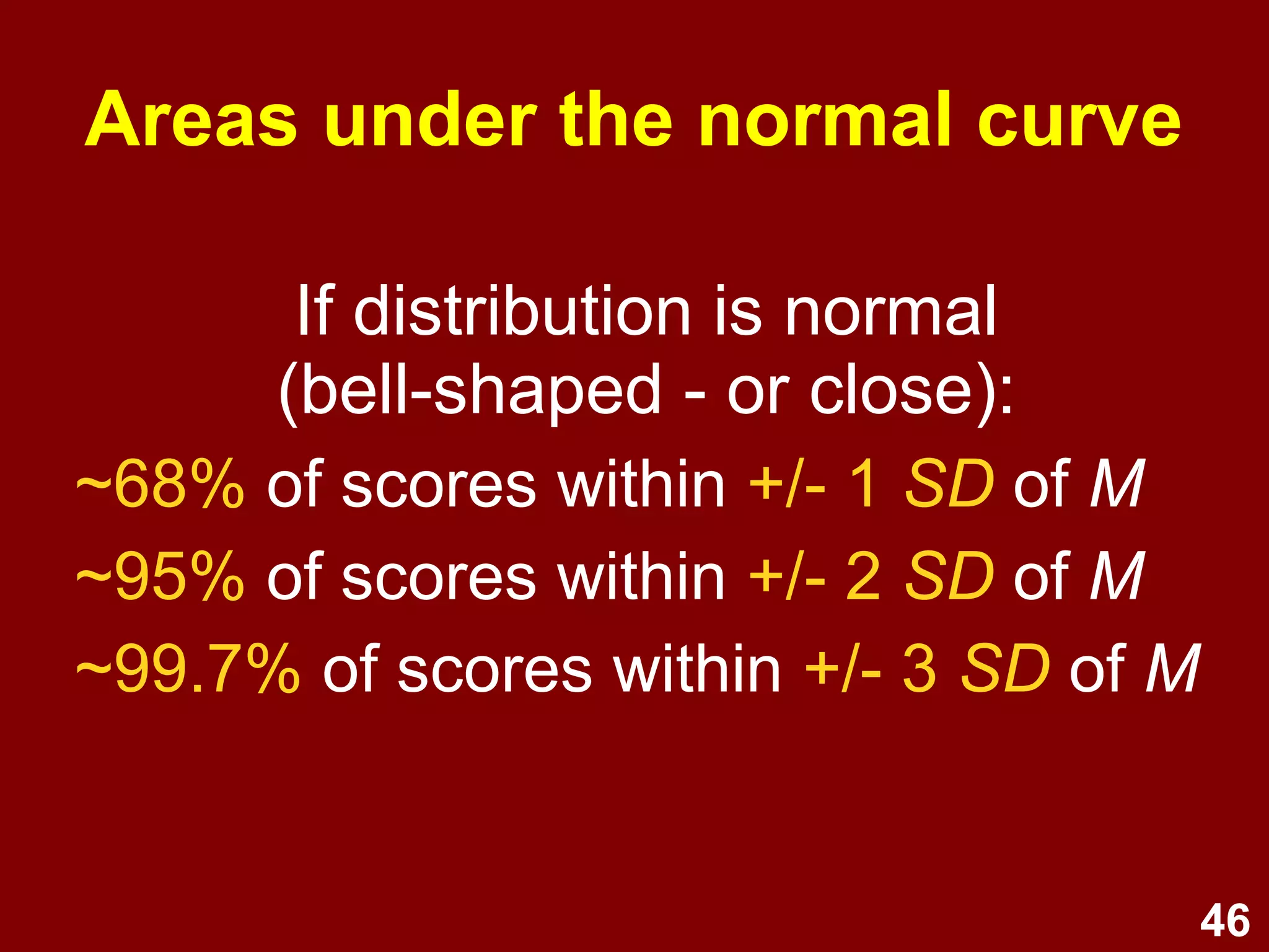
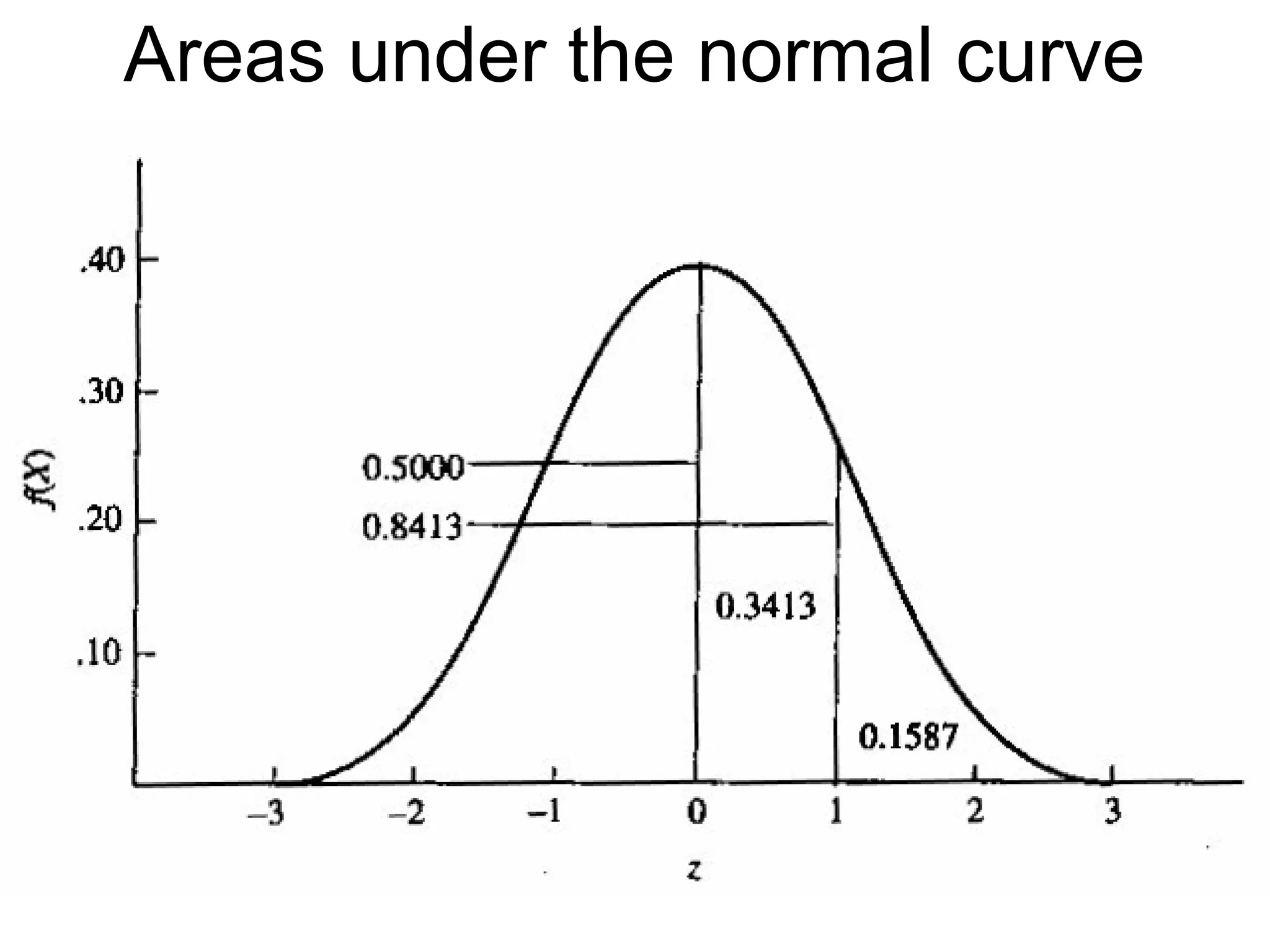
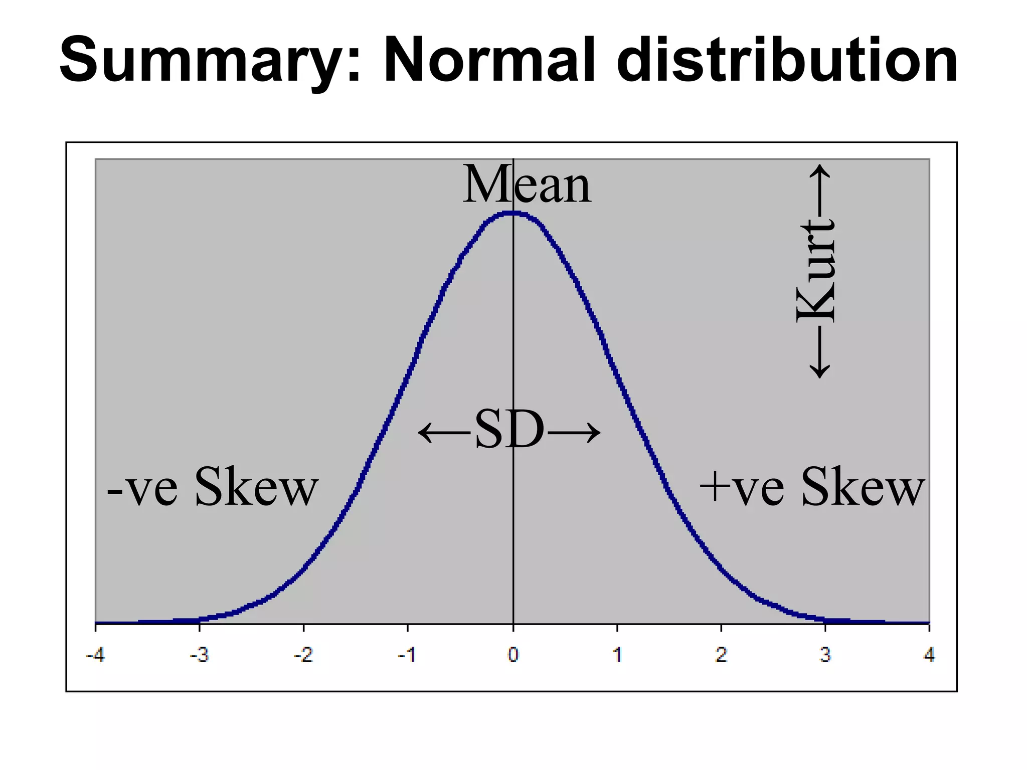
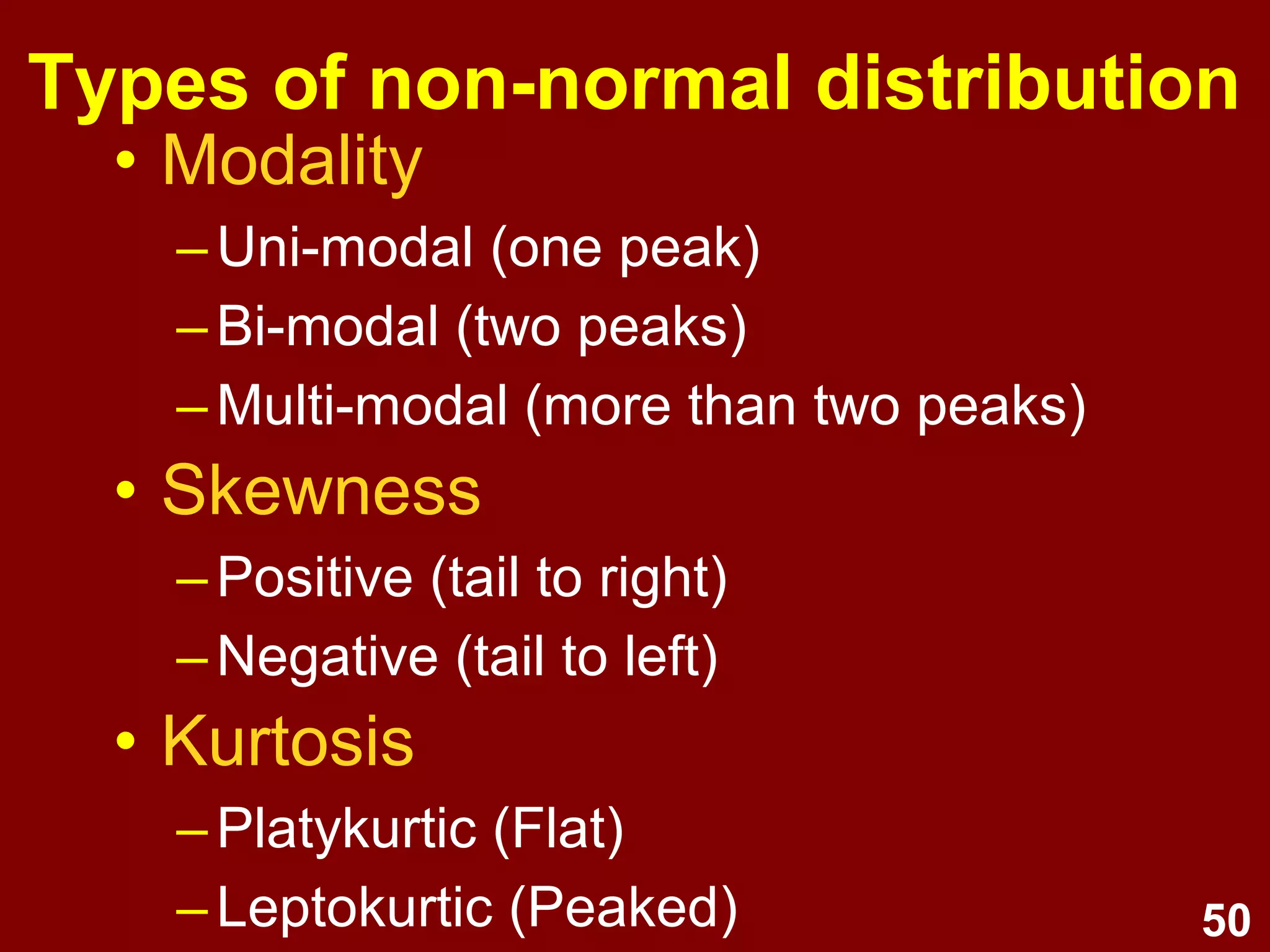
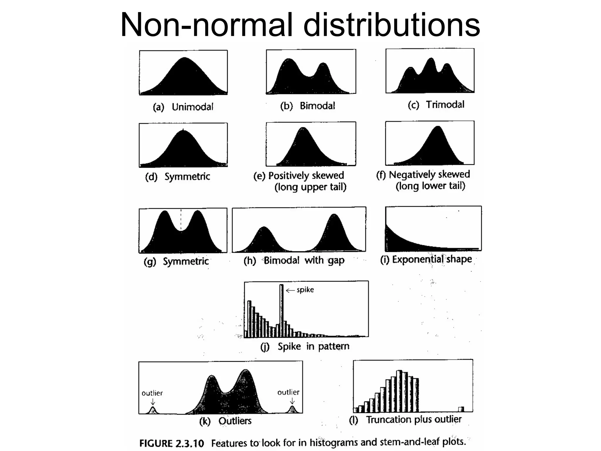

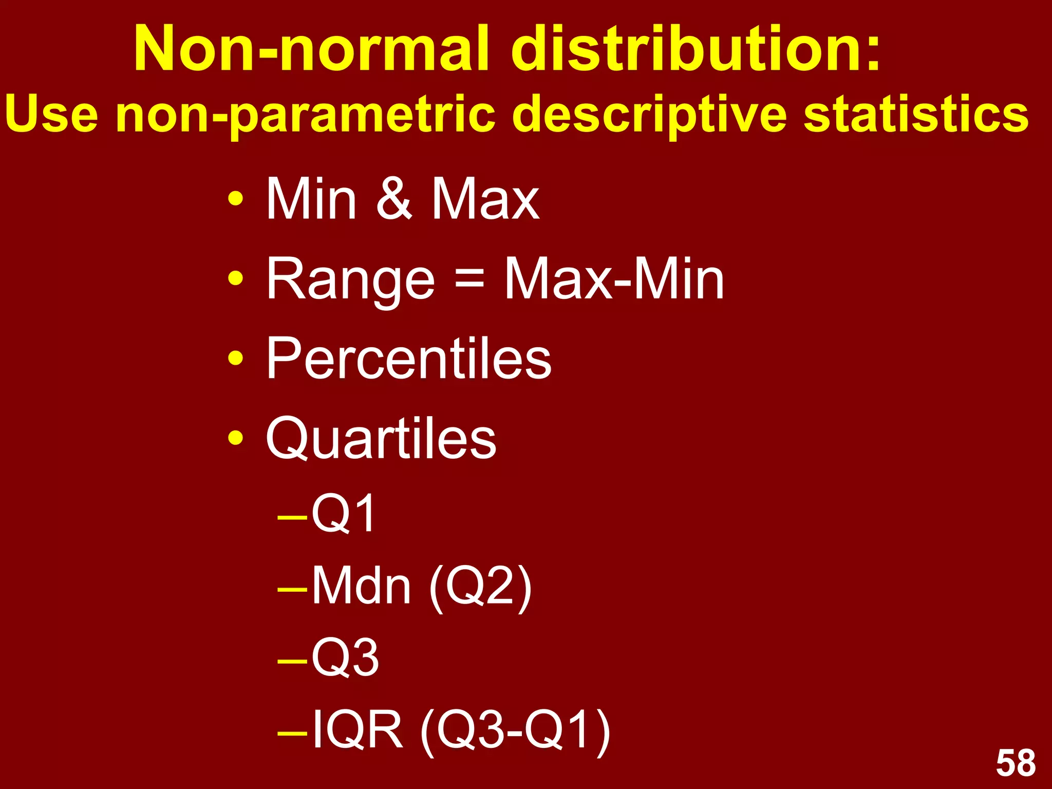

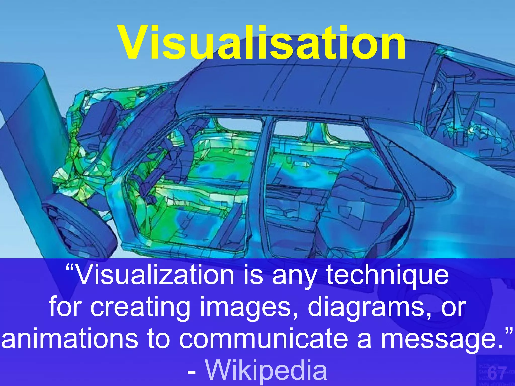


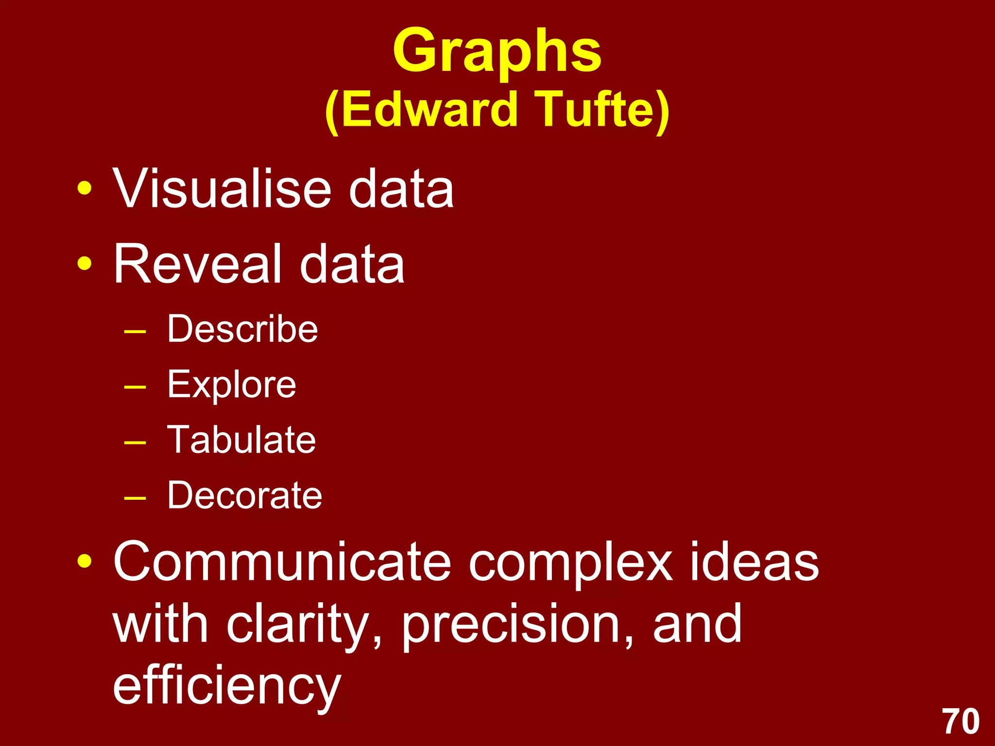
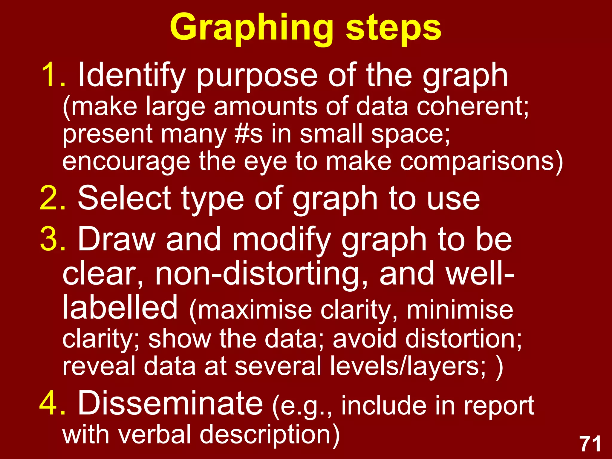
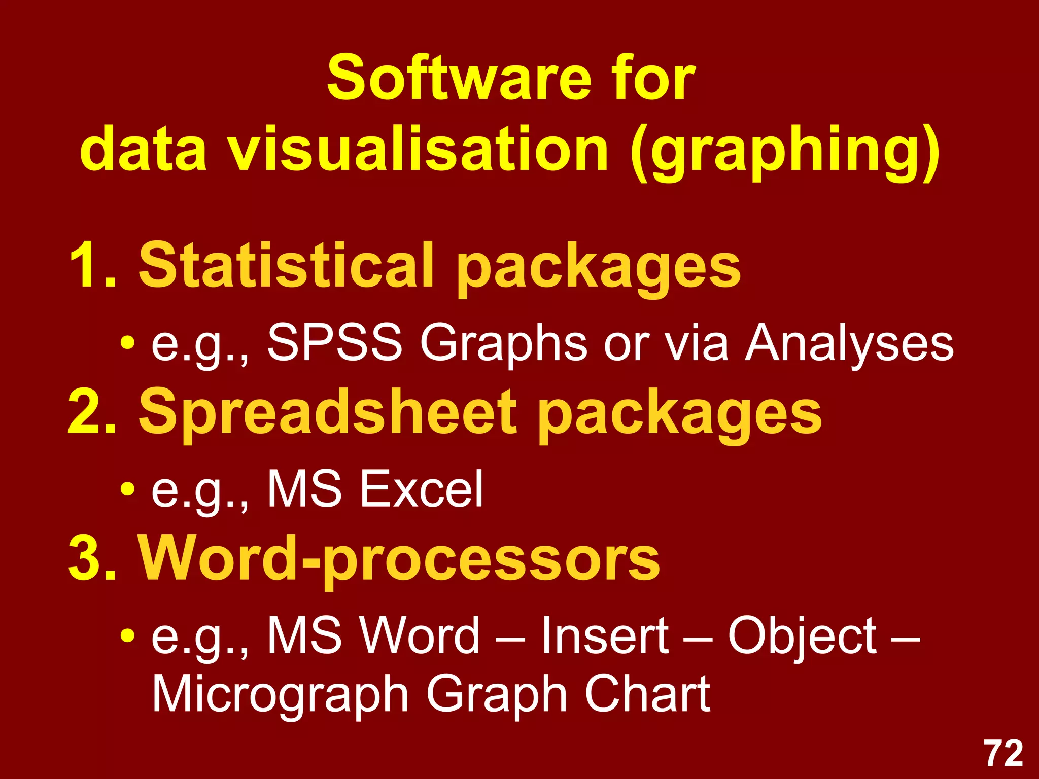
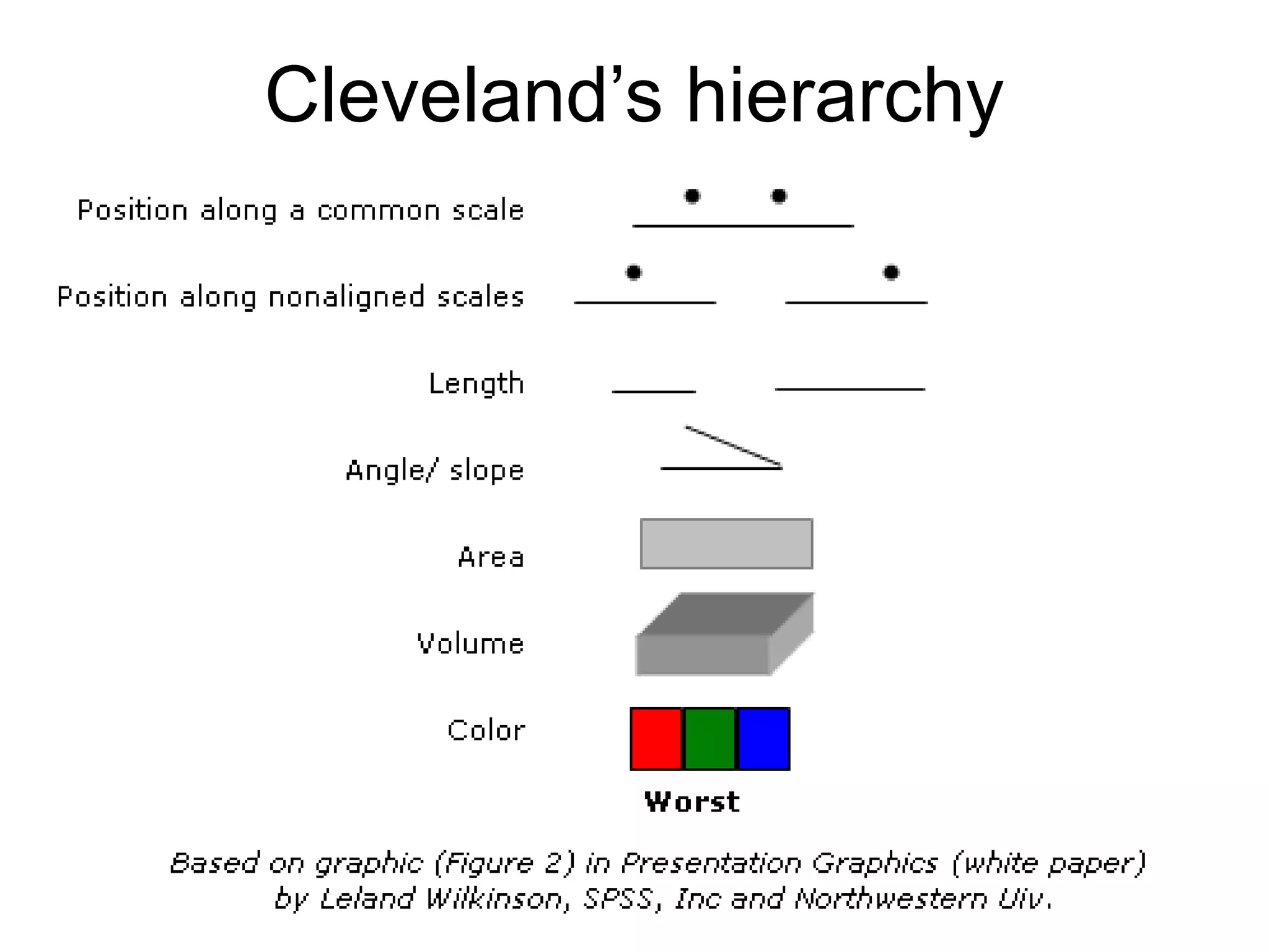

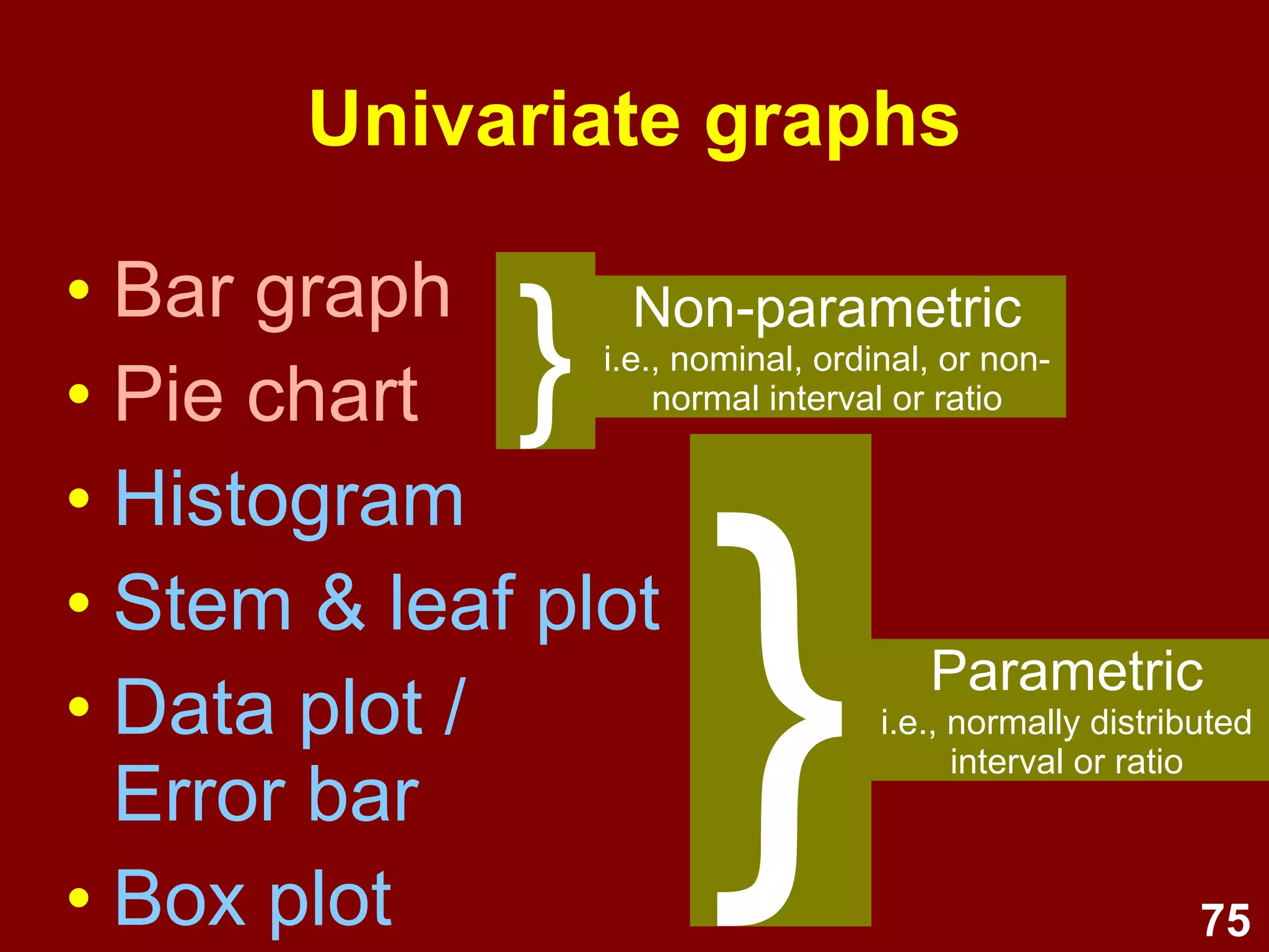
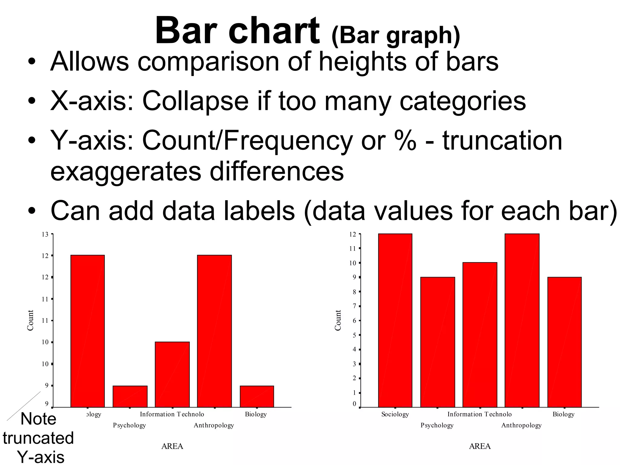
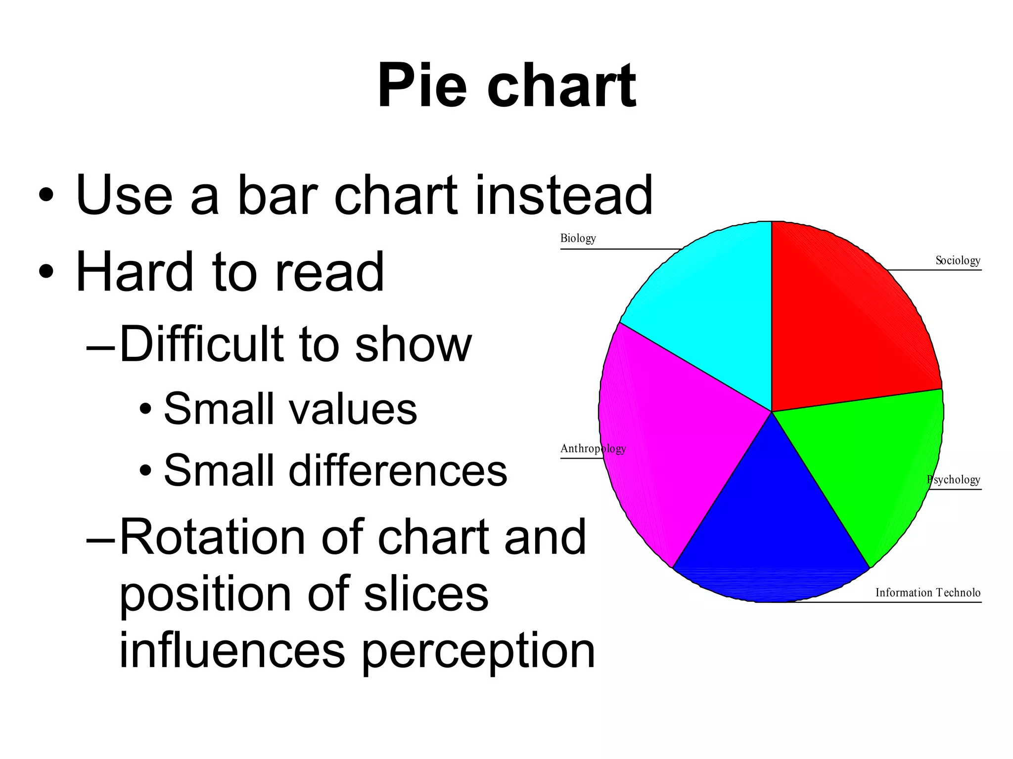
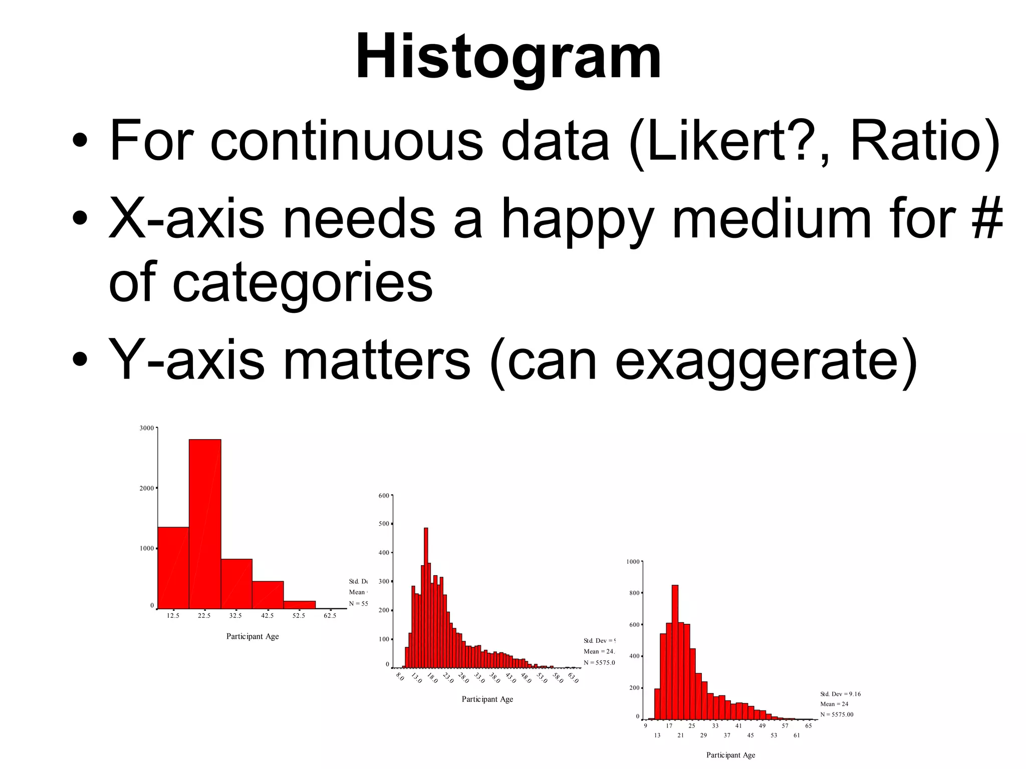
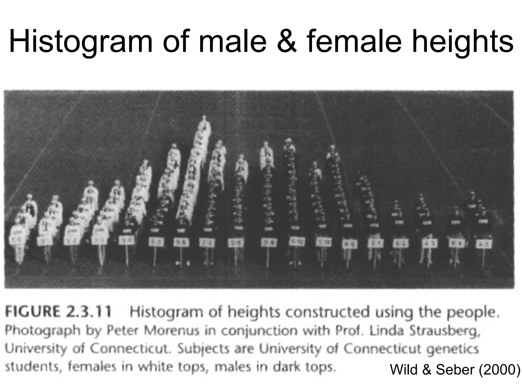
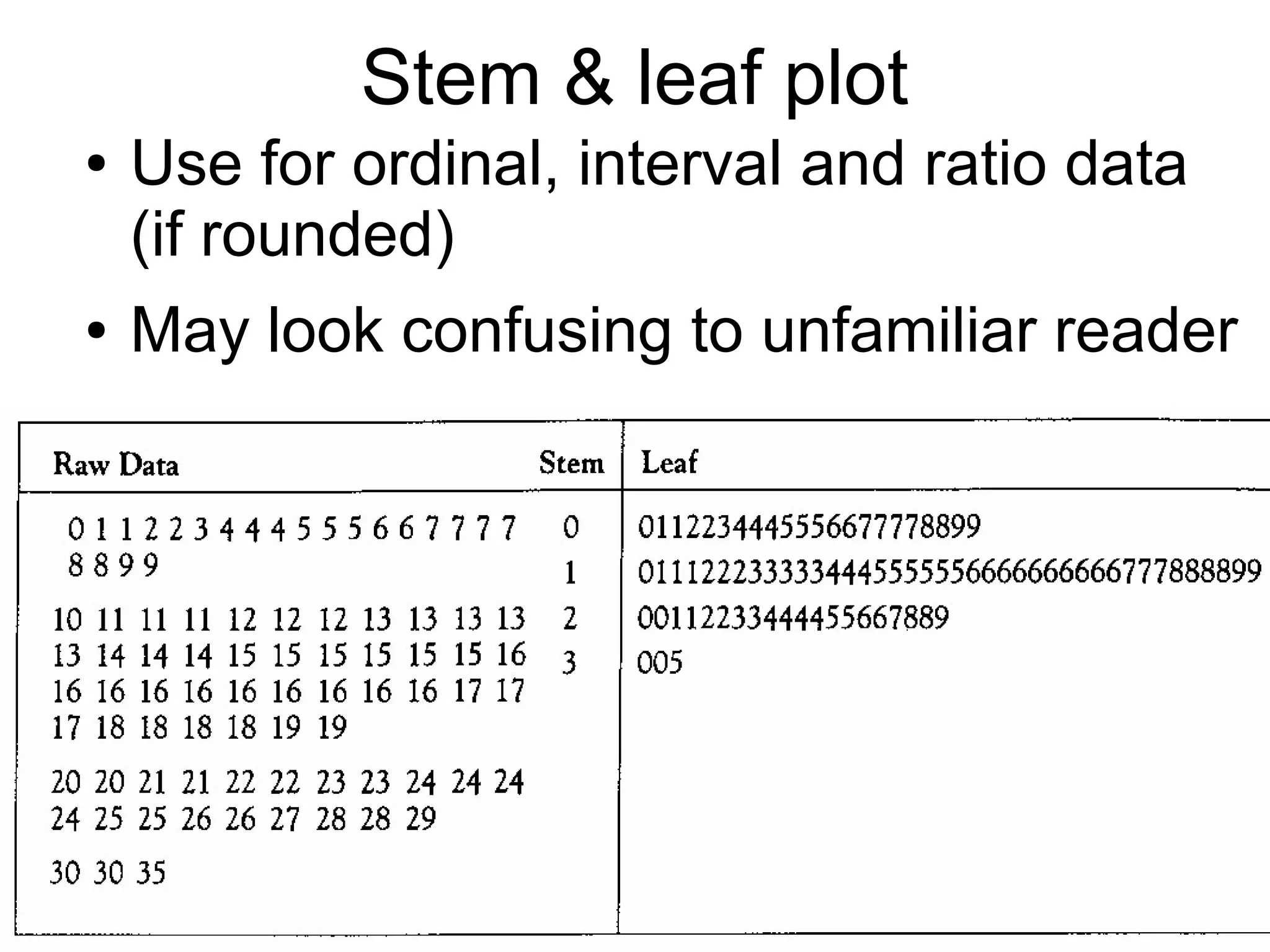
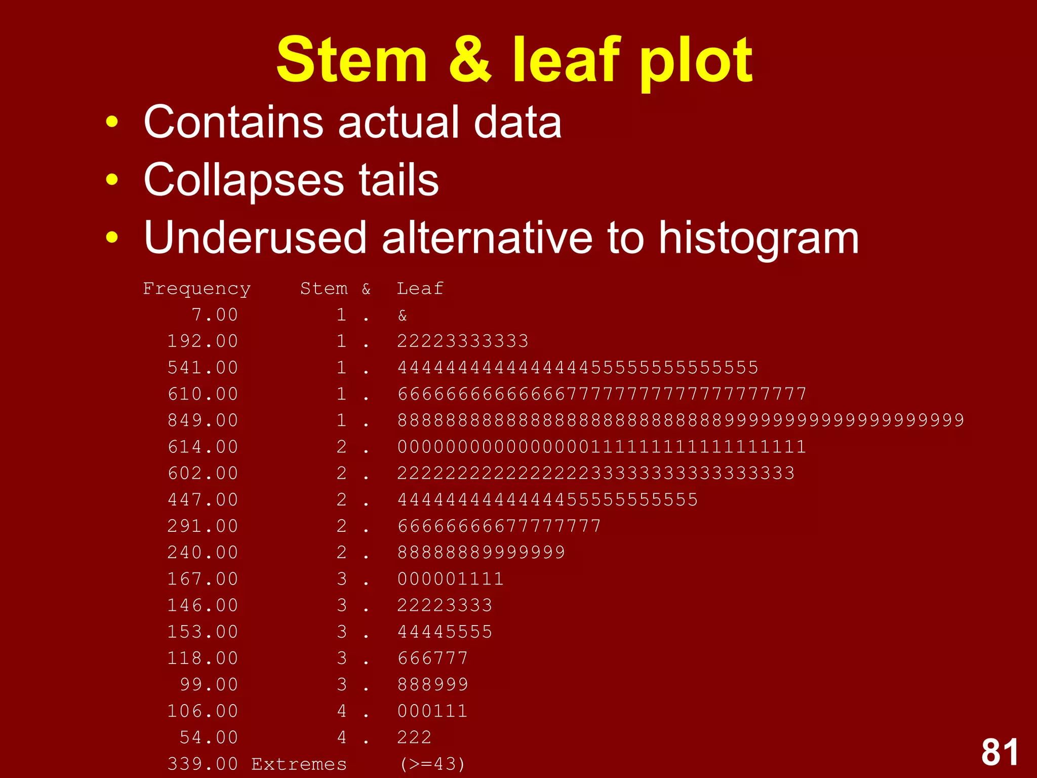
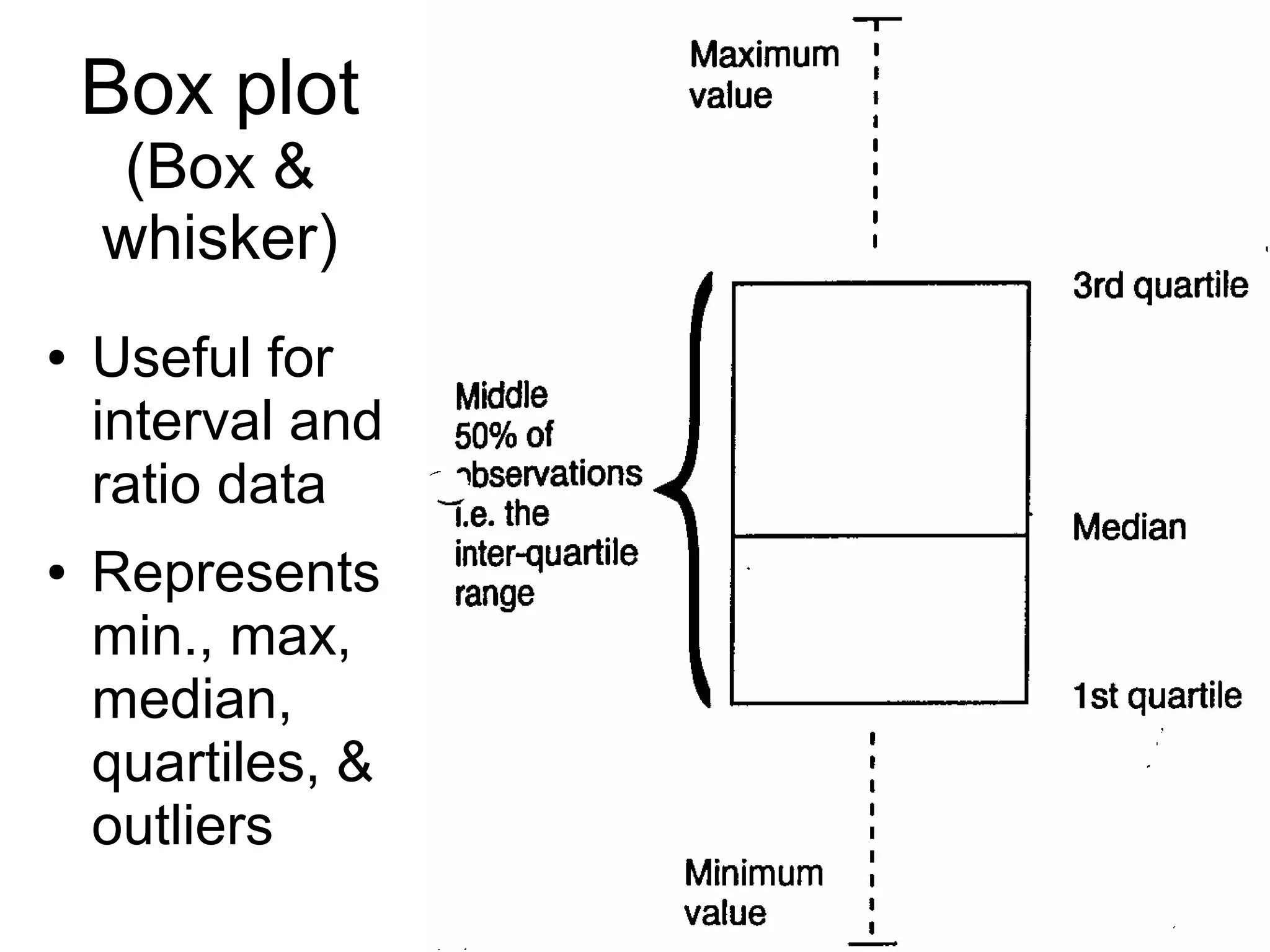


This document provides an overview of descriptive statistics and graphing techniques used in survey research and psychology. It discusses getting to know data, levels of measurement, descriptive statistics for different data types, properties of the normal distribution, and non-normal distributions. Graphical techniques covered include bar graphs, histograms, pie charts, and box plots. The principles of graphing to maximize clarity and minimize clutter are also outlined.