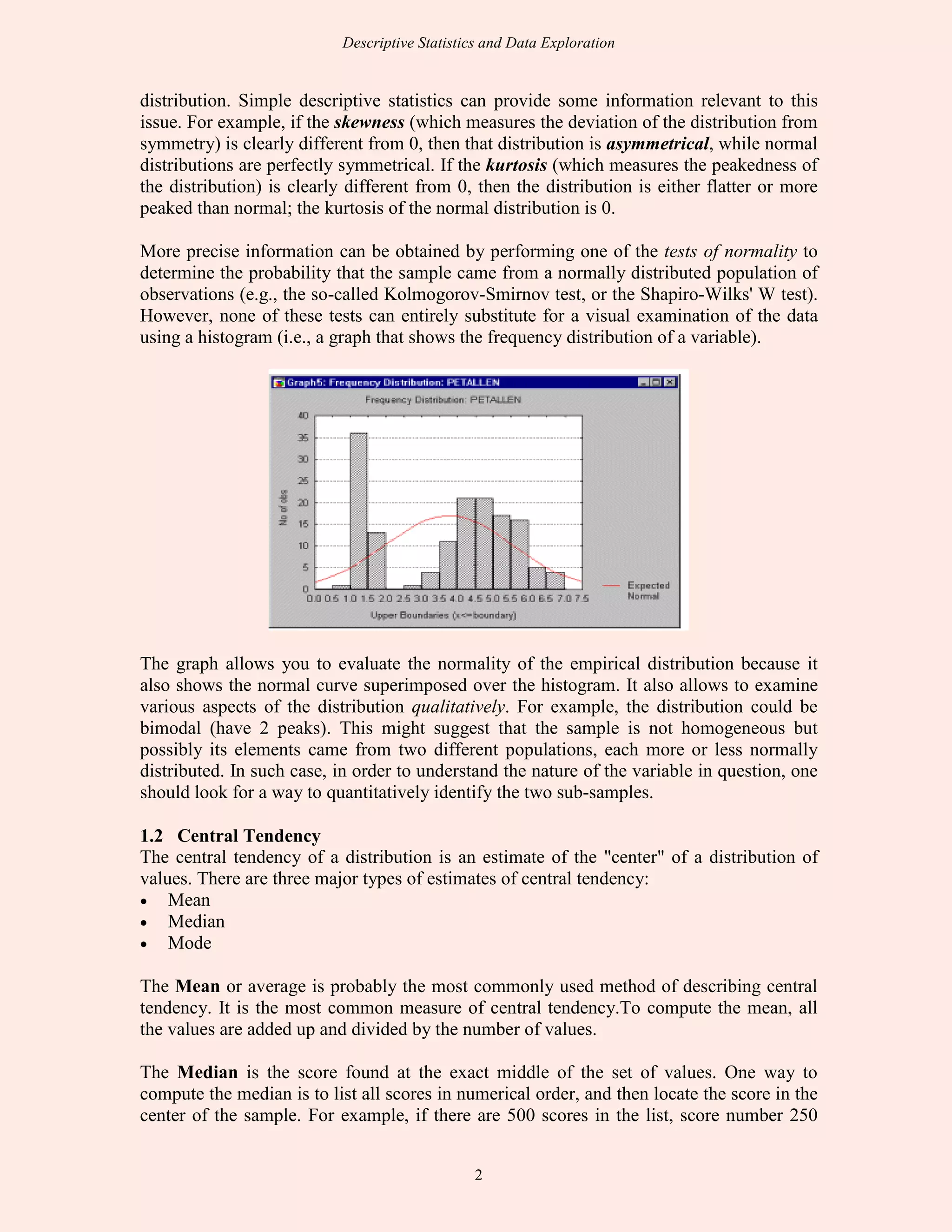
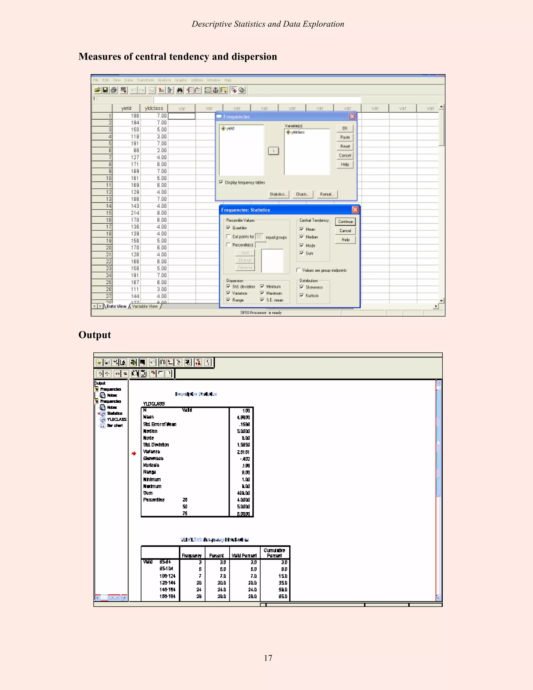
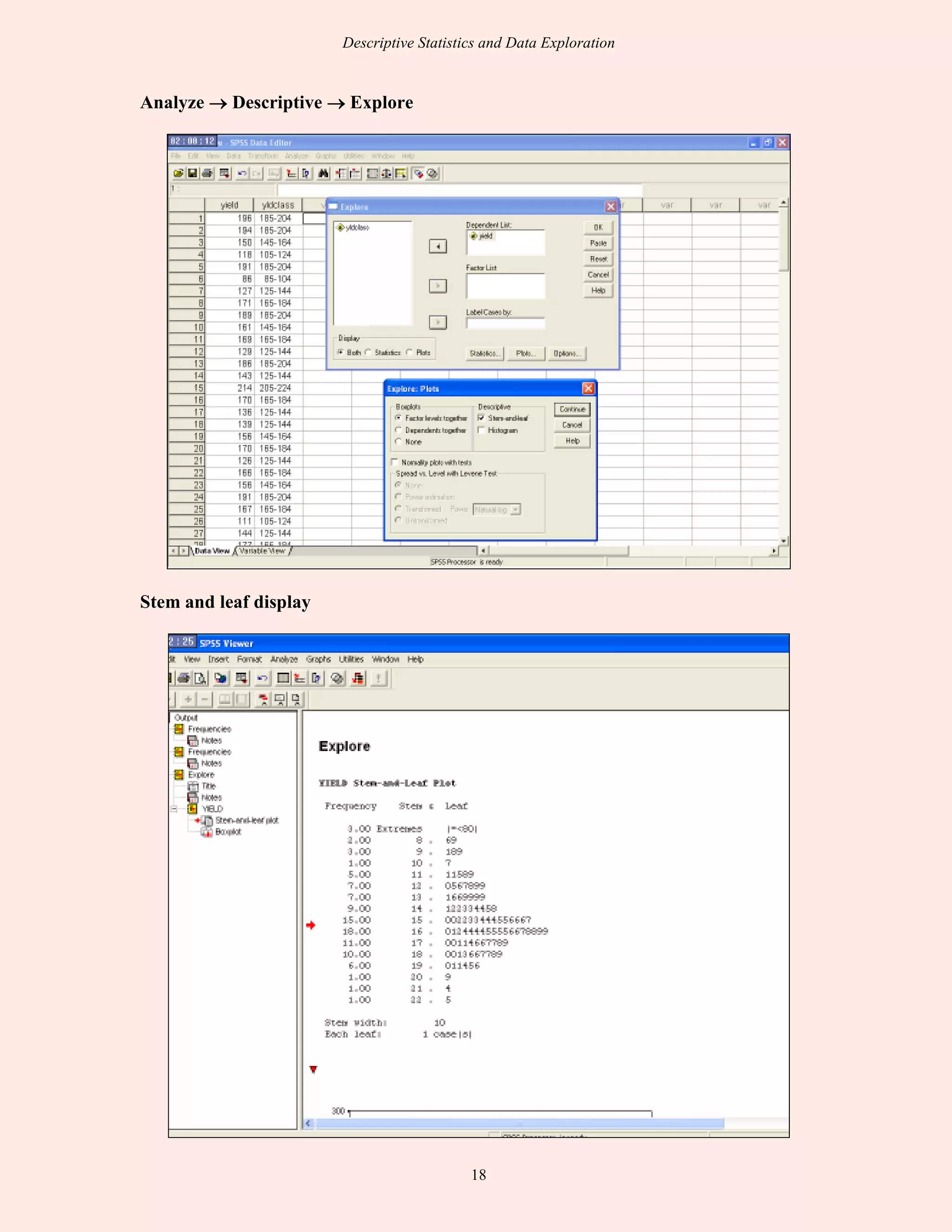
SlideShare a Scribd company logo
DESCRIPTIVE STATISTICS AND
EXPLORATORY DATA ANALYSIS
SEEMA JAGGI
Indian Agricultural Statistics Research Institute
Library Avenue, New Delhi - 110 012
seema@iasri.res.in
1. Descriptive Statistics
Statistics is a set of procedures for gathering, measuring, classifying, computing,
describing, synthesizing, analyzing, and interpreting systematically acquired quantitative
data. Statistics has major two components: the Descriptive Statistics and the Inferential
Statistics. Descriptive Statistics gives numerical and graphic procedures to summarize a
collection of data in a clear and understandable way whereas Inferential Statistics
provides procedures to draw inferences about a population from a sample.
Descriptive statistics help us to simplify large amounts of data in a sensible way. Each
descriptive statistic reduces lots of data into a simpler summary. There are two basic
methods: numerical and graphical. Using the numerical approach one might compute
statistics such as the mean and standard deviation. These statistics convey information
about the average. The plots contain detailed information about the distribution. Graphical
methods are better suited than numerical methods for identifying patterns in the data.
Numerical approaches are more precise and objective. Since the numerical and graphical
approaches complement each other, it is wise to use both. There are three major
characteristics of a single variable that we tend to look at:
• Distribution
• Central Tendency
• Dispersion
1.1 Distribution
The distribution is a summary of the frequency of individual values or ranges of values for
a variable. The simplest distribution would list every value of a variable and the number
of times each value occurs. One of the most common ways to describe a single variable is
with a frequency distribution. Frequency distributions can be depicted in two ways, as a
table or as a graph. Distributions may also be displayed using percentages. Frequency
distribution organizes raw data or observations that have been collected into ungrouped
data and grouped data. The Ungrouped Data provide listing of all possible scores that
occur in a distribution and then indicating how often each score occurs. Grouped Data
combines all possible scores into classes and then indicating how often each score occurs
within each class. It is easier to see patterns in the data, but the information about
individual scores is lost. Graphs make it easier to see certain characteristics and trends in
a set of data. Graphs for quantitative data include Histogram, Frequency Polygon etc. and
graphs for qualitative data include Bar Chart, Pie Chart etc.
Shape of the Distribution
An important aspect of the "description" of a variable is the shape of its distribution,
which tells the frequency of values from different ranges of the variable. Typically, a
researcher is interested in how well the distribution can be approximated by the normal
Descriptive Statistics and Data Exploration
2
distribution. Simple descriptive statistics can provide some information relevant to this
issue. For example, if the skewness (which measures the deviation of the distribution from
symmetry) is clearly different from 0, then that distribution is asymmetrical, while normal
distributions are perfectly symmetrical. If the kurtosis (which measures the peakedness of
the distribution) is clearly different from 0, then the distribution is either flatter or more
peaked than normal; the kurtosis of the normal distribution is 0.
More precise information can be obtained by performing one of the tests of normality to
determine the probability that the sample came from a normally distributed population of
observations (e.g., the so-called Kolmogorov-Smirnov test, or the Shapiro-Wilks' W test).
However, none of these tests can entirely substitute for a visual examination of the data
using a histogram (i.e., a graph that shows the frequency distribution of a variable).
The graph allows you to evaluate the normality of the empirical distribution because it
also shows the normal curve superimposed over the histogram. It also allows to examine
various aspects of the distribution qualitatively. For example, the distribution could be
bimodal (have 2 peaks). This might suggest that the sample is not homogeneous but
possibly its elements came from two different populations, each more or less normally
distributed. In such case, in order to understand the nature of the variable in question, one
should look for a way to quantitatively identify the two sub-samples.
1.2 Central Tendency
The central tendency of a distribution is an estimate of the "center" of a distribution of
values. There are three major types of estimates of central tendency:
• Mean
• Median
• Mode
The Mean or average is probably the most commonly used method of describing central
tendency. It is the most common measure of central tendency.To compute the mean, all
the values are added up and divided by the number of values.
The Median is the score found at the exact middle of the set of values. One way to
compute the median is to list all scores in numerical order, and then locate the score in the
center of the sample. For example, if there are 500 scores in the list, score number 250
Descriptive Statistics and Data Exploration
3
would be the median. Let the 8 scores be ordered as 15, 15, 15, 20, 20, 21, 25, 36. Score
number 4 and number 5 represent the halfway point. Since both of these scores are 20, the
median is 20. If the two middle scores had different values, you would have to interpolate
to determine the median.
The Mode is the most frequently occurring value in the set of scores. To determine the
mode, order the scores as shown above, and then count each one. The most frequently
occurring value is the mode. It is used for either numerical or categorical data. In the
above example, the value 15 occurs three times and is the mode. In some distributions,
there may be more than one modal value. For instance, in a bimodal distribution there are
two values that occur most frequently. Further, there may not be a mode. Mode is not
affected by extreme value. If the yield of paddy from different fields are 6.0, 4.9, 6.0, 5.8,
6.2, 6.0, 6.3, 4.8, 6.0, 5.7 and 6.0 tonnes per hectare, the modal value is 6.0 tonnes per
hectare.
For the same set of 8 scores, three different values, 20.875, 20, and 15 for the mean,
median and mode respectively have been obtained. If the distribution is truly normal (i.e.,
bell-shaped), the mean, median and mode are all equal to each other.
While the mean is the most frequently used measure of central tendency, it does suffer
from one major drawback. Unlike other measures of central tendency, the mean can be
influenced profoundly by one extreme data point (referred to as an "outlier"). The median
and mode clearly do not suffer from this problem. There are certainly occasions where the
mode or median might be appropriate. For qualitative and categorical data, the mode
makes sense, but the mean and median do not. For example, when we are interested in
knowing the typical soil type in a locality or the typical cropping pattern in a region we
can use mode. On the other hand, if the data is quantitative one, we can use any one of the
averages.
If the data is quantitative, then we have to consider the nature of the frequency
distribution. When the frequency distribution is skewed (not symmetrical), the median or
mode will be proper average. In case of raw data in which extreme values, either small or
large, are present, the median or mode is the proper average. In case of a symmetrical
distribution either mean or median or mode can be used. However, as seen already, the
mean is preferred over the other two.
When dealing with rates, speed and prices, use harmonic mean. If interest is in relative
change, as in the case of bacterial growth, cell division etc., geometric mean is the most
appropriate average.
The mean, median, and mode can be related (approximately) to the histogram: the mode is
the highest bump, the median is where half the area is to the right and half is to the left,
and the mean is where the histogram would balance.
1.3 Dispersion
Averages are representatives of a frequency distribution but they fail to give a complete
picture of the distribution. They do not tell anything about the scatterness of observations
within the distribution.
Descriptive Statistics and Data Exploration
4
Suppose that we have the distribution of the yields (kg per plot) of two paddy varieties
from 5 plots each. The distribution may be as follows:
Variety I 45 42 42 41 40
Variety II 54 48 42 33 30
It can be seen that the mean yield for both varieties is 42 kg. But we can not say that the
performance of the two varieties are same. There is greater uniformity of yields in the first
variety whereas there is more variability in the yields of the second variety. The first
variety may be preferred since it is more consistent in yield performance. From the above
example, it is obvious that a measure of central tendency alone is not sufficient to describe
a frequency distribution. In addition to it we should have a measure of scatterness of
observations. The scatterness or variation of observations from their average is called the
dispersion. There are different measures of dispersion like the range, the quartile
deviation, the mean deviation and the standard deviation.
The Range is simply the highest value minus the lowest value. The Standard Deviation
(S.D) is a more accurate and detailed estimate of dispersion because an outlier can greatly
exaggerate the range. The Standard Deviation shows the relation that set of scores has to
the mean of the sample. The standard deviation is the square root of the sum of the
squared deviations from the mean divided by the number of scores minus one. Mean
deviation is the mean of the deviations of individual values from their average. The
average may be either mean or median. For raw data the mean deviation from the median
is the least.
Although we can calculate these univariate statistics by hand, it gets quite tedious when
you have more than a few values and variables. Every statistics program is capable of
calculating them easily for you.
Measure of Relative Dispersion
Suppose that the two distributions to be compared are expressed in the same units and
their means are equal or nearly equal. Then their variability can be compared directly by
using their standard deviations. However, if their means are widely different or if they are
expressed in different units of measurement, we can not use the standard deviations as
such for comparing their variability. We have to use the relative measures of dispersion in
such situations.
There are relative dispersions in relation to range, the quartile deviation, the mean
deviation, and the standard deviation. Of these, the coefficient of variation which is
related to the standard deviation is important. The coefficient of variation is given by,
C.V. =
Mean
D.S
x 100
The C.V. is a unit-free measure. It is always expressed as percentage. The C.V. will be
small if the variation is small. Of the two groups, the one with less C.V. is said to be more
consistent.
Descriptive Statistics and Data Exploration
5
The coefficient of variation is unreliable if the mean is near zero. Also it is unstable if the
measurement scale used is not ratio scale. The C.V. is informative if it is given along with
the mean and standard deviation. Otherwise, it may be misleading.
Example 1.1: Consider the distribution of the yields (per plot) of two paddy varieties. For
the first variety, the mean and standard deviation are 60 kg and 10 kg, respectively. For
the second variety, the mean and standard deviation are 50 kg and 9 kg, respectively. Then
we have, for the first variety,
C.V. = ( 10 / 60 ) x 100 = 16.7 %
For the second variety,
C.V. = ( 9 / 50 ) x 100 = 18.0 %
It is apparent that the variabilitry in first variety is less as compared to that in the second
variety. But in terms of standard deviation the interpretation could be reverse.
Example 1.2: Consider the measurements on yield and plant height of a paddy variety.
The mean and standard deviation for yield are 50 kg and 10 kg respectively. The mean
and standard deviation for plant height are 55 cm and 5 cm, respectively.
Here the measurements for yield and plant height are in different units. Hence, the
variability can be compared only by using coefficient of variation. For yield,
C.V. = ( 10 / 50 ) x 100 = 20 %
For plant height,
C.V. = ( 5 / 55 ) x 100 = 9.1 %
The yield is subject to more variation than the plant height.
SPSS for Descriptive Statistics
A common first step in data analysis is to summarize information about variables in your
dataset, such as the averages and variances of variables. Several summary or descriptive
statistics are available under the Descriptives option available from the Analyze and
Descriptive Statistics menus:
Analyze
Descriptive Statistics
Descriptives...
After selecting the Descriptives option, the following dialog box will appear:
Descriptive Statistics and Data Exploration
6
This dialog box allows to select the variables for which descriptive statistics are desired.
To select variables, first click on a variable name in the box on the left side of the dialog
box, then click on the arrow button that will move those variables to the Variable(s) box.
For example, the variables salbegin and salary have been selected in this manner in the
above example. To view the available descriptive statistics, click on the button labeled
Options. This will produce the following dialog box:
Clicking on the boxes next to the statistics' names will result in these statistics being
displayed in the output for this procedure. In the above example, only the default statistics
have been selected (mean, standard deviation, minimum, and maximum), however, there
are several others that could be selected. After selecting all of the statistics you desire,
output can be generated by first clicking on the Continue button in the Options dialog
box, then clicking on the OK button in the Descriptives dialog box. The statistics that you
selected will be printed in the Output Viewer. For example, the selections from the
preceding example would produce the following output:
Descriptive Statistics and Data Exploration
7
This output contains information that is useful in understanding the descriptive qualities of
the data. The number of cases in the dataset is recorded under the column labeled N.
Information about the range of variables is contained in the Minimum and Maximum
columns. For example, beginning salaries ranged from $9000 to $79,980 whereas current
salaries range from $15,750 to $135,000. The average salary is contained in the Mean
column. Variability can be assessed by examining the values in the Std. column. The
standard deviation measures the amount of variability in the distribution of a variable.
Thus, the more that the individual data points differ from each other, the larger the
standard deviation will be. Conversely, if there is a great deal of similarity between data
points, the standard deviation will be quite small. The standard deviation describes the
standard amount variables differ from the mean. For example, a starting salary with the
value of $24,886.73 is one standard deviation above the mean in the above example in
which the variable, salary has a mean of $17,016.09 and a standard deviation of
$7,870.64. Examining differences in variability could be useful for anticipating further
analyses: in the above example, it is clear that there is much greater variability in the
current salaries than beginning salaries. Because equal variances is an assumption of many
inferential statistics, this information is important to a data analyst.
Frequencies
While the descriptive statistics procedure described above is useful for summarizing data
with an underlying continuous distribution, the Descriptives procedure will not prove
helpful for interpreting categorical data. Instead, it is more useful to investigate the
numbers of cases that fall into various categories. The Frequencies option allows you to
obtain the number of people within each education level in the dataset. The Frequencies
procedure is found under the Analyze menu:
Analyze
Descriptive Statistics
Frequencies...
Selecting this menu item produces the following dialog box:
Descriptive Statistics and Data Exploration
8
Select variables by clicking on them in the left box, then clicking the arrow in between the
two boxes. Frequencies will be obtained for all of the variables in the box labeled
Variable(s). This is the only step necessary for obtaining frequency tables; however, there
are several other descriptive statistics available. The example in the above dialog box
would produce the following output:
Clicking on the Statistics button produces a dialog box with several additional descriptive
statistics. Clicking on the Charts button produces the following box which allows you to
graphically examine the data in several different formats:
Descriptive Statistics and Data Exploration
9
Each of the available options provides a visual display of the data. For example, clicking
on the Histograms button with its suboption, with normal curve, will provide you with a
chart similar to that shown below. This will allow you to assess whether your data are
normally distributed, which is an assumption of several inferential statistics. You can also
use the Explore procedure, available from the Descriptives menu, to obtain the
Kolmogorov-Smirnov test, which is a hypothesis test to determine if your data are
normally distributed.
2. Exploratory Data Analysis
Exploratory Data Analysis (EDA) is an approach for data analysis that employs a variety
of techniques to
Descriptive Statistics and Data Exploration
10
• maximize insight into a data set;
• uncover underlying structure;
• extract important variables;
• detect outliers and anomalies;
• test underlying assumptions;
• develop parsimonious models; and
• determine optimal factor settings.
Most EDA techniques are graphical in nature with a few quantitative techniques. The
reason for the heavy reliance on graphics is that by its very nature the main role of EDA is
to open-mindedly explore, and graphics gives the analysts unparalleled power to do so,
enticing the data to reveal its structural secrets, and being always ready to gain some new,
often unsuspected, insight into the data. In combination with the natural pattern-
recognition capabilities that we all possess, graphics provides, of course, unparalleled
power to carry this out. The particular graphical techniques employed in EDA are often
quite simple, consisting of various techniques of:
• Plotting the raw data (such as data traces, histograms, bihistograms, stem and leaf
display, probability plots, lag plots, block plots, Youden plots, scatter plots, character
plots, residual plots.
• Plotting simple statistics such as mean plots, standard deviation plots, box plots, and
main effects plots of the raw data.
• Positioning such plots so as to maximize our natural pattern-recognition abilities, such
as using multiple plots per page.
For classical analysis, the sequence is
Problem => Data => Model => Analysis => Conclusions
For EDA, the sequence is
Problem => Data => Analysis => Model => Conclusions
Thus for classical analysis, the data collection is followed by the imposition of a model
(normality, linearity, etc.) and the analysis, estimation, and testing that follows are focused
on the parameters of that model. For EDA, the data collection is not followed by a model
imposition; rather it is followed immediately by analysis with a goal of inferring what
model would be appropriate. Many EDA techniques make little or no assumptions--they
present and show the data--all of the data--as is, with fewer encumbering assumptions.
Graphical procedures are not just tools that we could use in an EDA context, they are tools
that we must use. Such graphical tools are the shortest path to gaining insight into a data
set in terms of
• testing assumptions
• model selection
• model validation
• estimator selection
• relationship identification
• factor effect determination
• outlier detection
Descriptive Statistics and Data Exploration
11
If one is not using statistical graphics, then one is forfeiting insight into one or more
aspects of the underlying structure of the data.
Box plots are an excellent tool for conveying location and variation information in data
sets, particularly for detecting and illustrating location and variation changes between
different groups of data.
This box plot, comparing four machines for energy output, shows that machine has a
significant effect on energy with respect to both location and variation. Machine 3 has the
highest energy response (about 72.5); machine 4 has the least variable energy response
with about 50% of its readings being within 1 energy unit
The box plot can provide answers to the following questions:
• Is a factor significant?
• Does the location differ between subgroups?
• Does the variation differ between subgroups?
• Are there any outliers?
A scatter plot reveals relationships or association between two variables. Such
relationships manifest themselves by any non-random structure in the plot.
Descriptive Statistics and Data Exploration
12
This sample plot reveals a linear relationship between the two variables indicating that a
linear regression model might be appropriate.
Scatter plots can provide answers to the following questions:
• Are variables X and Y related?
• Are variables X and Y linearly related?
• Are variables X and Y non-linearly related?
• Does the variation in Y change depending on X?
• Are there outliers?
The probability plot is a graphical technique for assessing whether or not a data set
follows a given distribution such as the normal.
The data are plotted against a theoretical distribution in such a way that the points should
form approximately a straight line. Departures from this straight line indicate departures
from the specified distribution.
The correlation coefficient associated with the linear fit to the data in the probability plot
is a measure of the goodness of the fit. Estimates of the location and scale parameters of
the distribution are given by the intercept and slope. Probability plots can be generated for
several competing distributions to see which provides the best fit, and the probability plot
generating the highest correlation coefficient is the best choice since it generates the
straightest probability plot.
For distributions with shape parameters (not counting location and scale parameters), the
shape parameters must be known in order to generate the probability plot. For
distributions with a single shape parameter, the probability plot correlation coefficient
(PPCC) plot provides an excellent method for estimating the shape parameter.
The histogram can be used to answer the following questions:
• What kind of population distribution do the data come from?
• Where are the data located?
• How spread out are the data?
• Are the data symmetric or skewed?
• Are there outliers in the data?
Another method of displaying a set of data is with a stem-and-leaf plot. A stem-and-leaf
plot is a display that organizes data to show its shape and distribution.
In a stem-and-leaf plot, each data value is split into a stem and a leaf. The leaf is usually
the last digit of the number and the other digits to the left of the leaf form the stem. The
number 123 would be split as:
stem 12
leaf 3
A stem-and-leaf plot resembles a histogram turned sideways. The stem values could
represent the intervals of a histogram, and the leaf values could represent the frequency
Descriptive Statistics and Data Exploration
13
for each interval. One advantage to the stem-and-leaf plot over the histogram is that the
stem-and-leaf plot displays not only the frequency for each interval, but also displays all
of the individual values within that interval.
Example 2.1: Following is the data on temperatures:
77 80 82 68 65 59 61
57 50 62 61 70 69 64
67 70 62 65 65 73 76
87 80 82 83 79 79 71
80 77
Enter all the data of temperatures sequentially until stem and leaf plot contains all of the
data. The stem and leaf plot is as shown below:
Example 2.2: An example of the role that graphics play in terms of providing insight into
a data is shown in the following data set:
X Y
10.00 8.04
8.00 6.95
13.00 7.58
9.00 8.81
11.00 8.33
14.00 9.96
6.00 7.24
4.00 4.26
12.00 10.84
7.00 4.82
5.00 5.68
If the goal of the analysis is to compute summary statistics plus determine the best linear
fit for Y as a function of X, the results might be given as:
N = 11
Mean of X = 9.0
Mean of Y = 7.5
Intercept = 3
Slope = 0.5
Residual standard deviation = 1.237
Correlation = 0.816
The above quantitative analysis, although valuable, gives only limited insight into the
data. In contrast, the following simple scatter plot of the data
Temperatures
Tens Ones
5 0 7 9
6 1 1 2 2 4 5 5 5 7 8 9
7 0 0 1 3 6 7 7 9 9
8 0 0 0 2 2 3 7
Descriptive Statistics and Data Exploration
14
suggests the following:
• The data set behaves like a linear curve with some scatter;
• There is no justification for a more complicated model (e.g., quadratic);
• There are no outliers;
• The vertical spread of the data appears to be of equal height irrespective of the X-
value; this indicates that the data are equally-precise throughout and so a regular (that
is, equi-weighted) fit is appropriate.
3. Measurement Scales
Variables differ in "how well" they can be measured, i.e., in how much measurable
information their measurement scale can provide. There is obviously some measurement
error involved in every measurement, which determines the "amount of information" that
we can obtain. Another factor that determines the amount of information that can be
provided by a variable is its "type of measurement scale." Specifically variables are
classified as (a) nominal, (b) ordinal, (c) interval or (d) ratio.
• Nominal variables allow for only qualitative classification. That is, they can be
measured only in terms of whether the individual items belong to some distinctively
different categories, but we cannot quantify or even rank order those categories. For
example, all we can say is that 2 individuals are different in terms of variable A (e.g.,
they are of different race), but we cannot say which one "has more" of the quality
represented by the variable. Typical examples of nominal variables are soil type,
variety, gender, race, color, city, etc.
• Ordinal variables allow us to rank order the items we measure in terms of which has
less and which has more of the quality represented by the variable, but still they do not
allow us to say "how much more." A typical example of an ordinal variable is the
socioeconomic status of families. For example, we know that upper-middle is higher
than middle but we cannot say that it is, for example, 18% higher. Also this very
distinction between nominal, ordinal, and interval scales itself represents a good
Descriptive Statistics and Data Exploration
15
example of an ordinal variable. For example, we can say that nominal measurement
provides less information than ordinal measurement, but we cannot say "how much
less" or how this difference compares to the difference between ordinal and interval
scales.
• Interval variables allow us not only to rank order the items that are measured, but
also to quantify and compare the sizes of differences between them. For example,
temperature, as measured in degrees Fahrenheit or Celsius, constitutes an interval
scale. We can say that a temperature of 40 degrees is higher than a temperature of 30
degrees, and that an increase from 20 to 40 degrees is twice as much as an increase
from 30 to 40 degrees.
• Ratio variables are very similar to interval variables; in addition to all the properties
of interval variables, they feature an identifiable absolute zero point, thus they allow
for statements such as x is two times more than y. Typical examples of ratio scales are
measures of time or space. For example, as the Kelvin temperature scale is a ratio
scale, not only can we say that a temperature of 200 degrees is higher than one of 100
degrees, we can correctly state that it is twice as high. Interval scales do not have the
ratio property. Most statistical data analysis procedures do not distinguish between the
interval and ratio properties of the measurement scales.
EXERCISE
The following data relate to the grain yield (in gm per plot) of a sorghum variety from 100
experimental plots of equal area:
196 169 126 181 174 164 209 143 65 165
194 129 166 164 154 139 128 120 80 168
150 186 156 179 153 157 155 115 176 171
118 143 191 148 152 187 129 119 139 177
191 214 167 165 186 111 155 164 125 99
86 170 111 169 141 164 89 180 225 139
127 136 144 165 154 74 156 142 162 160
171 139 177 178 168 165 188 131 154 107
189 156 176 150 142 144 153 190 183 180
161 170 195 136 91 187 152 145 98 166
1. Perform the frequency distribution of the above data by dividing the data into classes
of size 10.
2. Find the measures of central tendency.
3. Find the measures of dispersion.
4. Create the stem and leaf display and box plot
Descriptive Statistics and Data Exploration
16
Analysis using SPSS
Data Entry, Transform →→→→ Recode →→→→ Into same variable
Making class intervals
Descriptive Statistics and Data Exploration
17
Measures of central tendency and dispersion
Output
Descriptive Statistics and Data Exploration
18
Analyze →→→→ Descriptive →→→→ Explore
Stem and leaf display

More Related Content

What's hot

Descriptive Statistics, Numerical Description
Descriptive Statistics, Numerical DescriptionDescriptive Statistics, Numerical Description
Descriptive Statistics, Numerical Description
getyourcheaton
 
Areas In Statistics
Areas In StatisticsAreas In Statistics
Areas In Statistics
guestc94d8c
 
Torturing numbers - Descriptive Statistics for Growers (2013)
Torturing numbers - Descriptive Statistics for Growers (2013)Torturing numbers - Descriptive Statistics for Growers (2013)
Torturing numbers - Descriptive Statistics for Growers (2013)
jasondeveau
 
Bcs 040 Descriptive Statistics
Bcs 040 Descriptive StatisticsBcs 040 Descriptive Statistics
Bcs 040 Descriptive Statistics
Narayan Thapa
 
descriptive and inferential statistics
descriptive and inferential statisticsdescriptive and inferential statistics
descriptive and inferential statisticsMona Sajid
 
INFLUENCE OF DATA GEOMETRY IN RANDOM SUBSET FEATURE SELECTION
INFLUENCE OF DATA GEOMETRY IN RANDOM SUBSET FEATURE SELECTIONINFLUENCE OF DATA GEOMETRY IN RANDOM SUBSET FEATURE SELECTION
INFLUENCE OF DATA GEOMETRY IN RANDOM SUBSET FEATURE SELECTION
IJDKP
 
Descriptive Statistics
Descriptive StatisticsDescriptive Statistics
Descriptive Statistics
Neny Isharyanti
 
Measures of central tendency and dispersion
Measures of central tendency and dispersionMeasures of central tendency and dispersion
Measures of central tendency and dispersion
RajaKrishnan M
 
Basics of Educational Statistics (Inferential statistics)
Basics of Educational Statistics (Inferential statistics)Basics of Educational Statistics (Inferential statistics)
Basics of Educational Statistics (Inferential statistics)
HennaAnsari
 
Introduction to statistics
Introduction to statisticsIntroduction to statistics
Introduction to statistics
Andi Koentary
 
Malimu descriptive statistics.
Malimu descriptive statistics.Malimu descriptive statistics.
Malimu descriptive statistics.
Miharbi Ignasm
 
Basic statistics concepts
Basic statistics conceptsBasic statistics concepts
Basic statistics concepts
ECRD2015
 
Descriptive statistics
Descriptive statisticsDescriptive statistics
Descriptive statisticsAiden Yeh
 
Analyzing quantitative data
Analyzing quantitative dataAnalyzing quantitative data
Analyzing quantitative dataBing Villamor
 
Descriptive statistics
Descriptive statisticsDescriptive statistics
Descriptive statistics
Dr Resu Neha Reddy
 
Choosing the Right Statistical Techniques
Choosing the Right Statistical TechniquesChoosing the Right Statistical Techniques
Choosing the Right Statistical Techniques
Bodhiya Wijaya Mulya
 
Analyzing quantitative data
Analyzing quantitative dataAnalyzing quantitative data
Analyzing quantitative data
mostafasharafiye
 
Descriptive statistics
Descriptive statisticsDescriptive statistics
Descriptive statistics
Abdelrahman Alkilani
 

What's hot (19)

Descriptive Statistics, Numerical Description
Descriptive Statistics, Numerical DescriptionDescriptive Statistics, Numerical Description
Descriptive Statistics, Numerical Description
 
Areas In Statistics
Areas In StatisticsAreas In Statistics
Areas In Statistics
 
Torturing numbers - Descriptive Statistics for Growers (2013)
Torturing numbers - Descriptive Statistics for Growers (2013)Torturing numbers - Descriptive Statistics for Growers (2013)
Torturing numbers - Descriptive Statistics for Growers (2013)
 
Bcs 040 Descriptive Statistics
Bcs 040 Descriptive StatisticsBcs 040 Descriptive Statistics
Bcs 040 Descriptive Statistics
 
descriptive and inferential statistics
descriptive and inferential statisticsdescriptive and inferential statistics
descriptive and inferential statistics
 
INFLUENCE OF DATA GEOMETRY IN RANDOM SUBSET FEATURE SELECTION
INFLUENCE OF DATA GEOMETRY IN RANDOM SUBSET FEATURE SELECTIONINFLUENCE OF DATA GEOMETRY IN RANDOM SUBSET FEATURE SELECTION
INFLUENCE OF DATA GEOMETRY IN RANDOM SUBSET FEATURE SELECTION
 
Descriptive Statistics
Descriptive StatisticsDescriptive Statistics
Descriptive Statistics
 
Measures of central tendency and dispersion
Measures of central tendency and dispersionMeasures of central tendency and dispersion
Measures of central tendency and dispersion
 
Basics of Educational Statistics (Inferential statistics)
Basics of Educational Statistics (Inferential statistics)Basics of Educational Statistics (Inferential statistics)
Basics of Educational Statistics (Inferential statistics)
 
Introduction to statistics
Introduction to statisticsIntroduction to statistics
Introduction to statistics
 
Malimu descriptive statistics.
Malimu descriptive statistics.Malimu descriptive statistics.
Malimu descriptive statistics.
 
Panel slides
Panel slidesPanel slides
Panel slides
 
Basic statistics concepts
Basic statistics conceptsBasic statistics concepts
Basic statistics concepts
 
Descriptive statistics
Descriptive statisticsDescriptive statistics
Descriptive statistics
 
Analyzing quantitative data
Analyzing quantitative dataAnalyzing quantitative data
Analyzing quantitative data
 
Descriptive statistics
Descriptive statisticsDescriptive statistics
Descriptive statistics
 
Choosing the Right Statistical Techniques
Choosing the Right Statistical TechniquesChoosing the Right Statistical Techniques
Choosing the Right Statistical Techniques
 
Analyzing quantitative data
Analyzing quantitative dataAnalyzing quantitative data
Analyzing quantitative data
 
Descriptive statistics
Descriptive statisticsDescriptive statistics
Descriptive statistics
 

Viewers also liked

Review of descriptive statistics
Review of descriptive statisticsReview of descriptive statistics
Review of descriptive statisticsAniceto Naval
 
Data Analysis: Descriptive Statistics
Data Analysis: Descriptive StatisticsData Analysis: Descriptive Statistics
Data Analysis: Descriptive Statistics
Mahmood Ahmad
 
Descriptive statistics
Descriptive statisticsDescriptive statistics
Descriptive statisticskemdoby
 
Descriptive research and Correlational Research
Descriptive research and Correlational ResearchDescriptive research and Correlational Research
Descriptive research and Correlational ResearchDepEd Santa Rosa
 
Measurement and scaling techniques
Measurement  and  scaling  techniquesMeasurement  and  scaling  techniques
Measurement and scaling techniquesUjjwal 'Shanu'
 

Viewers also liked (6)

Review of descriptive statistics
Review of descriptive statisticsReview of descriptive statistics
Review of descriptive statistics
 
Data Analysis: Descriptive Statistics
Data Analysis: Descriptive StatisticsData Analysis: Descriptive Statistics
Data Analysis: Descriptive Statistics
 
Descriptive statistics
Descriptive statisticsDescriptive statistics
Descriptive statistics
 
Descriptive research and Correlational Research
Descriptive research and Correlational ResearchDescriptive research and Correlational Research
Descriptive research and Correlational Research
 
Types of descriptive research
Types of descriptive researchTypes of descriptive research
Types of descriptive research
 
Measurement and scaling techniques
Measurement  and  scaling  techniquesMeasurement  and  scaling  techniques
Measurement and scaling techniques
 

Similar to 1 descriptive statistics

variability final Range std deviation hardest topic so ready carefully
variability final Range std deviation hardest topic so ready carefullyvariability final Range std deviation hardest topic so ready carefully
variability final Range std deviation hardest topic so ready carefully
Nishant Taralkar
 
Levels of Measurement.docx
Levels of Measurement.docxLevels of Measurement.docx
Levels of Measurement.docx
wewe90
 
Levels of Measurement.docx
Levels of Measurement.docxLevels of Measurement.docx
Levels of Measurement.docx
davidnipashe
 
Summary statistics
Summary statisticsSummary statistics
Summary statistics
Rupak Roy
 
MEASURES OF DISPERSION I BSc Botany .ppt
MEASURES OF DISPERSION I BSc Botany .pptMEASURES OF DISPERSION I BSc Botany .ppt
MEASURES OF DISPERSION I BSc Botany .ppt
aigil2
 
What do youwant to doHow manyvariablesWhat level.docx
What do youwant to doHow manyvariablesWhat level.docxWhat do youwant to doHow manyvariablesWhat level.docx
What do youwant to doHow manyvariablesWhat level.docx
philipnelson29183
 
Chapter 4 MMW.pdf
Chapter 4 MMW.pdfChapter 4 MMW.pdf
Chapter 4 MMW.pdf
RaRaRamirez
 
STATISTICAL PROCEDURES (Discriptive Statistics).pptx
STATISTICAL PROCEDURES (Discriptive Statistics).pptxSTATISTICAL PROCEDURES (Discriptive Statistics).pptx
STATISTICAL PROCEDURES (Discriptive Statistics).pptx
MuhammadNafees42
 
Class1.ppt
Class1.pptClass1.ppt
Class1.ppt
Gautam G
 
Class1.ppt
Class1.pptClass1.ppt
Class1.ppt
PerumalPitchandi
 
Class1.ppt
Class1.pptClass1.ppt
Class1.ppt
Sandeepkumar628916
 
Introduction to Statistics - Basics of Data - Class 1
Introduction to Statistics - Basics of Data - Class 1Introduction to Statistics - Basics of Data - Class 1
Introduction to Statistics - Basics of Data - Class 1
RajnishSingh367990
 
Class1.ppt
Class1.pptClass1.ppt
Class1.ppt
hanreaz219
 
STATISTICS BASICS INCLUDING DESCRIPTIVE STATISTICS
STATISTICS BASICS INCLUDING DESCRIPTIVE STATISTICSSTATISTICS BASICS INCLUDING DESCRIPTIVE STATISTICS
STATISTICS BASICS INCLUDING DESCRIPTIVE STATISTICS
nagamani651296
 
Statistics ppt.ppt
Statistics ppt.pptStatistics ppt.ppt
Statistics ppt.ppt
Heni524956
 
Descriptive Statistics: Measures of Central Tendency - Measures of Dispersion...
Descriptive Statistics: Measures of Central Tendency - Measures of Dispersion...Descriptive Statistics: Measures of Central Tendency - Measures of Dispersion...
Descriptive Statistics: Measures of Central Tendency - Measures of Dispersion...
EqraBaig
 
Graphical presentation of data
Graphical presentation of dataGraphical presentation of data
Graphical presentation of datadrasifk
 
Basic Statistical Concepts in Machine Learning.pptx
Basic Statistical Concepts in Machine Learning.pptxBasic Statistical Concepts in Machine Learning.pptx
Basic Statistical Concepts in Machine Learning.pptx
bajajrishabh96tech
 
SUMMARY MEASURES.pdf
SUMMARY MEASURES.pdfSUMMARY MEASURES.pdf
SUMMARY MEASURES.pdf
GillaMarieLeopardas1
 

Similar to 1 descriptive statistics (20)

variability final Range std deviation hardest topic so ready carefully
variability final Range std deviation hardest topic so ready carefullyvariability final Range std deviation hardest topic so ready carefully
variability final Range std deviation hardest topic so ready carefully
 
Levels of Measurement.docx
Levels of Measurement.docxLevels of Measurement.docx
Levels of Measurement.docx
 
Levels of Measurement.docx
Levels of Measurement.docxLevels of Measurement.docx
Levels of Measurement.docx
 
Summary statistics
Summary statisticsSummary statistics
Summary statistics
 
MEASURES OF DISPERSION I BSc Botany .ppt
MEASURES OF DISPERSION I BSc Botany .pptMEASURES OF DISPERSION I BSc Botany .ppt
MEASURES OF DISPERSION I BSc Botany .ppt
 
What do youwant to doHow manyvariablesWhat level.docx
What do youwant to doHow manyvariablesWhat level.docxWhat do youwant to doHow manyvariablesWhat level.docx
What do youwant to doHow manyvariablesWhat level.docx
 
Chapter 4 MMW.pdf
Chapter 4 MMW.pdfChapter 4 MMW.pdf
Chapter 4 MMW.pdf
 
STATISTICAL PROCEDURES (Discriptive Statistics).pptx
STATISTICAL PROCEDURES (Discriptive Statistics).pptxSTATISTICAL PROCEDURES (Discriptive Statistics).pptx
STATISTICAL PROCEDURES (Discriptive Statistics).pptx
 
Class1.ppt
Class1.pptClass1.ppt
Class1.ppt
 
Class1.ppt
Class1.pptClass1.ppt
Class1.ppt
 
Class1.ppt
Class1.pptClass1.ppt
Class1.ppt
 
Introduction to Statistics - Basics of Data - Class 1
Introduction to Statistics - Basics of Data - Class 1Introduction to Statistics - Basics of Data - Class 1
Introduction to Statistics - Basics of Data - Class 1
 
Class1.ppt
Class1.pptClass1.ppt
Class1.ppt
 
STATISTICS BASICS INCLUDING DESCRIPTIVE STATISTICS
STATISTICS BASICS INCLUDING DESCRIPTIVE STATISTICSSTATISTICS BASICS INCLUDING DESCRIPTIVE STATISTICS
STATISTICS BASICS INCLUDING DESCRIPTIVE STATISTICS
 
Advanced statistics
Advanced statisticsAdvanced statistics
Advanced statistics
 
Statistics ppt.ppt
Statistics ppt.pptStatistics ppt.ppt
Statistics ppt.ppt
 
Descriptive Statistics: Measures of Central Tendency - Measures of Dispersion...
Descriptive Statistics: Measures of Central Tendency - Measures of Dispersion...Descriptive Statistics: Measures of Central Tendency - Measures of Dispersion...
Descriptive Statistics: Measures of Central Tendency - Measures of Dispersion...
 
Graphical presentation of data
Graphical presentation of dataGraphical presentation of data
Graphical presentation of data
 
Basic Statistical Concepts in Machine Learning.pptx
Basic Statistical Concepts in Machine Learning.pptxBasic Statistical Concepts in Machine Learning.pptx
Basic Statistical Concepts in Machine Learning.pptx
 
SUMMARY MEASURES.pdf
SUMMARY MEASURES.pdfSUMMARY MEASURES.pdf
SUMMARY MEASURES.pdf
 

1 descriptive statistics

  • 1. DESCRIPTIVE STATISTICS AND EXPLORATORY DATA ANALYSIS SEEMA JAGGI Indian Agricultural Statistics Research Institute Library Avenue, New Delhi - 110 012 seema@iasri.res.in 1. Descriptive Statistics Statistics is a set of procedures for gathering, measuring, classifying, computing, describing, synthesizing, analyzing, and interpreting systematically acquired quantitative data. Statistics has major two components: the Descriptive Statistics and the Inferential Statistics. Descriptive Statistics gives numerical and graphic procedures to summarize a collection of data in a clear and understandable way whereas Inferential Statistics provides procedures to draw inferences about a population from a sample. Descriptive statistics help us to simplify large amounts of data in a sensible way. Each descriptive statistic reduces lots of data into a simpler summary. There are two basic methods: numerical and graphical. Using the numerical approach one might compute statistics such as the mean and standard deviation. These statistics convey information about the average. The plots contain detailed information about the distribution. Graphical methods are better suited than numerical methods for identifying patterns in the data. Numerical approaches are more precise and objective. Since the numerical and graphical approaches complement each other, it is wise to use both. There are three major characteristics of a single variable that we tend to look at: • Distribution • Central Tendency • Dispersion 1.1 Distribution The distribution is a summary of the frequency of individual values or ranges of values for a variable. The simplest distribution would list every value of a variable and the number of times each value occurs. One of the most common ways to describe a single variable is with a frequency distribution. Frequency distributions can be depicted in two ways, as a table or as a graph. Distributions may also be displayed using percentages. Frequency distribution organizes raw data or observations that have been collected into ungrouped data and grouped data. The Ungrouped Data provide listing of all possible scores that occur in a distribution and then indicating how often each score occurs. Grouped Data combines all possible scores into classes and then indicating how often each score occurs within each class. It is easier to see patterns in the data, but the information about individual scores is lost. Graphs make it easier to see certain characteristics and trends in a set of data. Graphs for quantitative data include Histogram, Frequency Polygon etc. and graphs for qualitative data include Bar Chart, Pie Chart etc. Shape of the Distribution An important aspect of the "description" of a variable is the shape of its distribution, which tells the frequency of values from different ranges of the variable. Typically, a researcher is interested in how well the distribution can be approximated by the normal
  • 2. Descriptive Statistics and Data Exploration 2 distribution. Simple descriptive statistics can provide some information relevant to this issue. For example, if the skewness (which measures the deviation of the distribution from symmetry) is clearly different from 0, then that distribution is asymmetrical, while normal distributions are perfectly symmetrical. If the kurtosis (which measures the peakedness of the distribution) is clearly different from 0, then the distribution is either flatter or more peaked than normal; the kurtosis of the normal distribution is 0. More precise information can be obtained by performing one of the tests of normality to determine the probability that the sample came from a normally distributed population of observations (e.g., the so-called Kolmogorov-Smirnov test, or the Shapiro-Wilks' W test). However, none of these tests can entirely substitute for a visual examination of the data using a histogram (i.e., a graph that shows the frequency distribution of a variable). The graph allows you to evaluate the normality of the empirical distribution because it also shows the normal curve superimposed over the histogram. It also allows to examine various aspects of the distribution qualitatively. For example, the distribution could be bimodal (have 2 peaks). This might suggest that the sample is not homogeneous but possibly its elements came from two different populations, each more or less normally distributed. In such case, in order to understand the nature of the variable in question, one should look for a way to quantitatively identify the two sub-samples. 1.2 Central Tendency The central tendency of a distribution is an estimate of the "center" of a distribution of values. There are three major types of estimates of central tendency: • Mean • Median • Mode The Mean or average is probably the most commonly used method of describing central tendency. It is the most common measure of central tendency.To compute the mean, all the values are added up and divided by the number of values. The Median is the score found at the exact middle of the set of values. One way to compute the median is to list all scores in numerical order, and then locate the score in the center of the sample. For example, if there are 500 scores in the list, score number 250
  • 3. Descriptive Statistics and Data Exploration 3 would be the median. Let the 8 scores be ordered as 15, 15, 15, 20, 20, 21, 25, 36. Score number 4 and number 5 represent the halfway point. Since both of these scores are 20, the median is 20. If the two middle scores had different values, you would have to interpolate to determine the median. The Mode is the most frequently occurring value in the set of scores. To determine the mode, order the scores as shown above, and then count each one. The most frequently occurring value is the mode. It is used for either numerical or categorical data. In the above example, the value 15 occurs three times and is the mode. In some distributions, there may be more than one modal value. For instance, in a bimodal distribution there are two values that occur most frequently. Further, there may not be a mode. Mode is not affected by extreme value. If the yield of paddy from different fields are 6.0, 4.9, 6.0, 5.8, 6.2, 6.0, 6.3, 4.8, 6.0, 5.7 and 6.0 tonnes per hectare, the modal value is 6.0 tonnes per hectare. For the same set of 8 scores, three different values, 20.875, 20, and 15 for the mean, median and mode respectively have been obtained. If the distribution is truly normal (i.e., bell-shaped), the mean, median and mode are all equal to each other. While the mean is the most frequently used measure of central tendency, it does suffer from one major drawback. Unlike other measures of central tendency, the mean can be influenced profoundly by one extreme data point (referred to as an "outlier"). The median and mode clearly do not suffer from this problem. There are certainly occasions where the mode or median might be appropriate. For qualitative and categorical data, the mode makes sense, but the mean and median do not. For example, when we are interested in knowing the typical soil type in a locality or the typical cropping pattern in a region we can use mode. On the other hand, if the data is quantitative one, we can use any one of the averages. If the data is quantitative, then we have to consider the nature of the frequency distribution. When the frequency distribution is skewed (not symmetrical), the median or mode will be proper average. In case of raw data in which extreme values, either small or large, are present, the median or mode is the proper average. In case of a symmetrical distribution either mean or median or mode can be used. However, as seen already, the mean is preferred over the other two. When dealing with rates, speed and prices, use harmonic mean. If interest is in relative change, as in the case of bacterial growth, cell division etc., geometric mean is the most appropriate average. The mean, median, and mode can be related (approximately) to the histogram: the mode is the highest bump, the median is where half the area is to the right and half is to the left, and the mean is where the histogram would balance. 1.3 Dispersion Averages are representatives of a frequency distribution but they fail to give a complete picture of the distribution. They do not tell anything about the scatterness of observations within the distribution.
  • 4. Descriptive Statistics and Data Exploration 4 Suppose that we have the distribution of the yields (kg per plot) of two paddy varieties from 5 plots each. The distribution may be as follows: Variety I 45 42 42 41 40 Variety II 54 48 42 33 30 It can be seen that the mean yield for both varieties is 42 kg. But we can not say that the performance of the two varieties are same. There is greater uniformity of yields in the first variety whereas there is more variability in the yields of the second variety. The first variety may be preferred since it is more consistent in yield performance. From the above example, it is obvious that a measure of central tendency alone is not sufficient to describe a frequency distribution. In addition to it we should have a measure of scatterness of observations. The scatterness or variation of observations from their average is called the dispersion. There are different measures of dispersion like the range, the quartile deviation, the mean deviation and the standard deviation. The Range is simply the highest value minus the lowest value. The Standard Deviation (S.D) is a more accurate and detailed estimate of dispersion because an outlier can greatly exaggerate the range. The Standard Deviation shows the relation that set of scores has to the mean of the sample. The standard deviation is the square root of the sum of the squared deviations from the mean divided by the number of scores minus one. Mean deviation is the mean of the deviations of individual values from their average. The average may be either mean or median. For raw data the mean deviation from the median is the least. Although we can calculate these univariate statistics by hand, it gets quite tedious when you have more than a few values and variables. Every statistics program is capable of calculating them easily for you. Measure of Relative Dispersion Suppose that the two distributions to be compared are expressed in the same units and their means are equal or nearly equal. Then their variability can be compared directly by using their standard deviations. However, if their means are widely different or if they are expressed in different units of measurement, we can not use the standard deviations as such for comparing their variability. We have to use the relative measures of dispersion in such situations. There are relative dispersions in relation to range, the quartile deviation, the mean deviation, and the standard deviation. Of these, the coefficient of variation which is related to the standard deviation is important. The coefficient of variation is given by, C.V. = Mean D.S x 100 The C.V. is a unit-free measure. It is always expressed as percentage. The C.V. will be small if the variation is small. Of the two groups, the one with less C.V. is said to be more consistent.
  • 5. Descriptive Statistics and Data Exploration 5 The coefficient of variation is unreliable if the mean is near zero. Also it is unstable if the measurement scale used is not ratio scale. The C.V. is informative if it is given along with the mean and standard deviation. Otherwise, it may be misleading. Example 1.1: Consider the distribution of the yields (per plot) of two paddy varieties. For the first variety, the mean and standard deviation are 60 kg and 10 kg, respectively. For the second variety, the mean and standard deviation are 50 kg and 9 kg, respectively. Then we have, for the first variety, C.V. = ( 10 / 60 ) x 100 = 16.7 % For the second variety, C.V. = ( 9 / 50 ) x 100 = 18.0 % It is apparent that the variabilitry in first variety is less as compared to that in the second variety. But in terms of standard deviation the interpretation could be reverse. Example 1.2: Consider the measurements on yield and plant height of a paddy variety. The mean and standard deviation for yield are 50 kg and 10 kg respectively. The mean and standard deviation for plant height are 55 cm and 5 cm, respectively. Here the measurements for yield and plant height are in different units. Hence, the variability can be compared only by using coefficient of variation. For yield, C.V. = ( 10 / 50 ) x 100 = 20 % For plant height, C.V. = ( 5 / 55 ) x 100 = 9.1 % The yield is subject to more variation than the plant height. SPSS for Descriptive Statistics A common first step in data analysis is to summarize information about variables in your dataset, such as the averages and variances of variables. Several summary or descriptive statistics are available under the Descriptives option available from the Analyze and Descriptive Statistics menus: Analyze Descriptive Statistics Descriptives... After selecting the Descriptives option, the following dialog box will appear:
  • 6. Descriptive Statistics and Data Exploration 6 This dialog box allows to select the variables for which descriptive statistics are desired. To select variables, first click on a variable name in the box on the left side of the dialog box, then click on the arrow button that will move those variables to the Variable(s) box. For example, the variables salbegin and salary have been selected in this manner in the above example. To view the available descriptive statistics, click on the button labeled Options. This will produce the following dialog box: Clicking on the boxes next to the statistics' names will result in these statistics being displayed in the output for this procedure. In the above example, only the default statistics have been selected (mean, standard deviation, minimum, and maximum), however, there are several others that could be selected. After selecting all of the statistics you desire, output can be generated by first clicking on the Continue button in the Options dialog box, then clicking on the OK button in the Descriptives dialog box. The statistics that you selected will be printed in the Output Viewer. For example, the selections from the preceding example would produce the following output:
  • 7. Descriptive Statistics and Data Exploration 7 This output contains information that is useful in understanding the descriptive qualities of the data. The number of cases in the dataset is recorded under the column labeled N. Information about the range of variables is contained in the Minimum and Maximum columns. For example, beginning salaries ranged from $9000 to $79,980 whereas current salaries range from $15,750 to $135,000. The average salary is contained in the Mean column. Variability can be assessed by examining the values in the Std. column. The standard deviation measures the amount of variability in the distribution of a variable. Thus, the more that the individual data points differ from each other, the larger the standard deviation will be. Conversely, if there is a great deal of similarity between data points, the standard deviation will be quite small. The standard deviation describes the standard amount variables differ from the mean. For example, a starting salary with the value of $24,886.73 is one standard deviation above the mean in the above example in which the variable, salary has a mean of $17,016.09 and a standard deviation of $7,870.64. Examining differences in variability could be useful for anticipating further analyses: in the above example, it is clear that there is much greater variability in the current salaries than beginning salaries. Because equal variances is an assumption of many inferential statistics, this information is important to a data analyst. Frequencies While the descriptive statistics procedure described above is useful for summarizing data with an underlying continuous distribution, the Descriptives procedure will not prove helpful for interpreting categorical data. Instead, it is more useful to investigate the numbers of cases that fall into various categories. The Frequencies option allows you to obtain the number of people within each education level in the dataset. The Frequencies procedure is found under the Analyze menu: Analyze Descriptive Statistics Frequencies... Selecting this menu item produces the following dialog box:
  • 8. Descriptive Statistics and Data Exploration 8 Select variables by clicking on them in the left box, then clicking the arrow in between the two boxes. Frequencies will be obtained for all of the variables in the box labeled Variable(s). This is the only step necessary for obtaining frequency tables; however, there are several other descriptive statistics available. The example in the above dialog box would produce the following output: Clicking on the Statistics button produces a dialog box with several additional descriptive statistics. Clicking on the Charts button produces the following box which allows you to graphically examine the data in several different formats:
  • 9. Descriptive Statistics and Data Exploration 9 Each of the available options provides a visual display of the data. For example, clicking on the Histograms button with its suboption, with normal curve, will provide you with a chart similar to that shown below. This will allow you to assess whether your data are normally distributed, which is an assumption of several inferential statistics. You can also use the Explore procedure, available from the Descriptives menu, to obtain the Kolmogorov-Smirnov test, which is a hypothesis test to determine if your data are normally distributed. 2. Exploratory Data Analysis Exploratory Data Analysis (EDA) is an approach for data analysis that employs a variety of techniques to
  • 10. Descriptive Statistics and Data Exploration 10 • maximize insight into a data set; • uncover underlying structure; • extract important variables; • detect outliers and anomalies; • test underlying assumptions; • develop parsimonious models; and • determine optimal factor settings. Most EDA techniques are graphical in nature with a few quantitative techniques. The reason for the heavy reliance on graphics is that by its very nature the main role of EDA is to open-mindedly explore, and graphics gives the analysts unparalleled power to do so, enticing the data to reveal its structural secrets, and being always ready to gain some new, often unsuspected, insight into the data. In combination with the natural pattern- recognition capabilities that we all possess, graphics provides, of course, unparalleled power to carry this out. The particular graphical techniques employed in EDA are often quite simple, consisting of various techniques of: • Plotting the raw data (such as data traces, histograms, bihistograms, stem and leaf display, probability plots, lag plots, block plots, Youden plots, scatter plots, character plots, residual plots. • Plotting simple statistics such as mean plots, standard deviation plots, box plots, and main effects plots of the raw data. • Positioning such plots so as to maximize our natural pattern-recognition abilities, such as using multiple plots per page. For classical analysis, the sequence is Problem => Data => Model => Analysis => Conclusions For EDA, the sequence is Problem => Data => Analysis => Model => Conclusions Thus for classical analysis, the data collection is followed by the imposition of a model (normality, linearity, etc.) and the analysis, estimation, and testing that follows are focused on the parameters of that model. For EDA, the data collection is not followed by a model imposition; rather it is followed immediately by analysis with a goal of inferring what model would be appropriate. Many EDA techniques make little or no assumptions--they present and show the data--all of the data--as is, with fewer encumbering assumptions. Graphical procedures are not just tools that we could use in an EDA context, they are tools that we must use. Such graphical tools are the shortest path to gaining insight into a data set in terms of • testing assumptions • model selection • model validation • estimator selection • relationship identification • factor effect determination • outlier detection
  • 11. Descriptive Statistics and Data Exploration 11 If one is not using statistical graphics, then one is forfeiting insight into one or more aspects of the underlying structure of the data. Box plots are an excellent tool for conveying location and variation information in data sets, particularly for detecting and illustrating location and variation changes between different groups of data. This box plot, comparing four machines for energy output, shows that machine has a significant effect on energy with respect to both location and variation. Machine 3 has the highest energy response (about 72.5); machine 4 has the least variable energy response with about 50% of its readings being within 1 energy unit The box plot can provide answers to the following questions: • Is a factor significant? • Does the location differ between subgroups? • Does the variation differ between subgroups? • Are there any outliers? A scatter plot reveals relationships or association between two variables. Such relationships manifest themselves by any non-random structure in the plot.
  • 12. Descriptive Statistics and Data Exploration 12 This sample plot reveals a linear relationship between the two variables indicating that a linear regression model might be appropriate. Scatter plots can provide answers to the following questions: • Are variables X and Y related? • Are variables X and Y linearly related? • Are variables X and Y non-linearly related? • Does the variation in Y change depending on X? • Are there outliers? The probability plot is a graphical technique for assessing whether or not a data set follows a given distribution such as the normal. The data are plotted against a theoretical distribution in such a way that the points should form approximately a straight line. Departures from this straight line indicate departures from the specified distribution. The correlation coefficient associated with the linear fit to the data in the probability plot is a measure of the goodness of the fit. Estimates of the location and scale parameters of the distribution are given by the intercept and slope. Probability plots can be generated for several competing distributions to see which provides the best fit, and the probability plot generating the highest correlation coefficient is the best choice since it generates the straightest probability plot. For distributions with shape parameters (not counting location and scale parameters), the shape parameters must be known in order to generate the probability plot. For distributions with a single shape parameter, the probability plot correlation coefficient (PPCC) plot provides an excellent method for estimating the shape parameter. The histogram can be used to answer the following questions: • What kind of population distribution do the data come from? • Where are the data located? • How spread out are the data? • Are the data symmetric or skewed? • Are there outliers in the data? Another method of displaying a set of data is with a stem-and-leaf plot. A stem-and-leaf plot is a display that organizes data to show its shape and distribution. In a stem-and-leaf plot, each data value is split into a stem and a leaf. The leaf is usually the last digit of the number and the other digits to the left of the leaf form the stem. The number 123 would be split as: stem 12 leaf 3 A stem-and-leaf plot resembles a histogram turned sideways. The stem values could represent the intervals of a histogram, and the leaf values could represent the frequency
  • 13. Descriptive Statistics and Data Exploration 13 for each interval. One advantage to the stem-and-leaf plot over the histogram is that the stem-and-leaf plot displays not only the frequency for each interval, but also displays all of the individual values within that interval. Example 2.1: Following is the data on temperatures: 77 80 82 68 65 59 61 57 50 62 61 70 69 64 67 70 62 65 65 73 76 87 80 82 83 79 79 71 80 77 Enter all the data of temperatures sequentially until stem and leaf plot contains all of the data. The stem and leaf plot is as shown below: Example 2.2: An example of the role that graphics play in terms of providing insight into a data is shown in the following data set: X Y 10.00 8.04 8.00 6.95 13.00 7.58 9.00 8.81 11.00 8.33 14.00 9.96 6.00 7.24 4.00 4.26 12.00 10.84 7.00 4.82 5.00 5.68 If the goal of the analysis is to compute summary statistics plus determine the best linear fit for Y as a function of X, the results might be given as: N = 11 Mean of X = 9.0 Mean of Y = 7.5 Intercept = 3 Slope = 0.5 Residual standard deviation = 1.237 Correlation = 0.816 The above quantitative analysis, although valuable, gives only limited insight into the data. In contrast, the following simple scatter plot of the data Temperatures Tens Ones 5 0 7 9 6 1 1 2 2 4 5 5 5 7 8 9 7 0 0 1 3 6 7 7 9 9 8 0 0 0 2 2 3 7
  • 14. Descriptive Statistics and Data Exploration 14 suggests the following: • The data set behaves like a linear curve with some scatter; • There is no justification for a more complicated model (e.g., quadratic); • There are no outliers; • The vertical spread of the data appears to be of equal height irrespective of the X- value; this indicates that the data are equally-precise throughout and so a regular (that is, equi-weighted) fit is appropriate. 3. Measurement Scales Variables differ in "how well" they can be measured, i.e., in how much measurable information their measurement scale can provide. There is obviously some measurement error involved in every measurement, which determines the "amount of information" that we can obtain. Another factor that determines the amount of information that can be provided by a variable is its "type of measurement scale." Specifically variables are classified as (a) nominal, (b) ordinal, (c) interval or (d) ratio. • Nominal variables allow for only qualitative classification. That is, they can be measured only in terms of whether the individual items belong to some distinctively different categories, but we cannot quantify or even rank order those categories. For example, all we can say is that 2 individuals are different in terms of variable A (e.g., they are of different race), but we cannot say which one "has more" of the quality represented by the variable. Typical examples of nominal variables are soil type, variety, gender, race, color, city, etc. • Ordinal variables allow us to rank order the items we measure in terms of which has less and which has more of the quality represented by the variable, but still they do not allow us to say "how much more." A typical example of an ordinal variable is the socioeconomic status of families. For example, we know that upper-middle is higher than middle but we cannot say that it is, for example, 18% higher. Also this very distinction between nominal, ordinal, and interval scales itself represents a good
  • 15. Descriptive Statistics and Data Exploration 15 example of an ordinal variable. For example, we can say that nominal measurement provides less information than ordinal measurement, but we cannot say "how much less" or how this difference compares to the difference between ordinal and interval scales. • Interval variables allow us not only to rank order the items that are measured, but also to quantify and compare the sizes of differences between them. For example, temperature, as measured in degrees Fahrenheit or Celsius, constitutes an interval scale. We can say that a temperature of 40 degrees is higher than a temperature of 30 degrees, and that an increase from 20 to 40 degrees is twice as much as an increase from 30 to 40 degrees. • Ratio variables are very similar to interval variables; in addition to all the properties of interval variables, they feature an identifiable absolute zero point, thus they allow for statements such as x is two times more than y. Typical examples of ratio scales are measures of time or space. For example, as the Kelvin temperature scale is a ratio scale, not only can we say that a temperature of 200 degrees is higher than one of 100 degrees, we can correctly state that it is twice as high. Interval scales do not have the ratio property. Most statistical data analysis procedures do not distinguish between the interval and ratio properties of the measurement scales. EXERCISE The following data relate to the grain yield (in gm per plot) of a sorghum variety from 100 experimental plots of equal area: 196 169 126 181 174 164 209 143 65 165 194 129 166 164 154 139 128 120 80 168 150 186 156 179 153 157 155 115 176 171 118 143 191 148 152 187 129 119 139 177 191 214 167 165 186 111 155 164 125 99 86 170 111 169 141 164 89 180 225 139 127 136 144 165 154 74 156 142 162 160 171 139 177 178 168 165 188 131 154 107 189 156 176 150 142 144 153 190 183 180 161 170 195 136 91 187 152 145 98 166 1. Perform the frequency distribution of the above data by dividing the data into classes of size 10. 2. Find the measures of central tendency. 3. Find the measures of dispersion. 4. Create the stem and leaf display and box plot
  • 16. Descriptive Statistics and Data Exploration 16 Analysis using SPSS Data Entry, Transform →→→→ Recode →→→→ Into same variable Making class intervals
  • 17. Descriptive Statistics and Data Exploration 17 Measures of central tendency and dispersion Output
  • 18. Descriptive Statistics and Data Exploration 18 Analyze →→→→ Descriptive →→→→ Explore Stem and leaf display