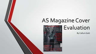
2. InWhatWay DoesYour Media Product Use,
Develop, Or Challenge Forms And Conventions Of
Real Media Products?
• During my research, I found out a lot of different things about the layout and
designs of magazine front covers.This helped me to then create my own.
• I added the title of the magazine in the upper third of the cover like other
magazines.This makes it easy for the audience to know what magazine it is. I also
added a skyline above the title. I included cover lines to the right hand side of the
middle third to give more information about certain reviews in the magazine to
draw the audience into buying it. I then included some films that would be
reviewed in the magazine in the lower third of the cover.The main image was from
a scene in the movie but cut onto a different background which gave the magazine
cover a better feel and matched the mood better.
3. How Effective IsThe Combination OfYour Main
Product And AncillaryTexts?
• I think my main product and ancillary text was an effective combination
because the mood of horror/thriller was matched by both and the brand
identity was brought through onto the magazine cover through the text of
the film title and the colours of the background, image and main text.
4. What HaveYou Learnt FromYour Audience
Feedback?
• In my audience feedback, Josh said “The dark colours used for the title and
cover lines are very effective and link with your targeted genre of horror”.
This means that the colours matched the genre which means that the
audience can understand what the intended genre for this film is.
• He also said “Overall, I feel the magazine front cover would look very good
next to a real produced one and everything is spot on”.This means that
there are not really any changes to be made to my front cover unless I
personally would want to change something.