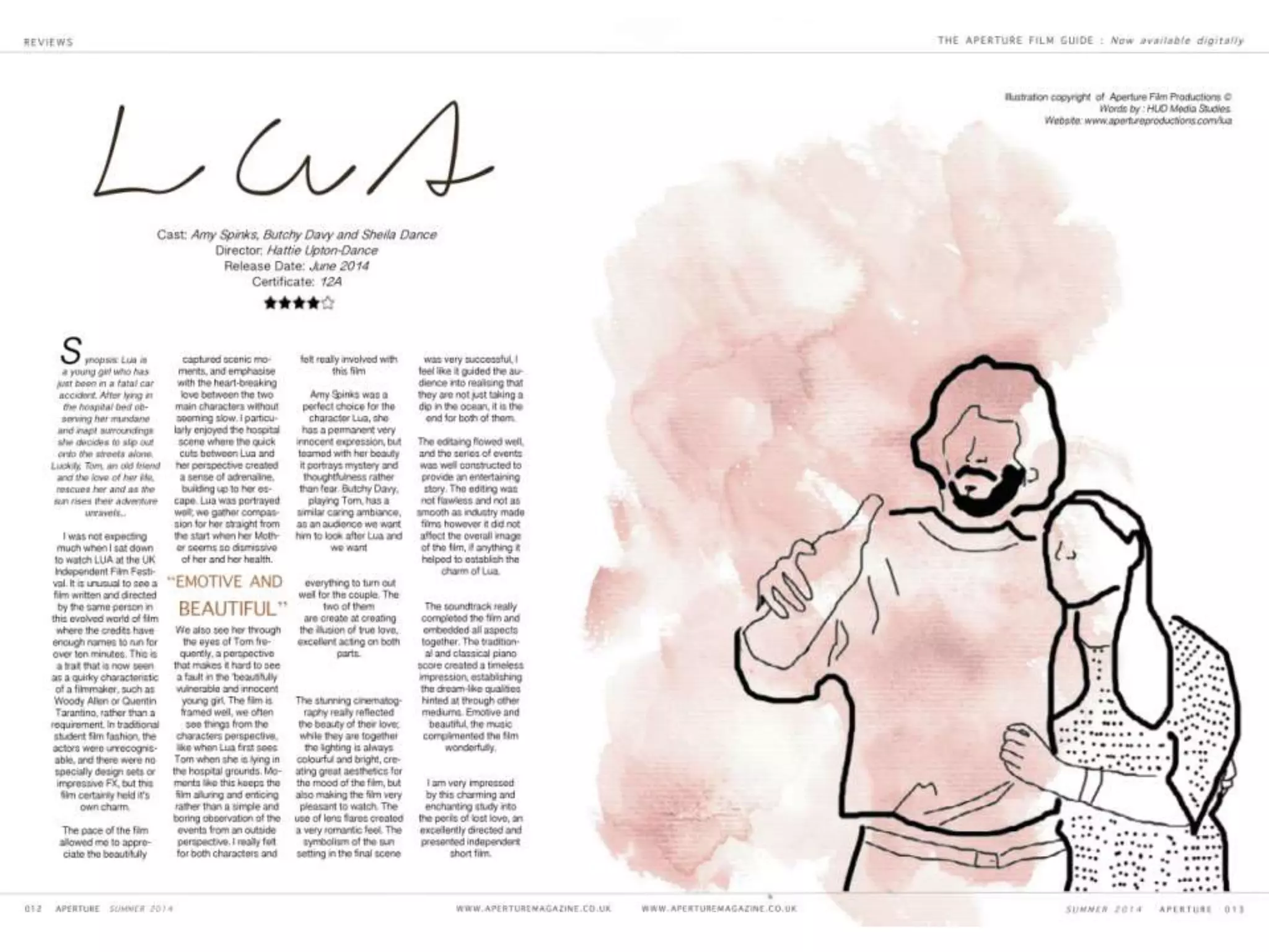
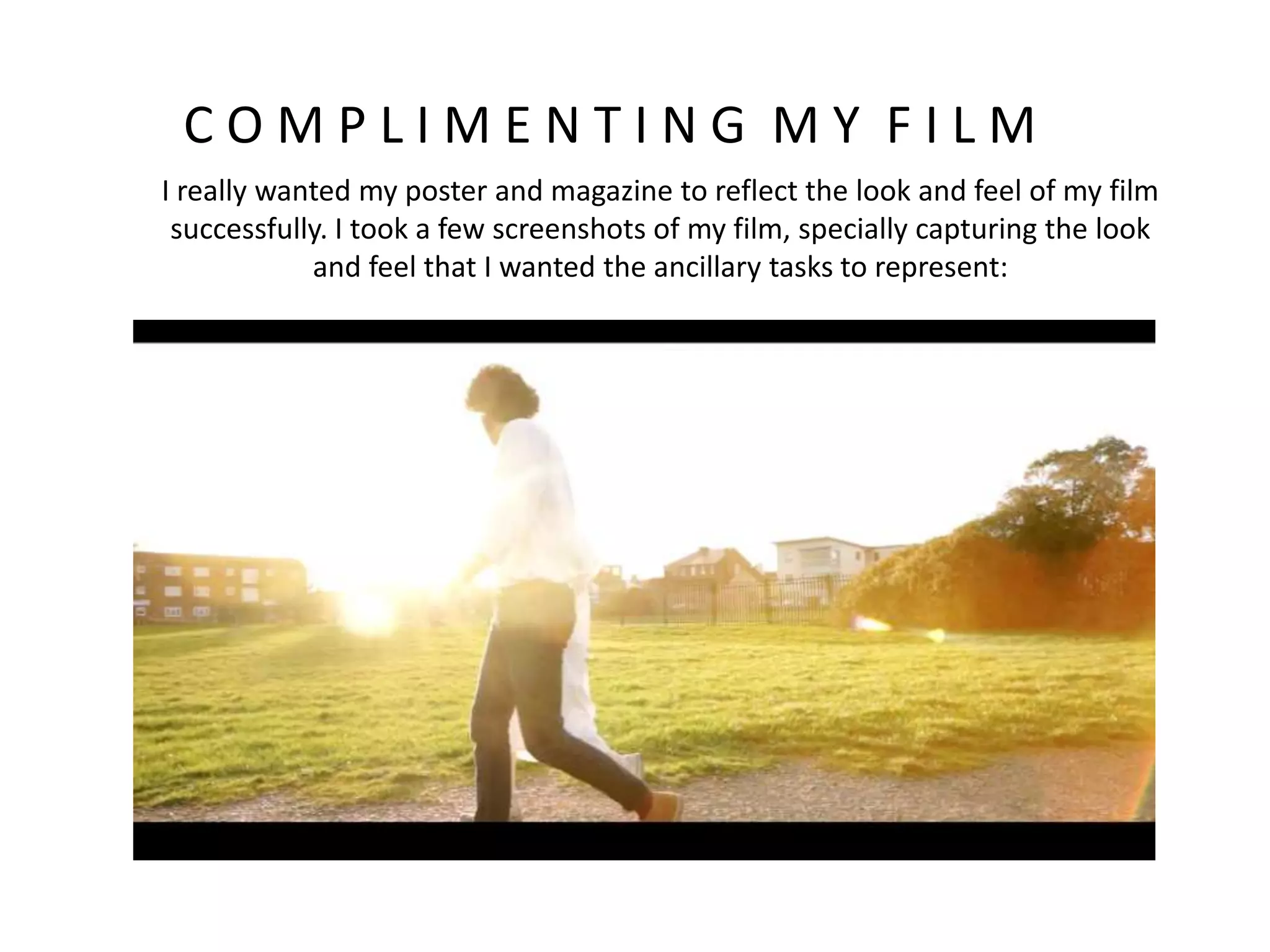
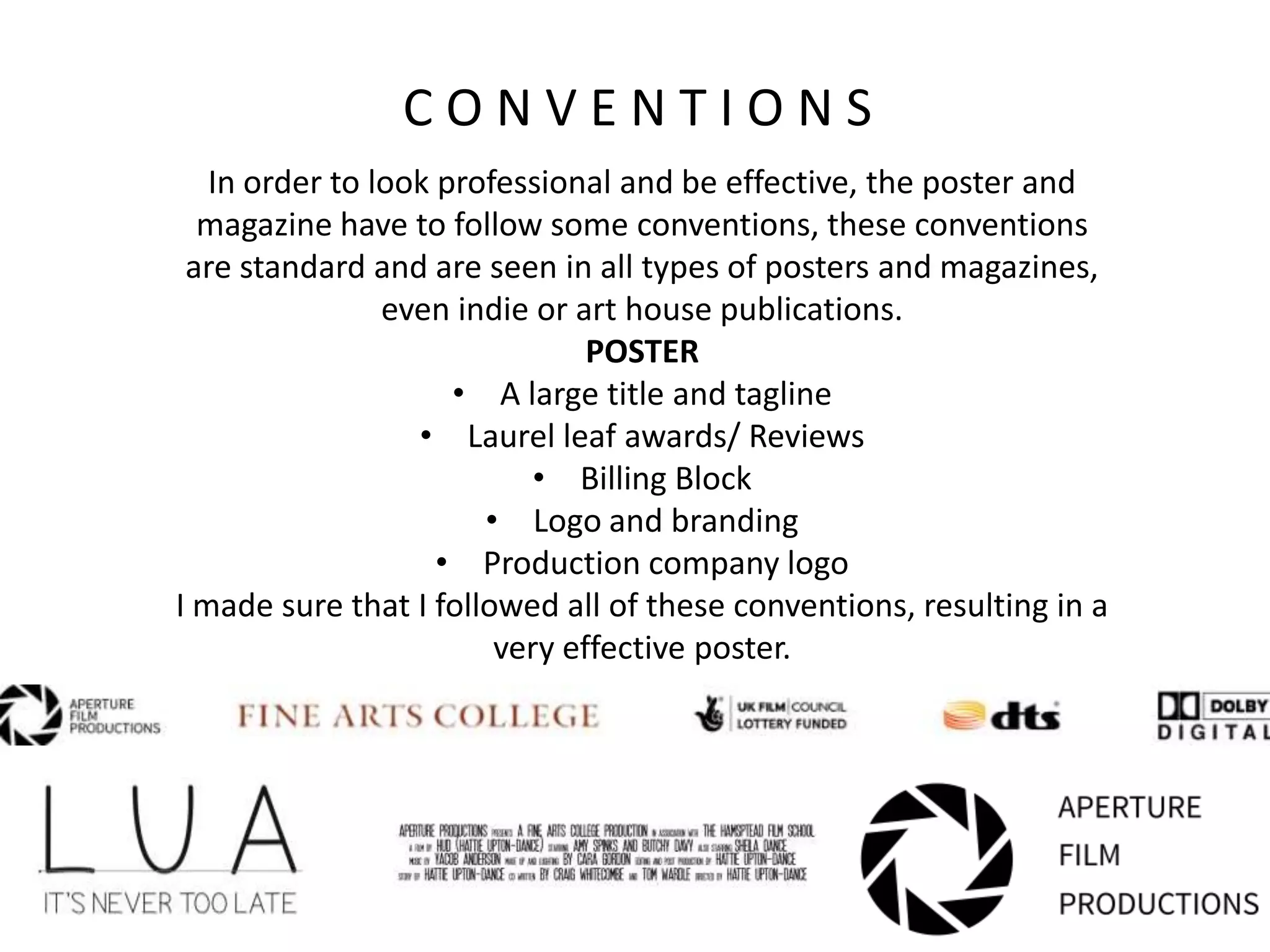
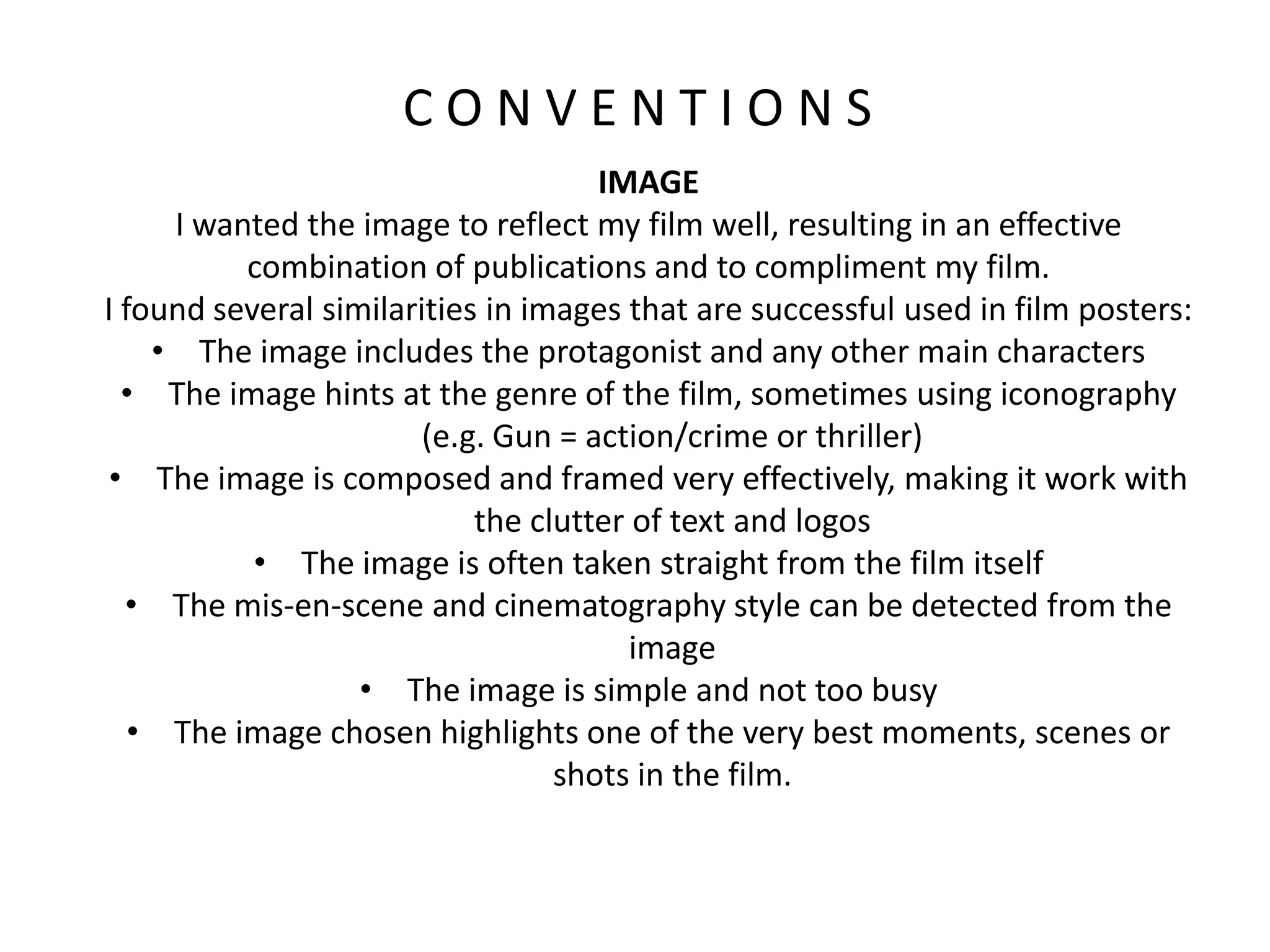
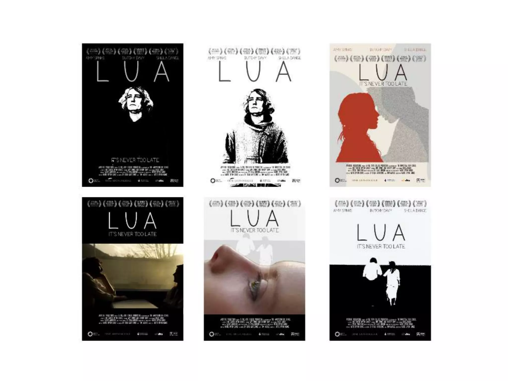
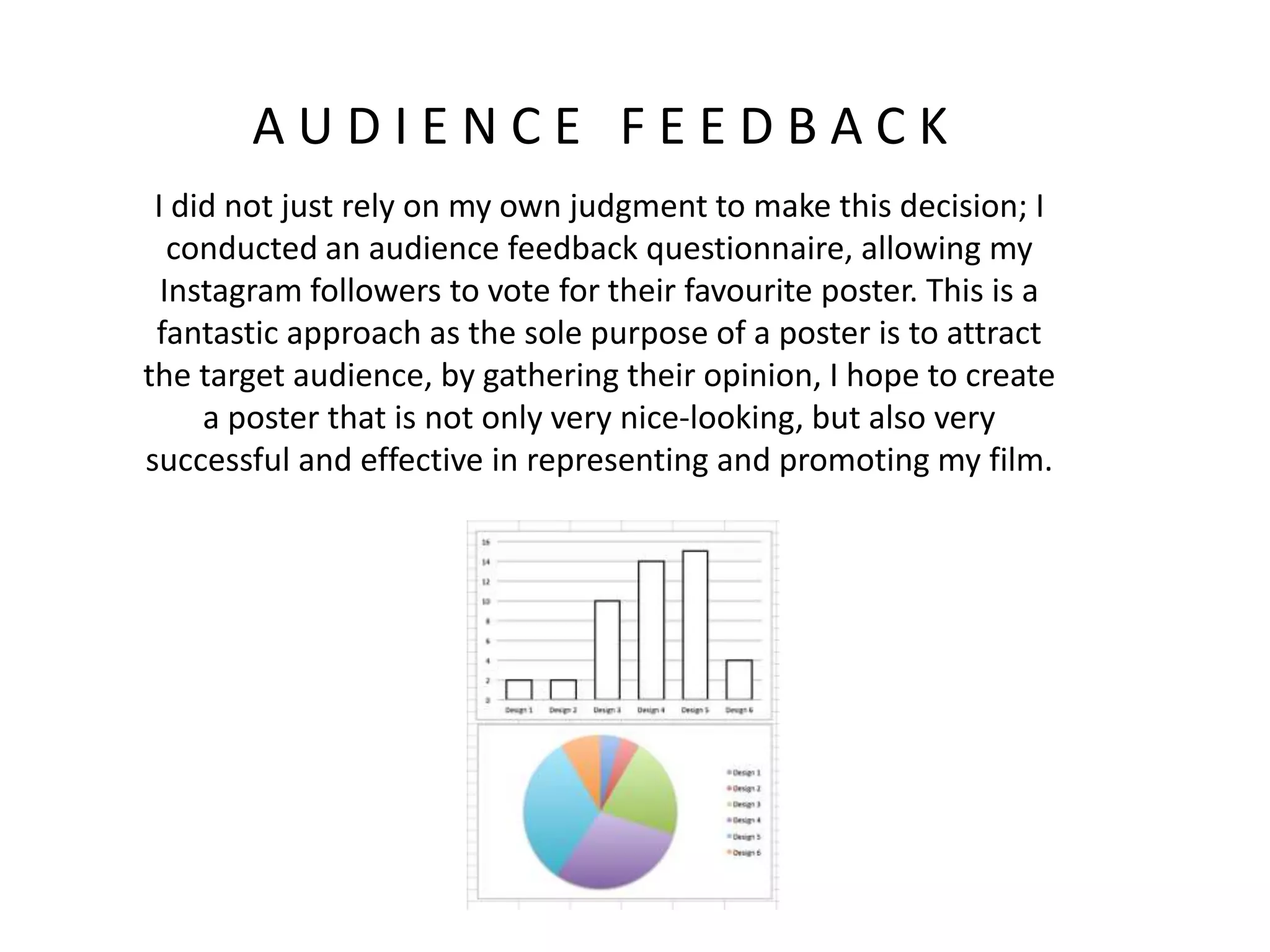
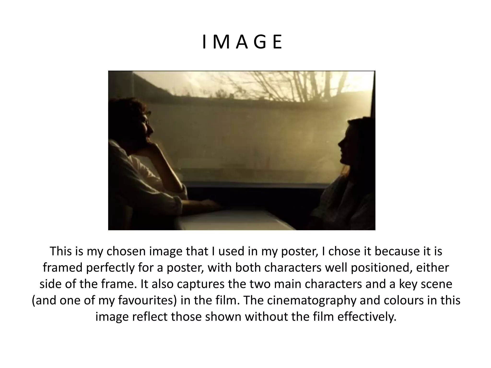
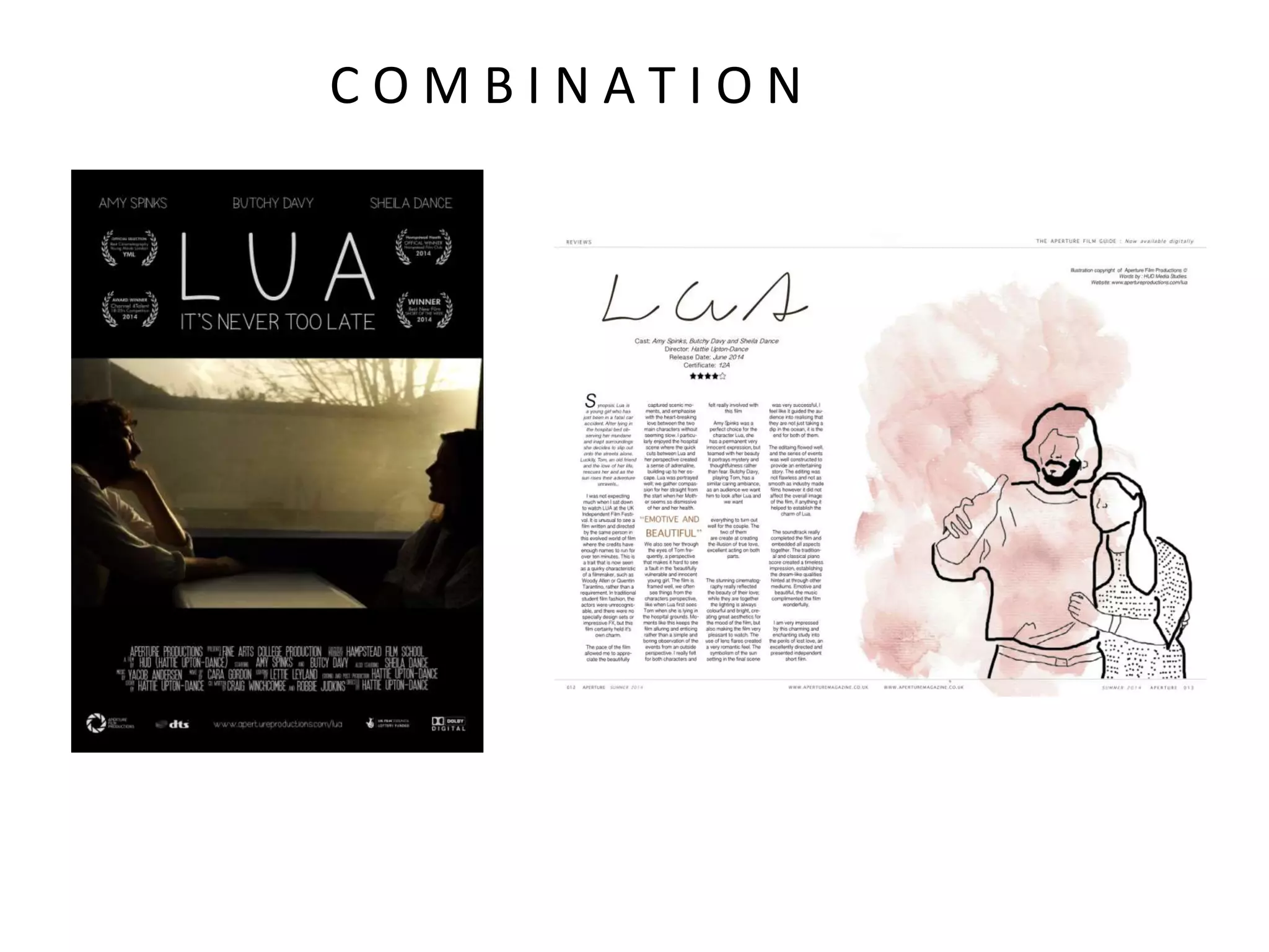
SlideShare a Scribd company logo
1 of 25
How Effective is the Combination of your
main product and ancillary texts?
E V A L U A T I O N Q U E S T I O N 2:
A N C I L L A R Y T A S K S
The purpose of the ancillary tasks is to compliment and
promote the film. It is important that the poster and
magazine appeals to the same audience as my film
caters for (the target audience), At the same time I
wanted these publications to look professional.
Together the combination of the ancillary tasks and my
final film should showcase a successful project.
T A R G E T A U I D E N C E
I wanted my poster and magazine to appeal to my
target audience for several reasons:
• I want to attract people that will actually enjoy my
film
• I want to attract people with similar interests and
appreciations as me
• I want the film to be showcased to a selective and
appreciative audience (cult audience)
• I wanted to create an “indie” and “arthouse” poster
and magazine design as these are the genres I enjoy
designing for the most
T A R G E T A U I D E N C E
I identified my target audience as, “Intellectual, 18-35,
Film lovers” a lot earlier on in the planning and
research process, I came across this definition for my
target audience after researching into the
demographics of publications and platforms that fit into
the genre of film that I wanted to create.
These publications still remain relevant to the genre of
film I have created so I took a lot of inspiration from
Indie magazines such as Little White Lies and Oh
Comedy magazine.
R E S E A R C H & A N A L Y S I S
When researching and analyzing other texts, I made sure that I
chose magazines that would cater for my target audience, that I
appreciated and that would probably review my genre of film.
Below is a screenshot of two magazines and my analysis. I chose to
analysis Little White Lies as I really appreciated the design, layout
and overall look of the magazine reviews. I chose to analysis
Empire magazine as it caters for film lovers, one of the criteria's for
my target audience.
R E S E A R C H & A N A L Y S I S
When analyzing these film reviews I found a few genre specific
conventions that I would definitely like to use in my magazine:
• MODE OF ADDRESS: a lot of the reviews I enjoyed had a very
technical mode of address, they address the audience as a
fellow film – maker, and discuss their interpretations fairly and
in a sophisticated manner
• DESIGN: a lot of the reviews I enjoyed had a very unique
design, some used illustration, others used quirky and clashing
colour schemes, turning the review into a piece of art rather
than a piece of art. I noticed that these qualities of design were
seen in the independent, print magazines, for example Little
White Lies is only printed once a month as is drawn or printed
by hand each time. I decided that I wanted to create something
similar to this, rather than a review from a tabloid which gets
thrown away.
R E S E A R C H & A N A L Y S I S
I adopted a similar technique when I researched and analyzed a collection of
posters. I selected a series of posters, advertising films that I enjoy and that fit
under my genre (and probably have a similar target audience).
I chose to analyze the film poster for “Nowhere Boy” as it is very similar to
mine; although it is a feature film, it follows a lot of art-house conventions and
is also based on the story of adolescents (it’s actually a biopic of John Lennon).
It was directed by Sam Taylor-Wood, she was originally a photographer and I
love her style of cinematography and composition. From watching interviews of
her, I knew she would have a say in the final poster which is why I decided to
analyze it.
R E S E A R C H & A N A L Y S I S
After searching through some posters, I came across a sub-genre of poster
design, “alternative poster design”. These posters are not made by the
production company, but rather independent designers who give there own
take and interpretation of the film through their design.
I really appreciated these designs for several
reasons:
• They are iconic and memorable
• They are minimalist and simple
• The contrast in colours is very enticing
• The designs are all very clever
After this specific research I decided to try some of
these techniques and attempt to design my poster
as an “alternative, illustration poster design”
C O M P L I M E N T I N G M Y F I L M
I really wanted my poster and magazine to reflect the look and feel of my film
successfully. I took a few screenshots of my film, specially capturing the look
and feel that I wanted the ancillary tasks to represent:
I realized that a lot of these sceenshots share the same colour scheme, which is
when I made my chosen colour scheme on Photoshop.
This is the colour scheme I created, I was
aware of which tones correctly
compliment each other after studying
various other magazines, magazines
normally stick to a specific colour scheme
for every publication, (For example
“Hello!” magazine is associated with red.)
A lot of green, beige and yellow are
naturally emphasized in many of my shots,
to create an effective combination of my
ancillary texts in relation to the film I will
incorporate these colours into the poster
and magazine review.
C O M P L I M E N T I N G M Y F I L M
R E F L E C T I N G M Y F I L M
It is important to incorporate the same ideas and
colours that are seen in the film, into the poster
because the poster is normally made by the same
production team, therefore they must compliment
each other and they most have joining themes flowing
between them. I discovered this after reviewing many
different film posters and noticing the connection in
mis-en-scene between the poster and film. This is
probably to further induce advertising and brand
cooperation (For example when you think of
Spiderman you think of red and blue). I decided to use
the same font, colour scheme and genre of design
(indie) of the film, in my film poster.
F O N T
For the film poster, I wanted to use the exact same font as in my
film, following the conventions of mainstream cinema. I conducted
a lot of research when creating the right font for my film.
I did not want to use the same font for the magazine, after researching, I realized that
logos and fonts belonging to the production company were not used in film reviews.
Often the magazine has their own title at the top, or incorporates the film’s title in their
own font. I chose an arty font for the title to reflect the genre of my made up magazine.
C O N V E N T I O N S
In order to look professional and be effective, the poster and
magazine have to follow some conventions, these conventions
are standard and are seen in all types of posters and magazines,
even indie or art house publications.
POSTER
• A large title and tagline
• Laurel leaf awards/ Reviews
• Billing Block
• Logo and branding
• Production company logo
I made sure that I followed all of these conventions, resulting in a
very effective poster.
C O N V E N T I O N S
IMAGE
I wanted the image to reflect my film well, resulting in an effective
combination of publications and to compliment my film.
I found several similarities in images that are successful used in film posters:
• The image includes the protagonist and any other main characters
• The image hints at the genre of the film, sometimes using iconography
(e.g. Gun = action/crime or thriller)
• The image is composed and framed very effectively, making it work with
the clutter of text and logos
• The image is often taken straight from the film itself
• The mis-en-scene and cinematography style can be detected from the
image
• The image is simple and not too busy
• The image chosen highlights one of the very best moments, scenes or
shots in the film.
E F F E C T I V E D E S I G N
I created all those designs, following the conventions; each one
has it’s own unique flare and a few of them took direct
inspiration from posters of my favourite films. In the end when
making a decision and choosing which draft I wanted to
complete to go on to be a successful final poster, I had to think
about the combination of the poster and the film and how they
will compliment each other. The design that I eventually
selected really represents the look/feel that I want my film to
represent, hopefully the people that are intrigued by this poster
will also proceed to enjoy my film. This poster design also
follows all the necessary conventions, and the image is the most
effective, (the main focus in the first two posters is not even of
the main character in the film). The poster does not look too
cluttered and the design is very artistic and follows the
conventions of an “indie” film poster.
A U D I E N C E F E E D B A C K
I did not just rely on my own judgment to make this decision; I
conducted an audience feedback questionnaire, allowing my
Instagram followers to vote for their favourite poster. This is a
fantastic approach as the sole purpose of a poster is to attract
the target audience, by gathering their opinion, I hope to create
a poster that is not only very nice-looking, but also very
successful and effective in representing and promoting my film.
I M A G E
This is my chosen image that I used in my poster, I chose it because it is
framed perfectly for a poster, with both characters well positioned, either
side of the frame. It also captures the two main characters and a key scene
(and one of my favourites) in the film. The cinematography and colours in this
image reflect those shown without the film effectively.
E F F E C T I V E M A G A Z I N E
I have taken a different, and perhaps “unconventional” approach to my magazine
design. I have decided to design it as if I was producing for a separate company as this
is the most realistic approach. I have written the article as a separate character (I
thought reviewing my own film in first person would be highly ineffective), this
allowed me to give an honest review impartially rating the highs and lows and giving a
valid impression of the film. This makes the review a lot more interesting, have a lot
more character, and be a lot more readable! I have also used an illustration as the
main image. This does not mirror the design of my poster but it is a style of image that
I have seen in several indie magazines (specially film reviews), I found these types of
images very eye-catching and impressive when I have seen them in other magazines.
C O M B I N A T I O N
It is fair to say that the font, colour scheme and design do not
match up identically, however I think that this is a far better
combination of the products. The colours and the design
between the poster and the magazine compliment each other
nicely, without seeming like a variation of branding or
advertising. The combination is effective as they both follow
conventions of indie publications and they both follow a similar
style, they are just slightly different, to show the difference in
purpose between the texts. The poster is designed as an
advertisement and reflects the film identically. The magazine is
supposed to be an impartial review, and compliments the film
and the poster well.

More Related Content

What's hot (19)

Empire magazine film analysis
Empire magazine film  analysisEmpire magazine film  analysis
Empire magazine film analysis
 
Presentation
PresentationPresentation
Presentation
 
Evaluation Question 1
Evaluation Question 1Evaluation Question 1
Evaluation Question 1
 
A2 media studies evaluation guide new version 2016
A2 media studies evaluation guide new version 2016A2 media studies evaluation guide new version 2016
A2 media studies evaluation guide new version 2016
 
Empire magazine film analysis
Empire magazine film  analysisEmpire magazine film  analysis
Empire magazine film analysis
 
Rorys Evaluation Presentation
Rorys Evaluation PresentationRorys Evaluation Presentation
Rorys Evaluation Presentation
 
A2 Media evaluation-question 2
A2 Media evaluation-question 2 A2 Media evaluation-question 2
A2 Media evaluation-question 2
 
Evaluation Question 2 - Synergy
Evaluation Question 2 - Synergy Evaluation Question 2 - Synergy
Evaluation Question 2 - Synergy
 
Eval question 1 part two
Eval question 1 part twoEval question 1 part two
Eval question 1 part two
 
Conlusion question1
Conlusion question1Conlusion question1
Conlusion question1
 
Question 2
Question 2Question 2
Question 2
 
Question 2
Question 2Question 2
Question 2
 
Question 2
Question 2 Question 2
Question 2
 
Evaluation
EvaluationEvaluation
Evaluation
 
How effective is the combination of your main task and ancillary tasks?
How effective is the combination of your main task and ancillary tasks?How effective is the combination of your main task and ancillary tasks?
How effective is the combination of your main task and ancillary tasks?
 
Film posters power point
Film posters power pointFilm posters power point
Film posters power point
 
02.) Proposal
02.) Proposal02.) Proposal
02.) Proposal
 
Critical evaluation[1]
Critical evaluation[1]Critical evaluation[1]
Critical evaluation[1]
 
Media evaluation
Media evaluationMedia evaluation
Media evaluation
 

Similar to Evaluation question 2

Evaluation
EvaluationEvaluation
Evaluation
yasminmd
 
Evaluation Question 2 - Fiona Aldwin
Evaluation Question 2 - Fiona AldwinEvaluation Question 2 - Fiona Aldwin
Evaluation Question 2 - Fiona Aldwin
aldwinfiona22
 
horror magazine and poster analysis
horror magazine and poster analysis horror magazine and poster analysis
horror magazine and poster analysis
Parveen Kaur
 
A2 Media Evaluation
A2 Media EvaluationA2 Media Evaluation
A2 Media Evaluation
hayleyfreake
 
Horror magazine and poster analysis
Horror magazine and poster analysis Horror magazine and poster analysis
Horror magazine and poster analysis
Parveen Kaur
 
John Wilding AS Evaluation
John Wilding AS EvaluationJohn Wilding AS Evaluation
John Wilding AS Evaluation
Anne Horne
 
Horror magazine and poster analysis
Horror magazine and poster analysis Horror magazine and poster analysis
Horror magazine and poster analysis
Parveen Kaur
 
In what ways does your media product use
In what ways does your media product useIn what ways does your media product use
In what ways does your media product use
etaylorchs
 
Evaluation q 1 poster
Evaluation q 1 posterEvaluation q 1 poster
Evaluation q 1 poster
MaisyDyer
 
Horror poster and magazine analysis
Horror poster and magazine analysis Horror poster and magazine analysis
Horror poster and magazine analysis
Parveen Kaur
 

Similar to Evaluation question 2 (20)

Magazine Review
Magazine Review Magazine Review
Magazine Review
 
A2 evaluation 2
A2 evaluation 2A2 evaluation 2
A2 evaluation 2
 
Evaluation for media
Evaluation for mediaEvaluation for media
Evaluation for media
 
Evaluation
EvaluationEvaluation
Evaluation
 
Further Evaluation Question 1
Further Evaluation Question 1Further Evaluation Question 1
Further Evaluation Question 1
 
Evaluation Question 2 - Fiona Aldwin
Evaluation Question 2 - Fiona AldwinEvaluation Question 2 - Fiona Aldwin
Evaluation Question 2 - Fiona Aldwin
 
Evaluation
EvaluationEvaluation
Evaluation
 
horror magazine and poster analysis
horror magazine and poster analysis horror magazine and poster analysis
horror magazine and poster analysis
 
A2 Media Evaluation
A2 Media EvaluationA2 Media Evaluation
A2 Media Evaluation
 
Media Evaluation
Media EvaluationMedia Evaluation
Media Evaluation
 
Horror magazine and poster analysis
Horror magazine and poster analysis Horror magazine and poster analysis
Horror magazine and poster analysis
 
John Wilding AS Evaluation
John Wilding AS EvaluationJohn Wilding AS Evaluation
John Wilding AS Evaluation
 
Evaluation 2
Evaluation 2Evaluation 2
Evaluation 2
 
Horror magazine and poster analysis
Horror magazine and poster analysis Horror magazine and poster analysis
Horror magazine and poster analysis
 
AS Media Evaluation.
AS Media Evaluation. AS Media Evaluation.
AS Media Evaluation.
 
In what ways does your media product use
In what ways does your media product useIn what ways does your media product use
In what ways does your media product use
 
A2 Horror Trailer
A2 Horror TrailerA2 Horror Trailer
A2 Horror Trailer
 
A2 case studies
A2 case studiesA2 case studies
A2 case studies
 
Evaluation q 1 poster
Evaluation q 1 posterEvaluation q 1 poster
Evaluation q 1 poster
 
Horror poster and magazine analysis
Horror poster and magazine analysis Horror poster and magazine analysis
Horror poster and magazine analysis
 

More from hattieuptondance

More from hattieuptondance (12)

Editing of script
Editing of scriptEditing of script
Editing of script
 
Lua final script2
Lua final script2Lua final script2
Lua final script2
 
Lua final script1
Lua final script1Lua final script1
Lua final script1
 
Lua final script
Lua final scriptLua final script
Lua final script
 
Lua 1st draft Script
Lua 1st draft ScriptLua 1st draft Script
Lua 1st draft Script
 
Lua final script
Lua final scriptLua final script
Lua final script
 
Lua Storyboard
Lua StoryboardLua Storyboard
Lua Storyboard
 
Test Screening Results
Test Screening ResultsTest Screening Results
Test Screening Results
 
Creation of magazine part II
Creation of magazine part IICreation of magazine part II
Creation of magazine part II
 
Creation of magazine part II
Creation of magazine part IICreation of magazine part II
Creation of magazine part II
 
Film Review Design Process I
Film Review Design Process IFilm Review Design Process I
Film Review Design Process I
 
Creation of magazine
Creation of magazineCreation of magazine
Creation of magazine
 

Recently uploaded

SPLICE Working Group: Reusable Code Examples
SPLICE Working Group:Reusable Code ExamplesSPLICE Working Group:Reusable Code Examples
SPLICE Working Group: Reusable Code Examples
Peter Brusilovsky
 
Contoh Aksi Nyata Refleksi Diri ( NUR ).pdf
Contoh Aksi Nyata Refleksi Diri ( NUR ).pdfContoh Aksi Nyata Refleksi Diri ( NUR ).pdf
Contoh Aksi Nyata Refleksi Diri ( NUR ).pdf
cupulin
 

Recently uploaded (20)

An overview of the various scriptures in Hinduism
An overview of the various scriptures in HinduismAn overview of the various scriptures in Hinduism
An overview of the various scriptures in Hinduism
 
SPLICE Working Group: Reusable Code Examples
SPLICE Working Group:Reusable Code ExamplesSPLICE Working Group:Reusable Code Examples
SPLICE Working Group: Reusable Code Examples
 
How to Manage Website in Odoo 17 Studio App.pptx
How to Manage Website in Odoo 17 Studio App.pptxHow to Manage Website in Odoo 17 Studio App.pptx
How to Manage Website in Odoo 17 Studio App.pptx
 
Stl Algorithms in C++ jjjjjjjjjjjjjjjjjj
Stl Algorithms in C++ jjjjjjjjjjjjjjjjjjStl Algorithms in C++ jjjjjjjjjjjjjjjjjj
Stl Algorithms in C++ jjjjjjjjjjjjjjjjjj
 
Contoh Aksi Nyata Refleksi Diri ( NUR ).pdf
Contoh Aksi Nyata Refleksi Diri ( NUR ).pdfContoh Aksi Nyata Refleksi Diri ( NUR ).pdf
Contoh Aksi Nyata Refleksi Diri ( NUR ).pdf
 
Graduate Outcomes Presentation Slides - English (v3).pptx
Graduate Outcomes Presentation Slides - English (v3).pptxGraduate Outcomes Presentation Slides - English (v3).pptx
Graduate Outcomes Presentation Slides - English (v3).pptx
 
OS-operating systems- ch05 (CPU Scheduling) ...
OS-operating systems- ch05 (CPU Scheduling) ...OS-operating systems- ch05 (CPU Scheduling) ...
OS-operating systems- ch05 (CPU Scheduling) ...
 
Improved Approval Flow in Odoo 17 Studio App
Improved Approval Flow in Odoo 17 Studio AppImproved Approval Flow in Odoo 17 Studio App
Improved Approval Flow in Odoo 17 Studio App
 
COMMUNICATING NEGATIVE NEWS - APPROACHES .pptx
COMMUNICATING NEGATIVE NEWS - APPROACHES .pptxCOMMUNICATING NEGATIVE NEWS - APPROACHES .pptx
COMMUNICATING NEGATIVE NEWS - APPROACHES .pptx
 
The Story of Village Palampur Class 9 Free Study Material PDF
The Story of Village Palampur Class 9 Free Study Material PDFThe Story of Village Palampur Class 9 Free Study Material PDF
The Story of Village Palampur Class 9 Free Study Material PDF
 
Including Mental Health Support in Project Delivery, 14 May.pdf
Including Mental Health Support in Project Delivery, 14 May.pdfIncluding Mental Health Support in Project Delivery, 14 May.pdf
Including Mental Health Support in Project Delivery, 14 May.pdf
 
Spring gala 2024 photo slideshow - Celebrating School-Community Partnerships
Spring gala 2024 photo slideshow - Celebrating School-Community PartnershipsSpring gala 2024 photo slideshow - Celebrating School-Community Partnerships
Spring gala 2024 photo slideshow - Celebrating School-Community Partnerships
 
How to Send Pro Forma Invoice to Your Customers in Odoo 17
How to Send Pro Forma Invoice to Your Customers in Odoo 17How to Send Pro Forma Invoice to Your Customers in Odoo 17
How to Send Pro Forma Invoice to Your Customers in Odoo 17
 
When Quality Assurance Meets Innovation in Higher Education - Report launch w...
When Quality Assurance Meets Innovation in Higher Education - Report launch w...When Quality Assurance Meets Innovation in Higher Education - Report launch w...
When Quality Assurance Meets Innovation in Higher Education - Report launch w...
 
ĐỀ THAM KHẢO KÌ THI TUYỂN SINH VÀO LỚP 10 MÔN TIẾNG ANH FORM 50 CÂU TRẮC NGHI...
ĐỀ THAM KHẢO KÌ THI TUYỂN SINH VÀO LỚP 10 MÔN TIẾNG ANH FORM 50 CÂU TRẮC NGHI...ĐỀ THAM KHẢO KÌ THI TUYỂN SINH VÀO LỚP 10 MÔN TIẾNG ANH FORM 50 CÂU TRẮC NGHI...
ĐỀ THAM KHẢO KÌ THI TUYỂN SINH VÀO LỚP 10 MÔN TIẾNG ANH FORM 50 CÂU TRẮC NGHI...
 
Major project report on Tata Motors and its marketing strategies
Major project report on Tata Motors and its marketing strategiesMajor project report on Tata Motors and its marketing strategies
Major project report on Tata Motors and its marketing strategies
 
OSCM Unit 2_Operations Processes & Systems
OSCM Unit 2_Operations Processes & SystemsOSCM Unit 2_Operations Processes & Systems
OSCM Unit 2_Operations Processes & Systems
 
Supporting Newcomer Multilingual Learners
Supporting Newcomer  Multilingual LearnersSupporting Newcomer  Multilingual Learners
Supporting Newcomer Multilingual Learners
 
male presentation...pdf.................
male presentation...pdf.................male presentation...pdf.................
male presentation...pdf.................
 
Basic Civil Engineering notes on Transportation Engineering & Modes of Transport
Basic Civil Engineering notes on Transportation Engineering & Modes of TransportBasic Civil Engineering notes on Transportation Engineering & Modes of Transport
Basic Civil Engineering notes on Transportation Engineering & Modes of Transport
 

Evaluation question 2

  • 1. How Effective is the Combination of your main product and ancillary texts? E V A L U A T I O N Q U E S T I O N 2:
  • 2.
  • 3.
  • 4. A N C I L L A R Y T A S K S The purpose of the ancillary tasks is to compliment and promote the film. It is important that the poster and magazine appeals to the same audience as my film caters for (the target audience), At the same time I wanted these publications to look professional. Together the combination of the ancillary tasks and my final film should showcase a successful project.
  • 5. T A R G E T A U I D E N C E I wanted my poster and magazine to appeal to my target audience for several reasons: • I want to attract people that will actually enjoy my film • I want to attract people with similar interests and appreciations as me • I want the film to be showcased to a selective and appreciative audience (cult audience) • I wanted to create an “indie” and “arthouse” poster and magazine design as these are the genres I enjoy designing for the most
  • 6. T A R G E T A U I D E N C E I identified my target audience as, “Intellectual, 18-35, Film lovers” a lot earlier on in the planning and research process, I came across this definition for my target audience after researching into the demographics of publications and platforms that fit into the genre of film that I wanted to create. These publications still remain relevant to the genre of film I have created so I took a lot of inspiration from Indie magazines such as Little White Lies and Oh Comedy magazine.
  • 7. R E S E A R C H & A N A L Y S I S When researching and analyzing other texts, I made sure that I chose magazines that would cater for my target audience, that I appreciated and that would probably review my genre of film. Below is a screenshot of two magazines and my analysis. I chose to analysis Little White Lies as I really appreciated the design, layout and overall look of the magazine reviews. I chose to analysis Empire magazine as it caters for film lovers, one of the criteria's for my target audience.
  • 8. R E S E A R C H & A N A L Y S I S When analyzing these film reviews I found a few genre specific conventions that I would definitely like to use in my magazine: • MODE OF ADDRESS: a lot of the reviews I enjoyed had a very technical mode of address, they address the audience as a fellow film – maker, and discuss their interpretations fairly and in a sophisticated manner • DESIGN: a lot of the reviews I enjoyed had a very unique design, some used illustration, others used quirky and clashing colour schemes, turning the review into a piece of art rather than a piece of art. I noticed that these qualities of design were seen in the independent, print magazines, for example Little White Lies is only printed once a month as is drawn or printed by hand each time. I decided that I wanted to create something similar to this, rather than a review from a tabloid which gets thrown away.
  • 9. R E S E A R C H & A N A L Y S I S I adopted a similar technique when I researched and analyzed a collection of posters. I selected a series of posters, advertising films that I enjoy and that fit under my genre (and probably have a similar target audience). I chose to analyze the film poster for “Nowhere Boy” as it is very similar to mine; although it is a feature film, it follows a lot of art-house conventions and is also based on the story of adolescents (it’s actually a biopic of John Lennon). It was directed by Sam Taylor-Wood, she was originally a photographer and I love her style of cinematography and composition. From watching interviews of her, I knew she would have a say in the final poster which is why I decided to analyze it.
  • 10. R E S E A R C H & A N A L Y S I S After searching through some posters, I came across a sub-genre of poster design, “alternative poster design”. These posters are not made by the production company, but rather independent designers who give there own take and interpretation of the film through their design. I really appreciated these designs for several reasons: • They are iconic and memorable • They are minimalist and simple • The contrast in colours is very enticing • The designs are all very clever After this specific research I decided to try some of these techniques and attempt to design my poster as an “alternative, illustration poster design”
  • 11. C O M P L I M E N T I N G M Y F I L M I really wanted my poster and magazine to reflect the look and feel of my film successfully. I took a few screenshots of my film, specially capturing the look and feel that I wanted the ancillary tasks to represent:
  • 12.
  • 13.
  • 14. I realized that a lot of these sceenshots share the same colour scheme, which is when I made my chosen colour scheme on Photoshop. This is the colour scheme I created, I was aware of which tones correctly compliment each other after studying various other magazines, magazines normally stick to a specific colour scheme for every publication, (For example “Hello!” magazine is associated with red.) A lot of green, beige and yellow are naturally emphasized in many of my shots, to create an effective combination of my ancillary texts in relation to the film I will incorporate these colours into the poster and magazine review. C O M P L I M E N T I N G M Y F I L M
  • 15. R E F L E C T I N G M Y F I L M It is important to incorporate the same ideas and colours that are seen in the film, into the poster because the poster is normally made by the same production team, therefore they must compliment each other and they most have joining themes flowing between them. I discovered this after reviewing many different film posters and noticing the connection in mis-en-scene between the poster and film. This is probably to further induce advertising and brand cooperation (For example when you think of Spiderman you think of red and blue). I decided to use the same font, colour scheme and genre of design (indie) of the film, in my film poster.
  • 16. F O N T For the film poster, I wanted to use the exact same font as in my film, following the conventions of mainstream cinema. I conducted a lot of research when creating the right font for my film. I did not want to use the same font for the magazine, after researching, I realized that logos and fonts belonging to the production company were not used in film reviews. Often the magazine has their own title at the top, or incorporates the film’s title in their own font. I chose an arty font for the title to reflect the genre of my made up magazine.
  • 17. C O N V E N T I O N S In order to look professional and be effective, the poster and magazine have to follow some conventions, these conventions are standard and are seen in all types of posters and magazines, even indie or art house publications. POSTER • A large title and tagline • Laurel leaf awards/ Reviews • Billing Block • Logo and branding • Production company logo I made sure that I followed all of these conventions, resulting in a very effective poster.
  • 18. C O N V E N T I O N S IMAGE I wanted the image to reflect my film well, resulting in an effective combination of publications and to compliment my film. I found several similarities in images that are successful used in film posters: • The image includes the protagonist and any other main characters • The image hints at the genre of the film, sometimes using iconography (e.g. Gun = action/crime or thriller) • The image is composed and framed very effectively, making it work with the clutter of text and logos • The image is often taken straight from the film itself • The mis-en-scene and cinematography style can be detected from the image • The image is simple and not too busy • The image chosen highlights one of the very best moments, scenes or shots in the film.
  • 19.
  • 20. E F F E C T I V E D E S I G N I created all those designs, following the conventions; each one has it’s own unique flare and a few of them took direct inspiration from posters of my favourite films. In the end when making a decision and choosing which draft I wanted to complete to go on to be a successful final poster, I had to think about the combination of the poster and the film and how they will compliment each other. The design that I eventually selected really represents the look/feel that I want my film to represent, hopefully the people that are intrigued by this poster will also proceed to enjoy my film. This poster design also follows all the necessary conventions, and the image is the most effective, (the main focus in the first two posters is not even of the main character in the film). The poster does not look too cluttered and the design is very artistic and follows the conventions of an “indie” film poster.
  • 21. A U D I E N C E F E E D B A C K I did not just rely on my own judgment to make this decision; I conducted an audience feedback questionnaire, allowing my Instagram followers to vote for their favourite poster. This is a fantastic approach as the sole purpose of a poster is to attract the target audience, by gathering their opinion, I hope to create a poster that is not only very nice-looking, but also very successful and effective in representing and promoting my film.
  • 22. I M A G E This is my chosen image that I used in my poster, I chose it because it is framed perfectly for a poster, with both characters well positioned, either side of the frame. It also captures the two main characters and a key scene (and one of my favourites) in the film. The cinematography and colours in this image reflect those shown without the film effectively.
  • 23. E F F E C T I V E M A G A Z I N E I have taken a different, and perhaps “unconventional” approach to my magazine design. I have decided to design it as if I was producing for a separate company as this is the most realistic approach. I have written the article as a separate character (I thought reviewing my own film in first person would be highly ineffective), this allowed me to give an honest review impartially rating the highs and lows and giving a valid impression of the film. This makes the review a lot more interesting, have a lot more character, and be a lot more readable! I have also used an illustration as the main image. This does not mirror the design of my poster but it is a style of image that I have seen in several indie magazines (specially film reviews), I found these types of images very eye-catching and impressive when I have seen them in other magazines.
  • 24. C O M B I N A T I O N
  • 25. C O M B I N A T I O N It is fair to say that the font, colour scheme and design do not match up identically, however I think that this is a far better combination of the products. The colours and the design between the poster and the magazine compliment each other nicely, without seeming like a variation of branding or advertising. The combination is effective as they both follow conventions of indie publications and they both follow a similar style, they are just slightly different, to show the difference in purpose between the texts. The poster is designed as an advertisement and reflects the film identically. The magazine is supposed to be an impartial review, and compliments the film and the poster well.