2. InWhatWay DoesYour Media Product Use,
Develop, Or Challenge Forms And Conventions Of
Real Media Products?
• During research, I looked at various different film posters both teaser and official which gave me a very
good idea of what to include in my own film poster. I did a teaser poster to start off with and I included all of
the things that are normally on a teaser poster.
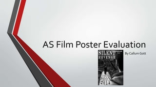
• I added the film title at the top left so that is it the first thing that people read. I included an endorsement
from HHS with a 5 star rating which is used on film posters to make the intended audience appealed by it so
they want to watch the film. I put “COMING SOON 2014” which gives an indication that the film will be
released soon and what year it will be released.The main image I used was effective at matching the genre
because I edited it to black and white so they are quite mysterious colours with an over-the-shoulder shot of
the suspect following the victim to create suspense for the audience. I finally included a tagline that said
“NO-ONE IS SAFE” which conformed with the genre and the main image.
• I did challenge the forms and conventions of a film poster by not putting any production companies or
actors on the poster.This was done because it keeps the audience guessing at what will happen and who
will be staring in the film so will want to go and watch it to find out the answers to their questions.
3. How Effective IsThe Combination OfYour Main
Product And AncillaryTexts?
• I think that the combination of my main product and my ancillary text
worked very well because I used branding throughout and also used a shot
from the film opening for the poster.This means that it is easy for the
audience to understand what movie it is and also gives a clue to the type of
genre it is.
• I used the same text for the title on the poster as the title in the film
opening.This makes it clear as to what film the poster is for. I also did this
for brand identity.
4. What HaveYou Learnt FromYour Audience
Feedback?
• From my audience feedback, Josh said “The film poster you’ve created is very
simple but works very well!”.This means that the design I did was very simple to
look at and was clear to see the different parts of the poster without being
overwhelmed by information.
• He also said “The main image is very well positioned on the poster and this makes
it look very professional because the layout is neat and tidy”.This means that the
image that I chose was well chosen because it matches the genre of the film well
and creates tension for the audience because they don’t know what’s going to
happen.