call girls in Kamla Market (DELHI) 🔝 >༒9953330565🔝 genuine Escort Service 🔝✔️✔️
Magazine Contents Page 1
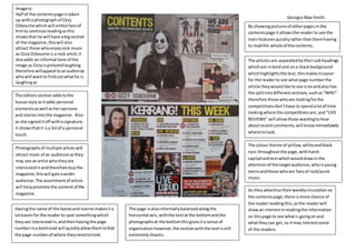
1. Georgia-Mae Smith.
Imagery:
Half of the contentspage istaken
up witha photographof Ozzy
Osbourne whichwill entice fansof
himto continue readingasthis
showsthat he will have abigsection
of the magazine,thiswill also
attract those whoenjoyrock music
as OzzyOsbourne is a rock artist,it
alsoadds an informal tone of the
image as Ozzyispicturedlaughing
therefore willappeal toanaudience
whowill wantto findoutwhathe is
laughingat.
The editorssectionaddstothe
house style asitadds personal
elementsaswell asheropinions
and storiesintothe magazine. Also
as she signeditoff witha signature,
it showsthatit isa bitof a personal
touch.
Photographsof multiple artistswill
attract more of an audience asthey
may see anartist whotheyare
interestedinandtherefore buythe
magazine,thiswill gainawider
audience. The assortmentof artists
will helppromote the contentof the
magazine.
Havingthe name of the bandsand eventsmakesita
loteasierforthe readerto spot somethingwhich
theyare interestedin,andthenhavingthe page
numberina boldread will quicklyallowthemtofind
the page numberof where theyneedtolook.
The colour theme of yellow,whiteandblack
runs throughoutthe page,withharsh
capitalisedtextwhichwoulddrawinthe
attentionof the targetaudience,whoisyoung
teensandthose whoare fansof rock/punk
music.
The articlesare separatedbytheirsubheadings
whichare inbold and ona blackbackground
whichhighlightsthe text,thismakesiteasier
for the readerto see whatpage numberthe
article theywouldlike tosee isonandalso has
the splitintodifferentsections,suchas“WIN!”
therefore those whoare lookingforthe
competitionsdon’thave tospendalotof time
lookingwhere the competitionsare,and“LIVE
REVIEWS” will allowthose wantingtohear
aboutrecentcomments,will knowimmediately
where tolook.
As theyadvertise theirweeklycirculation on
the contentspage,there ismore chance of
the readerreadingthis,asthe readerwill
showan interestinreadingthe information
on thispage to see whatis goingonand
whattheycan get,so itmay interestsome
of the readers.
By showingpicturesof otherpagesinthe
contentspage itallowsthe readerto see the
mainfeaturesquicklyratherthanthemhaving
to readthe whole of the contents.
The page isalsoinformallybalancedalongthe
horizontal axis,withthe textat the bottomandthe
photographsat the bottomthisgivesita sense of
organisationhowever,the sectionwiththe textisstill
extremelychaotic.
2. Georgia-Mae Smith.
The image on the contentspage will
draw inthe target audience asthe
maintarget audience of mixmagis
18-25 yearoldswhoenjoyDJ/dance
musicand thisisportrayedinthe
use of the photographwhichshows
a girl who lookslike she isgoingtoa
gigin sparklyclothesanda lotof
makeup,andisin a stereotypical
outfitwhichwouldbe wore to
clubbing.
The sub heading“VIP”will also
make the audience feel asif they
are special anda VeryImportant
Persontothe magazine,whichmay
attract themevenmore as it
portraysthat the magazine only, has
the bestfeatures,informationand
reviewsforthem. The use of “VIP”
alsois a language connotedwith
clubculture such as “VIPaccess”.
Therefore itisgenre specific.
There isa free CDadvertisedonthe
contentspage,thiswill attractthose
whoboughtthe magazine mainly
for the free itemswhichtheycould
get.It alsohas a picture of the CD
and informationaboutthe CDand a
track listwhichishelpful forthe
reader.
As the back groundisblack it is contrasted
stronglyagainstthe white fontusedforthe
contentspage,thismakesita lot easierforthe
audience toreadall the writing,ratherthan
havingto strainto readit. Thisalsogivesa
sophisticated,verystylishappeal tothe text.
The word “contents”is writtenina verybold,
capitalised fontwhichalsohasahiddenplay
buttoninthe C.This showsthatthe magazine is
focussedonmusicand itis alsolayout inorder
to standout and be read.
At the bottominboldwhite fontinthe right
handcorner it alsohas the website URLto mix
mags website,thiswillattractthose whoenjoy
readingarticlesonlinemore thaninpaper
form,and will alsoallowthemtosee what
otherfeaturesare online.
The contentspage is layout structurally,and
neatly.There isboldwhite fontwhichsaysthe
maintitle of the articlesinthe magazine,and
thenunderneathinanormal white fontit
givesa bitmore informationaboutthe main
articles.
Thiscontentspage is alsoinformallybalancedalongthe vertical axiswhich
makesitlookmore organisedandneatrather than havingpicturesandtextall
over.The whole layoutis verysimple however,hasa positive oneffectonthe
readeras it looksclearandconcise and easyto read.