
Recommended
More Related Content
What's hot
What's hot (20)
Viewers also liked
Viewers also liked (14)
Similar to Front cover analysis new
Similar to Front cover analysis new (20)
More from abbiecorbett_x
More from abbiecorbett_x (13)
Recently uploaded
Recently uploaded (20)
Front cover analysis new
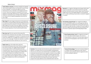
- 1. Abbie Corbett Target Audience and genre I thinkfrom lookingat thismagazine, I wouldsaythe target audience is bothgenders around the ages of 16 to middle 20s. I can see thisthroughthe use of the advertisements such as ‘Ibiza 2013’ and‘bringing the heat this summer’ these cover lines give the impression that this music magazine is for younger audiencesto buy. The genre of this music magazine is mainlydance music anddeep house clubbing etc. I can clearlysee this throughthe typographyusedandalsothe mainimage. Main Image The mainimage onthispicture is of the electronica duo Disclosure. The twobrothers look quite relaxed and are very casuallydressed, whichis typical for their ages. Unlike the Q and NME magazine, the artists onthe mainimage are much better groomedandthis shows that theyprobablyproduce their music for a younger age group, as theyare quite youngthemselves. Main Cover Line The main cover line is the name of the band/artist that is featured onthe cover page, inthiscase it being Disclosure. The typographyfor ‘Disclosure’ is actuallyover the top of the mainimage and is a lot bigger text compared to the rest of the text on the cover page. This gives the impression to audiences straight awaythat Disclosure is going to be a main cover line. Model Credit Again, the model credit is about the electronica duoDisclosure andit reads ‘Disclosure bringing the heat this summer’ this straight awaywouldappeal to much younger audience or different people whoenjoy listeningto dance music. The fact that it mentions the word summer andheat, it gives the impressionof a holiday, which links people to being out and clubbing to dance music, which is the genre of music Disclosure produce. It is made once again obvious that this magazine is aimedat a younger generationof people whodo listento andenjoydance music. Coverlines There are other cover lines that are usedas wellwhichall link together. For example, ‘Wina DJ set at Creamfields’ its givingpeople a chance to wina DJ set at a music festival knownas Creamfields. This again emphasises the point that this music magazine is aimedat a certaintarget audience; as if it was made for older people it wouldn’t give them these opportunitiesthat feature a music festival. There is another cover line to which reads ‘Ibiza 2013 all the clubs all the DJ’s allyou need’ sothe magazine tries to get audiences to feelinvolvedwith what is featured. Banners/Flashes/badges There are no banners or flashes or badges usedin this magazine front cover, whichif theywere usedcould have made the magazine that little bit more excitingto audiences. Colours/Typefaces/House style This magazine usescolours such as red, black andwhite however, the redisn’t as strong andbold, it is quite calm. The house style is kept the same andall of the typographyis well colouredinorder to standout. The Gutenberg DesignPrinciple This magazine has different features inalldifferent places on the cover page and unlike the other magazines the mastheadstarts at the top left handcorner and ends at the right handside, soit goes all the waythroughthe top of the magazine and bythe waycoverlines are placedI don’t think that it is typicallyusing the Gutenberg designprinciple. Masthead This magazine is Mixmag andonce againlike the other magazine mastheads it is veryboldandstands out, especially because it has beenwrittenin redtext. Above it says ‘the world’s biggest dance music andclubbing magazine’ so for people who don’t usuallyread Mixmag, theyare able to see what the magazine is allabout.
- 2. Abbie Corbett Target Audience and genre I wouldstaythe genre of this music magazine is quite like the Q magazine. From the type of bands featuredon the front ofthe magazine andthe red, black, white and blue colours being used, I wouldthink that the genre is indie / rock / alternative. The typographyalsosuggests this as it is very bold and eye catching. I wouldsaythat the target audience would be people who are interestedinthistype of music but more male audiences thanwomen around the agesof 18 andabove. Main Image The mainimage is ofa member of the Arctic Monkeys whichis a rock band. The artist seems to have hishands foldedwith his headtilt while holding a blackandred record. This suggests that the music genre of this magazine is quite old fashionedandvintage through the use of iconography. He is also giving direct mode of address andthe clothes he wears also suggest thisrock genre of music that he produces. Model credit The model credit onthismagazine is the name of the mainbandfeatured, whichinthis case is the Arctic Monkeys. This modelcredit is inbold redtext andit stands out from the rest of the other bands/artists that are featuredon the magazine. Therefore, it shows that the maincover line is basedaroundthis band. Main Cover Line The main cover line is the little piece of informationthat is given out about the bandonthe front cover. It says inthe bottomleft hand corner of the magazine ‘Arctic Monkeys reveal the record that changed mylife’ so audiences know that the maincover line willbe based aroundthe Arctic Monkeys andthis storyinparticular. It onlyallows audiencesto readthis little cover line, so if they are interestedandwanted to read more on thismaincover line, theywouldhave to purchase the magazine. Coverlines All of the other cover lines are basedon different music bands or artists. For example, there are covers lines suchas ‘FrankTurner destroys Wembleyspecial live report’ These sort of cover lines will still get attentionfrom audiences or people whoare interested, however the main cover line will appeal to a muchbigger audience and will attract more people. Banners/Flashes/badges The magazine does use a badge in the topright handcorner where most people would focus onas wellas other placeson a magazine. It is a little box that has informationinside with analmost 3D shape above it that reads ‘Record store day2013’ this is usedinorder to give audiences informationonwhat this magazine has to offer, it is almost like a special offer from the magazine andit will keep audiencesinterested. Colours/Typefaces/House style Like with the Q music magazine, this NME magazine usesthe same house style on the cover page. Again, it is onlyred, black, white and blue colours that are being used, so that theyall fit in together. The background colour is alsoquite pale, sothat the blackclothingthat the music artist is wearingcanstand out more. The Gutenberg DesignPrinciple The magazine couldhave usedthe Gutenberg design principle, however inthe bottomright hand corner is the price tagof the magazine andthis is usuallywhere people will look secondlyafter the topleft hand corner. Normallyif a magazine were to use this principle, theywouldn’t chose this place to put the price tag, as theywouldn’t want people to be put off bythe price before even looking at whatever else the magazine features or hasto offer. Masthead The mastheadof the magazine is the name ofthe magazine whichis NME andagainlike most of the typography, it is in capitals andis big and bold. It hasto be bigger than the rest of the typographysothat audiences know that is the brandof the magazine, sowhentheyare looking for it in shops theywill be able to find it bythis name as it stands out to them, it mayalsobe the first thing that audiences see at point of sale, as well as the main image used due to the part of the magazine it is placed in.
- 3. Abbie Corbett Target Audience and genre- From lookingat thismagazine cover; I wouldthink that the genre for this type of magazine is quite rock and roll. I can guess thisthroughdifferent bands names. However, if you weren’t to know whothese bands are, the genre is quite clear throughthe colours usedandthe central protagonist. I wouldsaythat the target audience for thistype of magazine would be around20 andabove. Main Image The mainimage is ofLiamGallagher, who is a member of the famous Britishband Oasis. The singer is giving direct mode of address to audiences and he seems to have a neutral face, whichsuggests he couldbe serious about what he does. The image is alsoinblack andwhite, whichcould suggest this rock type of genre. Main Cover Line The main cove line is the name of the bandthat is presentedonthe cover page andthe brief part of information that is usedto describe one ofthe articlesthat feature inside. All of the typographyon thisfront cover is either red, black or white, so it allfits inwith the genre it is trying to present. Model Credit The model credit is about the bandOasisand “their greatest triumphintheir ownwords” Theyuse Liam Gallagher, who is a singer inthe Britishband as the central protagonist, then as the maincover line, Liam’s name is usedandsoare speech marks to implythat he has spoken about thiscertainstory. These words are big andboldandin the colour red, alsothe words usedseemto suggest violence, as the word ‘shotgun’ is present. This could suggest to audiences that the genre ofthis magazine is quite violent maybe or rebellious. Therefore, this couldlead people to the conclusionthat the magazine genre is mainly rock, alternative or indie. Colours/Typefaces/House style The colours seem to only be red, black, white andthe smallest amount of blue. These colours suggest thisidea of rockandrebellion and danger, especiallythe red colour. Therefore the magazine tends to keep the same house style throughout the cover page and I canimagine theydo this throughout the whole of the magazine as well inorder to keepsuggesting this certaingenre of music magazine. Masthead The mastheadof thismagazine cover is the name of the magazine whichis ‘Q’ This masthead like inmanyother magazines is boldandbig, whichmeans it stands out to people. The letter Q can alsostandfor anythinginthese magazines and it gets people guessing what the letter actuallymeans. Also, above it there is typographythat reads ‘the world’s greatest music magazine’ which has obviouslybeenput there to attract audiences intobuying the magazine, as it will interest them. The Gutenberg DesignPrinciple It could be saidthat thismagazine has used the Gutenberg designprinciple as allof the best things have been placed inthe best places. For example, a personwould normallylook at the primaryoptical area first, whichonthis magazine is where the masthead is placed (the name ofthe magazine)andagain, it says ‘the worlds greatest music magazine’ so this would typicallybe the first thingthat people see. Thenonto the bottom right hand corner whichfeaturesnamesof other rock bands / artists. The strongfallow area is inthe top right corner which againfeatures more rock / indie artists andlastly, in the bottom left handcorner is the price tag, whichis the weak fallow area, whichwouldn’t interest manypeople. Coverlines The rest of the cover lines that are shownon thismagazine cover page seemto be the namesof other bands or singers. Fromlooking at these different band/singer names, theyall seem to have the same thing in commonandthat is that theyare mainlyrock/indie bands, so this again maygive awayto audiencesthat this magazine is aimedat that type of genre. However, there is a challenge to this, as the singer SamSmithis featuredon the cover. Banners/Flashes/badges There are no banners or flashes or badges usedin this magazine front cover, whichif theywere usedcould have made the magazine that little bit more excitingto audiences.