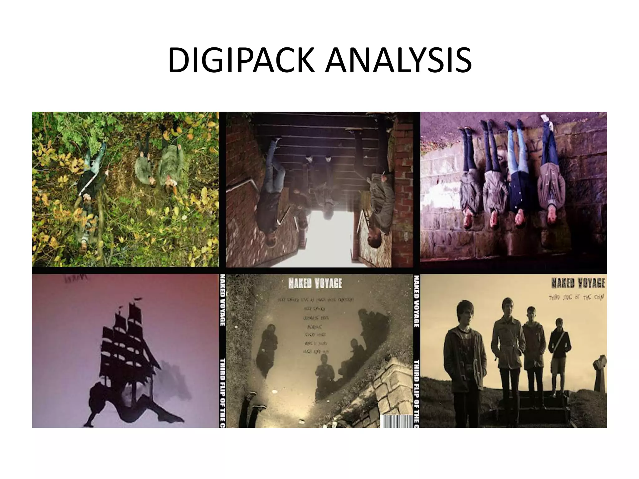
This document analyzes and compares the digipack designs of several pop artists, including Rihanna, Ellie Goulding, and Colbie Caillat. Some key points made:
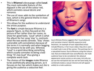
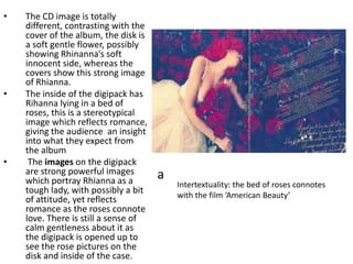
1) Rihanna's "Loud" digipack uses the color red and images of roses to symbolize themes of love and sexuality in her music.
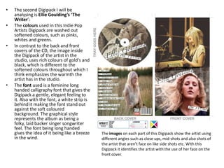
2) Ellie Goulding's "The Writer" digipack uses soft, washed-out colors and a calligraphy font to portray a folk/singer-songwriter style.
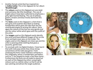
3) Colbie Caillat's "Breakthrough" digipack also uses gentle, summery colors along with a handwritten font and


![Media Digipack[2]](https://cdn.slidesharecdn.com/ss_thumbnails/mediadigipack2-140328115755-phpapp01-thumbnail.jpg?width=640&height=640&fit=bounds)


