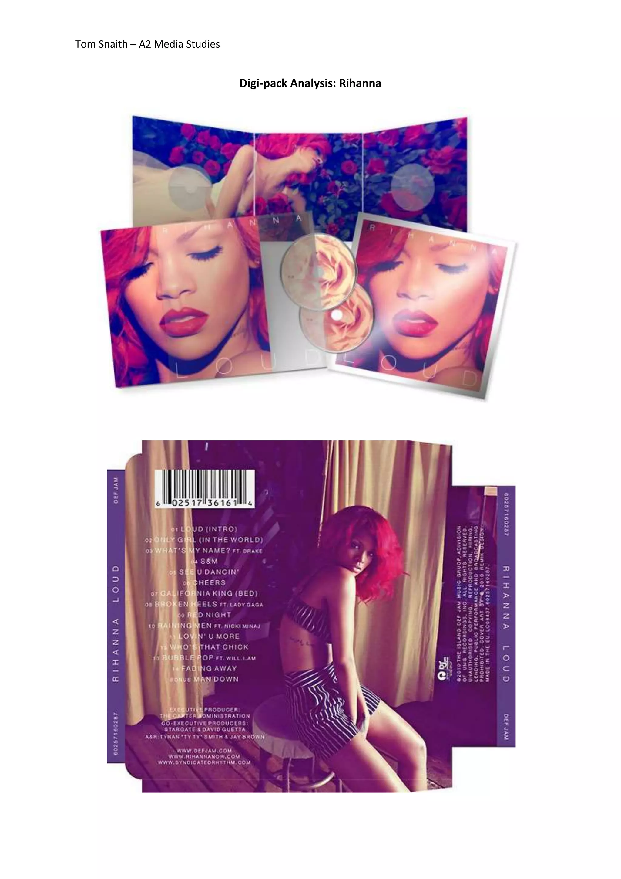
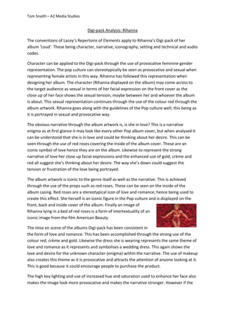
Tom Snaith – A2 Media Studies 
Digi-pack Analysis: Rihanna
Tom Snaith – A2 Media Studies 
Digi-pack Analysis: Rihanna 
The conventions of Lacey’s Repertoire of Elements apply to Rihanna’s Digi-pack of her 
album ‘Loud’. These being character, narrative, iconography, setting and technical and audio 
codes. 
Character can be applied to the Digi-pack through the use of provocative feminine gender 
representation. The pop culture can stereotypically be seen as provocative and sexual when 
representing female artists in this way. Rihanna has followed this representation when 
designing her album. The character (Rihanna displayed on the album) may come across to 
the target audience as sexual in terms of her facial expression on the front cover as the 
close up of her face shows the sexual tension; maybe between her and whoever the album 
is about. This sexual representation continues through the use of the colour red through the 
album artwork. Rihanna goes along with the guidelines of the Pop culture well; this being as 
it is portrayed in sexual and provocative way. 
The obvious narrative through the album artwork is, is she in love? This is a narrative 
enigma as at first glance it may look like every other Pop album cover, but when analysed it 
can be understood that she is in love and could be thinking about her desire. This can be 
seen through the use of red roses covering the inside of the album cover. These are an 
iconic symbol of love hence they are on the album. Likewise to represent the strong 
narrative of love her close up facial expressions and the enhanced use of gold, crème and 
red all suggest she’s thinking about her desire. The way she’s down could suggest the 
tension or frustration of the love being portrayed. 
The album artwork is iconic to the genre itself as well as the narrative. This is achieved 
through the use of the props such as red roses. These can be seen on the inside of the 
album casing. Red roses are a stereotypical icon of love and romance; hence being used to 
create this effect. She herself is an iconic figure in the Pop culture and is displayed on the 
front, back and inside cover of the album. Finally an image of 
Rihanna lying in a bed of red roses is a form of intertextuality of an 
iconic image from the film American Beauty. 
The mise en scene of the albums Digi-pack has been consistent in 
the form of love and romance. This has been accomplished through the strong use of the 
colour red, crème and gold. Likewise the dress she is wearing represents the same theme of 
love and romance as it represents and symbolises a wedding dress. This again shows the 
love and desire for the unknown character (enigma) within the narrative. The use of makeup 
also creates this theme as it is provocative and attracts the attention of anyone looking at it. 
This is good because it could encourage people to purchase the product. 
The high key lighting and use of increased hue and saturation used to enhance her face also 
makes the image look more provocative and makes the narrative stronger. However if the
Tom Snaith – A2 Media Studies 
image wasn’t edited then this affect wouldn’t be created and the image would look dull. 
Finally the text used on the album cover is a simple san serif font which is clear and easy to 
read. This sticks with the theme of the album and is also easy on the eye as the cover 
doesn’t look overcrowded and have too much going on.

Rihanna analysis

  • 1.
    Tom Snaith –A2 Media Studies Digi-pack Analysis: Rihanna
  • 2.
    Tom Snaith –A2 Media Studies Digi-pack Analysis: Rihanna The conventions of Lacey’s Repertoire of Elements apply to Rihanna’s Digi-pack of her album ‘Loud’. These being character, narrative, iconography, setting and technical and audio codes. Character can be applied to the Digi-pack through the use of provocative feminine gender representation. The pop culture can stereotypically be seen as provocative and sexual when representing female artists in this way. Rihanna has followed this representation when designing her album. The character (Rihanna displayed on the album) may come across to the target audience as sexual in terms of her facial expression on the front cover as the close up of her face shows the sexual tension; maybe between her and whoever the album is about. This sexual representation continues through the use of the colour red through the album artwork. Rihanna goes along with the guidelines of the Pop culture well; this being as it is portrayed in sexual and provocative way. The obvious narrative through the album artwork is, is she in love? This is a narrative enigma as at first glance it may look like every other Pop album cover, but when analysed it can be understood that she is in love and could be thinking about her desire. This can be seen through the use of red roses covering the inside of the album cover. These are an iconic symbol of love hence they are on the album. Likewise to represent the strong narrative of love her close up facial expressions and the enhanced use of gold, crème and red all suggest she’s thinking about her desire. The way she’s down could suggest the tension or frustration of the love being portrayed. The album artwork is iconic to the genre itself as well as the narrative. This is achieved through the use of the props such as red roses. These can be seen on the inside of the album casing. Red roses are a stereotypical icon of love and romance; hence being used to create this effect. She herself is an iconic figure in the Pop culture and is displayed on the front, back and inside cover of the album. Finally an image of Rihanna lying in a bed of red roses is a form of intertextuality of an iconic image from the film American Beauty. The mise en scene of the albums Digi-pack has been consistent in the form of love and romance. This has been accomplished through the strong use of the colour red, crème and gold. Likewise the dress she is wearing represents the same theme of love and romance as it represents and symbolises a wedding dress. This again shows the love and desire for the unknown character (enigma) within the narrative. The use of makeup also creates this theme as it is provocative and attracts the attention of anyone looking at it. This is good because it could encourage people to purchase the product. The high key lighting and use of increased hue and saturation used to enhance her face also makes the image look more provocative and makes the narrative stronger. However if the
  • 3.
    Tom Snaith –A2 Media Studies image wasn’t edited then this affect wouldn’t be created and the image would look dull. Finally the text used on the album cover is a simple san serif font which is clear and easy to read. This sticks with the theme of the album and is also easy on the eye as the cover doesn’t look overcrowded and have too much going on.