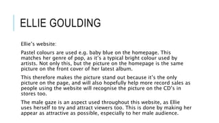
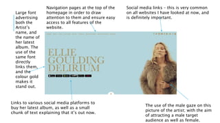
WEBSITE ANALYSIS By Lucy Pearson
KATY PERRY
Katy’s website:
I think that this is a very successful website because of the use of
colours, making it stand out at first glance.
There are plenty of navigation pages and the news section is kept up
to date frequently – therefore informing users on the latest of the
artists doings.
In terms of pictures, the homepage includes a slideshow montage of
various snaps of Katy Perry – therefore promoting her to the
audience.
The artist’s
name to
remind the
user of
who the
website is
dedicated
to.
Social media links as well as a link to
the merchandise store. This is a way
of promoting her merchandise too;
therefore boosting her name.
A
navigation
drop down
menu bar –
this leads
to various
sections
e.g. events
and images
so that the
user can
find out
more.
Large
picture of
Katy as the
background;
therefore
promoting
her as an
artist and
standing out
to anyone
looking at
The name of her latest album is in large in the centre of the
screen – therefore instantly promoting the song. The word is
hyperlinked so that it takes you straight to a page where you can
LITTLE MIX
Little Mix’s website:
Overall, this website is kept very “clean” in order to ensure that it is
suitable and appropriate for their target audience of children and
teens. This therefore means that it includes bright colours etc. to
achieve this, as well as all things suitable.
The home page, however, follows a specific dark theme. This is to
match their latest album, “Get Weird”, of which their overall theme is
quite dark and mysterious. Therefore, their website is directly linked
to the album.
The artist logo is in the centre of the page –
therefore making it stand out.
There’s an overall dark theme
going on, and it matches the
theme of their latest album –
“get weird”. This therefore
links them directly.
Navigation pages are clear
and easy to see. The font is
different to the logo, in
order to show that they’re
different.
The white
colour of the
font makes the
pages stand
out – therefore
attracting the
user to click
them and
explore the
Menu bar is clear
to see at the top
centre of the
page, therefore
making it easily
accessible.
The picture of the girls is
simple – against a plain
background – which makes
them instantly stand out and
attract attention.
ELLIE GOULDING
Ellie’s website:
Pastel colours are used e.g. baby blue on the homepage. This
matches her genre of pop, as it’s a typical bright colour used by
artists. Not only this, but the picture on the homepage is the same
picture on the front cover of her latest album.
This therefore makes the picture stand out because it’s the only
picture on the page, and will also hopefully help more record sales as
people using the website will recognise the picture on the CD’s in
stores too.
The male gaze is an aspect used throughout this website, as Ellie
uses herself to try and attract viewers too. This is done by making her
appear as attractive as possible, especially to her male audience.
Social media links – this is very common
on all websites I have looked at now, and
is definitely important.
The use of the male gaze on this
picture of the artist; with the aim
of attracting a male target
audience as well as female.
Large font
advertising
both the
Artist’s
name, and
the name of
her latest
album. The
use of the
same font
directly
links them,
and the
colour gold
makes it
stand out.
Links to various social media platforms to
buy her latest album, as well as a small
chunk of text explaining that it’s out now.
Navigation pages at the top of the
homepage in order to draw
attention to them and ensure easy
access to all features of the
website.

Website analysis

  • 1.
    WEBSITE ANALYSIS ByLucy Pearson
  • 2.
    KATY PERRY Katy’s website: Ithink that this is a very successful website because of the use of colours, making it stand out at first glance. There are plenty of navigation pages and the news section is kept up to date frequently – therefore informing users on the latest of the artists doings. In terms of pictures, the homepage includes a slideshow montage of various snaps of Katy Perry – therefore promoting her to the audience.
  • 3.
    The artist’s name to remindthe user of who the website is dedicated to. Social media links as well as a link to the merchandise store. This is a way of promoting her merchandise too; therefore boosting her name. A navigation drop down menu bar – this leads to various sections e.g. events and images so that the user can find out more. Large picture of Katy as the background; therefore promoting her as an artist and standing out to anyone looking at The name of her latest album is in large in the centre of the screen – therefore instantly promoting the song. The word is hyperlinked so that it takes you straight to a page where you can
  • 4.
    LITTLE MIX Little Mix’swebsite: Overall, this website is kept very “clean” in order to ensure that it is suitable and appropriate for their target audience of children and teens. This therefore means that it includes bright colours etc. to achieve this, as well as all things suitable. The home page, however, follows a specific dark theme. This is to match their latest album, “Get Weird”, of which their overall theme is quite dark and mysterious. Therefore, their website is directly linked to the album.
  • 5.
    The artist logois in the centre of the page – therefore making it stand out. There’s an overall dark theme going on, and it matches the theme of their latest album – “get weird”. This therefore links them directly. Navigation pages are clear and easy to see. The font is different to the logo, in order to show that they’re different. The white colour of the font makes the pages stand out – therefore attracting the user to click them and explore the Menu bar is clear to see at the top centre of the page, therefore making it easily accessible. The picture of the girls is simple – against a plain background – which makes them instantly stand out and attract attention.
  • 6.
    ELLIE GOULDING Ellie’s website: Pastelcolours are used e.g. baby blue on the homepage. This matches her genre of pop, as it’s a typical bright colour used by artists. Not only this, but the picture on the homepage is the same picture on the front cover of her latest album. This therefore makes the picture stand out because it’s the only picture on the page, and will also hopefully help more record sales as people using the website will recognise the picture on the CD’s in stores too. The male gaze is an aspect used throughout this website, as Ellie uses herself to try and attract viewers too. This is done by making her appear as attractive as possible, especially to her male audience.
  • 7.
    Social media links– this is very common on all websites I have looked at now, and is definitely important. The use of the male gaze on this picture of the artist; with the aim of attracting a male target audience as well as female. Large font advertising both the Artist’s name, and the name of her latest album. The use of the same font directly links them, and the colour gold makes it stand out. Links to various social media platforms to buy her latest album, as well as a small chunk of text explaining that it’s out now. Navigation pages at the top of the homepage in order to draw attention to them and ensure easy access to all features of the website.