SlideShare a Scribd company logo
1 of 4
Font - From the 80’s Rock Genre Very bold, quite block like letters. It stands out and  is simple, make a good impact, you would notice it if it was in-between a lot of other texts as it stands out. Again very bold and block letters, however the letters are very close together, bit hard to see what it says clearly when just glancing at it. The gold and black with red all contrast together well. This one is quite different to the others as it is must more decorative however it does make it quite eye catching the way the letters curl round and flick out – matching the name ‘snake’, which is very clever. However the use of colour on this one is quite dull.
Font – R&B Genre This is quite mixed as one is quite bold and has blocked letters but still quite close to the others however the others are much more girly with flicks at the end of the letters and scroll like. The gold and Silver is quite a wealthy colour you think of class when you think of these colours and sophistication.  This is very bold and has very block like letters, the different shades of pink indicate its still girly even though it has a boyish font style, the contrast with the black then reminds us its not a Pop- girly Genre and reminds us its still R&B. It stands out well and would be seen and picked out from a crowd.
Font – Pop Genre. We can tell this is girly straight away from the flicks in the writing the little squiggle coming of the end of the ‘y’ to me looks like a foundation splatter which again reminds us its girly. The black and white go together well but don’t give anything away about the Genre, which to me would be a important thing missing. The gold is quite a sophisticated colour and pairs well next to the black. The star again is quite girly reminds us of the Pop Genre – ‘Pop Star’.  This is clearly girly the pinks, the love heart, the flicks at the end of the texts and its quite like bubble writing, which reminds us of the Pop Genre. Everything about these texts keeps us informed its girly and Pop.
Font – Rap Genre. The black and white squares around the text draw our eyes in and make us focus on the text in the centre, the red, black and white colours work well, black and white compliment each other and the red clashes but in a good way as it attracts the eye. Its very block and bold letters, reminded us it’s a strong thing its representing, which the Rap Genre is, its not soft and quite its quite heavy in some sense.  The basic black writing makes us think of just what it says nothing else, it is also quite boyish and the ‘E’ that’s backwards is quite effective, as the writing style is plain and not that bold that adds a extra effect to attract attention. Very block lie letters again, quite bold but its easy to make out what it says as its quite spacious, its very simple like the one above and plain black which shows me that its quite a popular thing to have this font in the Rap industry. Even though its plain its still eye catching as its bold.

More Related Content

What's hot

Masthead designs
Masthead designsMasthead designs
Masthead designsLeafyJ
 
Anaylsing Dp Spreads
Anaylsing Dp SpreadsAnaylsing Dp Spreads
Anaylsing Dp Spreadsguest012be8
 
Digipak analysis for a2
Digipak analysis for a2Digipak analysis for a2
Digipak analysis for a2Mary Morgan
 
Nme contents page analysis
Nme contents page analysisNme contents page analysis
Nme contents page analysiscaljoe97
 
Magazine analysis
Magazine analysisMagazine analysis
Magazine analysissamhamer123
 
Media colour scheme and fonts
Media colour scheme and fontsMedia colour scheme and fonts
Media colour scheme and fontsniltiachplar
 
Proposal- task 6
Proposal- task 6Proposal- task 6
Proposal- task 6arilda_b
 
Fonts and Book Cover Research and Designs
Fonts and Book Cover Research and DesignsFonts and Book Cover Research and Designs
Fonts and Book Cover Research and DesignsDanielle Hulmes
 
Cd digipak analysis rihanna
Cd digipak analysis rihannaCd digipak analysis rihanna
Cd digipak analysis rihannalaurencooney2497
 
Double page spread 1
Double page spread 1Double page spread 1
Double page spread 1ASymonds96
 
Font research
Font researchFont research
Font researchcoleybop
 

What's hot (20)

Masthead designs
Masthead designsMasthead designs
Masthead designs
 
Anaylsing Dp Spreads
Anaylsing Dp SpreadsAnaylsing Dp Spreads
Anaylsing Dp Spreads
 
Digipak analysis for a2
Digipak analysis for a2Digipak analysis for a2
Digipak analysis for a2
 
Task 5
Task 5Task 5
Task 5
 
Genre
GenreGenre
Genre
 
Nme contents page analysis
Nme contents page analysisNme contents page analysis
Nme contents page analysis
 
Magazine analysis
Magazine analysisMagazine analysis
Magazine analysis
 
Font research
Font researchFont research
Font research
 
Media colour scheme and fonts
Media colour scheme and fontsMedia colour scheme and fonts
Media colour scheme and fonts
 
Proposal- task 6
Proposal- task 6Proposal- task 6
Proposal- task 6
 
Representations
RepresentationsRepresentations
Representations
 
Magazine Mastheads
Magazine MastheadsMagazine Mastheads
Magazine Mastheads
 
Fonts and Book Cover Research and Designs
Fonts and Book Cover Research and DesignsFonts and Book Cover Research and Designs
Fonts and Book Cover Research and Designs
 
Word art
Word artWord art
Word art
 
Intro to Typography
Intro to TypographyIntro to Typography
Intro to Typography
 
Double page spread
Double page spreadDouble page spread
Double page spread
 
Cd digipak analysis rihanna
Cd digipak analysis rihannaCd digipak analysis rihanna
Cd digipak analysis rihanna
 
Doublepage Spread Analysis
Doublepage Spread AnalysisDoublepage Spread Analysis
Doublepage Spread Analysis
 
Double page spread 1
Double page spread 1Double page spread 1
Double page spread 1
 
Font research
Font researchFont research
Font research
 

Viewers also liked

Presentation1
Presentation1Presentation1
Presentation1kck0915
 
110101 Bedrijfspresentatie Vdef Majormilestones
110101 Bedrijfspresentatie  Vdef  Majormilestones110101 Bedrijfspresentatie  Vdef  Majormilestones
110101 Bedrijfspresentatie Vdef Majormilestonespeelr
 
Df revised related list (remember all )
Df  revised related list (remember all )Df  revised related list (remember all )
Df revised related list (remember all )sljh86
 
Izstāde’’vērša gads’’ md
Izstāde’’vērša gads’’ mdIzstāde’’vērša gads’’ md
Izstāde’’vērša gads’’ mdAucesbibliotek
 
Nang luc canh tranh dn hien nay
Nang luc canh tranh dn hien nayNang luc canh tranh dn hien nay
Nang luc canh tranh dn hien nayDong SôngMây
 
5 กาพย์ห่อโคลงประพาสธารทองแดง 5.3 วิเคราะห์เนื้อหา
5 กาพย์ห่อโคลงประพาสธารทองแดง 5.3 วิเคราะห์เนื้อหา5 กาพย์ห่อโคลงประพาสธารทองแดง 5.3 วิเคราะห์เนื้อหา
5 กาพย์ห่อโคลงประพาสธารทองแดง 5.3 วิเคราะห์เนื้อหาJoice Naka
 
ความหมายของสำนวน
ความหมายของสำนวนความหมายของสำนวน
ความหมายของสำนวนJoice Naka
 
Elizabeth retrospective
Elizabeth retrospectiveElizabeth retrospective
Elizabeth retrospectiveElizabeth
 
ใบความรู้ที่ 3 การเขียนจดหมายกิจธุระ
ใบความรู้ที่ 3 การเขียนจดหมายกิจธุระใบความรู้ที่ 3 การเขียนจดหมายกิจธุระ
ใบความรู้ที่ 3 การเขียนจดหมายกิจธุระJoice Naka
 

Viewers also liked (12)

Presentation1
Presentation1Presentation1
Presentation1
 
Camp purple ppt.
Camp purple ppt.Camp purple ppt.
Camp purple ppt.
 
110101 Bedrijfspresentatie Vdef Majormilestones
110101 Bedrijfspresentatie  Vdef  Majormilestones110101 Bedrijfspresentatie  Vdef  Majormilestones
110101 Bedrijfspresentatie Vdef Majormilestones
 
Pavasaris
PavasarisPavasaris
Pavasaris
 
Stumble upon pres
Stumble upon presStumble upon pres
Stumble upon pres
 
Df revised related list (remember all )
Df  revised related list (remember all )Df  revised related list (remember all )
Df revised related list (remember all )
 
Izstāde’’vērša gads’’ md
Izstāde’’vērša gads’’ mdIzstāde’’vērša gads’’ md
Izstāde’’vērša gads’’ md
 
Nang luc canh tranh dn hien nay
Nang luc canh tranh dn hien nayNang luc canh tranh dn hien nay
Nang luc canh tranh dn hien nay
 
5 กาพย์ห่อโคลงประพาสธารทองแดง 5.3 วิเคราะห์เนื้อหา
5 กาพย์ห่อโคลงประพาสธารทองแดง 5.3 วิเคราะห์เนื้อหา5 กาพย์ห่อโคลงประพาสธารทองแดง 5.3 วิเคราะห์เนื้อหา
5 กาพย์ห่อโคลงประพาสธารทองแดง 5.3 วิเคราะห์เนื้อหา
 
ความหมายของสำนวน
ความหมายของสำนวนความหมายของสำนวน
ความหมายของสำนวน
 
Elizabeth retrospective
Elizabeth retrospectiveElizabeth retrospective
Elizabeth retrospective
 
ใบความรู้ที่ 3 การเขียนจดหมายกิจธุระ
ใบความรู้ที่ 3 การเขียนจดหมายกิจธุระใบความรู้ที่ 3 การเขียนจดหมายกิจธุระ
ใบความรู้ที่ 3 การเขียนจดหมายกิจธุระ
 

Similar to Presentation of fonts

Genre convention in music magazine
Genre convention in music magazineGenre convention in music magazine
Genre convention in music magazineanaiadai
 
Colour and font
Colour and fontColour and font
Colour and fontEva Clarke
 
Identifying genre
Identifying genreIdentifying genre
Identifying genrebir
 
Music Magazine Masthead’s
Music Magazine Masthead’sMusic Magazine Masthead’s
Music Magazine Masthead’sizzyrowland
 
Brand identity and mode of address analysis
Brand identity and mode of address analysisBrand identity and mode of address analysis
Brand identity and mode of address analysisginagoodall
 
Different fonts for rap digipaks
Different fonts for rap digipaksDifferent fonts for rap digipaks
Different fonts for rap digipakswhslaura
 
Brand Identity and mode of address
Brand Identity and mode of addressBrand Identity and mode of address
Brand Identity and mode of addressginagoodall
 
Final masthead analysis
Final masthead analysisFinal masthead analysis
Final masthead analysisIsabelle Humm
 
Contents pages
Contents pagesContents pages
Contents pagesCraig Hunt
 
Genre convention in music magazine
Genre convention in music magazineGenre convention in music magazine
Genre convention in music magazineanaiadai
 
Double Page Spread Analysis XXL
Double Page Spread Analysis XXLDouble Page Spread Analysis XXL
Double Page Spread Analysis XXLguest774dc26f
 

Similar to Presentation of fonts (20)

Genre convention in music magazine
Genre convention in music magazineGenre convention in music magazine
Genre convention in music magazine
 
DPS Analysis
DPS AnalysisDPS Analysis
DPS Analysis
 
DPS Analysis
DPS AnalysisDPS Analysis
DPS Analysis
 
Colour and font
Colour and fontColour and font
Colour and font
 
Masthead Two
Masthead TwoMasthead Two
Masthead Two
 
Identifying genre
Identifying genreIdentifying genre
Identifying genre
 
Music Magazine Masthead’s
Music Magazine Masthead’sMusic Magazine Masthead’s
Music Magazine Masthead’s
 
Mastheads analysis
Mastheads analysisMastheads analysis
Mastheads analysis
 
Font Practices
Font PracticesFont Practices
Font Practices
 
Brand identity and mode of address analysis
Brand identity and mode of address analysisBrand identity and mode of address analysis
Brand identity and mode of address analysis
 
Different fonts for rap digipaks
Different fonts for rap digipaksDifferent fonts for rap digipaks
Different fonts for rap digipaks
 
3 dps
3 dps3 dps
3 dps
 
Brand Identity and mode of address
Brand Identity and mode of addressBrand Identity and mode of address
Brand Identity and mode of address
 
Iggy azalea digipak
Iggy azalea digipakIggy azalea digipak
Iggy azalea digipak
 
Font research fini
Font research finiFont research fini
Font research fini
 
Final masthead analysis
Final masthead analysisFinal masthead analysis
Final masthead analysis
 
Contents pages
Contents pagesContents pages
Contents pages
 
Genre convention in music magazine
Genre convention in music magazineGenre convention in music magazine
Genre convention in music magazine
 
Monatge
MonatgeMonatge
Monatge
 
Double Page Spread Analysis XXL
Double Page Spread Analysis XXLDouble Page Spread Analysis XXL
Double Page Spread Analysis XXL
 

More from kellyhunt

More from kellyhunt (8)

Storyboard
StoryboardStoryboard
Storyboard
 
Storyboard
StoryboardStoryboard
Storyboard
 
Storyboard
StoryboardStoryboard
Storyboard
 
Storyboard
StoryboardStoryboard
Storyboard
 
Storyboard
StoryboardStoryboard
Storyboard
 
Storyboard
StoryboardStoryboard
Storyboard
 
Storyboard
StoryboardStoryboard
Storyboard
 
Deadlines
DeadlinesDeadlines
Deadlines
 

Presentation of fonts

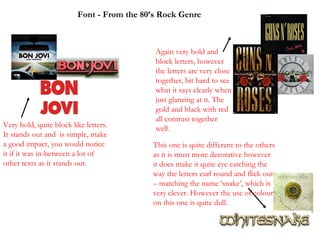
  • 1. Font - From the 80’s Rock Genre Very bold, quite block like letters. It stands out and is simple, make a good impact, you would notice it if it was in-between a lot of other texts as it stands out. Again very bold and block letters, however the letters are very close together, bit hard to see what it says clearly when just glancing at it. The gold and black with red all contrast together well. This one is quite different to the others as it is must more decorative however it does make it quite eye catching the way the letters curl round and flick out – matching the name ‘snake’, which is very clever. However the use of colour on this one is quite dull.
  • 2. Font – R&B Genre This is quite mixed as one is quite bold and has blocked letters but still quite close to the others however the others are much more girly with flicks at the end of the letters and scroll like. The gold and Silver is quite a wealthy colour you think of class when you think of these colours and sophistication. This is very bold and has very block like letters, the different shades of pink indicate its still girly even though it has a boyish font style, the contrast with the black then reminds us its not a Pop- girly Genre and reminds us its still R&B. It stands out well and would be seen and picked out from a crowd.
  • 3. Font – Pop Genre. We can tell this is girly straight away from the flicks in the writing the little squiggle coming of the end of the ‘y’ to me looks like a foundation splatter which again reminds us its girly. The black and white go together well but don’t give anything away about the Genre, which to me would be a important thing missing. The gold is quite a sophisticated colour and pairs well next to the black. The star again is quite girly reminds us of the Pop Genre – ‘Pop Star’. This is clearly girly the pinks, the love heart, the flicks at the end of the texts and its quite like bubble writing, which reminds us of the Pop Genre. Everything about these texts keeps us informed its girly and Pop.
  • 4. Font – Rap Genre. The black and white squares around the text draw our eyes in and make us focus on the text in the centre, the red, black and white colours work well, black and white compliment each other and the red clashes but in a good way as it attracts the eye. Its very block and bold letters, reminded us it’s a strong thing its representing, which the Rap Genre is, its not soft and quite its quite heavy in some sense. The basic black writing makes us think of just what it says nothing else, it is also quite boyish and the ‘E’ that’s backwards is quite effective, as the writing style is plain and not that bold that adds a extra effect to attract attention. Very block lie letters again, quite bold but its easy to make out what it says as its quite spacious, its very simple like the one above and plain black which shows me that its quite a popular thing to have this font in the Rap industry. Even though its plain its still eye catching as its bold.