
Recommended
More Related Content
What's hot
What's hot (20)
Viewers also liked
Viewers also liked (20)
Similar to Music magazine analysis
Similar to Music magazine analysis (20)
More from karenmaryan
Recently uploaded
Recently uploaded (20)
Music magazine analysis
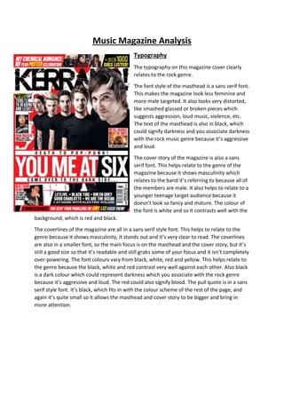
- 1. Music Magazine Analysis Typography The typography on this magazine cover clearly relates to the rock genre. The font style of the masthead is a sans serif font. This makes the magazine look less feminine and more male targeted. It also looks very distorted, like smashed glassed or broken pieces which suggests aggression, loud music, violence, etc. The text of the masthead is also in black, which could signify darkness and you associate darkness with the rock music genre because it’s aggressive and loud. The cover story of the magazine is also a sans serif font. This helps relate to the genre of the magazine because it shows masculinity which relates to the band it’s referring to because all of the members are male. It also helps to relate to a younger teenage target audience because it doesn’t look so fancy and mature. The colour of the font is white and so it contrasts well with the background, which is red and black. The coverlines of the magazine are all in a sans serif style font. This helps to relate to the genre because it shows masculinity, it stands out and it’s very clear to read. The coverlines are also in a smaller font, so the main focus is on the masthead and the cover story, but it’s still a good size so that it’s readable and still grabs some of your focus and it isn’t completely over-powering. The font colours vary from black, white, red and yellow. This helps relate to the genre because the black, white and red contrast very well against each other. Also black is a dark colour which could represent darkness which you associate with the rock genre because it’s aggressive and loud. The red could also signify blood. The pull quote is in a sans serif style font. It’s black, which fits in with the colour scheme of the rest of the page, and again it’s quite small so it allows the masthead and cover story to be bigger and bring in more attention.
- 2. Layout The masthead on this magazine cover is at the top of the magazine covering the whole width of the magazine cover. This brings the main focus of the magazine to that exact point. It uses the rule of thirds by placing the members of the band in the centre of the magazine and it also places the cover story underneath which meets with the exact points of where the lines meet. They also placed the band members on the vertical line so it’s more of a balanced picture, and they also placed a lot of the writing from the cover story on the vertical lines too, so that the main focus is drawn towards the picture and the writing. The masthead on this magazine cover comes right underneath the top line of route of the eye. Just above the top line of the route of the eye is the puffs, so the posters. Through the diagonal line you have the picture of all of the band members. Just above the bottom line of the route of the eye is the cover story. So this means that the magazine is conventional, because the masthead, main image and cover story all come into the route of the eye.
- 3. Colour The colour scheme of this magazine cover consist mainly of red, black and white. The red of the magazine signifies anger and danger, because when we get angry we normally go red in the face and so it could connote anger. The red of the magazine could also signify blood, and blood is linked to violence and aggression, which links into the genre. The black of the magazine signifies darkness. Darkness connotes fear and sadness, so it could relate to the genre of music, because fear links in with danger and aggression. The white of the magazine just contrasts well with the red and black of the magazine. Images The images in this magazine use shot types like mid-shot. This is a useful shot type because it allows you to see their faces and what they’re wearing. So with You Me at Six, you can see they’re all wearing black clothing, this links in with colour and helps relate to the genre of music as dark and aggressive. It also allows you to see their faces at a reasonable view point, and still allows you to see the expression on their faces. The rest of the shot types on the magazine are either close ups or mid-shots. The close ups are on the smaller pictures from the coverline, so it allows you to still be able to see a clear expression of their face. So with New Found Glory, you can see with the singers face how expressive he is and it allows you to see how passionate he is about his music. The other shot type, mid-shot, is used in one of the My Chemical Romance posters at the top, just above the masthead. This allows you to see what they’re wearing, and they’re wearing The Black Parade costumes, which was one of their eras, so you can see that the photo is obviously from that era. This also links in with mise-en-scene because it’s costume. The sort of props and costume they use is with the lead singer in the main picture, Josh, you can see he has horns stuck onto his head, so this relates to the music genre, because when you think of rock, you think of aggression and violence, and Josh could be portrayed as the devil because of his horns, and the devil is aggressive and uses violence.
- 4. Language They use different sorts of language on this magazine cover. For example, on the cover story it says “Death to pop punk! You Me At Six come over to the dark side…” so it uses dramatic language, like death and dark, which links in with the genre as the genre of the magazine and music is associated with dark themes. There are also lots of band names and lots of festival names, including “+Over 1000 gigs listed!” so this gives you an insight at what’s inside of the magazine, which helps appeal to the target audience because the target audience obviously likes bands and attending festivals, so this magazine helps them to see which festivals and bands are the best and which ones will help appeal to who. Conventions This magazine is conventional because it uses route of the eye and rule of thirds. It also includes pictures of bands, posters, interviews, etc. It has the masthead at the top going across the entire width, it has the cover story relating to the picture of the band on the front cover, and it has lots of coverlines placed all over the page. It uses dark colours to represent the genre, so aggressive, violent and loud. There is a lot of text on the left third of the page, so that is conventional as well because there’s normally a lot of text on the left third of a magazine cover.
- 5. Typography The typography uses a very house style effect because they use the same font styles and the same colour scheme as they used on the front cover, they used red, black, white and yellow on the cover a lot, and then within the contents they use the same colours. The font style used throughout most of the contents is sans serif, which creates a masculine feel to the magazine, because the magazine brings in a lot of male readers, so they’re going to shape the magazine around the main audience that is attracted to the genre. They also use serif in the “Win!” speech bubble. They used this because it attracts your eyes towards it because it’s a different font style and so it doesn’t blend in with the rest of the magazine, and also its font colour is black, and it’s against a yellow bubble, so it draws your eyes towards it. The font colours used are mainly black and red, but they use yellow for the sub-headings, this again fits in with what the front cover was, which included black, red, white and yellow. The colours fit the genre because red connotes anger and aggression, and could also represent blood which links in with anger and violence. Black connotes darkness and sadness, which fits in with the genre because we relate darkness with horror, which fits in with the genre because rock music can sometimes be quite scary and use horrific lyrics.
- 6. Layout For the contents page, it uses rule of thirds, because you can see down the vertical lines, main things are placed there, so down the vertical line on the left, you have a picture of a band, and on the vertical line on the right, you have a list of stuff that is included in the magazine, so the news, posters, features, etc. Also, when the lines meet, there are other main things, so the lines that meet at the bottom left highlight the headline, and so your eyes are drawn straight towards that point, and the lines that meet on the top left highlight the image of the band, so that also draws your eyes towards it. Also all of the lines that meet on the right highlight the contents page and so your eyes are drawn towards that too, and it allows you to get a detailed description of what you’d find inside the magazine. The order of the magazine is very clean and well organised, it’s not all in your face and over powering, it’s laid out very neatly and clean, which is not very conventional for a rock magazine, because when you think of rock, you think of mess and violence and guitar smashing, etc. However, the contents page is very neat and clean. Although contents pages are conventionally clean and organised, so you can see clearly what you want to find and where you can find it. Colour The colours of the contents page link in with the colours of the front page, they use a lot of the same colours, like red, black, yellow and white. For example they use red, black and yellow a lot for the font colours, and they use white across the right of the page and all the way across the bottom. They also use dark colours with the band members, so black clothing, which helps with the black font colours and linking it to the genre. They also used the red for the colour of the “All Time Low” font, which draws attention towards the band, and highlights the band so that it’s the main focus of the contents page. Like I said before the colours are very consistent, which connotes a house style effect.
- 7. Images The types of shot types used in the main image is long shot, but the text of the headline covers the bottom half of their legs and feet. This allows us to see the full view of the band and what they’re wearing. It’s important to see what they’re wearing because it allows us to see what they’re like and what sort of colours they wear, in this case, dark colours to relate and link in to the genre. Another reason it’s a good shot to have is because we like to see all of the band, rather than just the singer or drummer. It also allows us to identify the band members. Their poses are all normal, they’re not doing any over the top posing like air guitar or anything, they’re just standing there, one has his arm in the air, but again it’s not too in your face. They also use an image of Andy Biersack, who is the lead singer of Black Veil Brides, and the shot type used is a medium close up, this is a good shot type to use because it allows us to see a bit of what his wearing, but isn’t so far away that we can’t identify who he is. It also allows us to see the expression on his face and what his emotions are. One of the final images used is just a picture of a bunch of Kerrang magazines placed over the top of each other, this is because it’s advertising a subscription to the magazine, and just allows you to see a few of the magazines you’d be able to subscribe to. There isn’t much mise-en-scene used, the main centre image doesn’t use any props but has a consistent colour scheme in clothing, which is black. The image using Andy Biersack has a skull as a prop, this connotes like a dangerous kind of style, because no-one normally walks around with a skull in their hand, so it’s got a mystery and danger feel about it, which relates to the genre.
- 8. Language The language used in this magazine is very ordered and not as dramatic as the front cover. It says “All Time Low tickets and meet and greet!” this isn’t as dramatic as the cover story that was shown on the front cover. It doesn’t contain words like death, and dark-side, it’s very calm and contained. They say “Win!” in relation to the All Time Low tickets, but they have the font in its own little bubble and as its own font style, so this makes it a bit more dramatic than the rest of the language because it’s very big and you can tell it’s important because of the fact that it has its own font style and colour. The rest of the language just talks about what’s inside of the magazine, and at the bottom there’s a readers letter that they sent into the magazine and then had it published. At the top of the contents page it just says “Kerrang! Contents” which is conventional for a contents page, because it has the name of the magazine and then states the fact that it’s the contents page. Conventions The contents page for this magazine is very conventional because it is laid out very neatly and tells you where everything is. It also uses dark colours to represent the genre, so aggressive, loud, violent, etc. It’s also consistent throughout the cover and the contents page because they both use the same colour scheme. It tells you at the top of the contents page that it is in fact the contents page. It also has a main image on the left third of the page, which most contents pages have so the contents aren’t so boring and full of words. They also used two smaller images in the bottom corners, so it isn’t as plain and boring. The main sub-headings telling us what is inside of the magazine is also very conventionally placed in rows, so that it’s easy to see what you want to find, and there’s not too much going on, so it’s not over-powering.
- 9. Typography The type of font used in this double page spread is sans serif. For the pull quote, you can see that they used the same font that is used for the masthead of Kerrang. This is effective because it’s consistent, and we can identify that the same font has been used, so we know that it is Kerrang. They also used white and red for the font colour of the pull quote, which creates a house style effect because it’s consistent throughout the whole of the magazine, e.g. the cover, contents page and double page spread. These are also good colours to use because as I’ve said before, they relate and link in well with the genre, and they also contrast nicely against the black background. For the kicker, they used a different font style and colour to the main text of the article, so they used a red “M” in the same font style as the pull quote, which is consistent, and the rest of the font for the main article is white, and a sans serif style, which is much less distorted compared to the kicker and pull quote. The white of the font works well because it contrasts well against the background, so it’s easier to see. For the little strip of writing down the right hand side of the page, it uses sans serif again, which is good because it creates masculinity and the font colours all contrast well against the background and each other, and it is consistent throughout the whole of the page itself. The captions on the pictures are also in a sans serif font, and the colour used for the font is white, because it contrasts well against the pictures, because the pictures are in black and white, and so they’ve placed the white font against the black/darker parts of the image.
- 10. Layout The way this double page spread is laid out is very clean and clear. On the left hand side of the page, you have the main image, which is very big and clear. It’s also an image of the lead singer of the band. On the right had side of the page, there’s the feature and another strip of information on the right hand side. On the bottom of the page on the right hand side, there’s pictures of the other members of the band, showing them recording in the story, which relates to the feature because it talks about them recording a new album. On the right hand side of the page, you can see it uses route of the eye very clearly. At the top of the page on the top line of route of the eye, it has the pull quote, which is used very effectively, because it’s very big, bold, colourful and right at the top of the page, so it draws your eyes towards that section of the page. Down the middle of the page going across the diagonal line of route of the eye, you have the main article (feature). This is placed effectively because it follows the route in which your eyes would take when scanning a page, it’s very clear to see because of the way the colours of the font and background contrast against each other, and there’s also a lot of font, so that makes it easier to see. At the bottom of the page across the bottom line of route of the eye, you can clearly see two very well placed images. These are placed effectively because they’re quite big and they stand out well against the black background, because the pictures are also in black and white. It also draws your eyes towards this section of the page because it’s the only section of the page where there are actually images. The left hand side of the page is laid out very well because it just features a little block of words at the top of the page, and then the main image underneath it, which stands out well again because the image is in black and well, which contrasts well against the black background.
- 11. Colour The colours on this double page spread are used very effectively because they are used consistently throughout the whole of the three pages I’ve analysed, the cover, contents page and then this page. The colours all contrast well against and with each other. You can also see that the images are in black and white, which is a good effect to use because then it blends in with the rest of the page and so, is used effectively. The colours all relate and link to the genre well because the black of the page signifies darkness and sadness, which relates well to the genre, because people relate rock music to darkness and sometimes the songs can be quite saddening. Red relates to the genre because the red connotes anger and aggression, and could also be used to represent blood which is linked to violence and aggression. Images The images used in this double page spread are all in black and white. There is one very big main image taking up most of the left hand page, and the rest of the images on the bottom right are quite small. The main image’s shot type is mid-long shot. This is an effective shot type to use because you can see the drummer in the background and the singer of the band is looking down, which creates a mystery effect, because we can’t see his face so we can’t see the emotion in his face and so we can’t analyse what effect it has. He also uses a microphone stand and a microphone to create the effect and excitement that they’re creating a new album, and from the way he’s posed, it looks like a very dramatic, emotional but mysterious album. The bottom three images all use different shot types. The first image (going from left to right) is a mid-shot. This creates effect because it allows us to see the emotion on his face, but isn’t too close so that it’s uncomfortable. They also used a spotlight to shine on him,
- 12. which makes him look important and like he’s a good person. He’s also holding a guitar so it’s another good shot to use because we’re able to see the guitar but still be close enough to see his face. The second image’s shot type is a wide-shot. This is a good shot type to use because it allows us to see the rest of the band members, and also we can see that they’re in a studio, which signifies that they’re recording which relates to the article. You can also see they’re standing over a mixing panel, which also shows that they’re recording. You can also see that they’re all talking to each other, so it shows that they communicate well and so it’ll be a good album. The third image’s shot type is a close-up. This is a good shot type to use because it allows us to see the emotion and expression on his face, but it’s not so close that it’s uncomfortable. We can see in the image there is a microphone stand that he’s singing into, so it also connotes that they’re recording, which once again relates to the article. Language The pull quote says “We’re being the best MCR we can be!” this shows that they’re very ambitious and are determined to be good and get lots done. The caption of the third image on the bottom right says “Oh no! I’ve forgotten to lock the bloody front door….” This shows that the magazine is quite comical, and quite playful, and don’t mind making themselves look silly or funny.
- 13. Conventions This double page spread is very conventional because on a double page spread, you normally have one page covered in an image, and the other with the actual article itself. You also have images relating to the article itself placed around the outside of the article. It has a pull quote, which can also double up as a headline, and it also has a kicker, standfirst, a box out and captions. It’s also conventional because the colours relate to the rest of the magazine, and are consistent throughout the whole magazine. This again creates a house effect, and makes the magazine relate more to the genre and look cleaner and cut.