
Recommended
More Related Content
What's hot
What's hot (20)
Similar to Masthead analysis
Similar to Masthead analysis (20)
More from emilygriffiths915
More from emilygriffiths915 (6)
Recently uploaded
Recently uploaded (20)
Masthead analysis
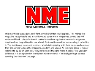
- 1. This masthead uses a Sans-serif font, which is written in all capitals. This makes the magazine recognisable and it stands out to other music magazines, due to the red, white and black colour choice – it makes it stand out against other music magazine mastheads as they all tend to use a black font – with no colour surrounding it or behind it. The font is very clean and precise – which is in-keeping with their target audience as they are aiming to keep the magazine, modern and young. As the indie genre is mainly listened to by 16-24 year olds, they do focus on trying to make it appeal to a younger audience. It is also placed in the top left hand corner as it isn't long enough to have covering the centre of the page.
- 2. As Q magazine is very historic, it shows this by not having any other wording around it – and is easily spotted by the red background and the white font. Not many music magazines do this as they tend to put their colour in the font rather than around it. There is a slight shadowing effect, which other music magazines don’t do, puts the attention on the Q as it is just one letter; making it stand out to other music magazines as they don’t tend to have shadowing. They tend to keep their text flat on the page, and not giving it a 3D look. Also, like NME it is placed in the top left hand corner due to the lack of characters, which makes the colour stand out even more against the page and the image on the main cover.
- 3. This magazine, Kerrang, is for a rock magazine aimed at teenagers and young adults. All the characters are in capitals which reflects the genre of music it’s in – rock also as it is an onomatopoeia, it gives the illusion of a smashed look – and can explain why they choose to display artists in their magazine who listen to edgy music. As rock is stereotypically loud it can also explain why they chose to have a smashed effect for their masthead. As the colour scheme is black and white – it does stand out against other music magazines; due to their competitors having red. And by it being black and white also helps the effect of it looking broken to be emphasise it. Also the Sans-serif texts makes it easy to recognise and is also unique, and draws attention to it making it more recognisable.