
Recommended
More Related Content
What's hot
What's hot (19)
Viewers also liked
Similar to Front Cover Analysis: Kerrang
Similar to Front Cover Analysis: Kerrang (20)
More from rebeccachow0
More from rebeccachow0 (20)
Recently uploaded
Recently uploaded (20)
Front Cover Analysis: Kerrang
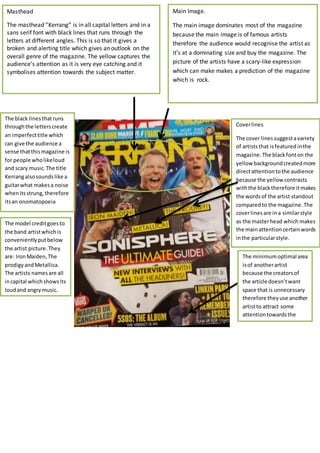
- 1. Masthead The masthead ”Kerrang” is in all capital letters and in a sans serif font with black lines that runs through the letters at different angles. This is so that it gives a broken and alerting title which gives an outlook on the overall genre of the magazine. The yellow captures the audience’s attention as it is very eye catching and it symbolises attention towards the subject matter. Cover lines The cover lines suggest a variety of artists that is featured in the magazine. The black font on the yellow background created more direct attention to the audience because the yellow contrasts with the black therefore it makes the words of the artist standout compared to the magazine. The cover lines are in a similar style as the master head which makes the main attention certain words in the particular style. Main Image. The main image dominates most of the magazine because the main image is of famous artists therefore the audience would recognise the artist as it’s at a dominating size and buy the magazine. The picture of the artists have a scary-like expression which can make makes a prediction of the magazine which is rock. The minimum optimal area is of another artist because the creators of the article doesn’t want space that is unnecessary therefore they use another artist to attract some attention towards the article. The black lines that runs through the letters create an imperfect title which can give the audience a sense that this magazine is for people who like loud and scary music. The title Kerrang also sounds like a guitar what makes a noise when its strung, therefore its an onomatopoeia The model credit goes to the band artist which is conveniently put below the artist picture. They are: Iron Maiden, The prodigy and Metallica. The artists names are all in capital which shows its loud and angry music.