1. Jade Ashworth Magazine analysis
Masthead
The masthead is in the primary optical area.
It is extremely eye-catching and is easy in the eye
The masthead is red on a white background make
the masthead stand out.
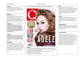
Main image
The main image is Adele -
The target audience for this magazine is both male
and female, both genders like the artist and
also..one of the headings is ‘if you’ve got it flaunt it
which will invite girls whereas bands/singers such as
Liam Gallagher and U2 are liked by both girls and
boys.
Model credit
The model credit is also the main cover line.
It shows the name of the person on the main
image It is white and stands out against Adeles’
hair. Adele is famous for her love and breakup
songs therefor it may attract people who have
recently split up from a relationship as they may
confined in her music
Cover lines
Most cover lines are in the terminal area and the
primary optical area as these. The red stands out.
The colours used are really harsh colours, when
they are placed next to each other they stand out
more
Main cover line
the main cover line is sans serif. ‘ADELE’ is very
large. To catch her fans eyes as she is a very popular
artist. The quote ‘if you’ve got it flaunt it’ is smaller
but easy to see against Adele’s hair as both texts are
white and contrast with the dark tones in her hair.
The red ‘blows us away’ stands out against the
white cover line showing that that is an important
story
Colour
The colour scheme used. white and black, the
background is white and the red and black show up easier
and stand out more. The colours suggest indie-rock as do
each of the artists mentioned, The fact the gold circle is
on the front showing that it is the 300th
issue suggest
wealth and success showing that the magazine is
successful,
Typefaces
The font used is sans serif and simple. The colours are
harsh and contrast with one and other making it stand
out more. Adele is larger than everything else on the
page. Her name is also in white when everything else is in
colour.
Photography lighting
the lighting used is high key which creates a more vibrant
atmosphere to correspond with a more urban feel to the
colours shown. The high key lighting is on her face giving
her a porcelain look.
Design Principles Used?
The design principle which has been used is the
Guttenberg design principle. This is effective because the
primary optical area is where the masthead is placed and
the weak fallow area includes a range of cover lines. 3 of
the 4 areas are filled with text.to make the magazine look
more modern. The magazine is a positive view of the
music industry as no hatred is aimed towards music. It is
captivating, even though it has quite a simple
structure;this corresponds with the ‘Pop’ theme that
Adele creates in the image and within her music
House Style
the words stand out against the white background and contrast to make the red and black
font stand out more. The golden ‘300th
issue will catch the viewers eye as they may think it
is an important issue with more important stories.
The font style is consistent whereas the text size varies to contrast which parts are
important and will catch the viewers eye
the layout is similar to every other Q magazine.
Comment on how the design of the magazine cover attracts the target audience:
2. Jade Ashworth Magazine analysis
Masthead
The masthead is in the primary optical area.
It is extremely eye-catching
the colour black suggests seriousness and goes well
with the colour pink producing a pop theme
it is extremely eye-catching and is easy in the eye
the masthead is red on a white background make
the masthead stand out.
Main image
The main image is Katy Perry -
The target audience for this magazine is both male
and female, the artist is likable by both genders and
women see her as a role model along with men
being ‘in love’. Over the entire magazine is mainly
aimed at women with KatyPerry. She is also stood in
a seductive manor. High key lighting has been used
in the image, especially on the upper parts of her
body (face and left arm. Her bikini contrasts with
her skin because of the dark tone
Model credit
the model credit is also the main cover line. It
shows the name of the person on the magazine
which is KatyPerry. The model credit stands out due
to it being more a larger font than the other cover
lines. The two colours contrast. The black ‘Katy’
goes with the hair and the pink ‘Perry’ goes with her
lips,
Cover lines
thecover lines are based around KatyPerry’s body.
Most cover lines are in the weak fallow area, but
other cover lines are based around the whole page.
The pink stands out. The colours used are really
harsh and vibrant colours,thecover lines show more
artists which will be in the magazine including a
range of pop and rap.
Main cover line
The main cover line is sans serif. ‘Katy Perry’ it is
larger than the other sources of coverlines. The
main cover line describes the photo… ‘Bi-curious
babe’ as she is standing in a seductive manor.. The
other coverlines are smaller but easy to see against
the white background.
The few pink words within the cover lines stand out.
Colour
The colour scheme used is white pink and black, the
background is white and the pink and black show up
easier and stand out more. The text is placed around
the image and the colours contrast with the image
whilst suggesting a pop and dance feel as pop and
dance are usually represented and based around the
colour pink
The main inviting words are in black bold.
Typefaces
The font used is sans serif and simple. The colours are
harsh with a hint of brightness from the colour pink.
They contrast with one and other making the more
important words stand out more. Katy perry is the
main focal point and the text is positioned around he
body. Her name is in both black and pink.
Photography Lighting
The lighting used is high key which creates a more
vibrant atmosphere to match the pop and rap feel to
the colours shown. The high key lighting is on her
body whilst contrasting with her outfit.The high key
lighting helps define her pose which is suggesting
attitude.
Design Principles Used?
The design principle which has been used is the
guttenberg design principle. This is effective because
the primary optical area and the strong fallow area is
where the masthead is placed and a range of
coverlines are placed around the body of katyperry in
each area.. The magazine is a positive view of the
music industry as no hatred is aimed towards music.
It is captivating, even though it has quite a simple
structure;This corresponds with the ‘Pop’ and slow
r&b music theme in which katyperry creates in the
image and within her music. Her pose suggest
attitude.
House Style
Colours – pink white and black, which
The words stand out against the white background. The bold text fit in with the certain
pose in which she is pulling suggesting she has attitude. The colours contrast to make the
pink and black font stand out more The font style is consistent whereas the text size varies
to contrast which parts are important and will catch the viewers eye
Comment on how the design of the magazine cover attracts the target audience:
3. Jade Ashworth Magazine analysisMasthead
The masthead is in the primary optical area.
It is extremely eye-catching
There aren’t many bright colours other than the
main cover line. It is extremely eye-catching as it
stand out against the light and dark background.
The masthead is red white and black which fits in
with the indie-rock theme.
Main image
The main image is paramore -The target audience
for this magazine is both male and female, the band
is likable by both genders and women. It is both
gender orientated. The genre of paramour is
alternative High key lighting has been used and
contrasts with their clothing because of the dark
colours in which they are wearing
Model credit
the model credit is also the main cover line. It
shows the name of the person on the magazine
which is Paramore.. The model credit stands out
due to it being more a larger font than the other
cover lines. As well as it being bright pink and
matching her lipstick where as all the other colours
on the magazine are dark and dull.
Cover lines
the cover lines are manly placed in the weak fallow
area. They stand out due to them being white
against black clothing
They are in a sans serif font and are capitalised
showing that its key important points about the
magazine to give a taste of whats inside to the
viewer.
Main cover line
The main cover line is sans serif. ‘Paramore’ it is also
the model credit and is larger than the other
sources of coverlines. The main cover line describes
the photo as the photo is of paramour. It will also
catch a lot of viewers’ eye due to them being such a
big band. The other coverlines are smaller but easy
to see against the black background.
It is pink therefor stands out the most.
Colour
The colour scheme used is Black and red following
the typical NME scheme. The background is white but
the people in the photo are wearing all black with the
text displayed against them letting it stand out. The
main cover line is pink making it stand out and to
catch the fan bases’ eye The text is placed ontop of
the image and the colours contrast with the image
whilst suggesting a indie-rock which can be
portrayed to both genders but the pinkness of the
main cover line/model credit suggesting a more
female appropriate magazine
Typefaces
The font used is sans serif and simple. The colours are
dark with a hint of brightness from the colour pink.
They contrast with one and other making the
important words stand out more. ‘Paramore’ is the
main focal point and the text is positioned on top of
the photo.
Photography Lighting
The lighting used is low key on the background and
high key on their faces creating a more vibrant
atmosphere to match the indie-rock feel to the
colours shown. The high key lighting helps define her
pose which is suggesting attitude.Along with the girl
having bright pink lips.
Design Principles Used?
The design principle which has been used is the
guttenberg design principle. This is effective because
the primary optical area is where the masthead is
placed and a range of coverlines are on top of the
photo of paramour. The magazine is a positive view
of the music industry as no hatred is aimed towards
music. It is captivating, even though it has quite a
simple and dark structure, This corresponds with the
pink and ‘girly’ feel. showing the indie-rock theme in
which paramore create in the image and within their
music. The girls pose suggest attitude.
House Style
Colours – Mainly black and red suggesting indie-rock. With bits of pink suggesting a more
feminism genre. The words stand out against the black background. The bold text fit in
with the certain pose in which she is pulling suggesting she has attitude along with
matching her lipstick. The colours contrast to make the pink font stand out more to catch
the viewers’ eye as paramore have a huge fan base. The font style is consistent whereas the
text size varies to contrast which parts are important and will catch the ewers eye
Comment on how the design of the magazine cover attracts the target audience: