
Recommended
More Related Content
What's hot
What's hot (20)
Viewers also liked
Viewers also liked (19)
Similar to Rick Rosses Tattoos and Wealth Intimidate in Magazine Feature
Similar to Rick Rosses Tattoos and Wealth Intimidate in Magazine Feature (20)
Recently uploaded
Recently uploaded (20)
Rick Rosses Tattoos and Wealth Intimidate in Magazine Feature
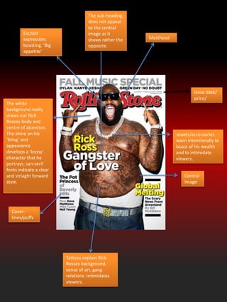
- 1. Masthead Central Image Cover- lines/puffs Tattoos explain Rick Rosses background, sense of art, gang relations. Intimidates viewers. Jewels/accessories worn intentionally to boast of his wealth and to intimidate viewers. Excited expression, boasting. ‘Big appetite’ The white background really draws out Rick Rosses body and centre of attention. The shine on his ‘bling’ and appearance develops a ‘bossy’ character that he portrays. san-serif fonts indicate a clear and striaght forward style. Issue date/ price/ The sub-heading does not appeal to the central image as it shows rather the opposite.
- 2. Masthead: Copyright font Cover- lines : bold and in capitals to attract viewer Interesting diet info, draws audience attention Central image Eye-candy: seduction technique to attract males. Beyoncé is the image many want to have and inside are ways of how to do such Clothes: Sets the pace for what is style, seduces women Overlapping font to distinguish importance. There is a clear purple/pink theme on this front cover which indicates its feminine and is aimed at the female aspect of the market. The colours are vibrant and express Beyoncé character.
- 3. Central image Soft black & white colour effect with fine outlines. This could be intended to show ‘no emotion’ aspect of the star, West. Also the effect highlights and distinguishes the central image from the masthead. The reflected central image is relative to inverted cover line distinguishing opposites of ‘Love’ & ‘Hate’ Masthead The overall design of the magazine portrays an elegant simplicity. This could be suggesting an image of Kanye West and the reflected effect is ample to pull of the magazine. Cover lines
- 4. Masthead: The masthead us bold and white which lets it stand out from the pure black background. It is also placed behind Drake to outline Drake’s 3-D figure and his importance. The small track of names running on the top are small hints to the audience indicating who the magazine is starring. This is effective as it is short but very effective in attracting an audience who know what to read. Cover lines: The cover lines are short and either in italics or different size in width or length to ensure each cover line stands out. The cover-lines are also colour coded yellow and white, both colours which really stand out from the black background. This is effective as it portrays style. The unstoppable text appears to be edited in but is purposefully positioned on Drake’s t- shirt to appear it’s a part of his t-shirt and is indicating how he must feel – ‘unstoppable’. The barcode is unusually and positioned to cover drake’s arm, indicating that the focus should in fact be on the centre of the cover. The bar code also consists of more cover lines which carry less significance as it is in a smaller size. The colour scheme is very effective as it works in combination with other aspects of the cover. For instance, Drake is wear a black t- shirt with a black hat alongside the black background. However, Drake still stands out due to the subtle light effect used to shows his outline, this shows a ‘dark’ aspect of Drake. The colours white, yellow and black work together effectively as they compliment each other and it does not spoil the mise en-scene.
- 5. The soft tone of greys and blacks induces a formal and serious element. The restricted involvement of red is intended to draw the readers attention to the key parts of the page C lose-up image of the singer Adele with a plain expression exaggerates the formality of the magazine but also the sincere emotion the image is portraying. This magazine tailors for the soul genre audience including classical/R&B. The small contents headlines on the left give a ‘low-down’ of the magazine. They illustrate a sense of organisation. The ‘Q.Review’ section shows the magazine is well established that they organise interviews with popular bands. The MOD is very serious and stern. The clean-cut Adele and correctly organised subheadings support this view.
- 6. Black and orange are the main colour scheme of this contents page and most likely the front magazine cover. Orange is a juvenile bold colour and when mixed with black shows clear vibrant distinctions attracting the audiences attention; The main image appeals to the contents theme ‘Drummer’. The black and white represents shows the image may have come from an older age. Alternatively the black and white maybe intentional to remake and idea of the past 50 years of drumming history. Secondary images provide a visual insight into the magazine and also corresponds to the number sub-headings that provide more information. The style of font is serif which shows the magazine is relaxed and trending. This style and colour of font is likely to have been carried on from the magazine cover page. Issue date :is important for the magazine as it sets a schedule and indication of which magazine has been released but also keeps audiences informed of and up to date of which is the latest magazine out. Structured sub- headings with spec of information is used to draw in the audience.
- 7. The slanted page effect gives the magazine a different angle the audience can read from which is different. The slant also reflects the attitude of the secondary main image. Bold san-serif font creates an idea that this magazine contains serious informative news/gossip about popular artists and about the music industry. Small print contents takes up a small area of the page than the secondary image. This initially shows that XXL believe the reader will get a better understanding of the contents from viewing the image rather than reading the information provided. This shows that images can transfer more information at times than written text. The XXL logo; reminds readers of the magazineXXL issued a simple colour scheme, main colours include black, white and red. This is a recurring pattern within XXL which means it is their main theme. The majority of the colour is white, this is to distinguish all the dark colours. Issue date The jewellery shown in the secondary image shows the audience this magazine has established what a ‘typical’ rap artist should look like i.e. intimidating.
- 8. The ‘contents’ font style is a trademark for Vibe magazine. It also works as a reminder for audiences of the magazine they’re reading and it also suits contemporary audience with its different style. The colour of burgundy is shared in different shades throughout the page and also compliments the white texts alongside the main image. This works very well the different shading of Burgundy near the corners of the page gives the page depth. The overall colour scheme appears to give off a ‘warm’ welcoming feeling however this is completely contradicted by the main image who appears provocative and rough. The image is very bold as it captures the artist holding up several chains whilst revealing his gold teeth. The image is very provocative and over powers all other texts on the page. Reminder of issue date The contents is in a very small font outlining its lack of importance in comparison to all other texts on the page. It does share a theme of ‘white’ with the page title which is effective in giving the page a constant theme throughout.